叁式 - Rebranding
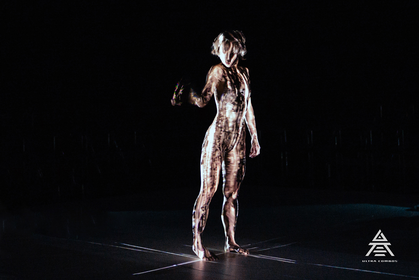
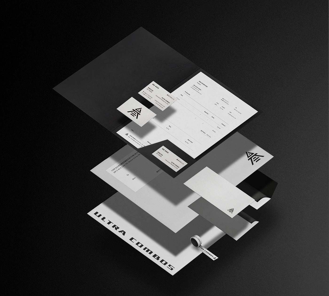
"叁式 UltraCombos" is an interactive and new media design studio founded in 2010. The studio is professional in crossover integration execution services such as all kinds of interactive programs, visual art designs and hardware devices. They provide our clients with various creative proposals, and work them out in accordance with the needs of our clients. In addition, they are more than willing to add more excitements and challenges into each of our new project, for making customized business applications with distinct styles. It is the unswerving ambition and persistence shared by all of the members in UltraCombos.
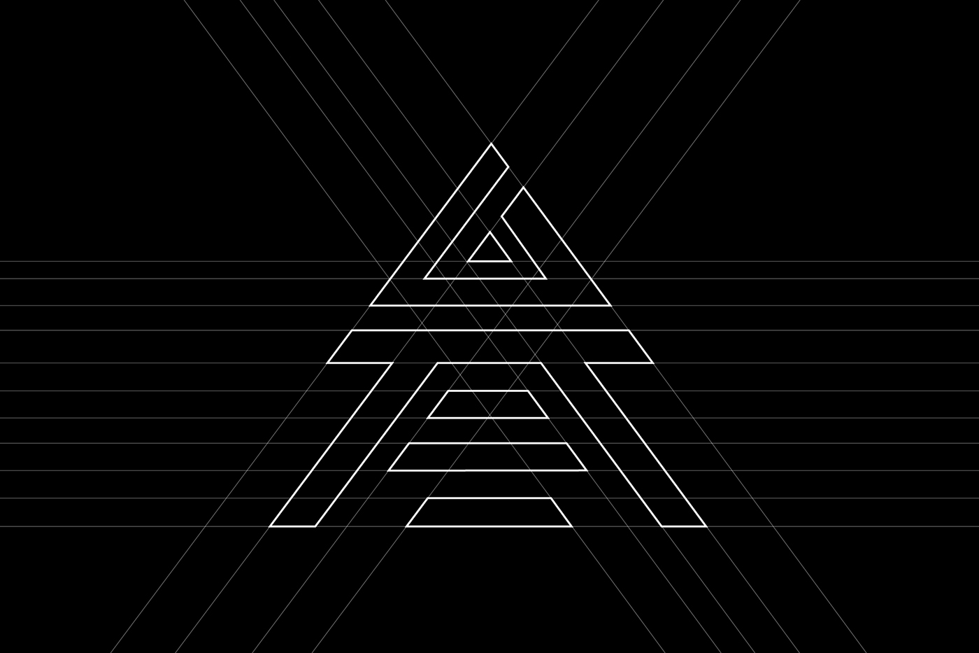
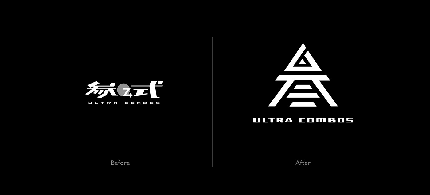
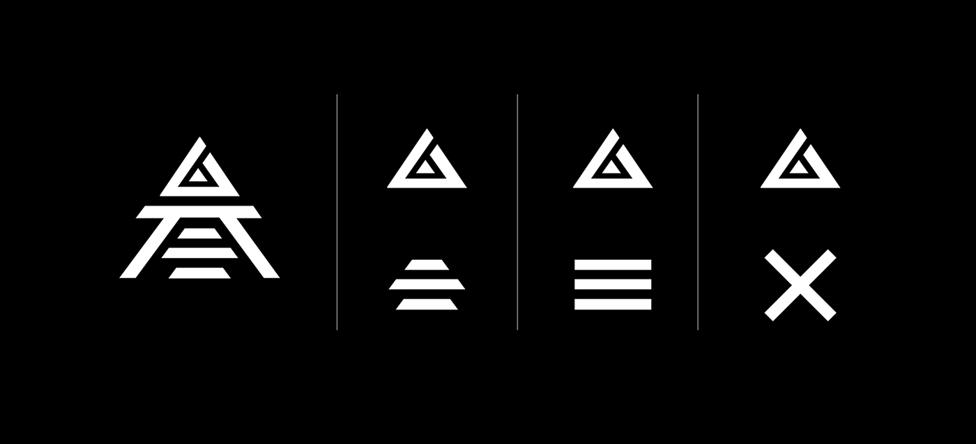
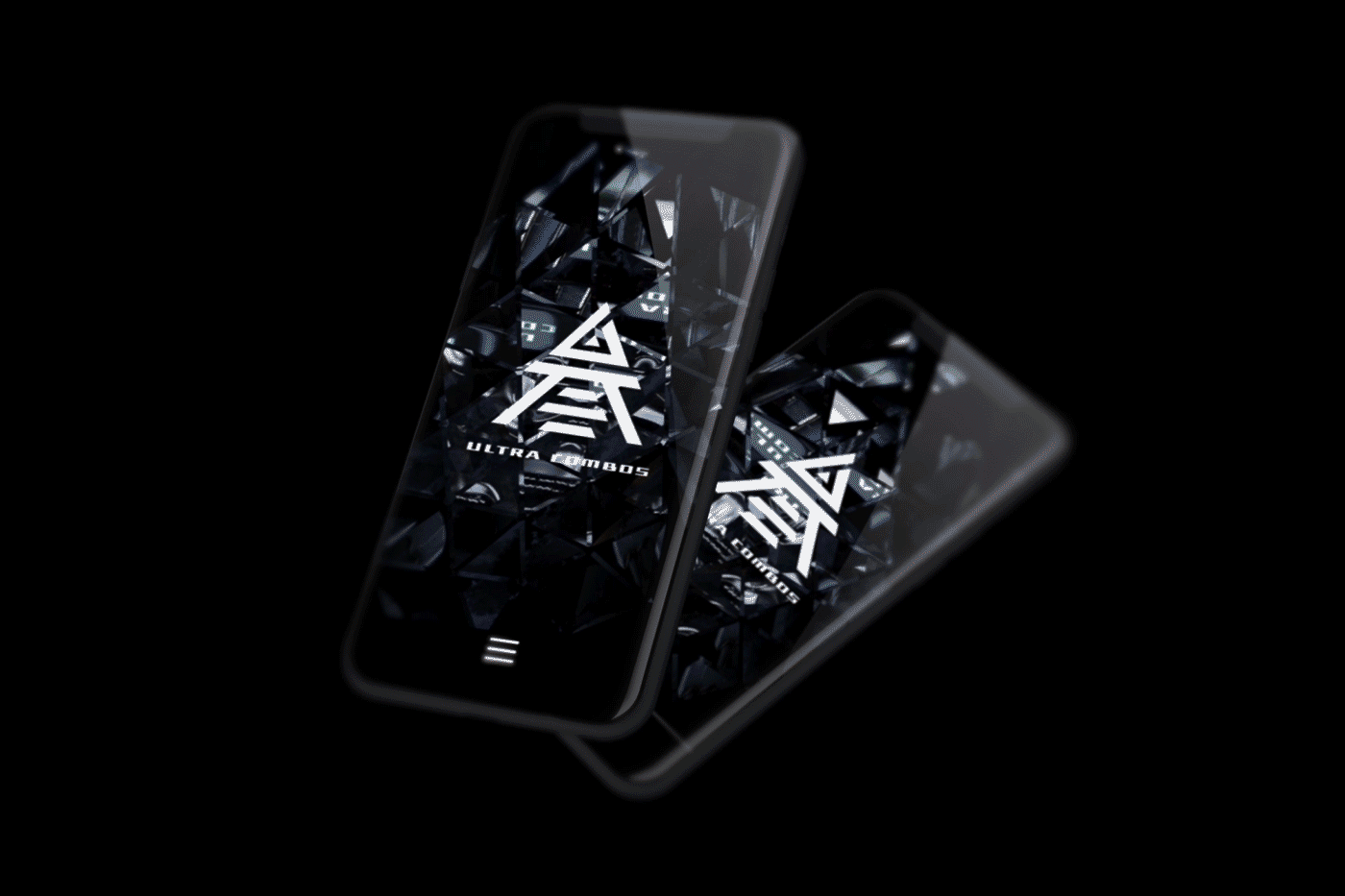
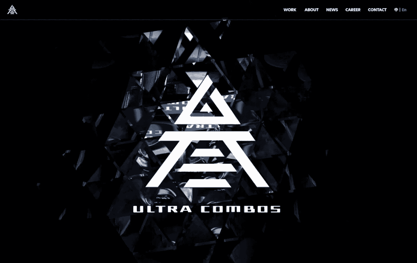
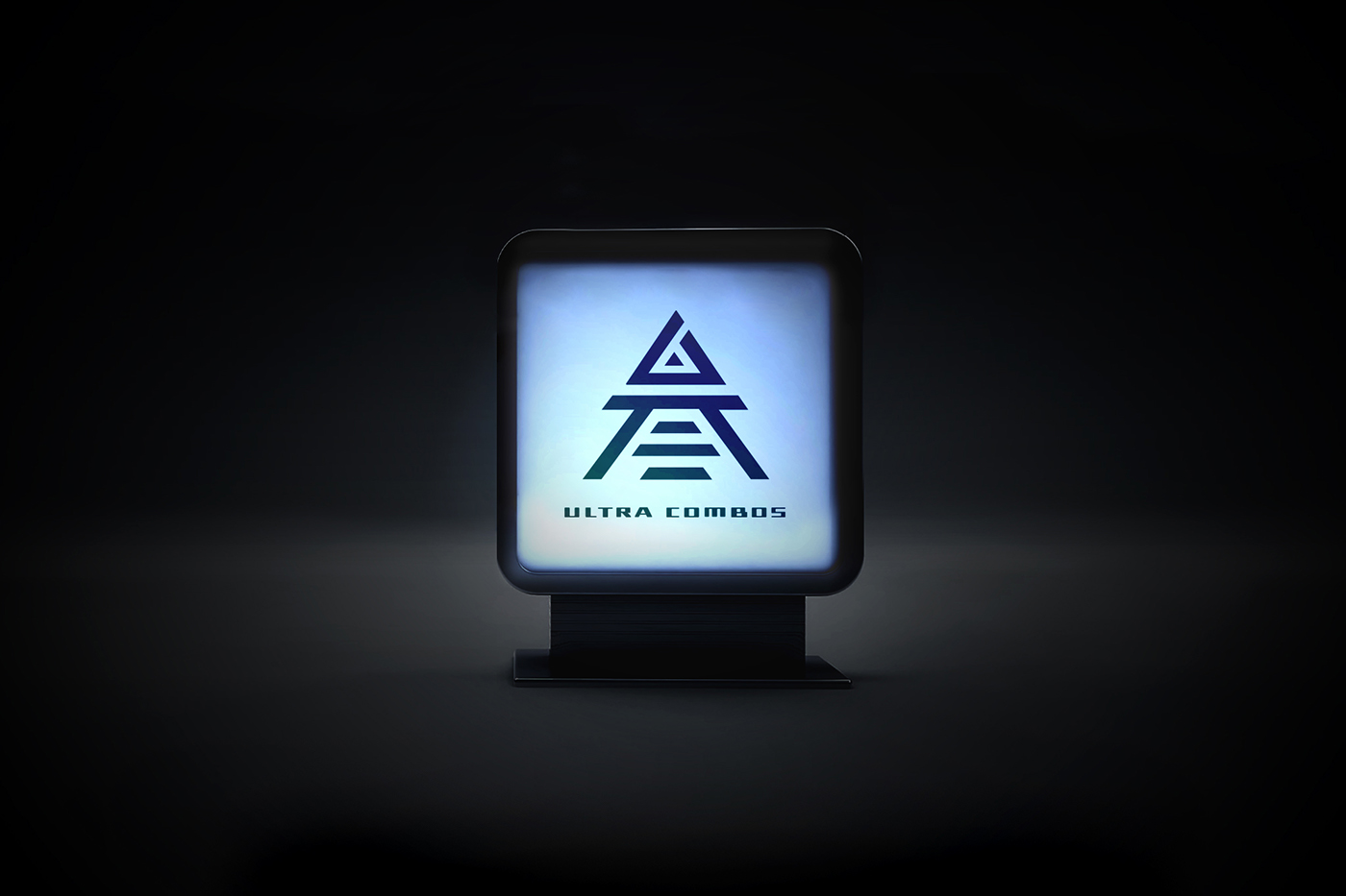
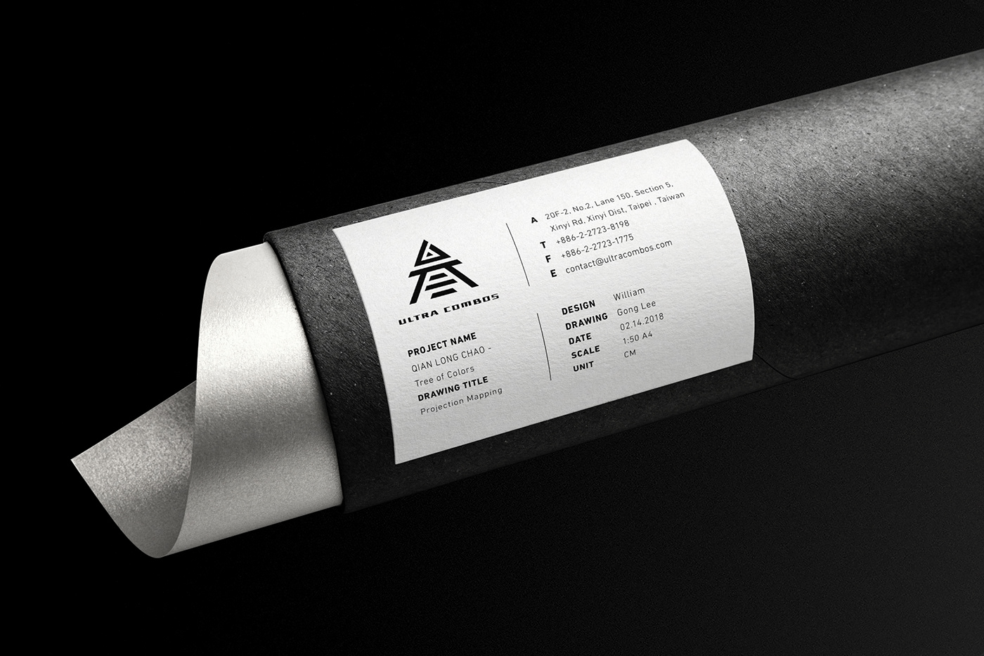
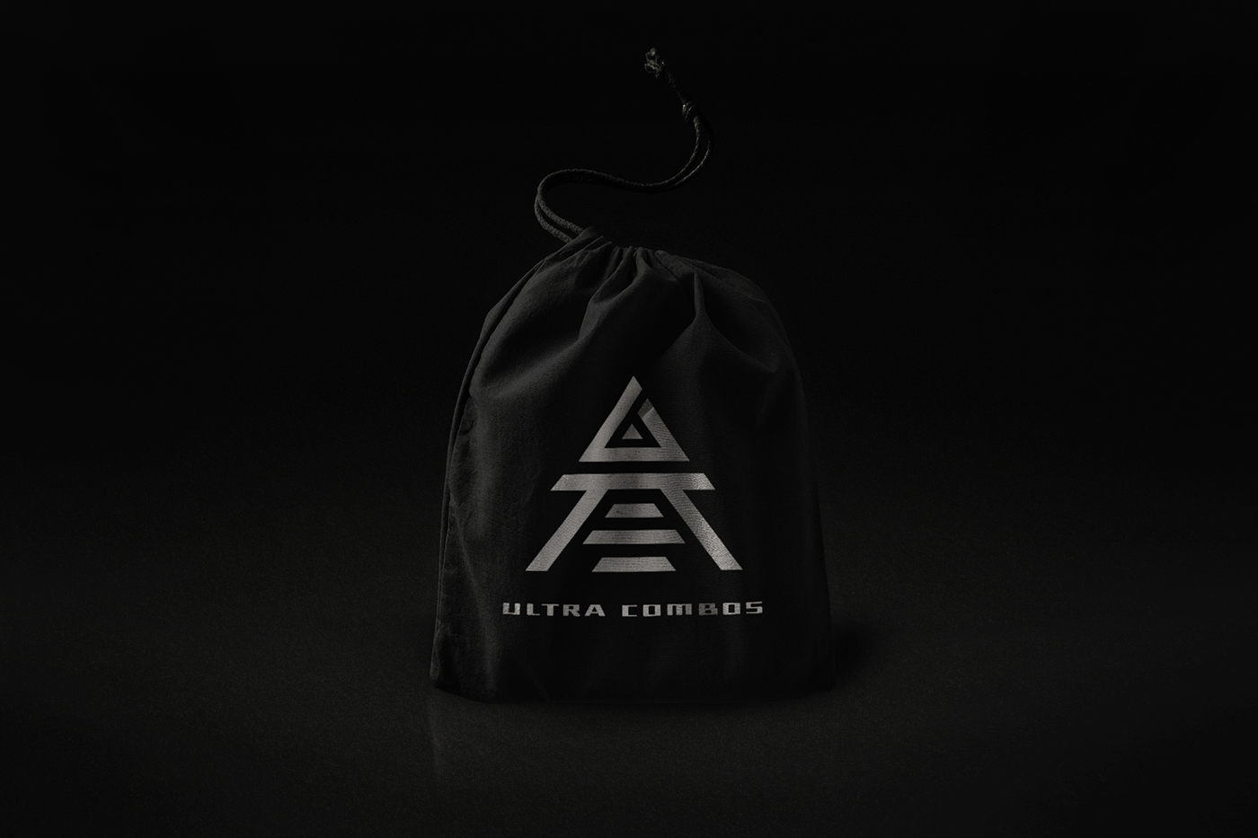
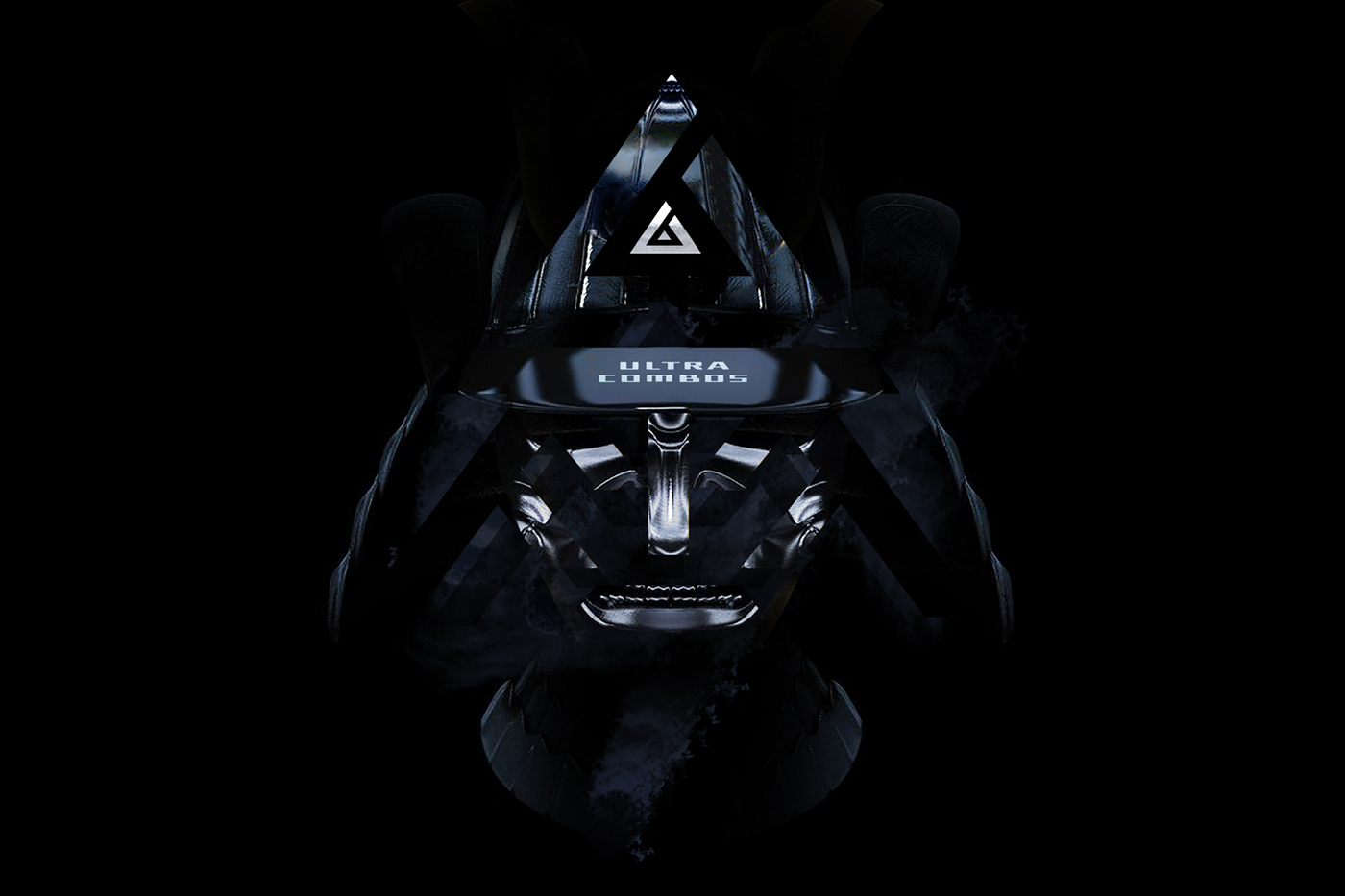
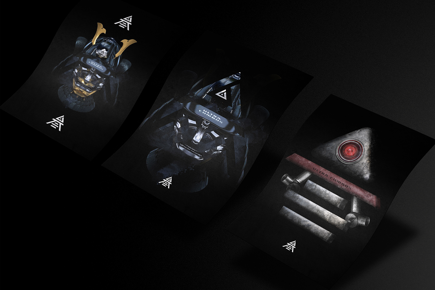
As Ultracombos prepares to release an unprecedented wave of new services and experiences, they felt their logo should evolve as well, visually accentuating this new era. The new logo takes the word 「叁」 as an idea, which means Triple / Triangle / Multiple in Mandarin Chinese. The logo is built for the digital world, supporting the diversity of their service, representing and endorsing our creations and designs.
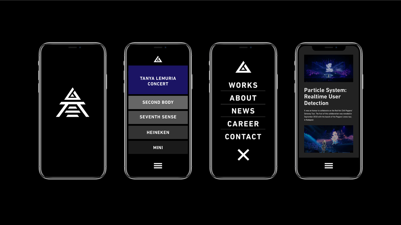
Also, the typeface here is more than a design element. It articulates our message, expressing both what they say and how they say it. Modern, bold, and futuristic, we built the UC Type Family aligned with the their brand personality. We wish you to feel that: It’s clean. It’s bold and simple. It’s easy to use. And It looks very 叁式.