
2017
B R E A T H E
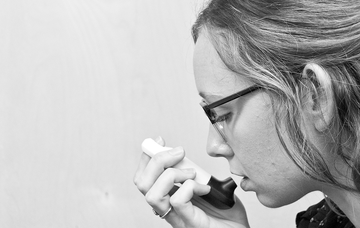
B R E A T H E is intended to elevate the design of an inhaler. The design is based on merging the concepts of iconic and accessibility. The form is simple, taking inspiration from worry stones, or highly tactile items that are used as a form of therapy or as an outlet for stress through tactile interaction. Symmetry and simplicity in the form brings in elements of 'iconic' and approachability, helping to reinforce the moment of relief one gets when medication is delivered.
The trigger is incorporated in a simple circular opening- supporting this idea of high tactility while also nodding to the act of breathing or inhaling. The simple color breakup helps quickly identify the key interaction areas of the product, helping to eliminate ambiguity.
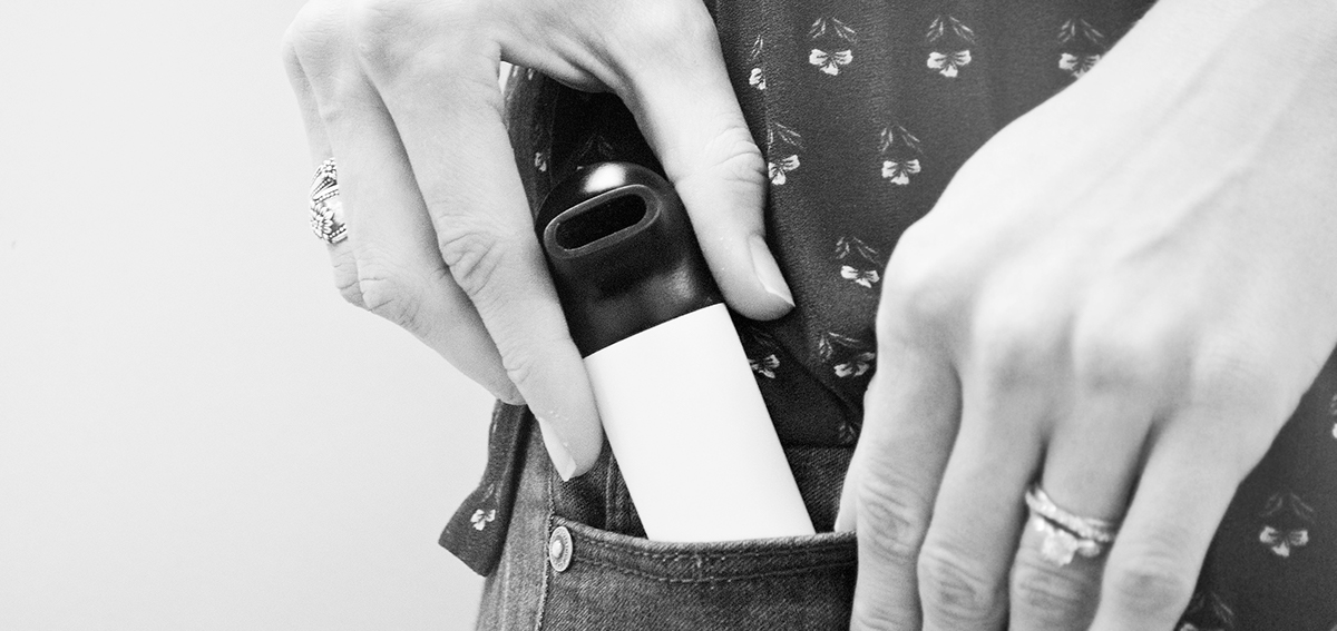
The bottom mouthpiece quarter-turns off to make for easy removal of medicine canister and for easy sanitation of the mouthpiece. Different color components can be mixed and matched to make it your own.


B R E A T H E was an independent design exercise based on the #breathebetterwithcs design challenge.

