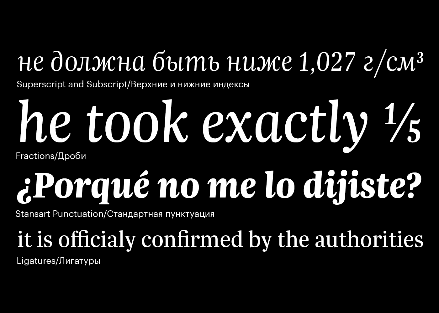
Trola is a contemporary text typeface for press, corporate and editorial uses. In terms of style, Trola is a neo-Baroque typeface. Its contemporary proportions make it particularly recommended for generous sizes and still fit in tight spaces. It can also be considered a headline with a moderate contrast to gain presence and make a stronger screen display. Trola is most suitable as a text font: its large x-height, short extenders and readable, round italics make it a great family for small sizes and compact settings.
Historians of type used to speak of the goût hollandois (or Dutch taste) to describe 17th century types from the Netherlands characterised by a tall x-height, condensed proportion and dark color. Trola, although designed by a Spaniard, is doubly a Dutch face. Not only does it have the characteristics of the goût hollandois style, but it also reflects modern trends in Dutch types.
Trola’s Roman fonts bear the traces of Johann Michael Fleischman—see the “a” and “g” in particular; while its italics remind of Gerard Unger’s work in the way branching is handled. Overall, Trola is sturdy and compact—the sort of font that should have wide application for situations requiring small sizes of text, as well as those where space is at a premium.
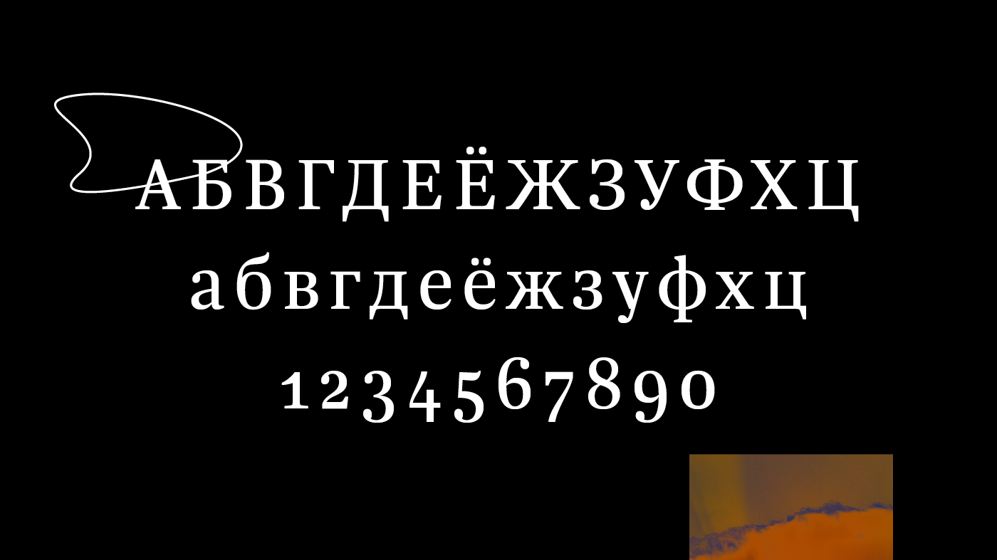
In 2017, Trola family has been updated and improved, and has expanded to Cyrillic. The cyrillic version designed by Letterjuice (Pilar Cano & Ferran Millan) and finally all has been supervised and agreed by the russian type designers Ilya Ruderman and Yury Ostromentsky.