


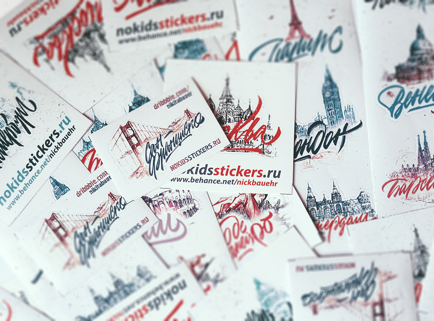
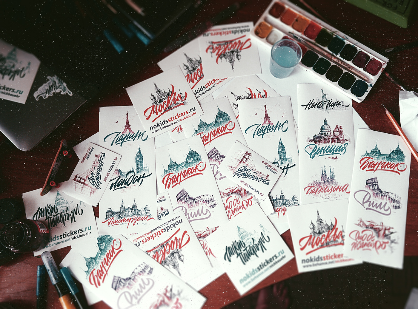
Stickers with the world's cities
The best way to spend vacation is to take a trip. Together with the store No! KidsStickers we compiled not only a list of worth visiting cities, but also made stickers with each of them ─ we suppose, visualized dreams come true more often. The drawings of the city sights belong to my friend Marina Kolganova, — we spent lots of time working on this project and finally can share it with you. Special thanks to the "Motion Design School" and my pal Alex Lakfar for the wonderful stickers animation. Enjoy watching!
Лучший способ провести отпуск с пользой - отправиться в путешествие. Совместно с магазином No!KidsStickers мы не только составили список городов мира, которые стоит посетить, но и сделали стикеры с каждым из них ─ все-таки, визуализированные мечты сбываются чаще.
В создании наклеек своими рисунками городов мне очень помогла моя подруга Марина Колганова - не один месяц мы потратили, работая над этим проектом и, наконец, можем поделиться им с вами. Отдельное спасибо школе моушн-дизайна "Motion Design School" и моему товарищу Саше Лакфару за замечательные анимации стикеров. Приятного просмотра!
San Francisco
Animated by Vladimir Lubarskiy

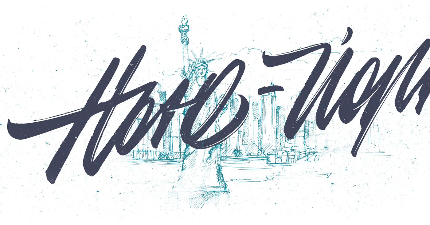
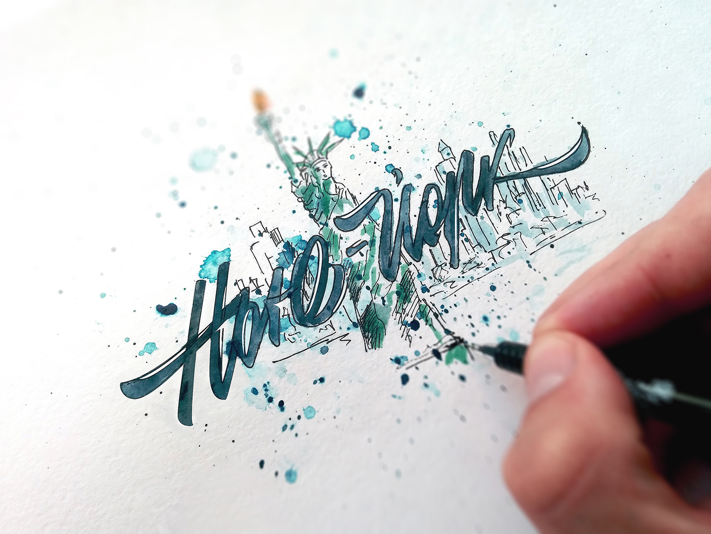
New York
Animated by Alex Lakfar
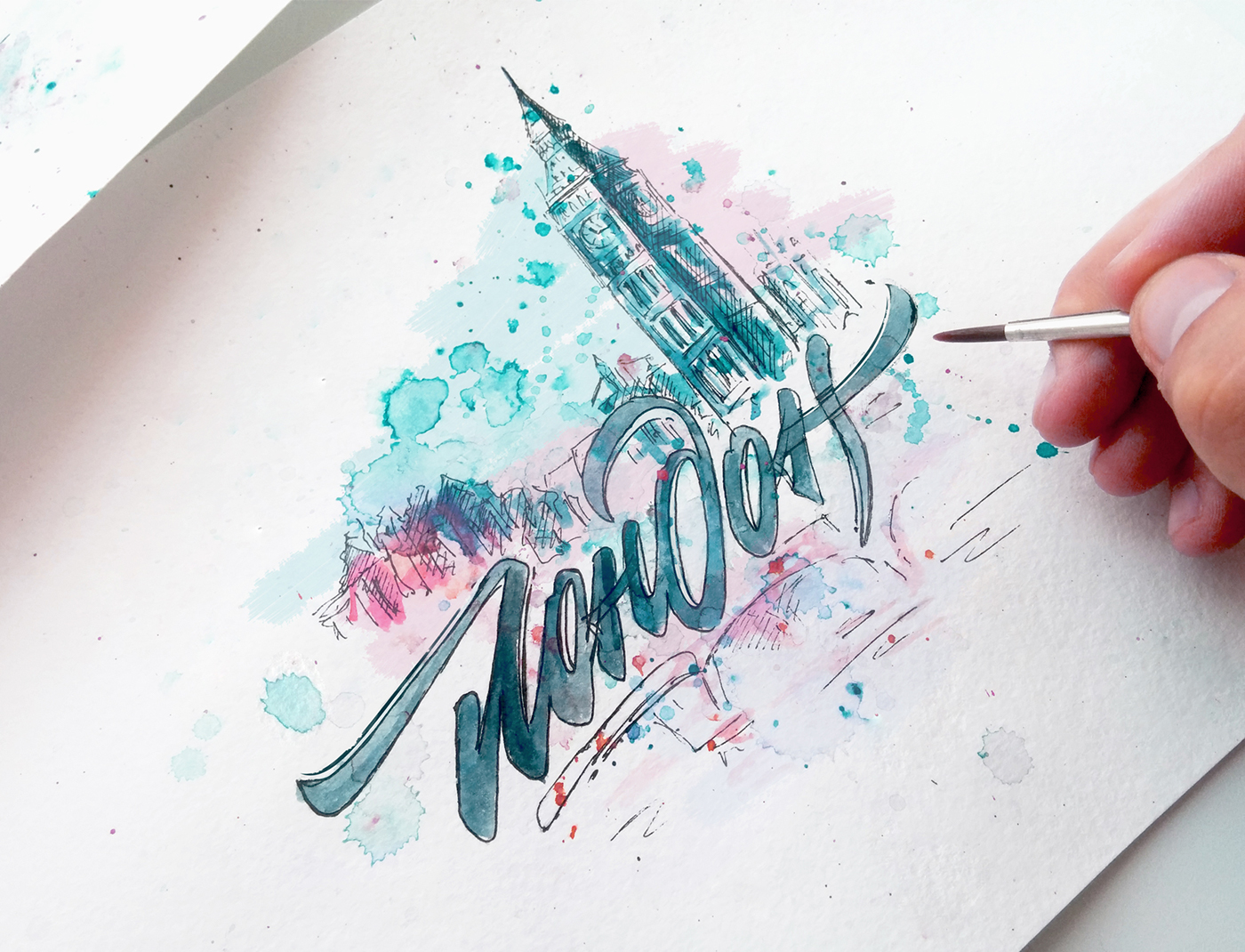
London
Animated by Ihor Karas
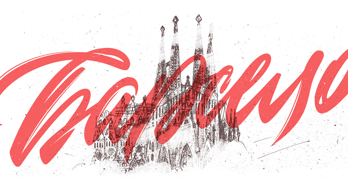
Barcelona
Animated by Alexandr Pyatkov
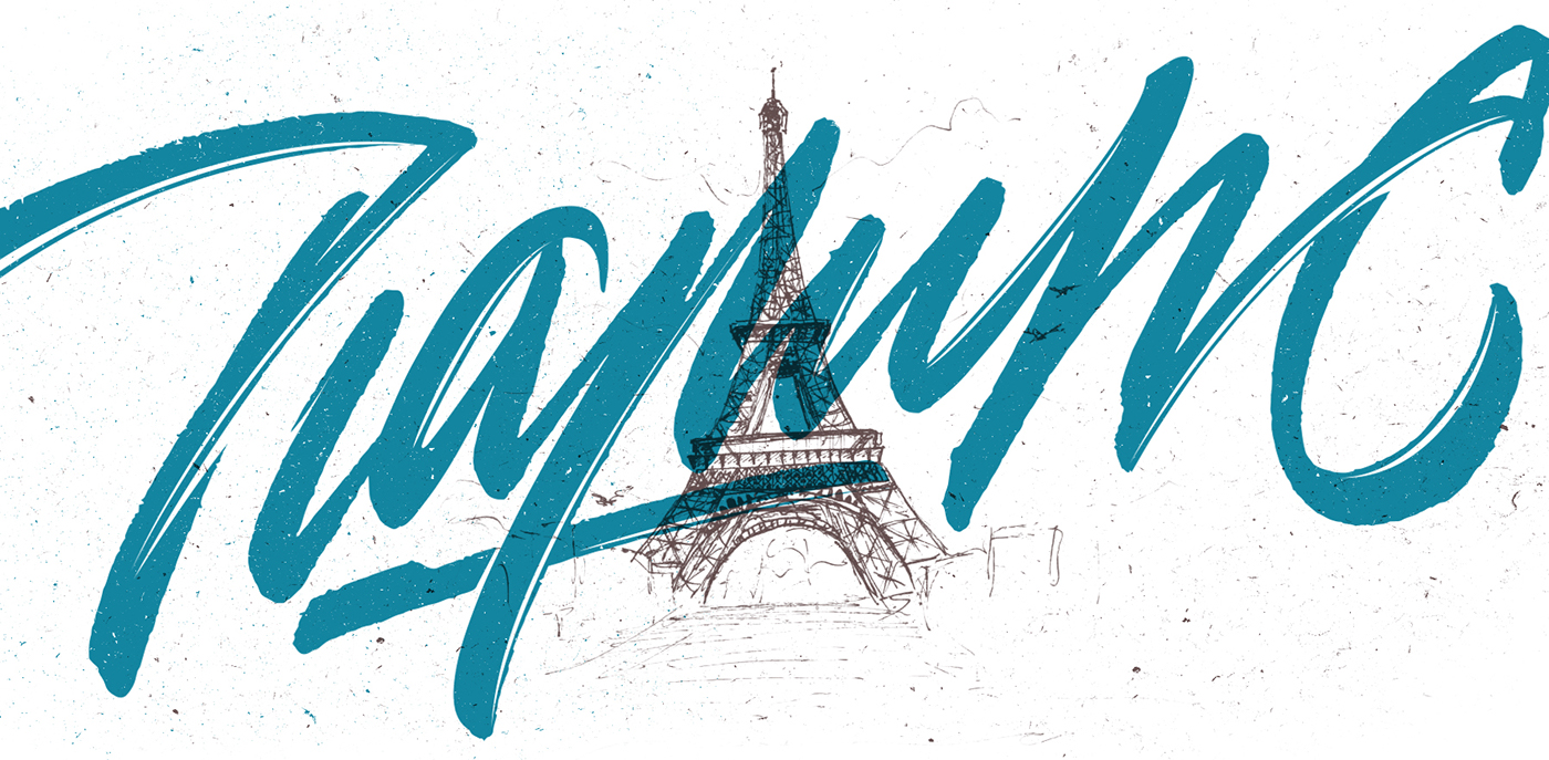
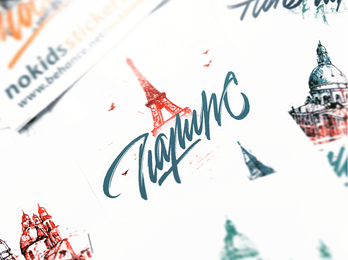
Paris
Animated by Yaroslav Kononov
Amsterdam
Animated by Alex Konchenkov
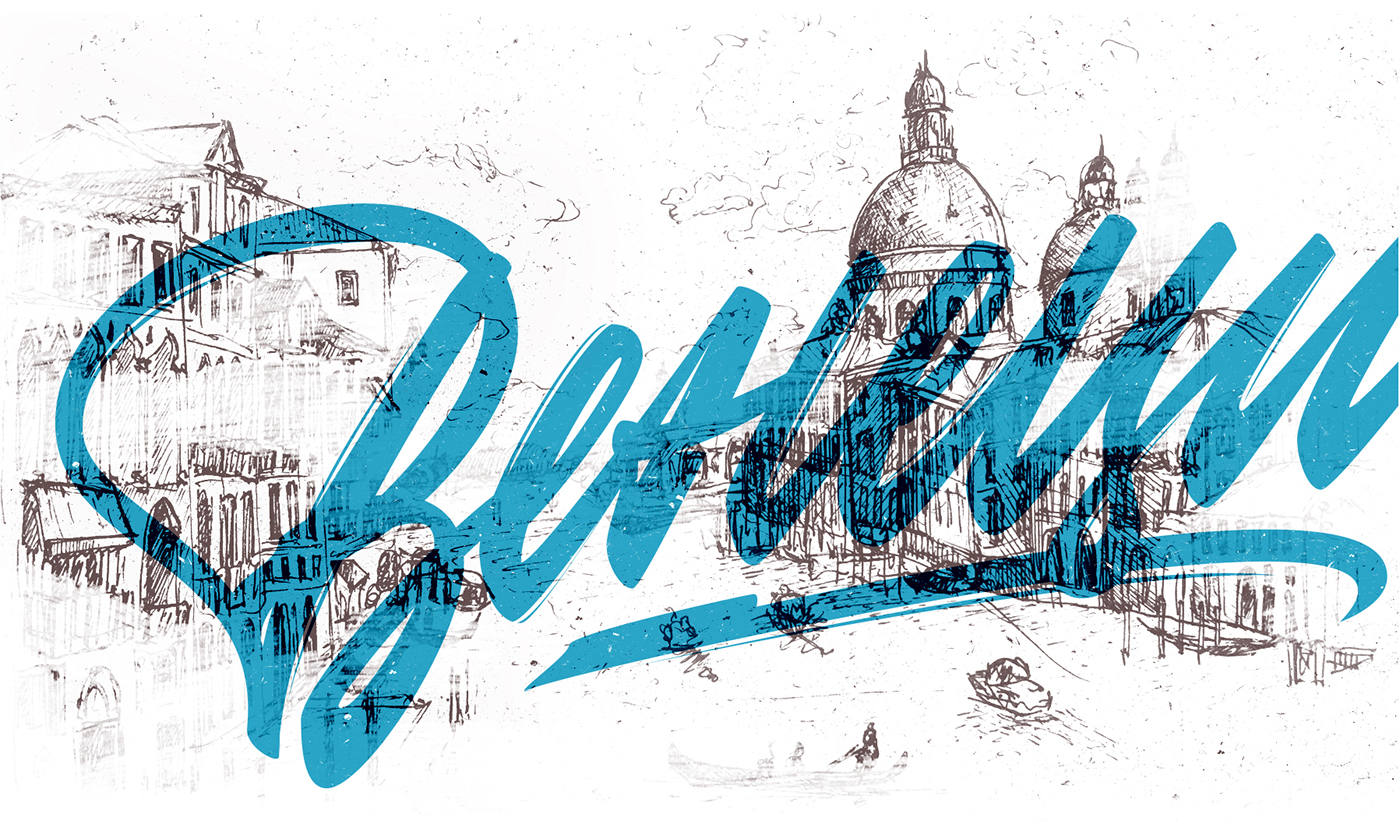
Venice
Animated by Maxim Kravchenko
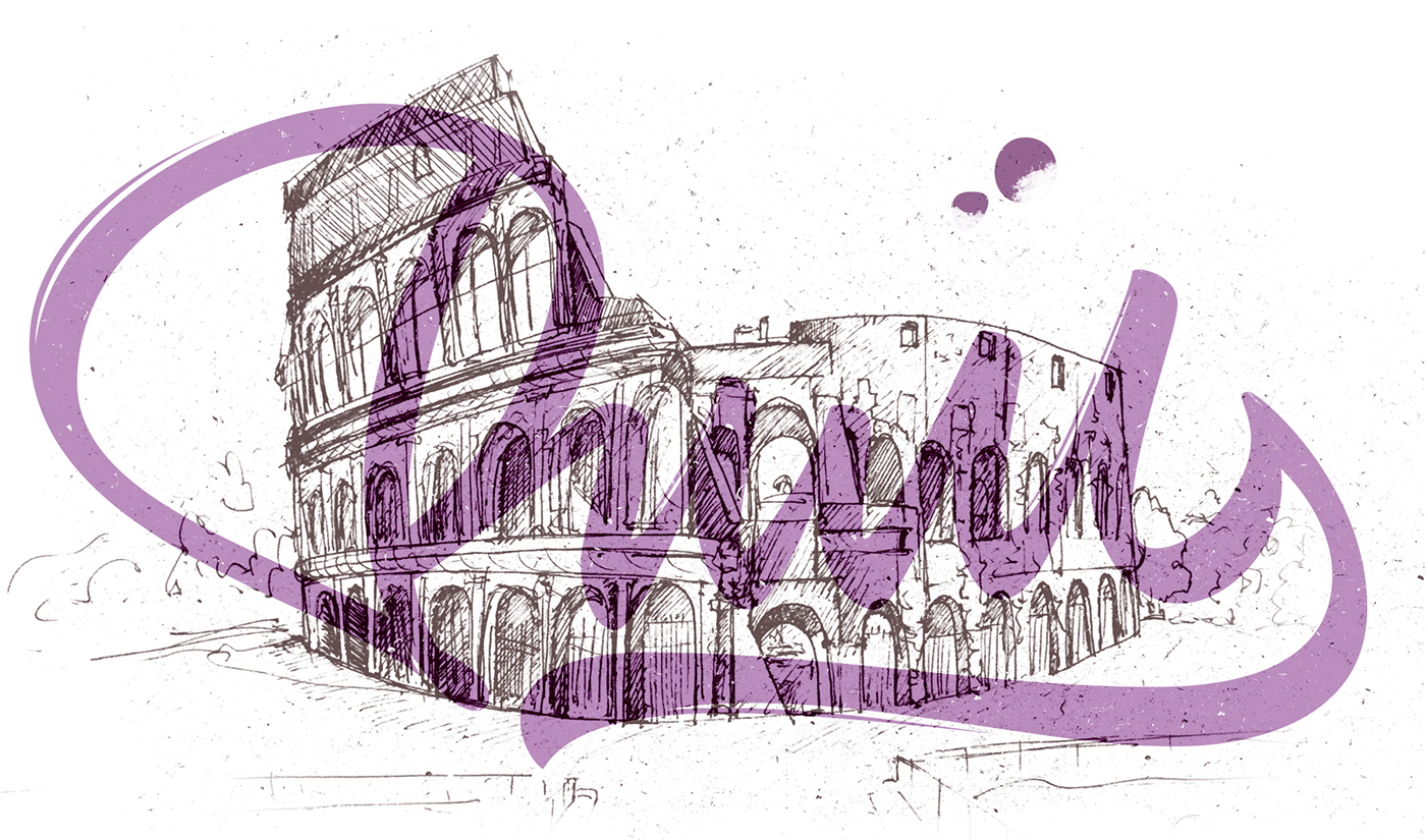
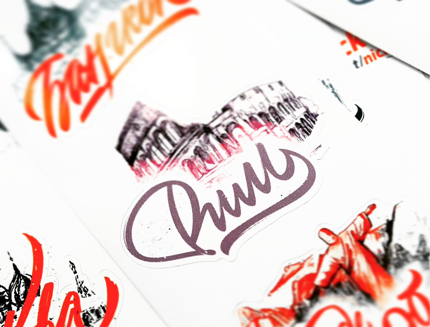
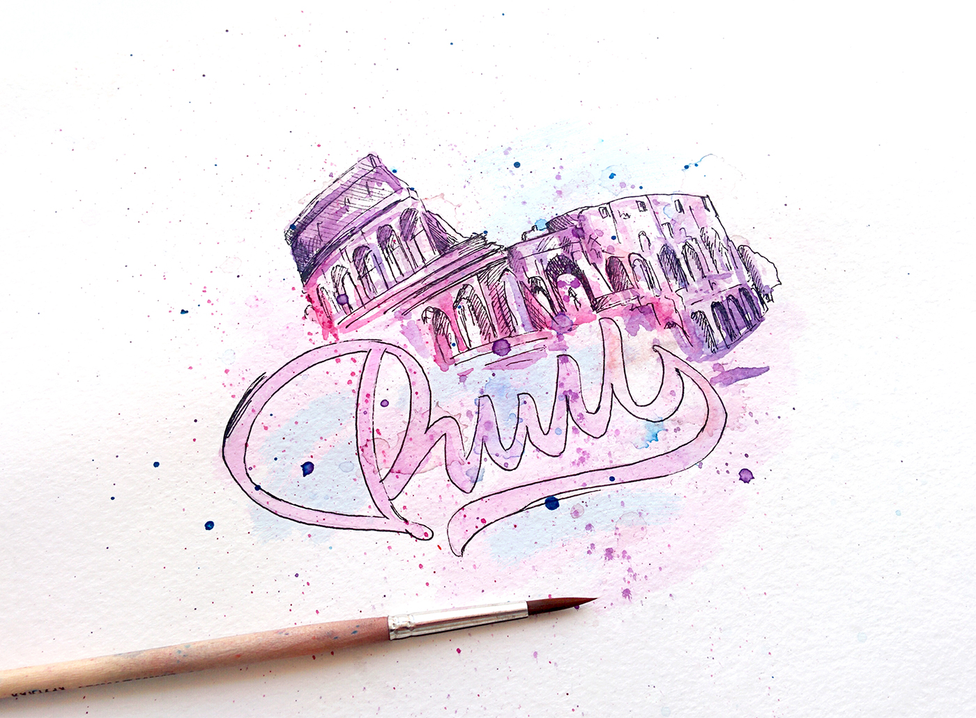
Rome
Animated by Sergey Sprenne
Rio De Janeiro
Animated by Yaroslav Kononov

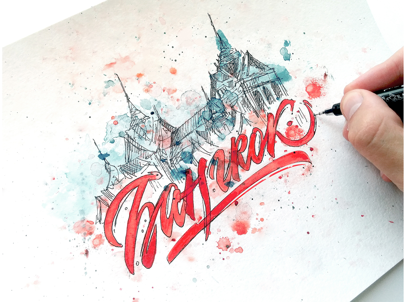
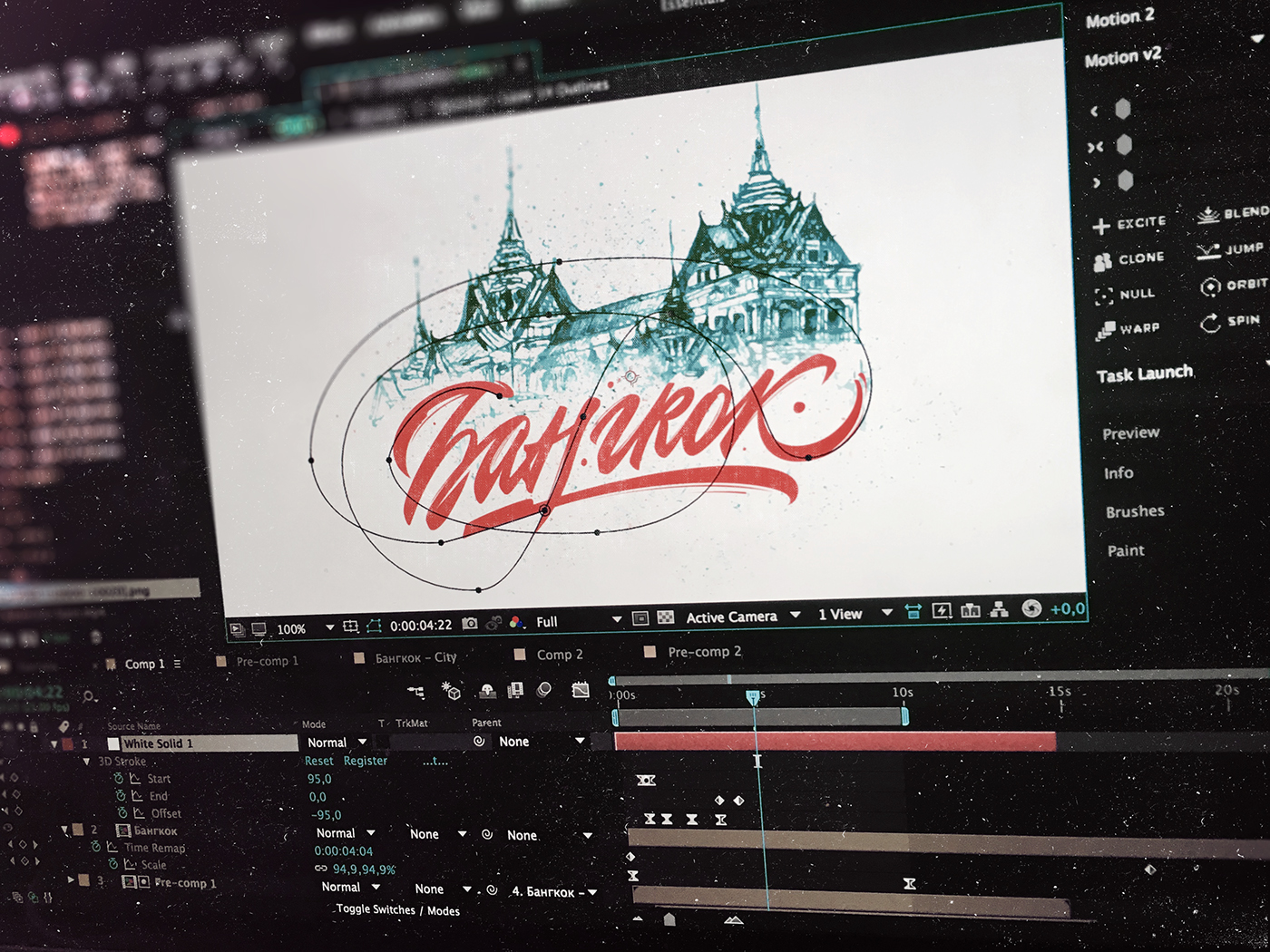
Bangkok
Animated by Alex Lakfar
Process
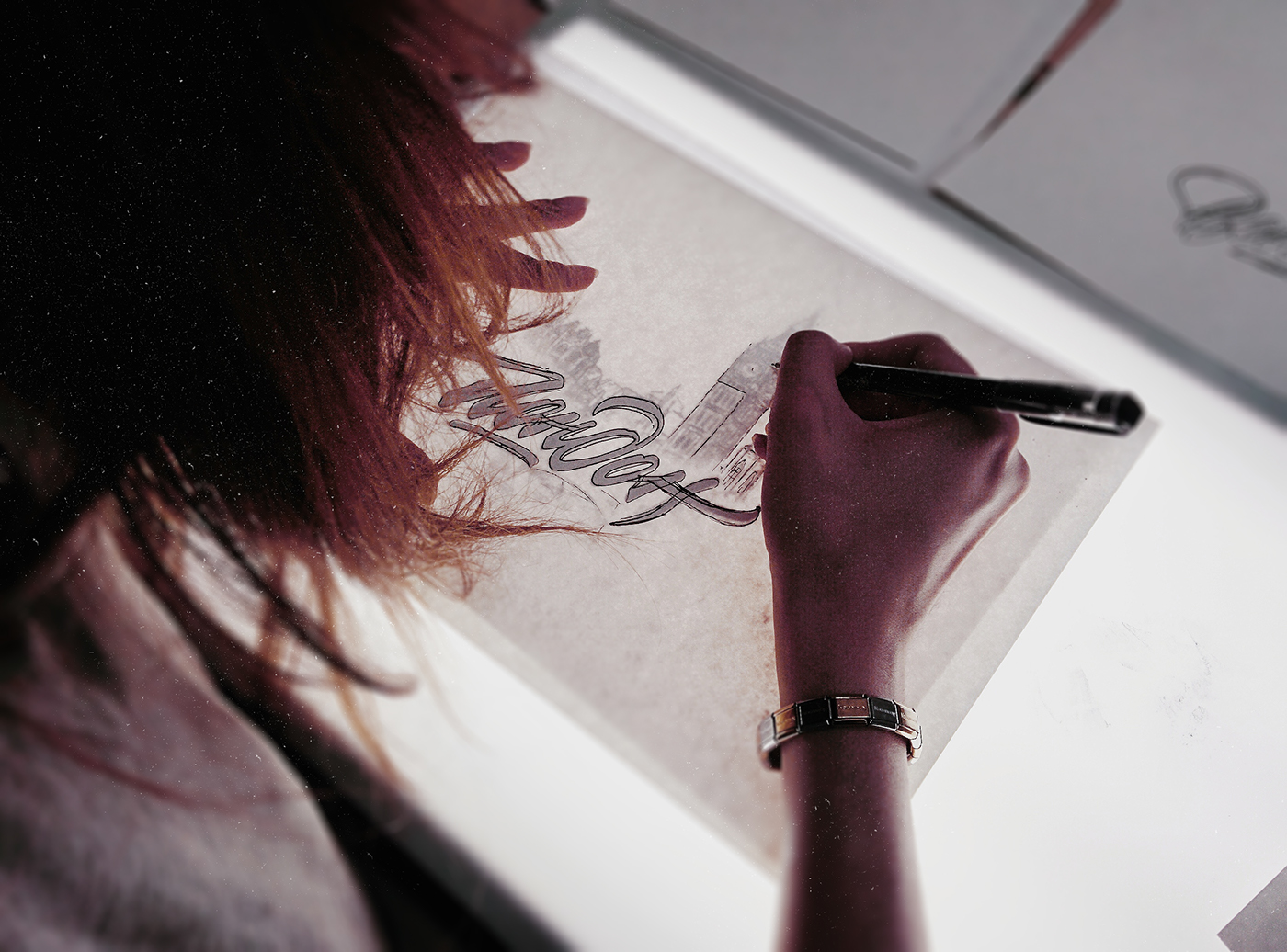
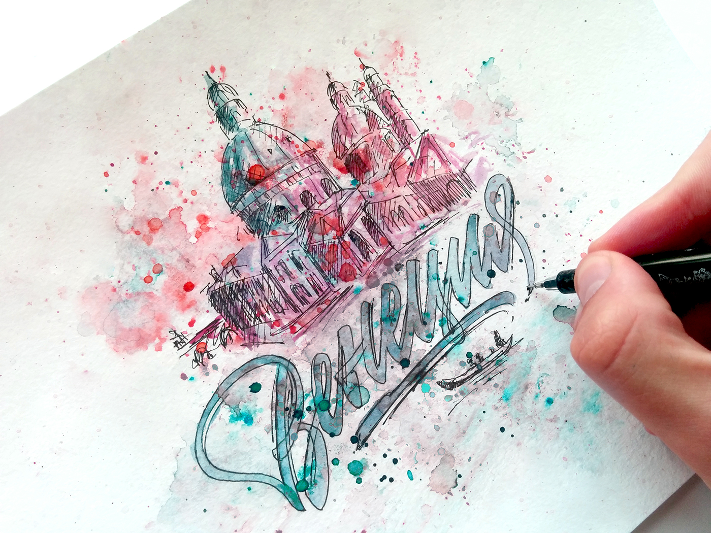
Pretty long I have pondered over the idea of creating my own stickers; it led to the collaboration with the No! KidsStickers store, which you can see right here. When I started, I couldn't find for a long time a good concept and composition to look the lettering lonely. I lived in university campus then. Once my neighbor entered the room and saw mountains of written paper. Then she told me that in childhood she had graduated from art school. So, I asked her to paint St. Petersburg’s St. Isaac's Cathedral and got the missing element of the right concept by having been combined drawing and calligraphy.
Моей голове уже давно не давала покоя мысль о создании своих стикеров, что привело к коллаборации с магазином No!KidsStickers. Приступив к работе, я долго ходил вокруг да около, пытаясь найти подходящую концепцию и композицию, чтобы надпись не смотрелась одиноко. В то время я жил в общежитии и моя соседка, войдя в комнату и увидев гору исписанной бумаги, рассказала, что в детстве окончила художественную школу. Попросив её нарисовать Питерский Исаакиевский собор, я получил недостающий элемент и, совместив рисунок и каллиграфию, пришёл к нужной концепции.
New York
As far as possible I always try to use the native alphabet working on personal projects: domestic customers ask for it less often, and even in this case they require English lettering or calligraphy. Cyrillic alphabet is rather complicated and relatively difficult to use, so it's always interesting to work with it. After first discussion we concluded the letters should be exactly in Cyrillic: surrounded by the dominance of the Latin alphabet it will be very cool to see native Cyrillic alphabet.
Практически всегда работая над персональными проектами я стараюсь, где это возможно, использовать родной алфавит ─ отечественные заказчики обращаются на порядок реже, а если и обращаются, то просят надписи на английском языке. Кириллица ─ достаточно непростой и относительно сложный для работы алфавит, поэтому работать с ней всегда интересно. Обсуждая на начальном этапе концепцию стикеров с магазином, мы пришли к выводу, что надписи должны быть исполнены именно ей - в засилье латинского алфавита будет очень здорово увидеть немного родной и самобытной кириллицы.
Video process in Adobe Illustrator.
Ful length 1 hour. Song: Tristam - Crave

London
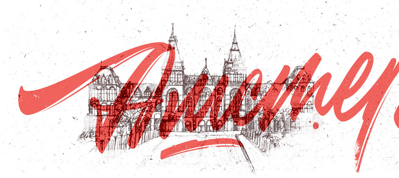
The most complicated is to match the illustration and the lettering, therefore I mostly spent time not with a brush in my hands, but with a mouse, trying to correctly build a common structure. The conflict of the lettering and illustration layering was solved thanks to various grunge brushes, which allowed to free space for letters elegantly and get rid of piling.
Самое сложное - композиционно согласовать иллюстрацию и надпись, поэтому большую часть времени я провёл в руках не с кистью, а с мышкой, пытаясь грамотно выстроить общую структуру. Конфликт наслоения надписи и иллюстрации был решен благодаря различным гранжевым кистям, позволившим изящно освободить пространство для букв и избавиться от нагромождения.
Video process in Adobe Illustrator.
Ful length 1 hour. Song: Thomas Mraz - Маневрировать
Amsterdam
Also it was a challenge to find the right color, and thanks to watercolor and Photoshop I've made it. Achieving a balance between the colors of the inscription and illustration turned out to be a laborious, but rather interesting work at the same time. Searching for interesting color options, the gradient tool in Photoshop helped me a lot. It allowed to highlight the tints and place accents in a practically monotonous sketch. Such illustration looks great after tracing in AI. Some part of this stage you can see in the video below.
Также непростой задачей оказался поиск подходящего цвета, с чем помогла акварель и фотошоп. Достижение баланса в цветах надписи и иллюстрации оказалось трудоёмким, но довольно интересным делом. В процессе поиска интересных цветовых решений мне помог инструмент карта градиента в фотошопе, с помощью которого мне удалось выделить оттенки и расставить акценты в практически однотонном наброске. После трейсинга в AI такая иллюстрация выглядит отлично. Какую-то часть этого этапа работы вы сможете увидеть в ролике ниже.
Video process in Adobe Illustrator.
Ful length 2 hours. Song: Andy Night ─ See You The Light
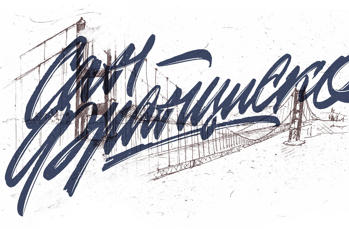
San-Francisco
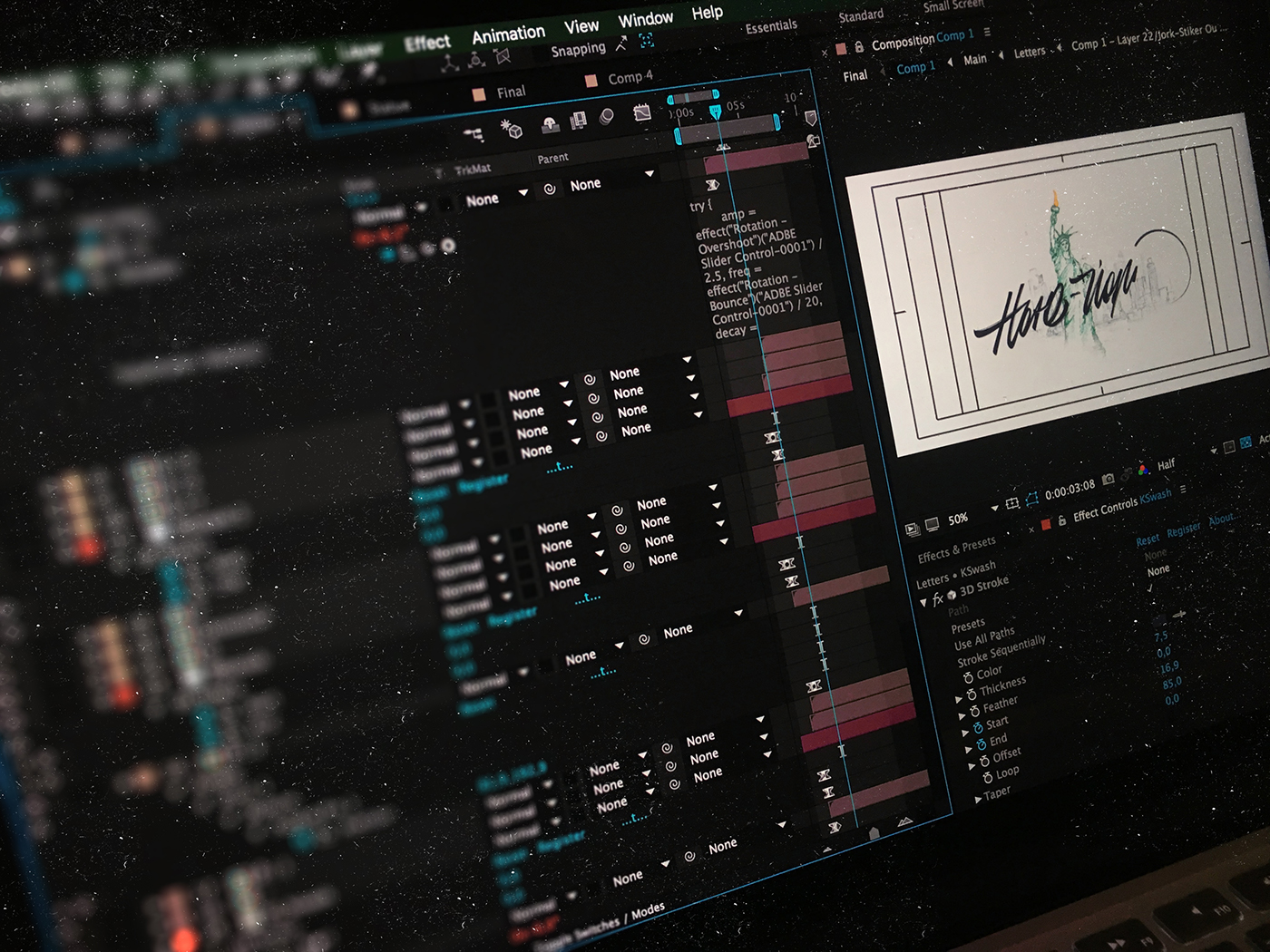
The most favorite part of any project for me is the final digitizing of the sketch in Illustrator. During this process any monotonous work sends tension from head to hands and brings in the pleasant clarity to consciousness. As you can see, I have made the WIP-video of each stickers’ digitizing ─ I recommend it especially for those who just starts their way. When I was a beginner, such videos helped me tame the naughty Adobe Illustrator and Pen Tool.
Моя самая любимая часть любого проекта - финальная обработка подготовленной надписи в иллюстраторе, ибо любой монотонный труд переводит всё напряжение с головы на руки и вносит в мысли приятную ясность. Кстати, как вы могли заметить, я записал для вас процесс оцифровки каждого стикера ─ рекомендую к просмотру, особенно всем тем, кто только начинает свой путь в летеринге - в своё время подобные ролики очень помогли мне укротить непослушный Иллюстратор и перо.
Video process in Adobe Illustrator.
Ful length 2 hours. Song: Masego – Navajo
Barcelona
Digitization of the lettering in Adobe Illustrator is carried out in two ways. At the first, the most common, the Pen tool is used, with which we draw point by point each letter around the contours of the calligraphic sketch. This is the most laborious process, which takes from half an hour to 5 hours, depending on carefulness the designer, who prepared the sketch before the vector. This case is showed in video.
Оцифровка надписей в Adobe Illustrator осуществляется двумя путями. При первом, самом распространённом, используется инструмент перо, которым поэтапно выводят каждую букву, точка за точкой огибая контуры каллиграфического скетча. Это наиболее трудоёмкий процесс, который в различных ситуациях отнимает от получаса до 5 часов совокупного времени в зависимости от того, как тщательно дизайнер готовил набросок перед вектором. Именно этот способ показан в видео.

Video process in Adobe Illustrator.
Ful length one hour. Song: Say Lou Lou ─ Better In the Dark
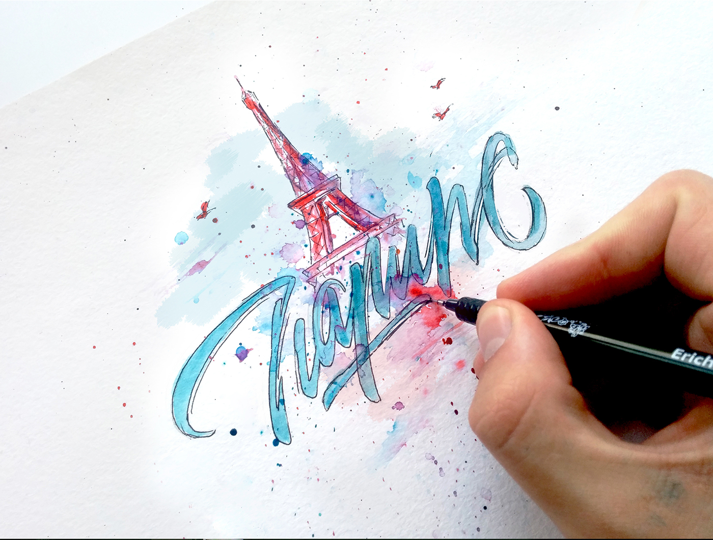
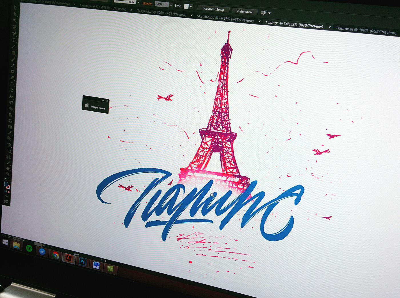
Paris
The second way is tracing. This tool is quite interesting and requires some skills. Tracing saves time and translates the prepared raster image into a vector in just a few clicks. With the help of this tool, I always manage to save temper and structure of the lettering, its original look (as possible), obtained on paper. Much work remains after a tracing: the inscription tends to be too rough and to have extra points that need to be corrected. The inscriptions above almost each illustration in our project are made in this way.
Второй способ ─ это трейсинг, инструмент довольно интересный и требующий не меньшей сноровки. Трейсинг позволяет сэкономить время и перевести подготовленное растровое изображение в вектор буквально за несколько кликов. С помощью него мне всегда удается сохранить характер и структуру надписи, максимально сберечь её первозданный вид, полученный на бумаге. Нередко работы после трейсинга остаётся не меньше, чем в случае с пером - надпись получается чересчур грубой и образуются лишние точки, которые необходимо исправлять. Надписи на иллюстрациях почти над каждым текстом выполнены именно этим способом.
Video process in Adobe Illustrator.
Ful length 1 hour. Song: Lauv - Reforget

Bangkok
Collaboration is always a good form of work. Something completely different and new comes during the merging of the styles of two artists or the symbiosis of completely different spheres of activity. With the help of our large team we’ve prepared for you a collaboration of three areas of design: illustration, lettering and motion design.
Коллаборации в любом своём проявлении - это хорошо. Слияние стилей двух артистов или же симбиоз двух совершенно разных сфер деятельности приводит к образованию чего-то совершенно иного и нового.
Для вас мы большой командой подготовили коллаборацию даже не двух, а 3-х областей дизайна - иллюстрация, леттеринг и моушн.
Video process in Adobe Illustrator.
Ful length 1,5 hours. Song: Cut Throats & HTTP – Get Ill
Venice
For the uninitiated spectator, lettering is a common font without weeks of work and packs of paper covered with writing in search of the necessary forms. That's why I try to show the whole process and all aspects of work publishing any creative projects, to make the question "What kind of font is it?" sounded a less often.
Для непосвященного зрителя леттеринг - это обычный шрифт, за которым человек не видит недель трудов и пачек исписанной в поисках нужных форм бумаги. Именно поэтому при публикации любых творческих проектов я стараюсь показать весь процесс и все стороны работы над той или иной вещью, чтобы вопрос "А что это за шрифт?" звучал чуточку пореже обычного.
Video process in Adobe Illustrator.
Ful length 40 minutes. Song: ONUKA ─ Time
Rome
Thanks to modern tools we can breathe life into any graphic form, and letters are no exception: they can breathe, rejoice and be sad, be light and funny or thoughtful and serious. In dynamics we tried to convey the color and temperament of each city represented in this set.
Благодаря современным инструментам можно вдохнуть жизнь в любую графическую форму, и буквы – не исключение: они могут дышать, радоваться и грустить; быть лёгкими и веселыми или вдумчивыми и серьёзными. В динамике мы постарались передать колорит и темперамент каждого города, представленного в этом сете.
Video process in Adobe Illustrator.
Ful length 30 minutes. Song: Lake Arrowhead ─ Nora En Pure
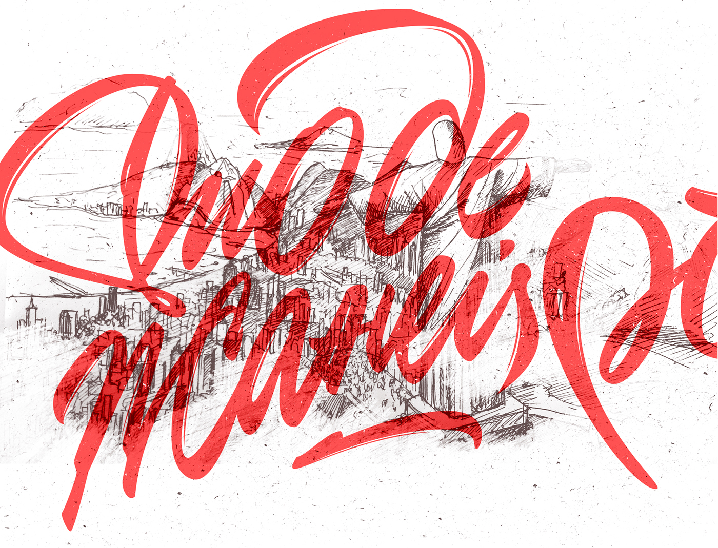
Rio De Janeiro
I often receive questions about the tools I used to working with on on my projects. So here they are to help you and myself: city sketches are made using the Micron liner and gel pens; Calligraphic sketches of cities are written by brushpens Edding 1340 and Lyra Aqua Brush, using a usual inks. Post-processing - Adobe Photoshop, vector - Adobe Illustrator. Animations are made in Adobe After Effects.
Нередко получаю сообщения с вопросами об инструментах, использованных при работе над тем или иным проектом. Чтобы облегчить задачу и вам, и себе: скетчи городов выполнены с помощью линера Micron и гелевых ручек; каллиграфические наброски городов написаны брашпенами Edding 1340 и Lyra Aqua Brush, с использованием обычной туши. Пост-обработка - Adobe Photoshop, вектор - Adobe Illustrator. Анимации выполнены в Adobe After Effects.
Video process in Adobe Illustrator.
Ful length 2 hours. Song: Tep No – Karma, You Got Owned
Cities' drawings - Marina Kolganova / Рисунки городов - Марина Колганова
Animations ─ Motion Design School and Alex Lakfar / Анимации ─ Motion Design School и Саша Лакфар
Lettering, Idea and Stickers - Nikita Bauer / Cтикеры, идея и леттеринг ─ Никита Бауэр


