


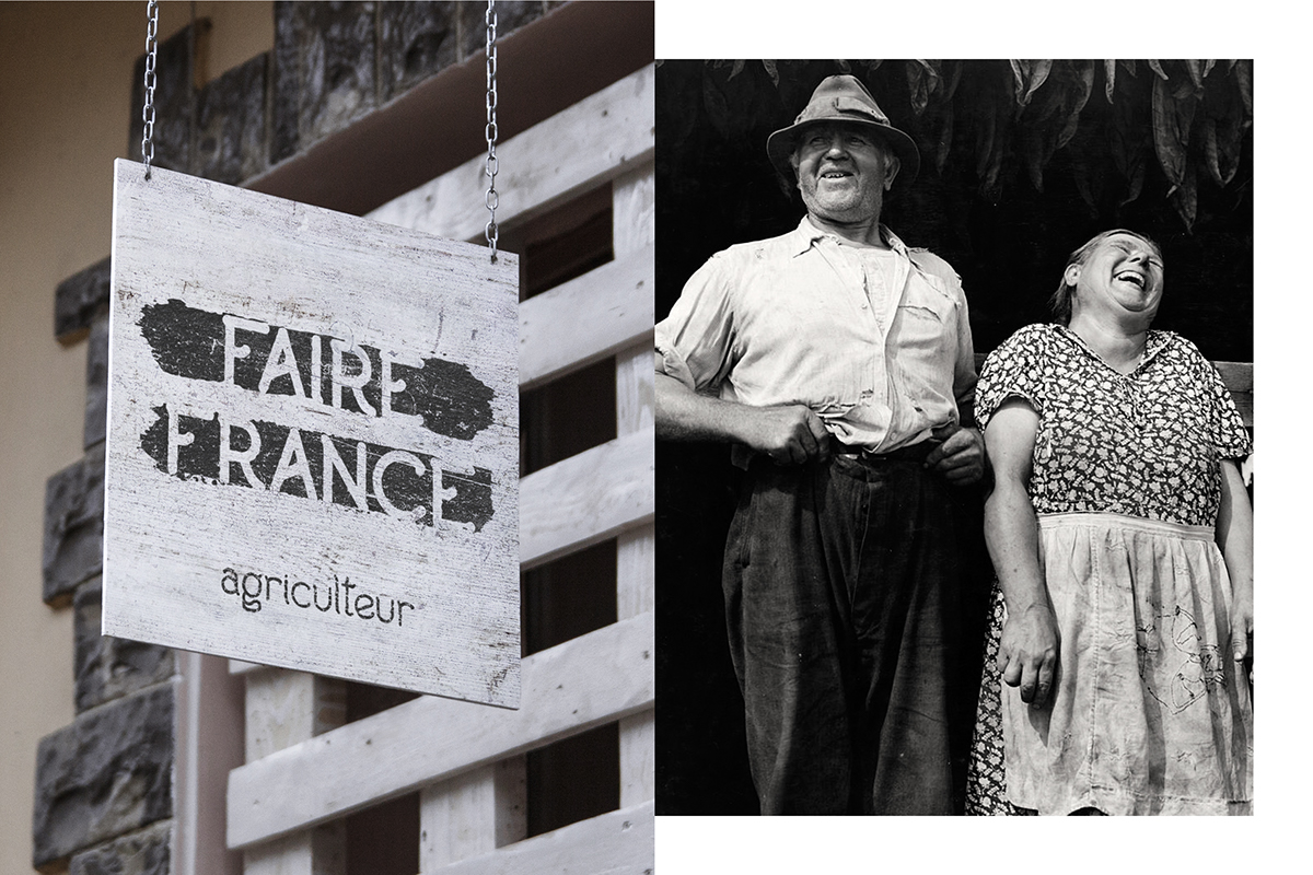
______________________ FAIRE FRANCE
FAIRE FRANCE is a branding and type project I did for school. The goal was to create the logo, the font and bottles' packaging.
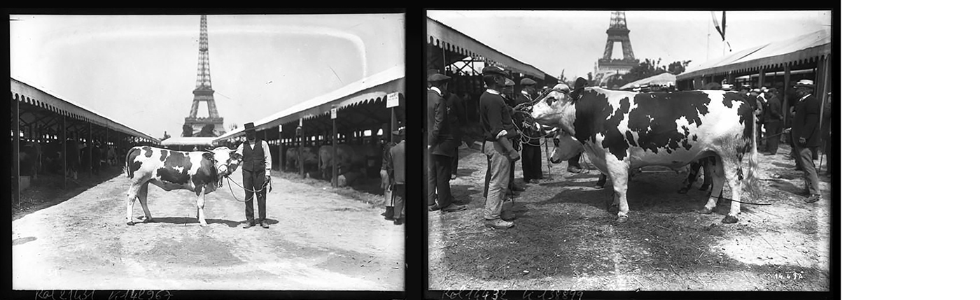
The brand is based in north of France and has a solidarity economy process that allows farmers to get paid at the right price.
______________________
______________________ Inspiration - Construction - Colors
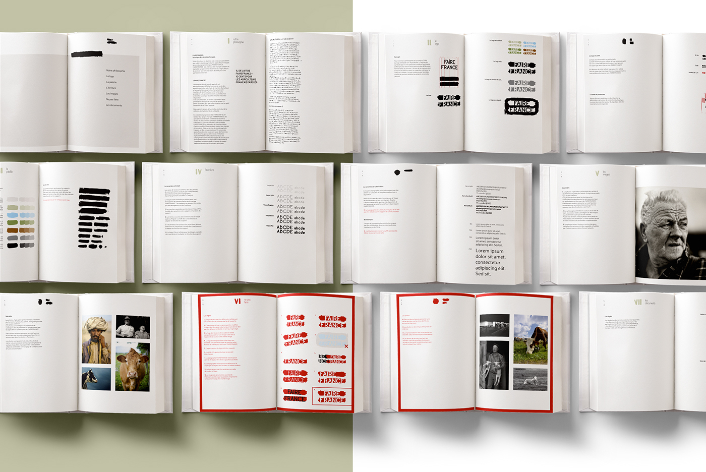
Vaque, is the name of the type designed for the brand. It's a rounded semi-serif type that suits kids and adults.
The inspiration come from the tail of a cow and its mouvement.
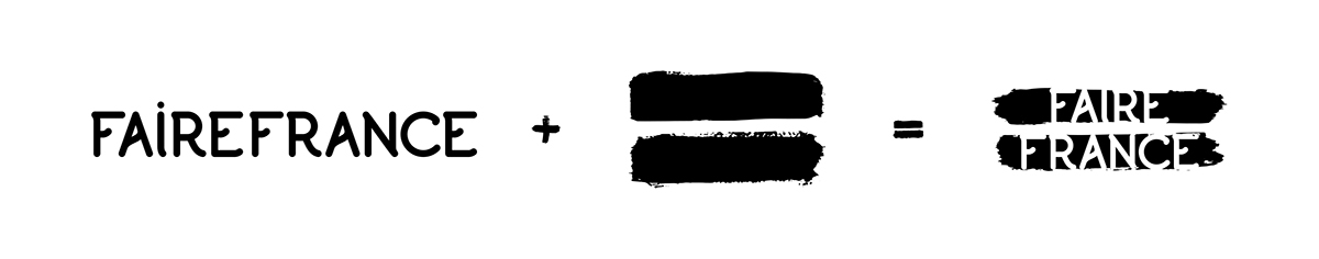
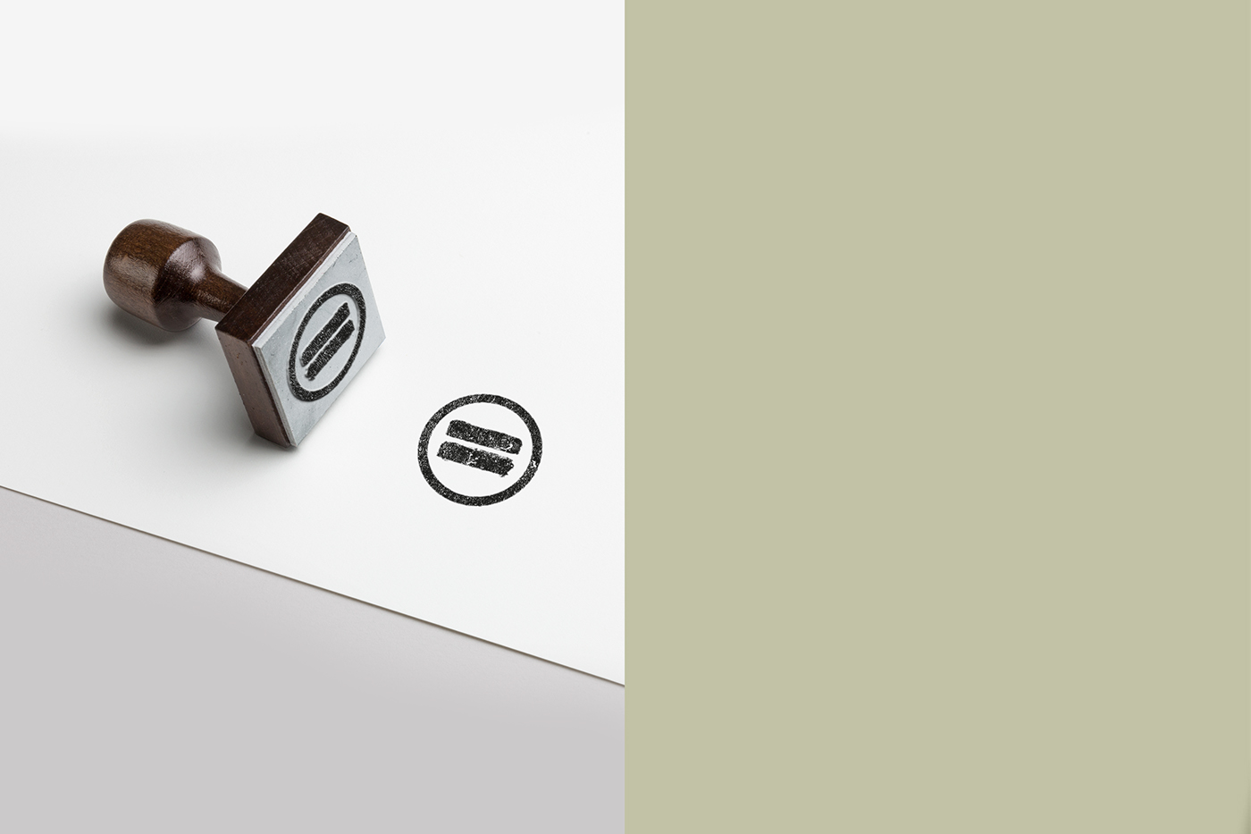
The second part of the logo is a brush inspired by old farms where the walls are damaged by the time.
The idea was to put to lines so it looks like the equal sign with the type inside.
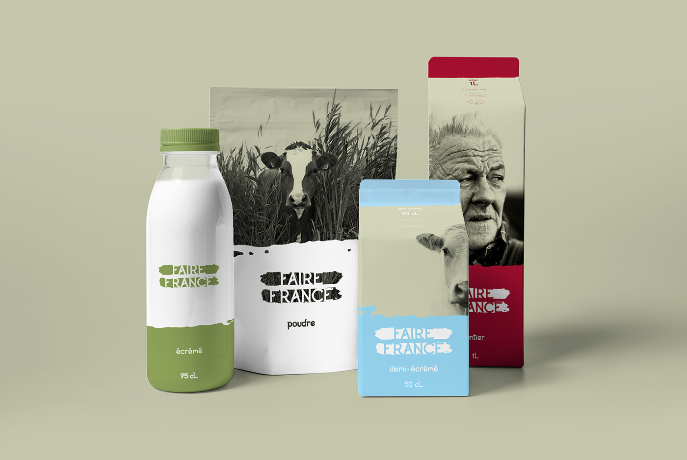
The colors comes from, first cows and secondary colors are blue for 1% milk, red for whole milk and green for cream

_____________________
______________________ Type

_____________________
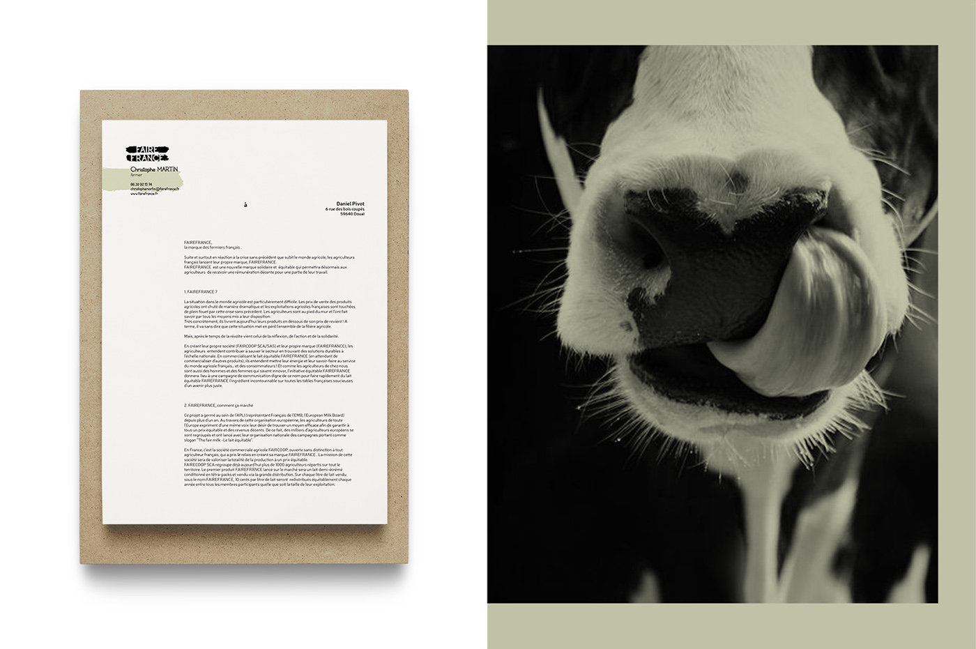
______________________ Stationery


_____________________
______________________ Thanks for watching


