Introduction
Approached by Sergey, Co-Founder of Designmodo, to create a new modern logotype which will represent their genuine intention in helping the designer and developer community by providing quality articles and digital goods. Designmodo is a great resource of informative material for designers and web developers.Sergey told and showed me they were working on a complete overhaul design of the blog and pages and a new modern logotype would accompany the new design perfectly.
Exploration Concept sketches
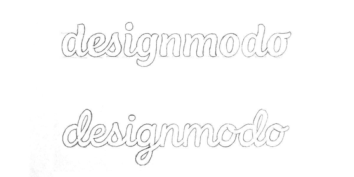
We decided to test the waters at first exploring the possibility of a hand-lettered written variant. First one was a favourite but doubted if it would fit in-line with their vision, Sergey was eager to have me explore a more simplistic direction.
Concept Development
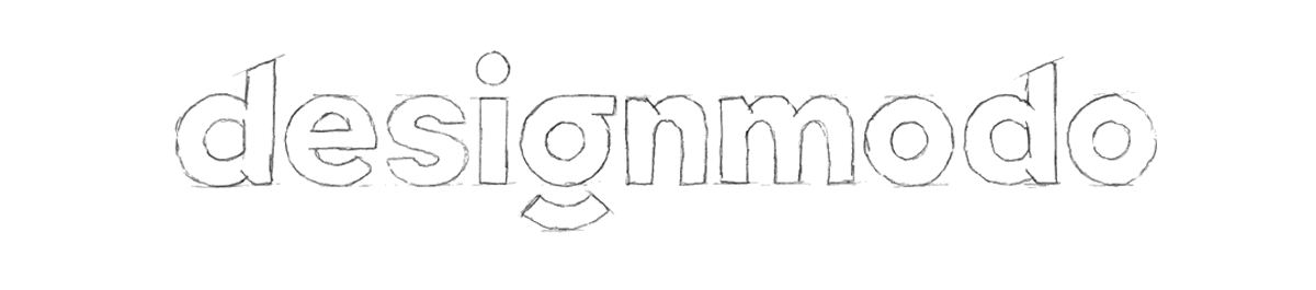
Started figuring which character could work as the unique element best. Their old word-mark had the "e" as it's unique element but didn't want to go that route as I don't really like that kind of carnival type treatments. I found the "g" was next to the obvious "d" the best option to make it stand out. With simplicity in mind I gathered inspiration and sketched up a lot of "g's" (a few examples are below)

The most left "g" variant was most in line with what I had in mind but had concerns it wouldn't read properly as a "g". To make sure it could work and get a sense of how it would look together, I sketched out all other characters as well, which gave me the opportunity to review it properly.

Satisfied with the looks it was time to apply more thickness to the characters and prepare it for the Designmodo team to review.


The team at Designmodo was pretty happy with how it turned out but we both agreed the overall appearance was way too thick and needed to be refined into a thinner weight.


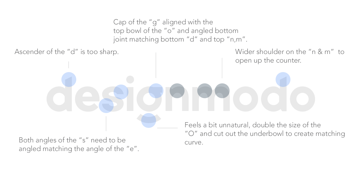
Now the weight is refined and approved we could focus on the improvements. The main concern was the fact that the type felt a bit too tough/sharp. A softer appearance would resemble a friendly overall look. Also the "s" didn't felt inline with the other characters, the ascenders of the "d's" were too sharp, the "n" & "m" shoulder counters were too tight/condensed and the "g" felt quite off.
Revised Version & Alternate Version
With the revisions made the appearance was much softer and friendlier. We still decided to use the sharp versions for alternative smaller use since the softer appearance looks good on medium to large sizes, on small sizes it only looks blurred which reduces the readability.
Icon/symbol Version
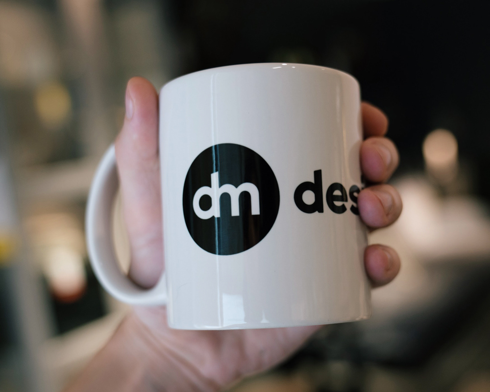
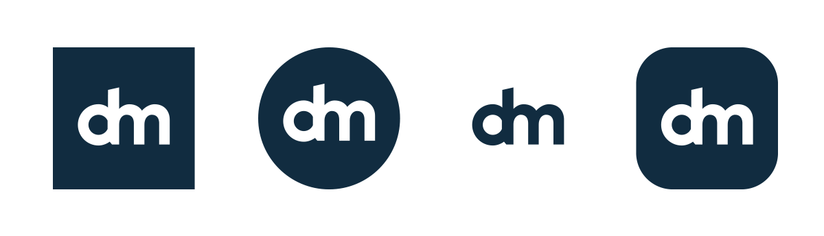
Next to the logotype an icon for smaller uses was also needed. We tried a couple of options such as the "d" stand-alone, "dm" disconnected but we ended up using the "dm" overlaying each-other.
Alternate Icon
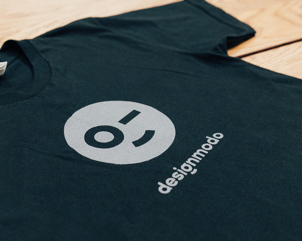
While exploring possible solutions to the main icon/symbol version I came up with a fun iteration, combining the circle and the descender of the "g" with a tilted stem from the "i" creating a wink smile. We loved it and ended up using it as an alternate version to the main icon.

The Final Result
Next to being really satisfied with the end result, Sergey and the team at Designmodo were an absolute joy to work with. Below are a few pictures of the final logotype in use.