Challenge:
To create an new fresh ground up identity for a new milling company. Kenland Sawmill sources for a wood and processes it for different purposes - For furniture fitting companies and for local sale.
Response:
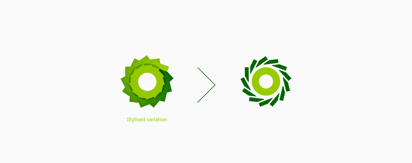
To create a simple, clean, bold and easy-to-recognize logo to help them standout. The logo represents an element that is cuts across all power tools. The mark stylistically resembles a blade, which the main part used across all power tools.
A color green palette represents nature and also their main ethos; Sustainable milling for a greener future.
Inspiration