Main Marque

Graphic Element

Journals of Work


Emphasising experience and trust was essential for this start up. Despite being a new business its employees have over two decades of experience in the transport and environment industries.
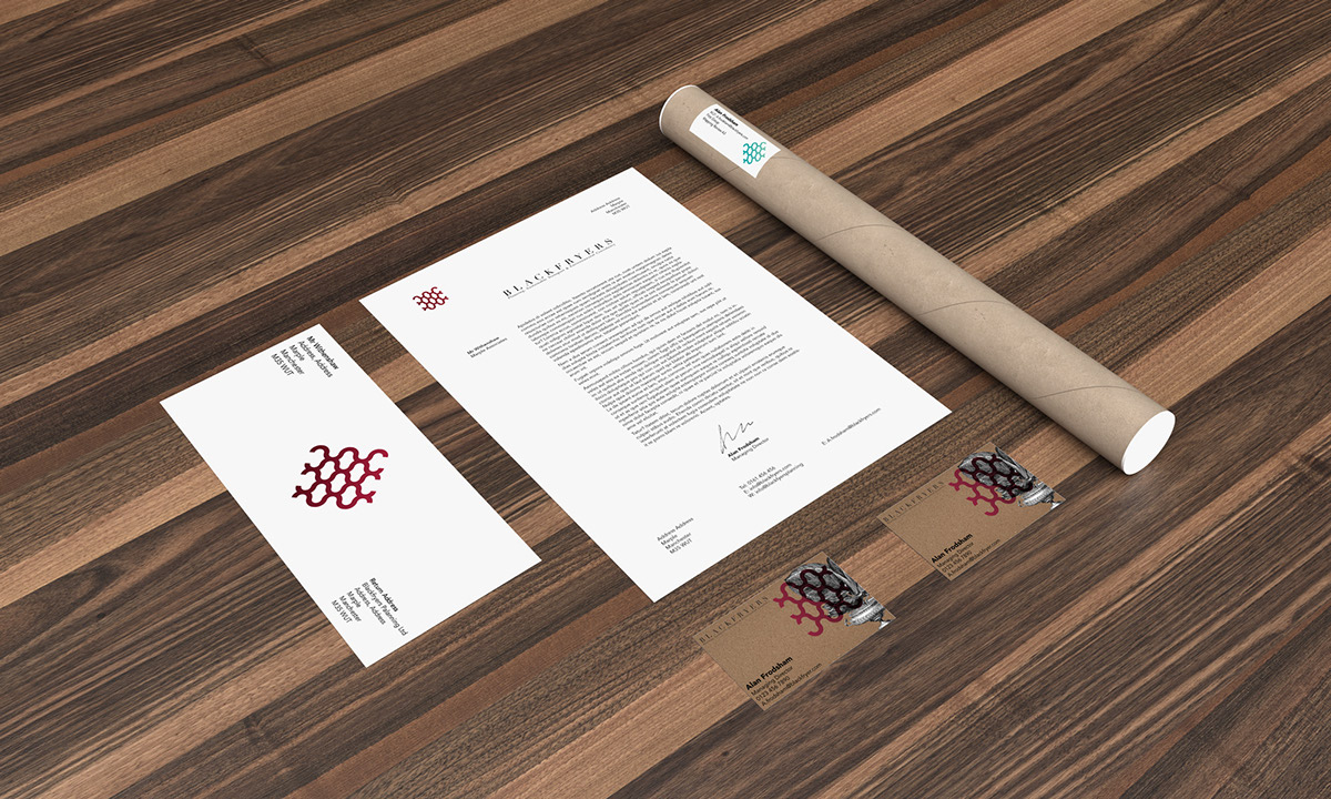
Project proposals and project review documents are common in the planning sector and so covers for each strand of the business were created. Colours and illustration change for each of the three strands: Planning, Sustainable Transport & Environmental Planning.
A graphic element to was created to show the brands commitment to the environment it represents the bark of a tree. Used as an overlay it bring a sense of modernity to the historical images. A specific colour was chosen for each strand of the brand to differentiate them however using it within the graphic element ties the whole brand together.


