mu_table
Branding
University set branding project. Each student was assigned a fictional company to create a whole visual identification for. The company I got was a restaurant called 'mu_table', serving hybrid food, with its brand values being modern, experimental and fresh. Each student wa supposed to come up with 3 different concepts and then present their favourite one.
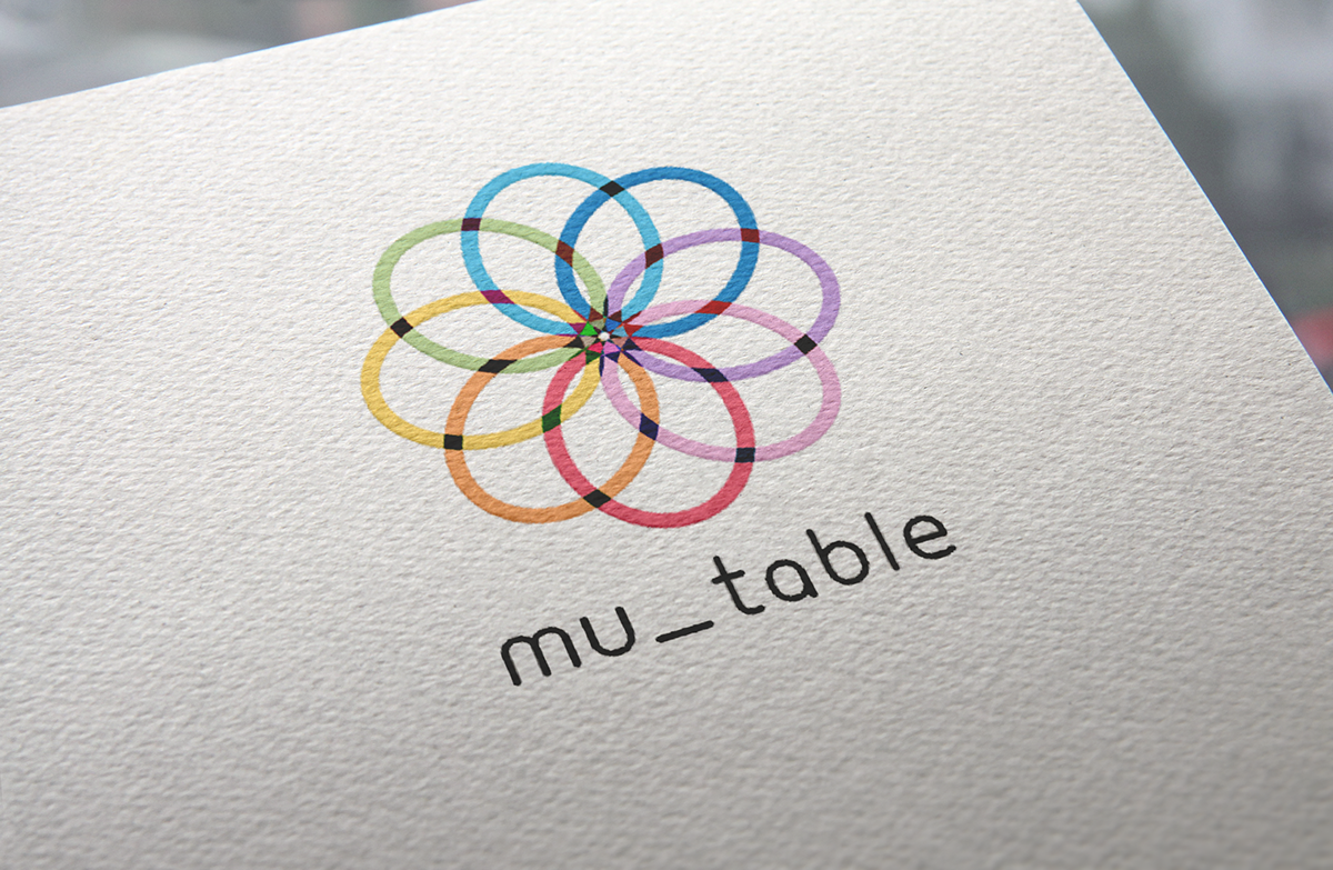
The final branding I chose to present was inspired by Olympic Games logo – each circle in the logo represents each cuisine. The logo can be rotated to highlight each cuisine and overlaying circles create a new colour/new hybrid food. Different parts of the logo applied on different touchpoints are meant to be collected together, creating fun atmosphere and making the most of rotating logo concept.


