


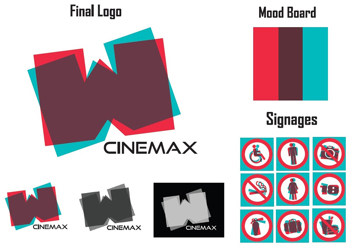
W CINEMAX came to me with a specific insight, which the cinema was modern and offering 3D films with high technology equipment. Essentially, it was a distinctive cinema but there were certain aspects that it wanted to address and emphasize the characteristic of the business entity.
An anaglyph colour palette which provides a stereoscopic 3D effect in red and cyan and also bold typeface were chosen to embody this new brand's values, benefits and objectives. Bold and confident, the simple initial ‘W’ give the feeling of a bold new look for W CINEMAX. The overlapping of 2 colours of red and cyan present one-of-a-kind the 3D cinema personality.

The logo and branding needed to address this, by working well both on a large and small scale, final designs across the huge range of different media from prints to ephemera to vehicles.
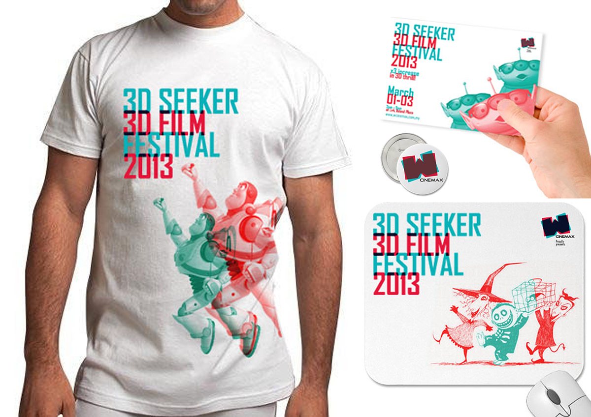
Ephemera design
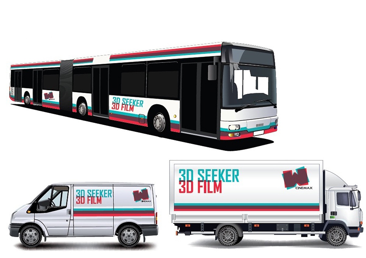
Vehicle design
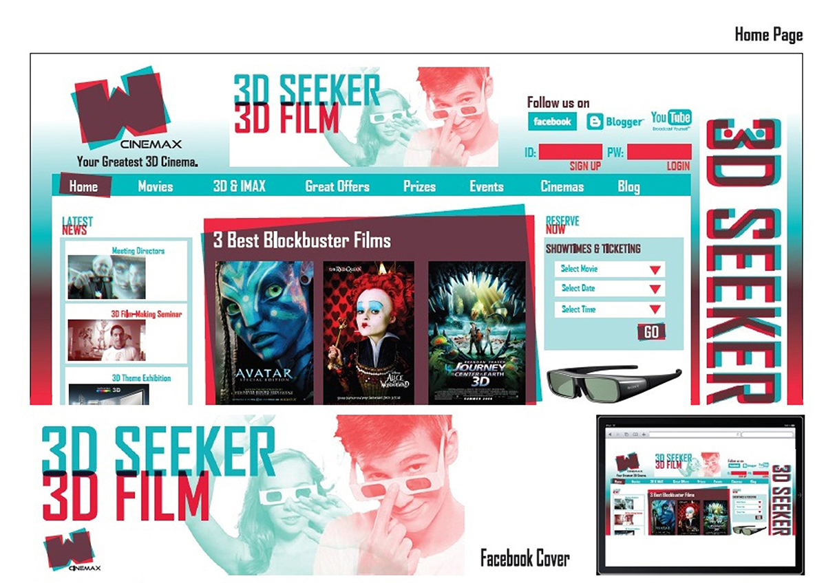
Web and digital
The logo and the art style had to be applied literally to every media, in the same way as when the audience are searching his or her favourite 3D film via the official website of W CINEMAX or seeing the big billboard besides the road. When people mention or thinking of red and cyan colour, they will unconsciously linking to the W CINEMAX. It’s important to note that W CINEMAX is at its essence not only providing 3D viewing experience but also great 3D equipment and exclusive 3D films.
This project is being featured in CUTOUT Student Alley Creative Showcase 2012
to find out more.


