Is always a great pleasure to be part of initiatives that aim to accelerate the development of education and society. Moreover, it's a greater pleasure when an institution offering Finnish education, ranked as the best education in the world for 2016 by WEF (World Economic Forum).
There are numerous factors that make Finnish education as the best in the world, some of them are: practical learning, focus on the student, motivate students to aim higher, better use of technology, solid evaluation, and positivity. The client's request was to integrate such factors, into a visual branding project.
Education, knowledge, advancement, and development were some of the main components I thought of during the brainstorming process. Additionally, the brand was going to be a representation of the Finnish education and culture.
Finnish school logo belongs to the symbolic types of logo, hence it is a combination of a symbol and letters. Finnish school symbol is created with the sole purpose to create a feeling of Finnish philosophy and constructivism.
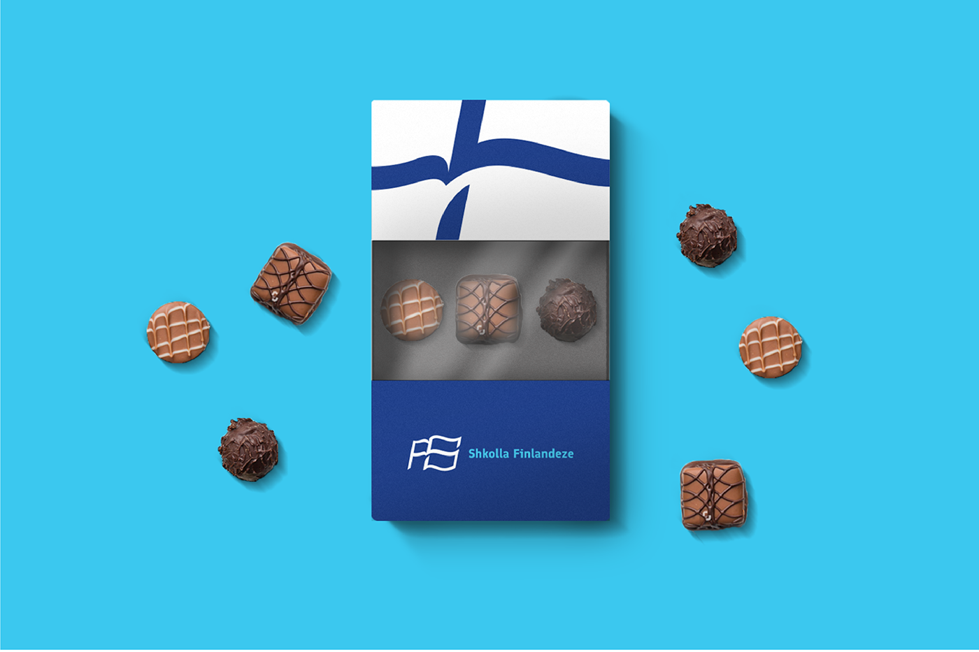
The book is always associated with education, knowledge, advancement, and development of cadres throughout centuries. The shape of a book is combined with Finnish flag which truly represents Finnish education. Henceforth, letters FS are a representation of Finnish School, Finnish System, Shkolla Finlandeze (in Albanian), Shkollimi Finlandez (in Albanian).
Letters of Finnish School included in the logo are partially edited, with the purpose to keep the authenticity of the font they belong to. Finlandia Font is a font created by Helsinki type studio, which incorporates strong and compressed shapes. These shapes, as stated by Helsinki Type Studio are a representation of traditional virtue in Finnish culture, which is: Honest and elastic determination combined with history and culture of Finnish people.
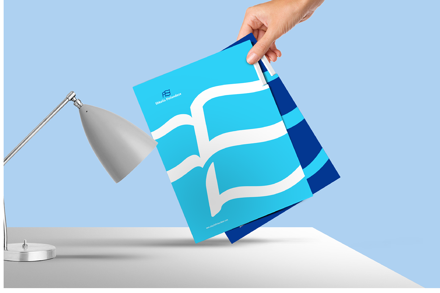
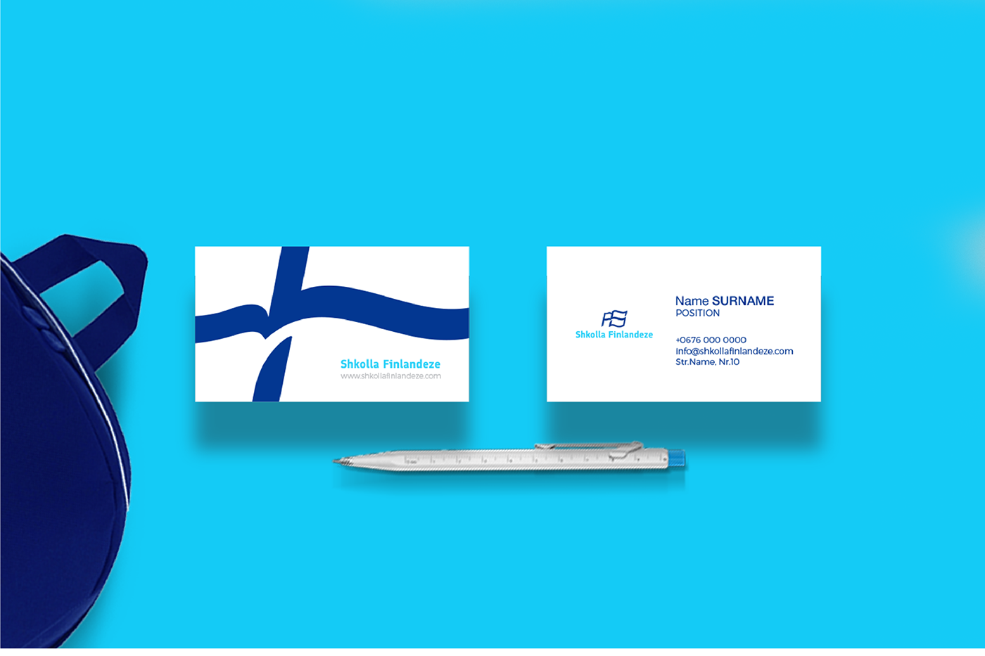
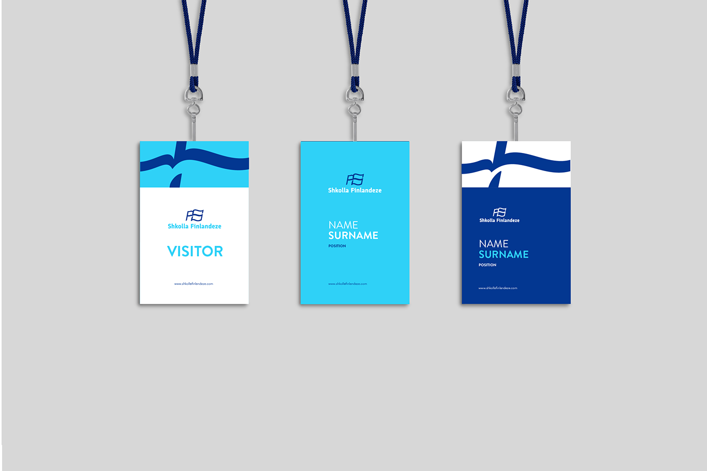
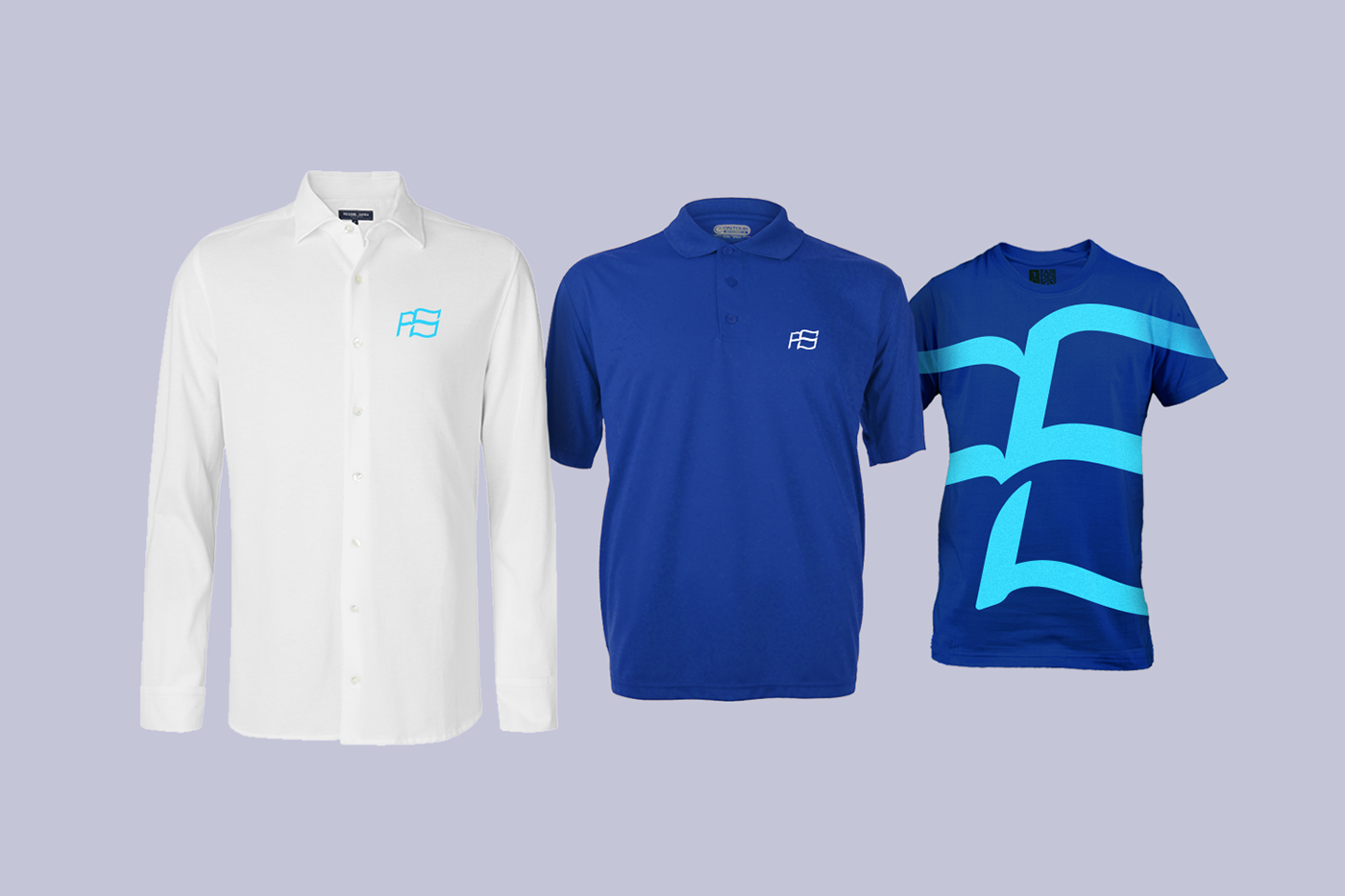
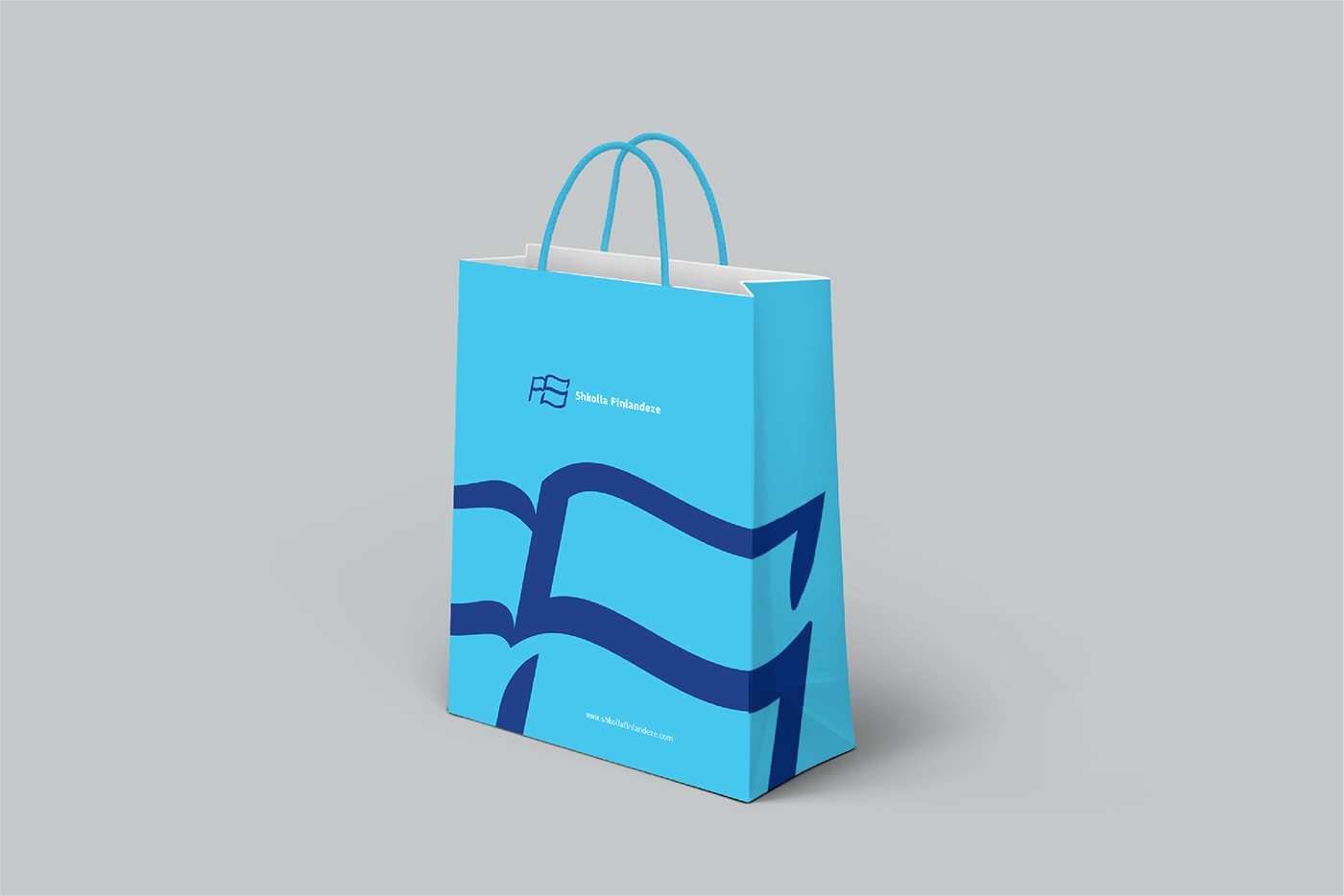
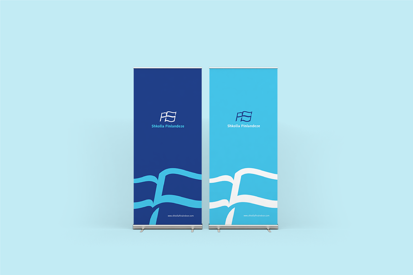
Finnish School brand has two main colors; blue navy color is part of Finnish flag which is combined with a modern sky like blue. Both colors are mainly used in the Scandinavian culture of design, it also offers a powerful contrast that keeps the Finnish identity.
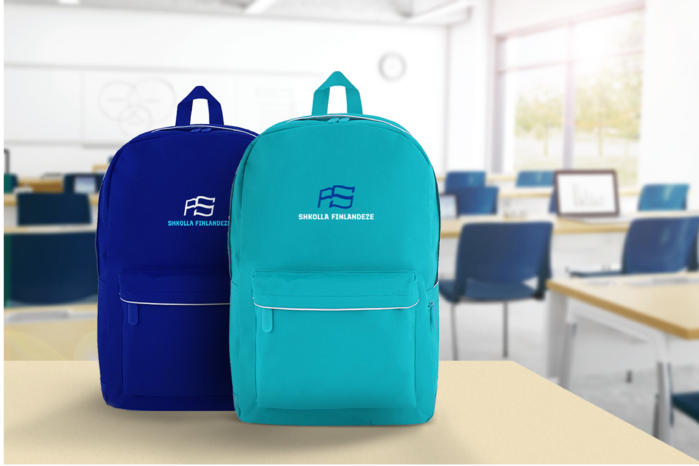
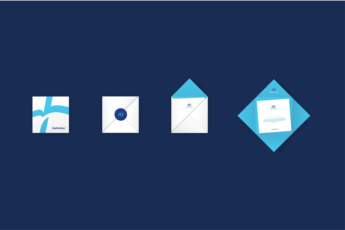
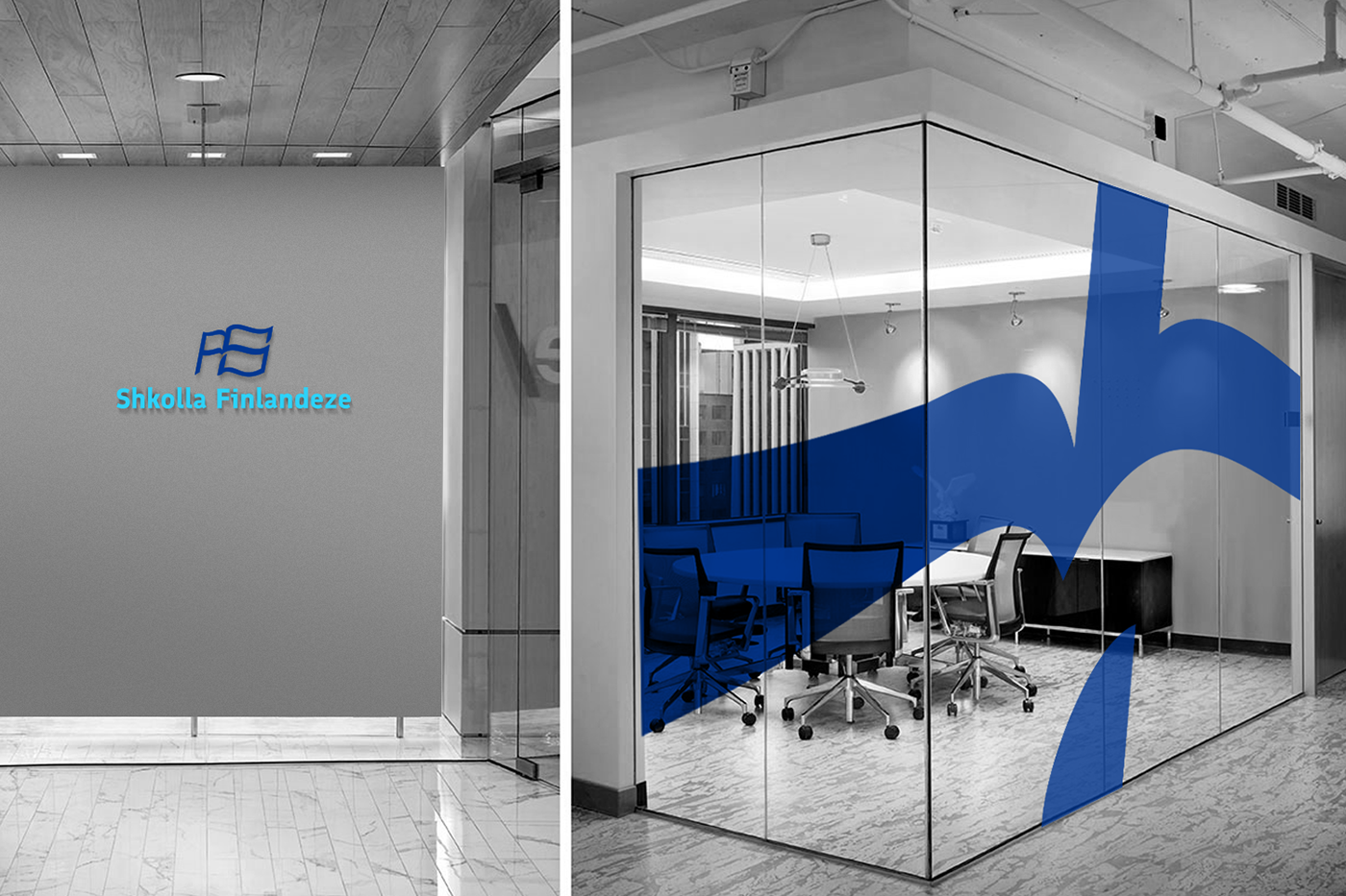
Brand Element - In branding, there is always more space for other storytelling tools except for the logo. Moreover, keeping the philosophy behind the logo was crucial on the further development of the brand. The other parts of the brand speak the same language with the logo for the audience to draw similarities. The main element which was used in branding is the inner part of the symbol, which alone represents the shapes of the Finnish flag. Another part incorporated is sky like the blue color, which in itself is very characteristic and not so mainstream. This element is used as an identification symbol, which will be mainly for printing materials and digital presentations.