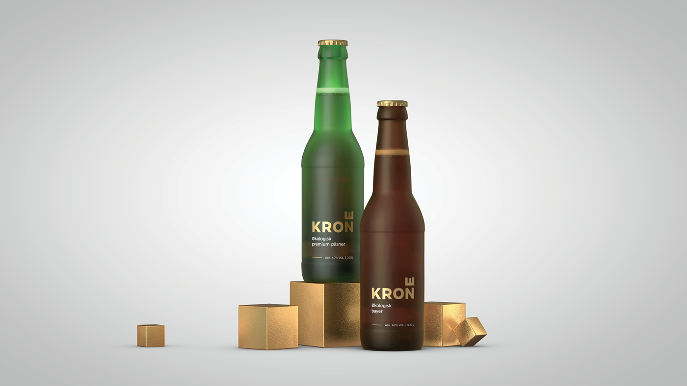


Krone is a new ecological beer brand that competes with the big established Norwegian brands.
Krone means “Crown” in Norwegian, visualized by the horizontal E.
Strategy
The strategy for Krone was to stand out on the shelf and be bold, yet with elegant simplicity. The design had to find the balance between daring to challenge the commercial market with an unconventional design while still having just enough beer tradition to compete against the established brands. The design is simple and modern while the name and choice of colour hint at beer tradition and quality. Krone is an organic product, but we did not want Krone to look like other stereotypical organic products, as is often recognized by eco-paper, organic decor elements and ornaments.
Creative Idea
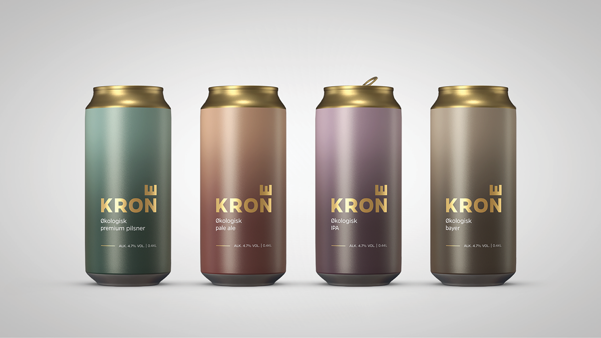
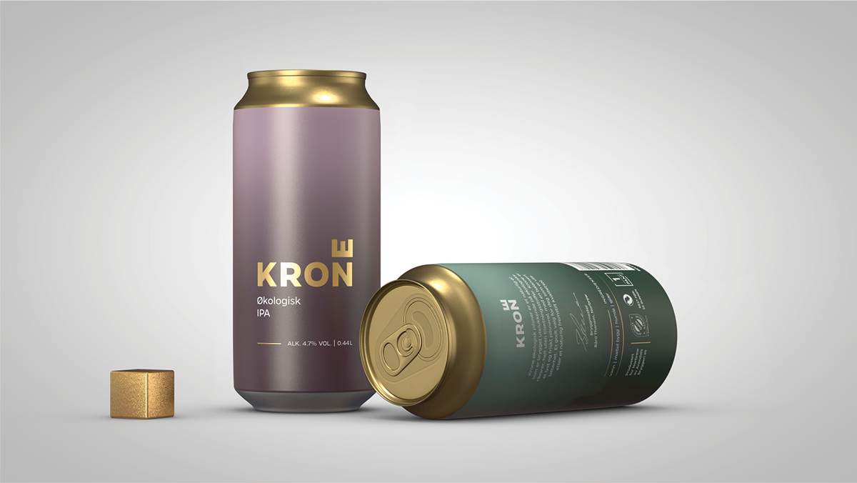
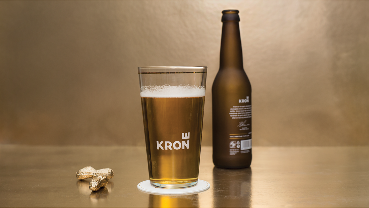
The idea behind Krone, was to create a bold and urban beer brand that reflects that quality can be simplicity. The beer is made with four natural ingredients and this simplicity is reflected in the design. We developed a frosted glass bottle that stands out and gives a tempting cold look. This is unique among beer bottles worldwide. We stripped away all that wasn’t essential giving a sense of purity and putting the simple frosted glass in focus. Graphics are silkscreened directly onto the bottles, using real gold. The cans (0.4L) with matt finish harmonize the bottles.
Team Creuna Norway
Concept and design: Marc Ligeti, Kristina Nyjordet
Concept contributor: Thor Erik Ramleth
3D: Sindre Martin Dahl
Project management: Anne Kindem
Awards
ADC Awards: Merit / 2018
D&AD: Wood Pencil / 2018
Pentawards: Gold / 2017
Red Dot Award / 2017
Cannes Lions: Finalist / 2017
European Design Awards: Silver / 2017
Gullblyanten: Gold / 2017
Visuelt: Diploma / 2017


