


Collective Exhibition 2017
Collective 2017 is an exhibition and culmination of work produced whilst studying B.A. Visual Arts at the University of Kent, Canterbury, England.
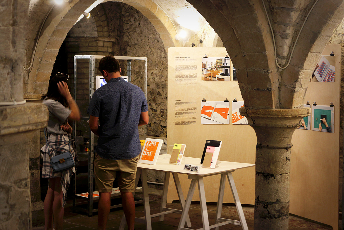
The exhibition was fully funded and arranged independently by ten B.A. Visual Arts students, with specialisms in Graphic Design, Photography and Visual Communication, and was held at Eastbridge Hospital // 'The Crypt', in Canterbury of June 2017.
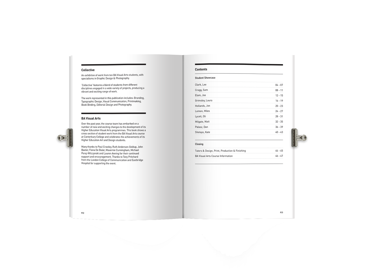
Collective was intended to hold a plethora of multi-disciplined student’s work from a wide variety of different visual communication backgrounds. The work presented in Collective includes; Branding, Typographic Design, Visual Communication, Printmaking, Book Binding, Editorial Design, Photography and Illustration.


Logo Development
The logo was perhaps the most crucial element to the identity of the show.
Through a long process of brainstorming, it was decided that the logo mark would be a traditional X to symbolise both the value of the amount of students involved (Roman Numerals: X = 10) and to symbolise the cross-processes involved in the overlaps between Graphic design and Photography. The logo mark itself was eventually to be composed of 10 separate elements, one for each of the contributing students.


Promotional Items
To promote the exhibition we designed a wide range of posters and flyers, which were spot-colour printed using Pantone 877U Metallic Silver. Additional to this we produced B6 catalogues to act as an editorial guide for our exhibition and record of our works and studies. The booklet was produced with a Spot-UV finish applied to the front cover.


Social Media
Additional to all of the printed promotional materials, social media was tackled heavily to promote the exhibition and the individual pieces of work. This was done through everyones favourite app; Instagram.


Thanks for looking!


