


Gao Dumpling Bar
Identity design for Copenhagen's new dumpling bar

GAO is Copenhagen's first dumpling bar, a bridge between two cultures. The restaurant is a Hong Kong inspired dumpling-only restaurant with the vision to bring authentic, quick, and healthy experience through the medium of various kinds of dumplings we enjoy in Asia. Traditionally, Copenhagen has been a city that isn’t receptive of very loud brands. Opening in Nørrebro, one of Copenhagen’s most culturally rich neighborhoods, Gao wants to create a simple brand experience that takes cues from the rich Chinese color palettes but presented in a way that Copenhageners know and love.


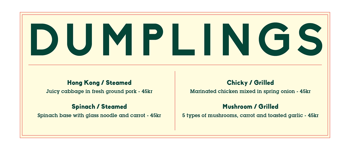


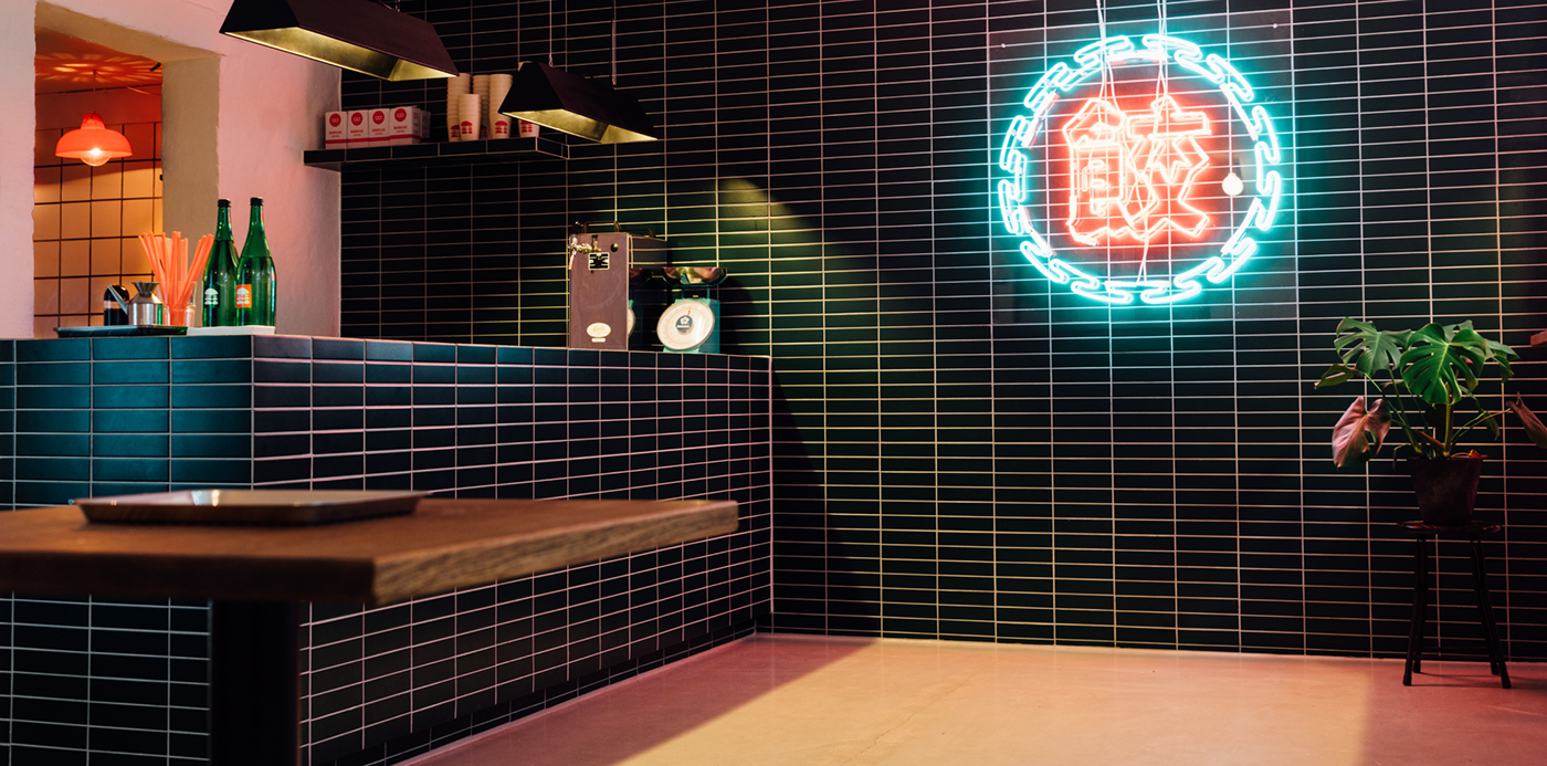
The designs are inspired by both 60’s Hong Kong fun, vibrant vibe and Scandinavian design simplicity. A bold logo, clean typography and a vibrant color palette form the key elements of the brand. The hand drawn illustrated dumplings are used both in the GAO stamp and as patterns – a signature of a restaurant where everything from the dough to the filling is handmade. The color palette is extended into the restaurant where green graphic tiles and dark oak wood are the main feature around an integrated bar area. Paired with Danish design furniture and an iconic neon sign, hand crafted in Hong Kong, the experience is well balanced between Chinese and Scandinavian aesthetics.


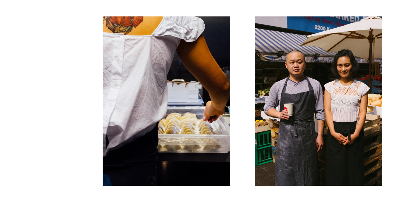


Bringing the story of GAO to the public, contents are created using photography, animation and graphic design across all platforms. Street shots from Hong Kong, inspiration, ingredients and peaks into the kitchen are in focus. Specially animated GIFs bring the vibrant colors into play.

CREDIT
Photography: Tim Ho
Strategy: Tem Hansen, Tim Ho
Interior Design: Barbry_Studio
Website: gaodumpling.com
A work under Constant Creative, Hong Kong & Copenhagen


