


Logo _____________
& Branding.
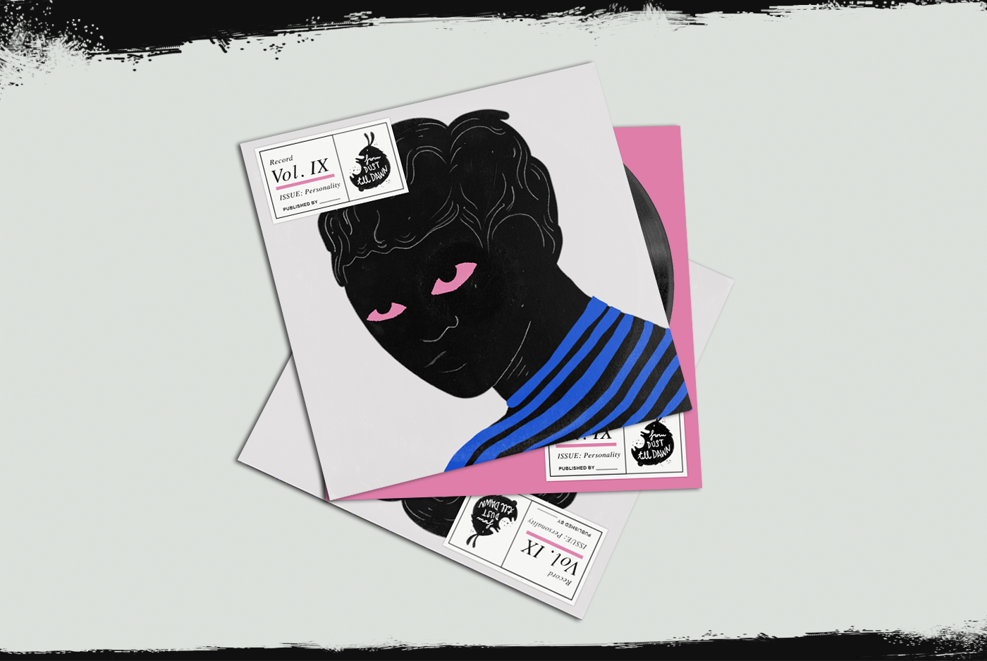
Client: "From dust till dawn" production studio for Burning Man festival.
As the brand "From dust till dawn" is a big part of the nightlife & party that happen mostly in the middle of nowhere, or Nevada to be precise - it was crucial to show it in our art direction as well. The moment an ordinary working man goes out there and becomes a nocturnal creature, when his arousals take up heights into the space once he meets another who could dance to him, that feeling when his eyes are red, tired but happy/ These...are the ultimate moments this brand stands behind_
The Logo is _____.

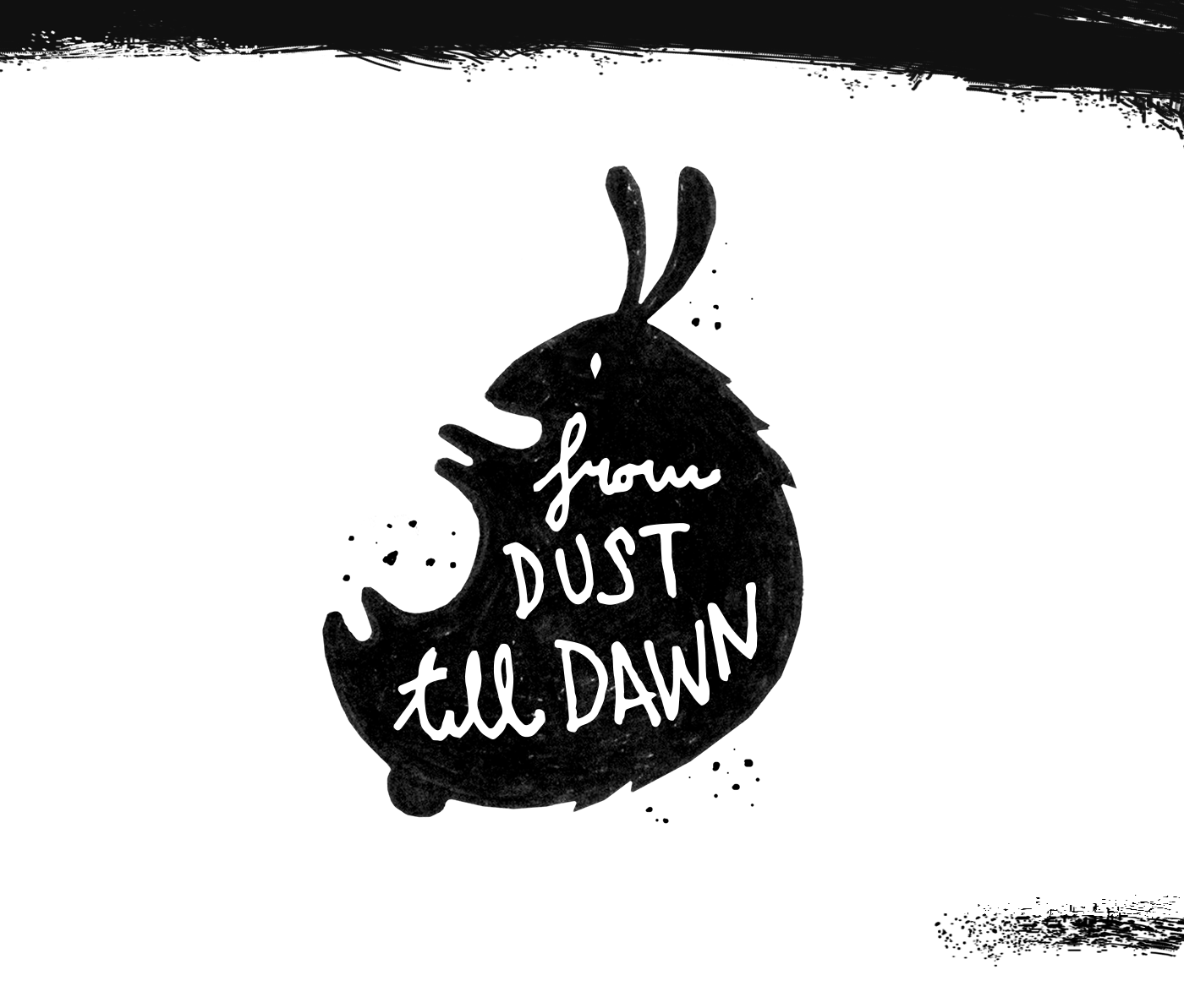
Logo & Typography _ both hand-drawn, pen > paper > tablet > Adobe illustrator > Voila!
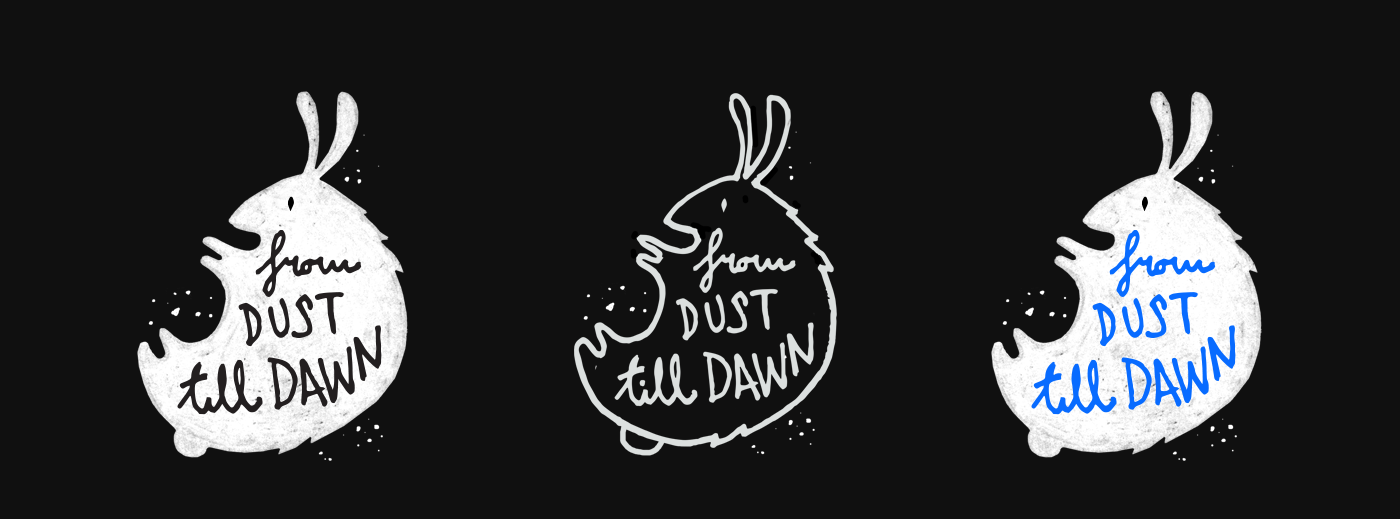
Art direction is _____.
Did someone say 'Sleepless night'?
Did someone say 'Sleepless night'?

Illustration _ Lots of love > Apple pen > iPad Pro > Voila!
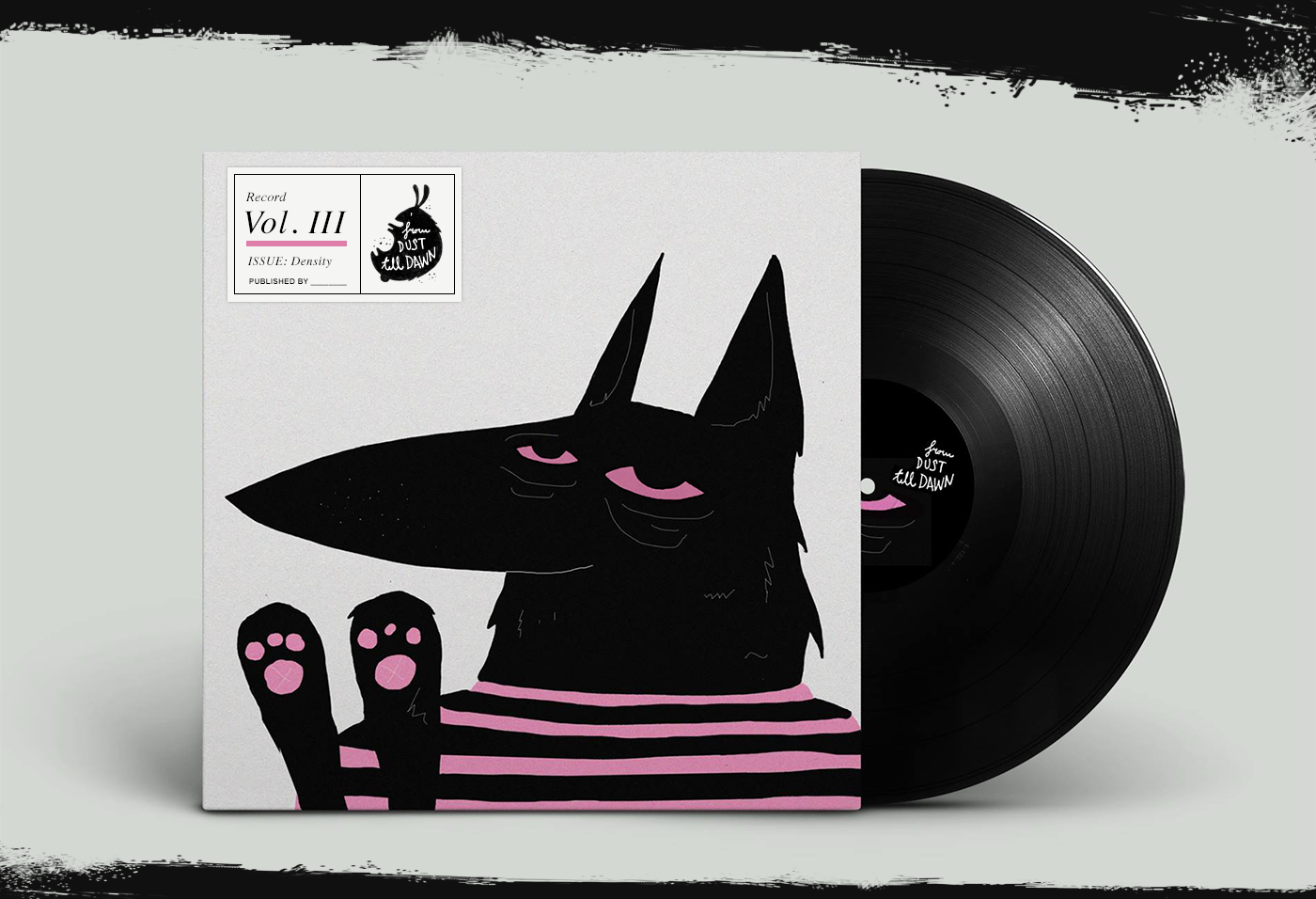

Illustration _ Lots of love > Apple pen > iPad Pro > Voila!
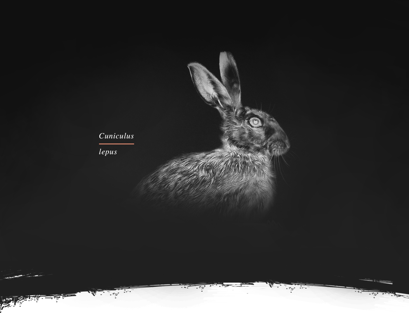
Ideas are like rabbits.
You get a couple and learn how to handle them,
and pretty soon you have a dozen
_______
John Steinbeck
You get a couple and learn how to handle them,
and pretty soon you have a dozen
_______
John Steinbeck

Thank you
very _________.


