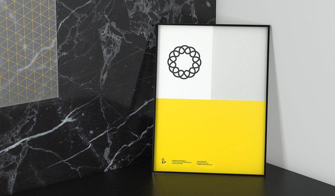
Garnett & Partners is an award-winning architectural practice based in London. For their rebrand, we focussed on the plus symbol – a powerful icon of the various partnerships at the heart of their business. As a team that is greater than the sum of its parts, it represents the strength of their relationships with colleagues. As a company whose mainstay is repeat business, it represents the partnership between G&P and their clients. As a team that aims to create 'timelessly contemporary' work, it represents the link between past experience and a vision for the future. And as a creative architectural practice, it represents the combination of style and function.
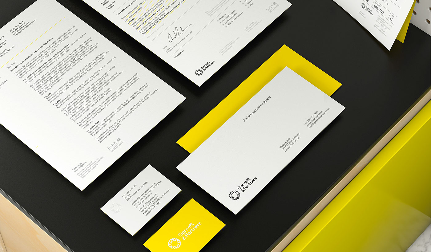
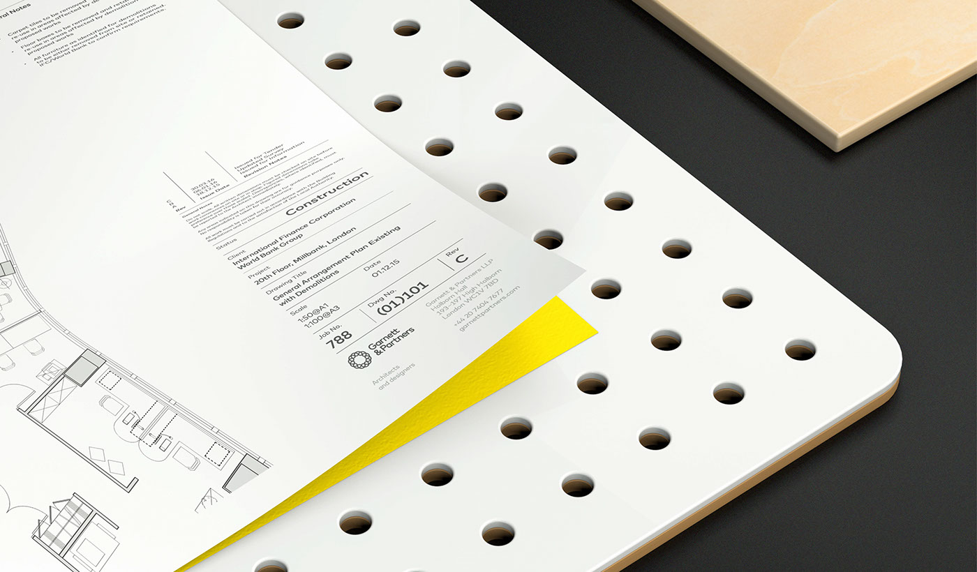
The symbol was developed into a complete identity and rolled out across a range of materials, from beautifully letterpressed business cards to invoices, presentation templates and a brand new website. For more information about the process, see the G&P blog post.
—————
Printing by Glasgow Press
Web development by Tom Hirst