Adobe Pride 2017 identity
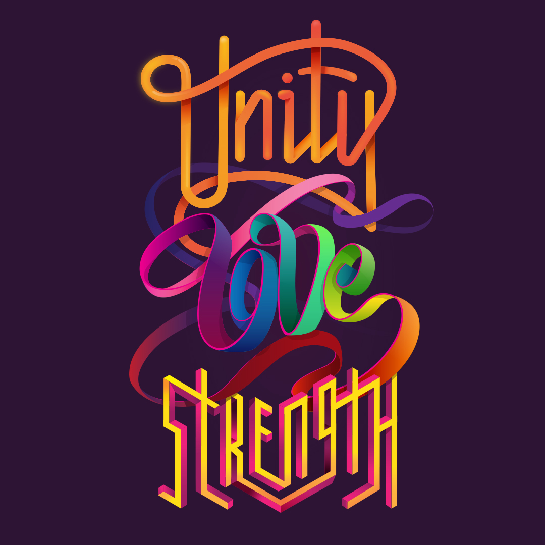
Great internal project I worked on at Adobe for the identity for 2017 Pride events. The lettering was created by myself and another fellow Adobe designer, Erica Larson LINK. Both of us used a variety of vector techniques in Adobe Illustrator and I sketched mine out in Adobe Sketch in the beginning. It's really cool to see it starting to be used in the different office locations and exciting to see the response. I added a couple pics from the Pride event in Utah taken by Clint Goudie-Nice ... and I will add more along the way.
You can also go to Create magazine and read an interview/article about the collaboration and some of the thinking behind the project HERE

Once the lettering was created I compiled my word with the other 2 and integrated them in both a horizontal and vertical format. The combined lettering graphics were used for float decoration, tee shirts and group banners.
This was the original sketch done on the iPad pro with Adobe Sketch. I was thinking of filling more space and even adding more colors to the ribbon but once the piece started to come together it felt better to allow for more space around it and interlock it better with other words.
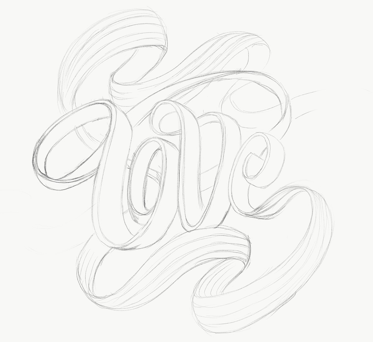
Each word had to work on its own as we printed separate posters for each for participants to hold up on there own and together in a line.


I created a simplified version of the word love to use for temporary tattoos at events.
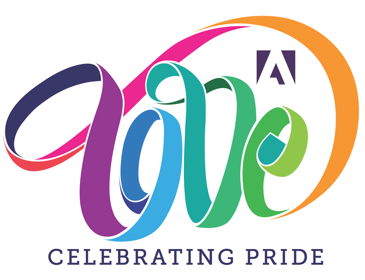
The graphic is being used heavily over Adobe's digital properties as well.


Couple pic from the parade in Utah. Ill add more as come. These were taken by Clint Goudie-Nice.


