


TETRAPOD brewing co.
brand experience design
Brand Overview
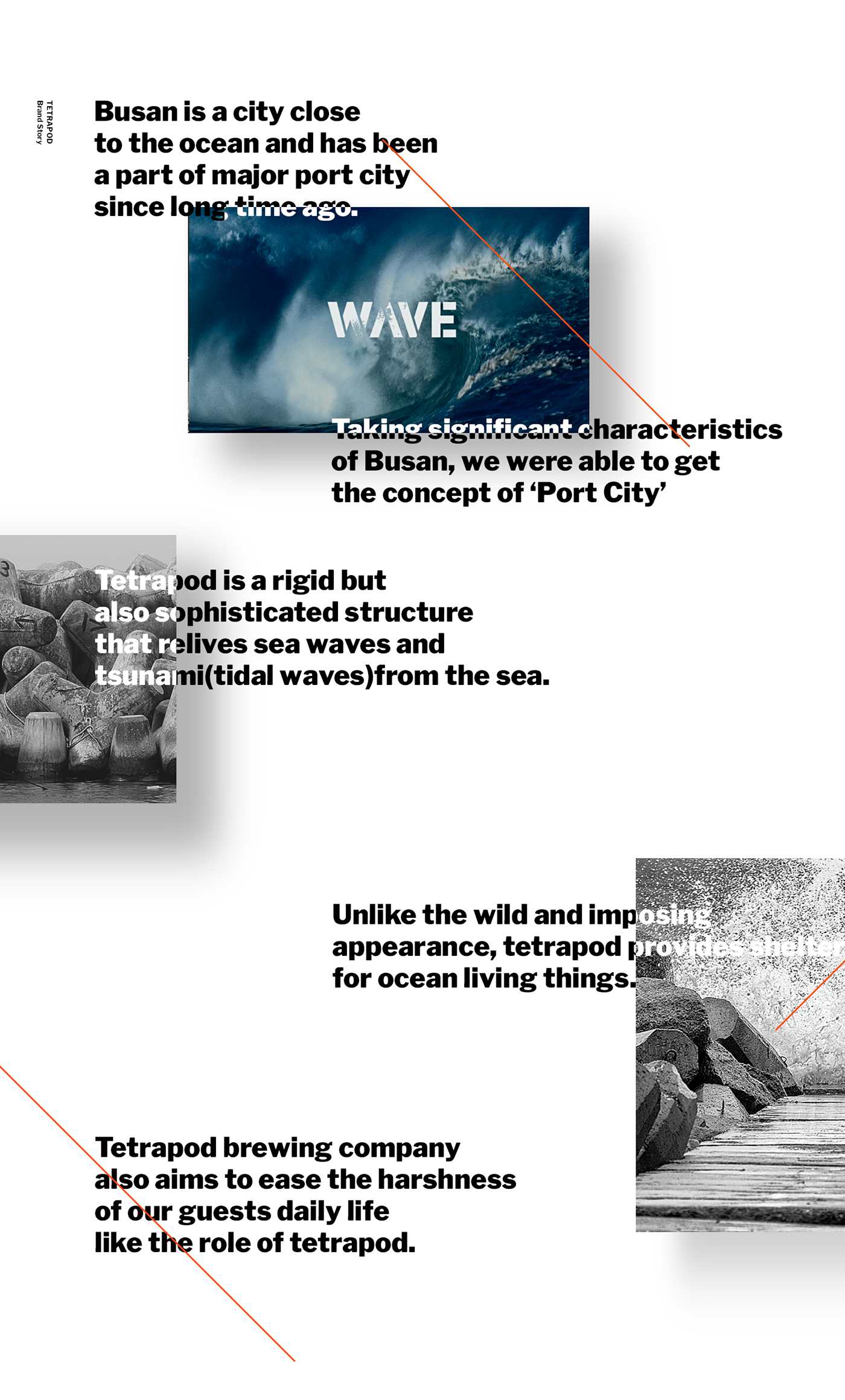
TETRAPOD BREWING CO. is a brand created by the beer-loving designers,developers and businessmen. Started in Busan, a representative port city of South Korea, TETRAPOD BREWING CO. retains a wild and masculine image of a typical port city, but at the same time, aims for a pub brand that can calm the rough waves of the customers with its carefree and relaxed atmosphere.
Project Object
Aiming for a creation of a pub with sincere service and a carefree, relaxed atmosphere, we created a unique brand image for TETRAPOD along with the slogan, “Bring your own life”, suggesting people to bring their own stories and enjoy, and established a new brand identity and a visual system that can differentiate the brand from its field.
Brand Design Essence
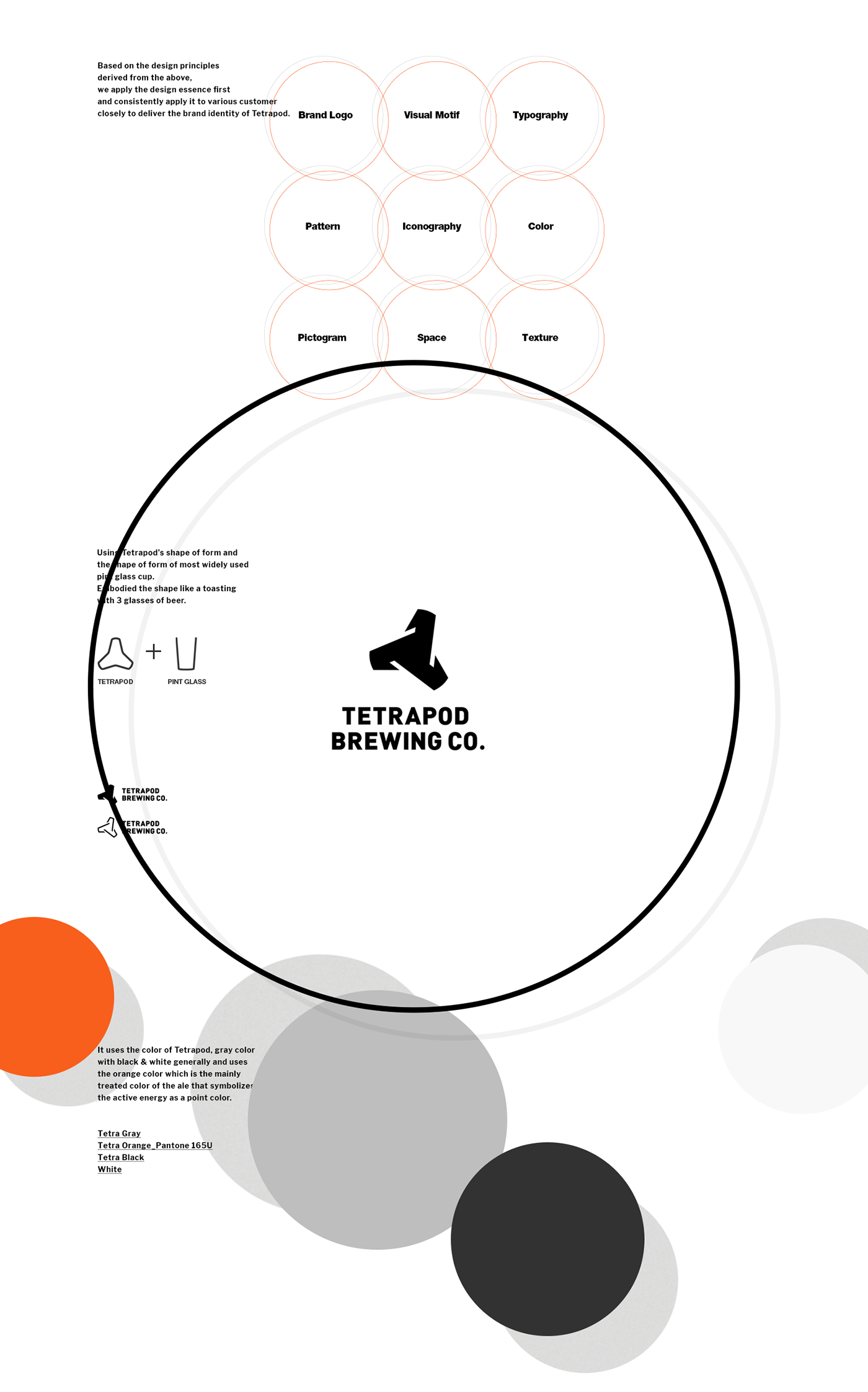
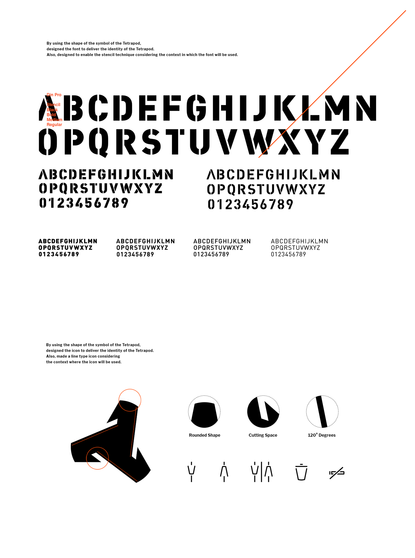
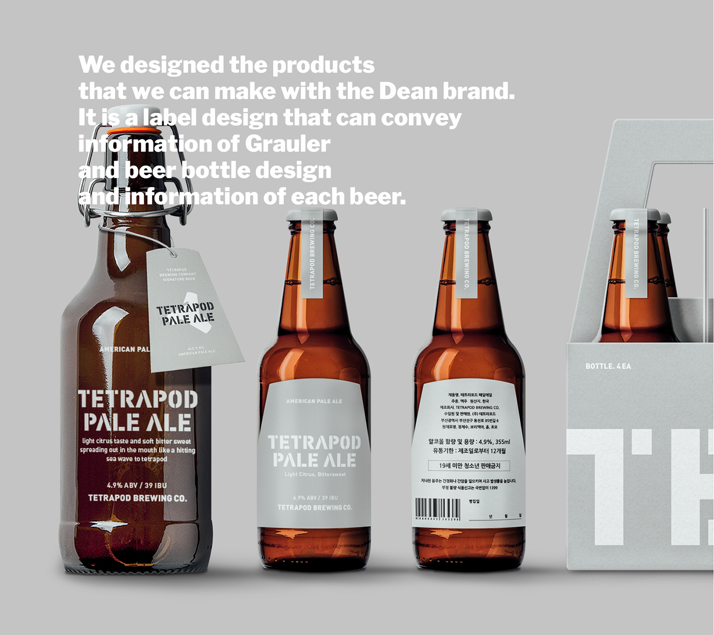
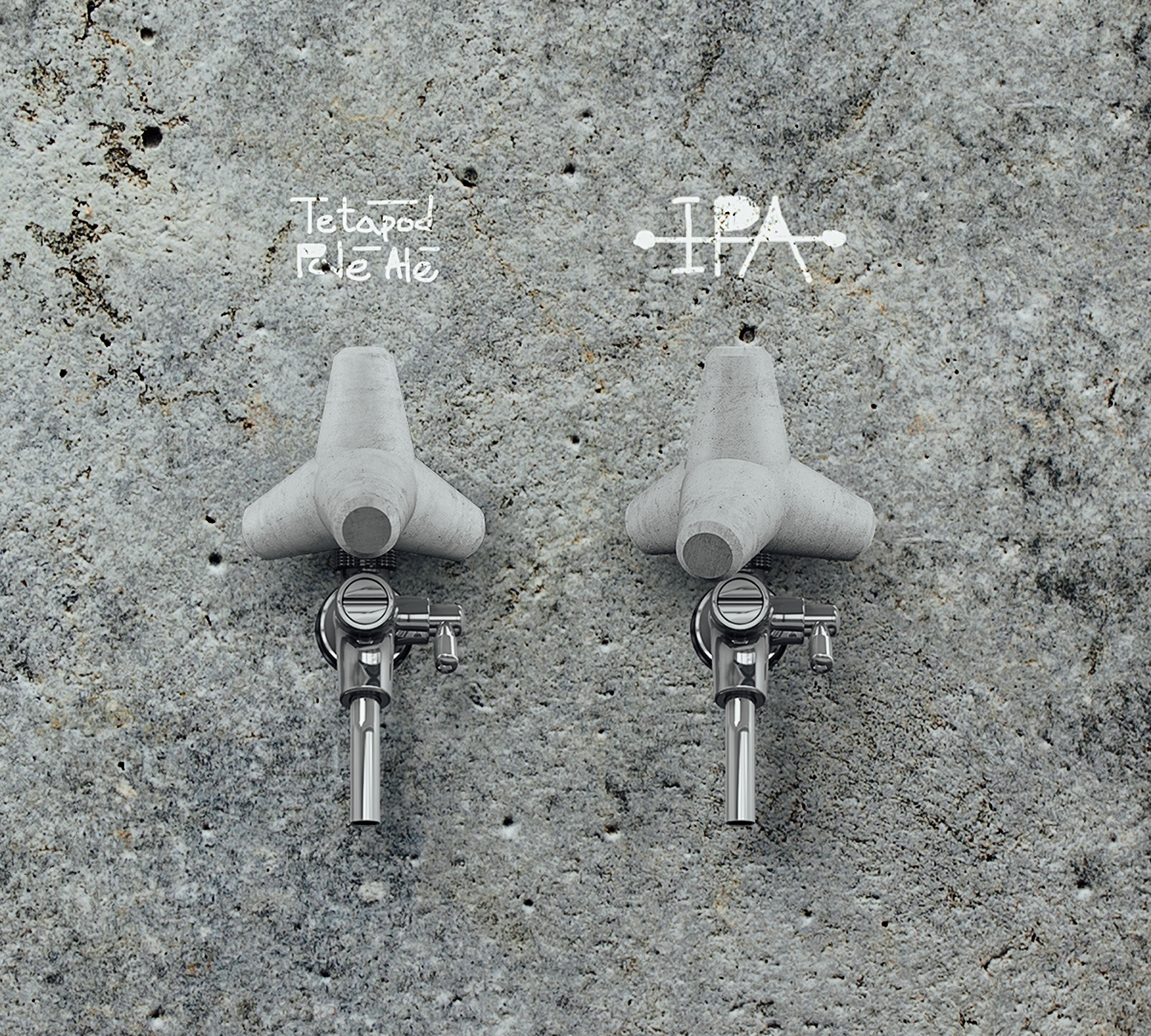
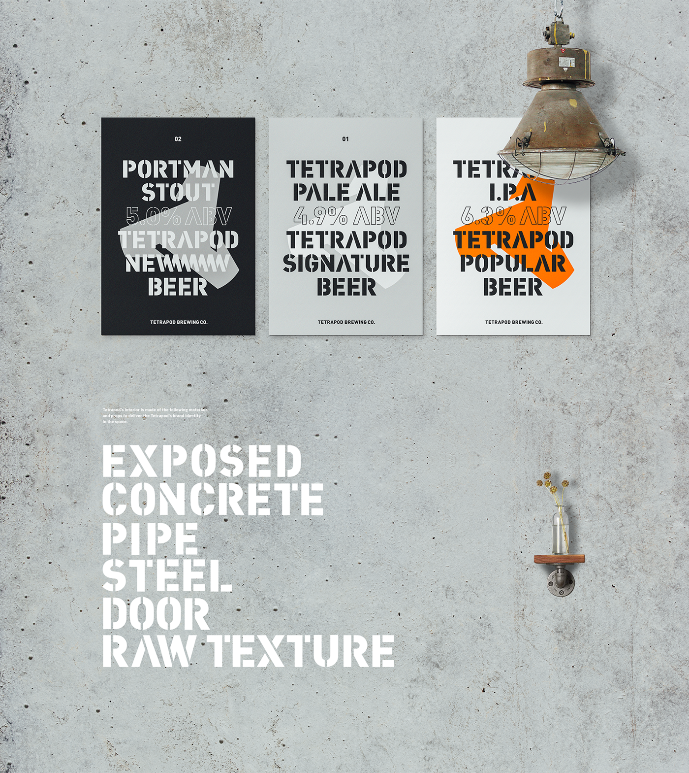
Originally meaning ‘four-limbed’, ‘Tetrapod’ is a tetrahedral concrete structure used as armour unit on breakwaters. The core values of the brand, derived from the formative characteristics, are reflected in the brand design essence such as colors, typography, patterns, and icons. Brand identity of TETRAPOD BREWING CO. is effectively expressed with the design principles established as such. To convey rawness of concrete, only the papers from recycled materials are used, making TETRAPOD environmentally friendly. To reveal the unique identity of the brand, we designed various types of products, including cups, sampler trays, coasters, and handle taps. Those are the essential design elements that can deliver the unique brand image of
TETRAPOD BREWING CO. to the customers, successfully differentiating the brand from the others.
Brand Overview
테트라포드 브루잉 컴퍼니(TETRAPOD BREWING CO.)는 맥주를 좋아하는 디자이너, 개발자, 사업가들이 모여서 만든 브랜드입니다. 한국의 대표적인 항구도시인 부산을 첫 지점으로 시작하여, 항구의 거칠고 남성적인 이미지를 가지고 있지만, 편안하고 자유로운 분위기로 고객들의 거친 파도를 완화 지켜주는 펍 브랜드를 지향합니다.
Project Object
진정성있는 서비스로 편안하고 자유로운 분위기를 느낄 수 있는 펍 공간을 구현하는 것을 추구하며, 사람들 각자의 이야기를 가져와서 즐기라는 의미의 “Bring your own life” 슬로건과 함께 테트라포드만의 브랜드 이미지를 만들고, 동종 업계에서의 차별적 포지셔닝을 위한 새로운 브랜드 아이덴티티와 시각적 체계를 구축하였습니다.
Brand Design Essence
테트라포드는 본래 다리가 네 개라는 뜻이며, 항만 외곽에 쌓아두어 파도로부터 항내를 보호하는 역할을 하는 네 개의 뿔 모양의 콘크리트 구조물입니다. 조형적 특성을 기반으로 도출한 브랜드 핵심 가치를 바탕으로 브랜드 에센스인 컬러, 타이포그래피, 패턴, 아이콘등 브랜드 디자인 에센스에 반영 후 디자인 원칙을 세워 테트라포드의 브랜드 아이덴티티를 효과적으로 표현합니다. 모든 종이는 테트라포드의 콘크리트 느낌을 살리기 위해 Raw한 recycled material를 사용하여 친환경적입니다. 그리고 우리만의 아이덴티티를 전달 할 수 있도록 컵, 샘플러 트레이, 코스터, 핸들탭등 다양한 제품의 디자인을 진행하였습니다. 이는 다른 브랜드와는 차별화된 테트라포드 브루잉 컴퍼니만의 브랜드 톤앤매너를 만들어내며, 고객들에게 테트라포드 브루잉 컴퍼니의 고유 브랜드 이미지를 전달하는 핵심적인 디자인 요소입니다.
Facebook
Instagram
Website


