

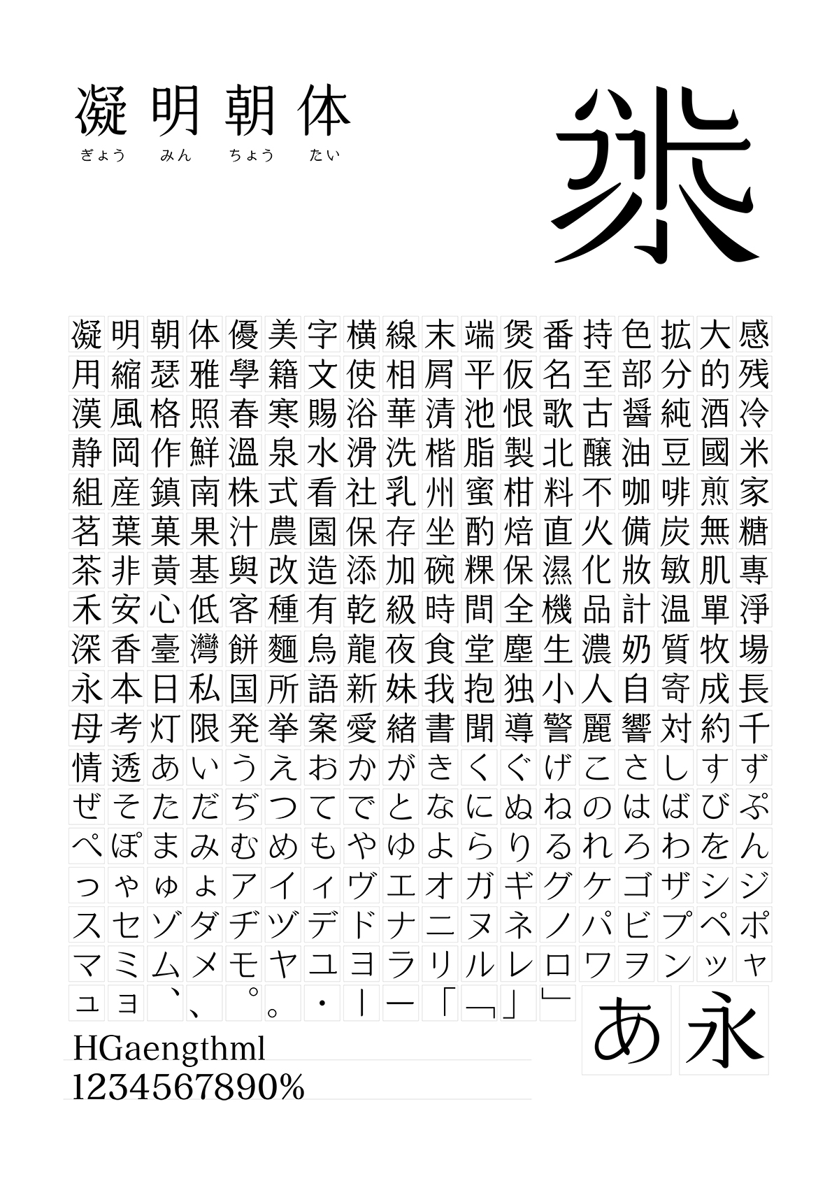
凝明朝体應用例 | Cream Mincho Demo
AD + D:Bohan Shih
-
June, 2017
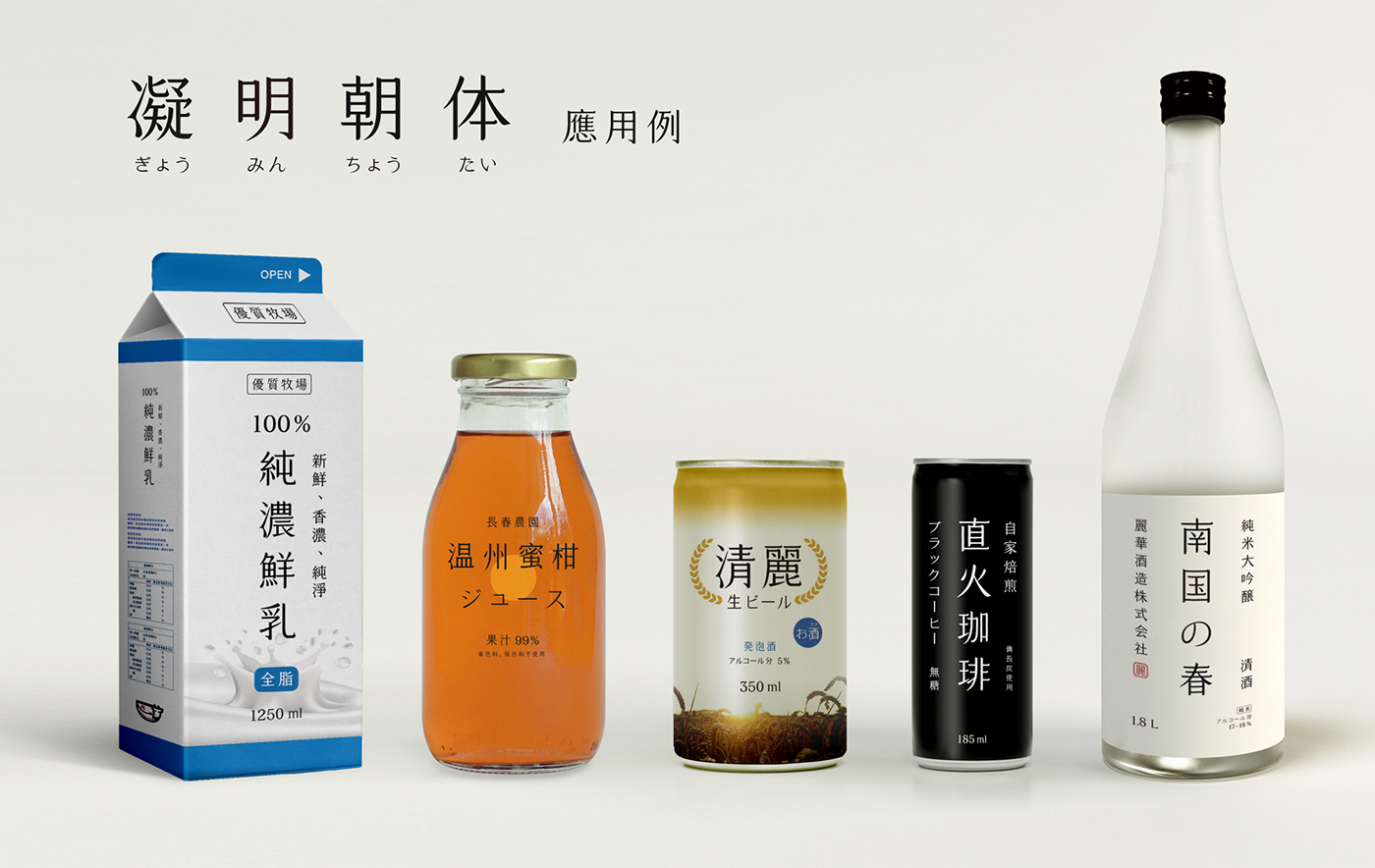
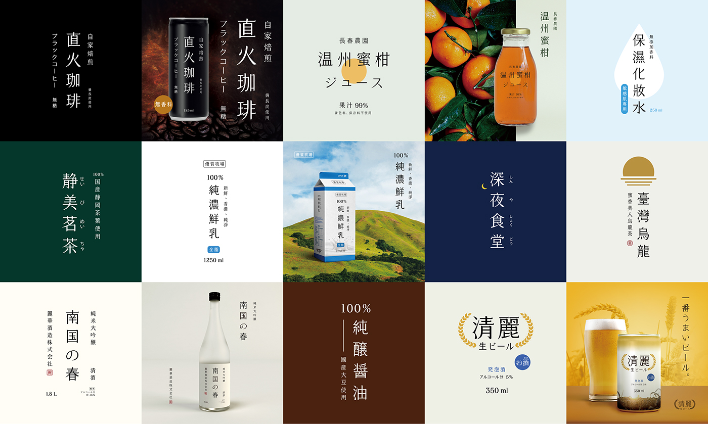
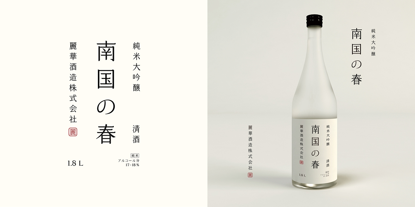
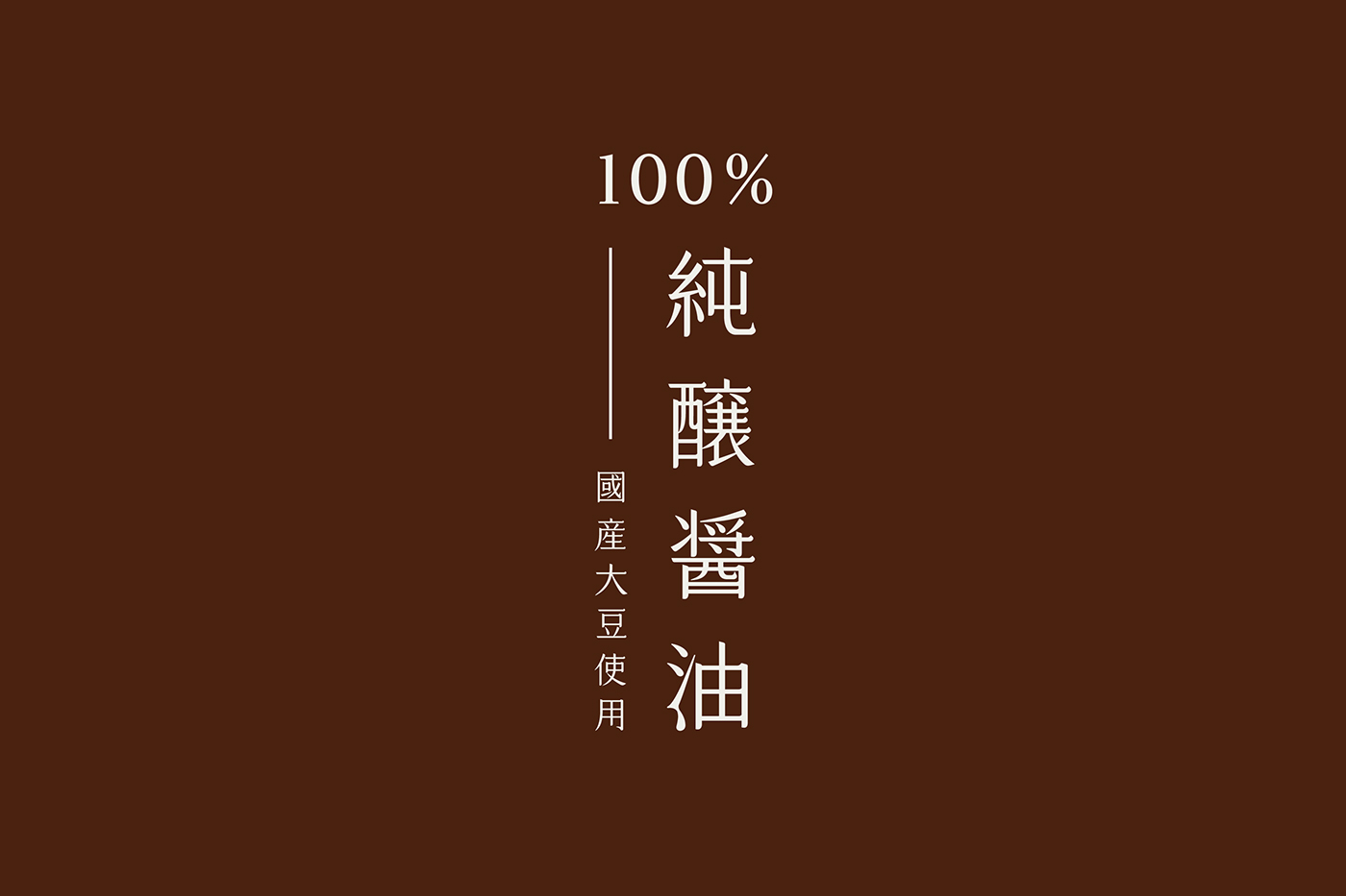
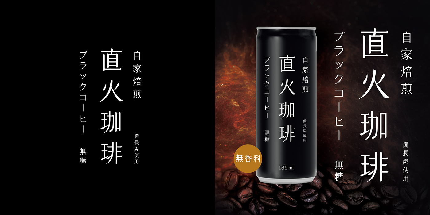
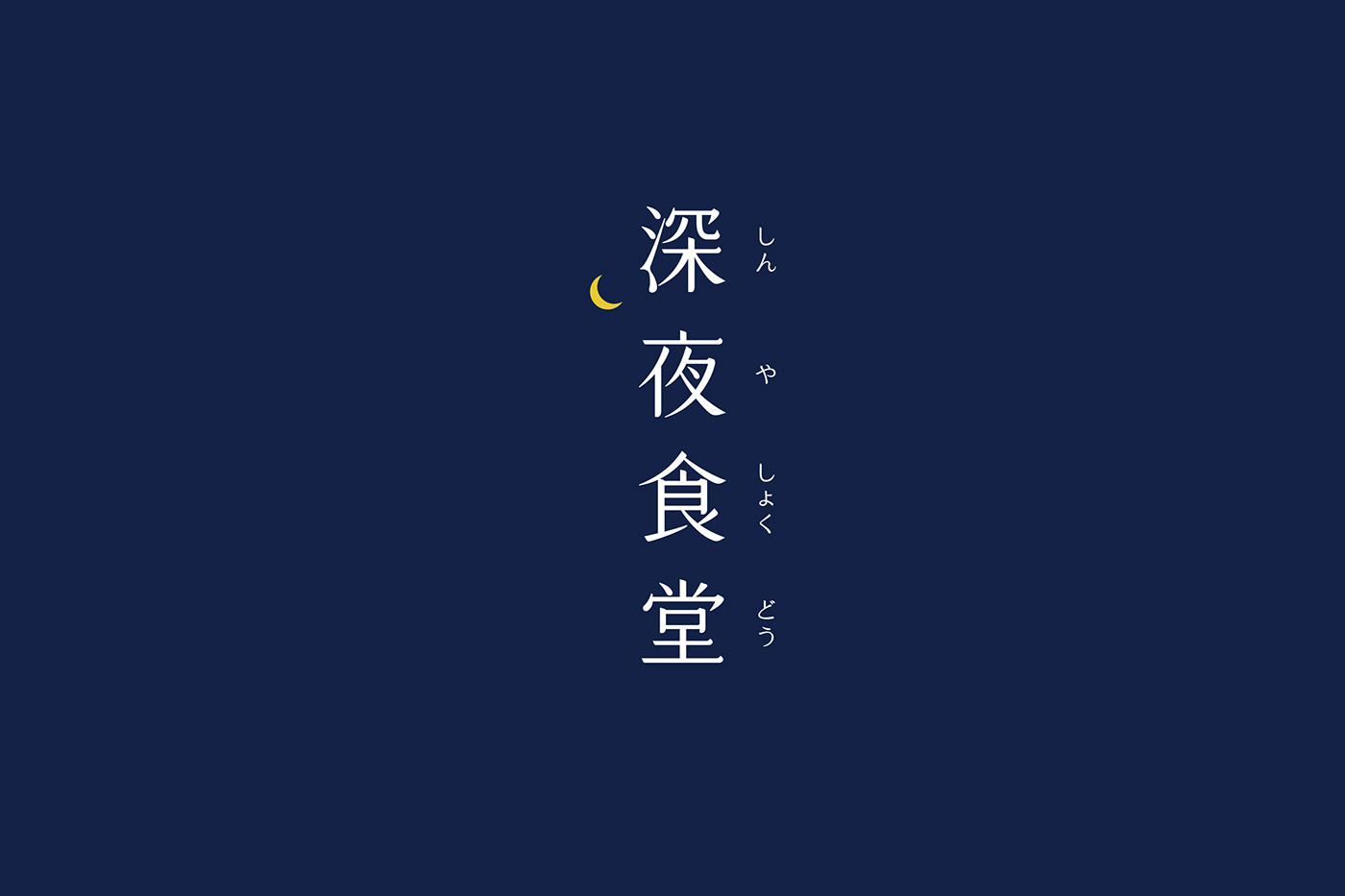
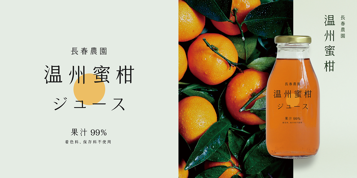
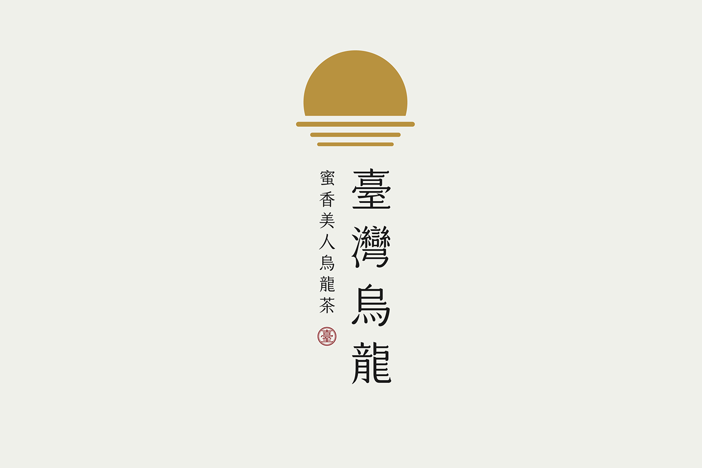
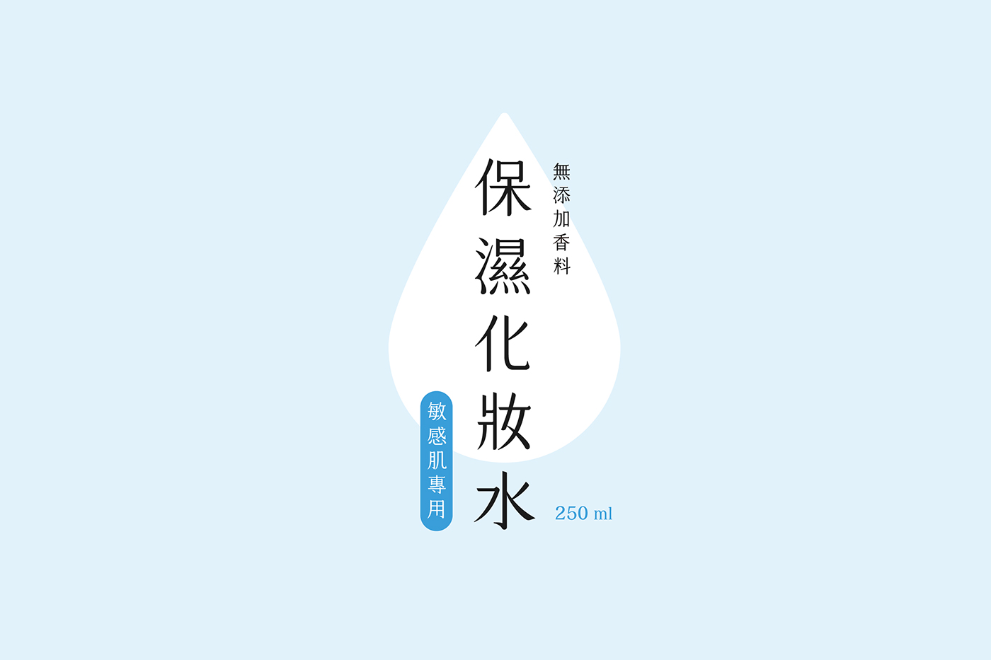
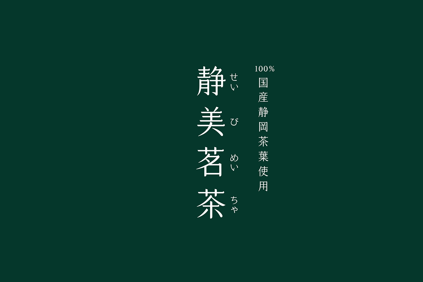
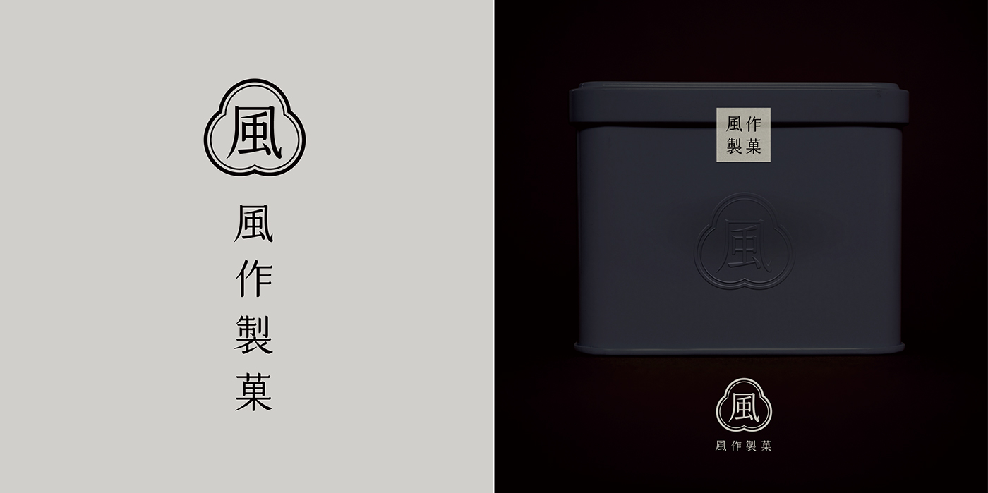
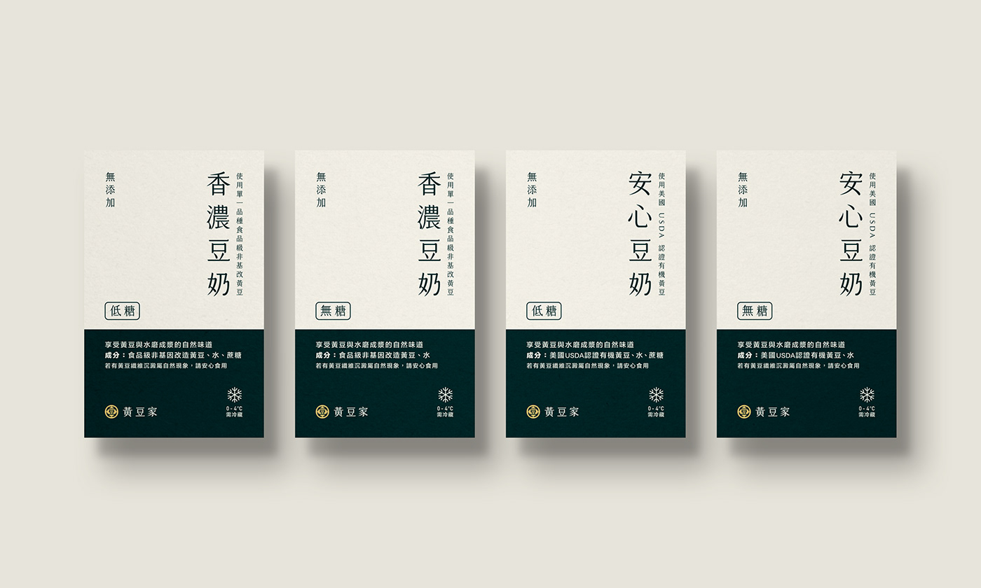
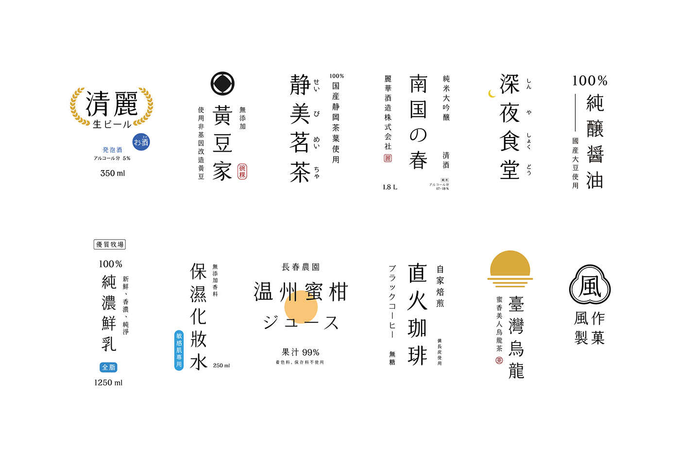
凝明朝体是一個十分特別的字體,它融合了楷體與明體的優點,擁有方正的字身、稍高的重心、舒展的中宮,且因橫劃末端有如凝霜般翹起而得名。放大來看,明體的感覺十分明顯,可作為標題⽤字;縮小來看,又有楷體的優雅,⼗分適合使用於書籍內頁之中,集優美、高雅、可愛、明快、規矩、精緻為一體;平假名的設計保留部分漢字筆劃的特⾊,是為了與漢字的風格做呼應。以下提供凝明朝体應用例數組,其中出現的漢字、假名、符號、數字到歐文字母,皆使用凝明朝體進行排版設計,從飲品、日用品到識別設計皆有,歡迎您細細品析。
The particularity of the Cream Mincho consists in combing the merits of Mincho and Kai. Although Cream Mincho possesses the square figure, it looks slender and elegant. Besides, the name of Cream Mincho is derived from the cream look at the end of the horizontal stroke. Not only is Cream Mincho appropriately used for the title because of the obvious appearance of Mincho, but it also applicable for the content due to the features of Kai, therefore Cream Mincho can be regarded as integration of the elegance, cuteness, agility, staidness and delicacy. As for the design of the Hiragana, maintaining the characteristic of the raise at the end of the horizontal stroke is for corresponding to the style of Chinese characters.
觀看更多:凝明朝体
註:凝明朝体目前屬概念性創作,尚未進行字庫開發,目前僅能以客製方式製作


THANK YOU
凝明朝体實際應用例:黃豆家識別設計


