


Accounting Office
AnalysisIn an analysis performed it was discovered that most brands of the Company’s genre are composed of colors and symbologies without representation, many only try to affirm the brand from the logo (symbol of the brand representation) with acronyms, numbers, and elements that refer the brand over again. The colors study are not used, the colors are customized from the customer's taste without using the true sense of the psychology of colors.
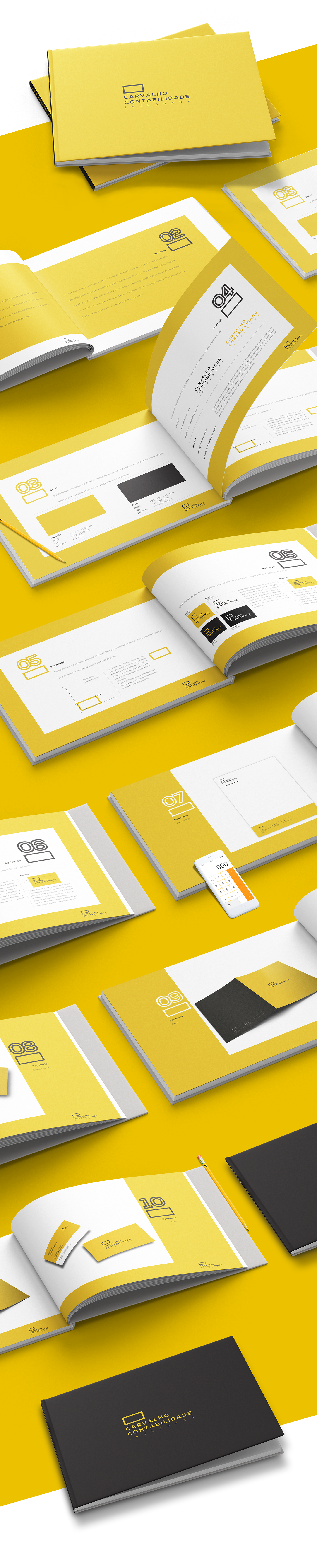
Proposal
Our proposal uses colors that pass the feeling of optimism, confidence, self-esteem, extroversion, strength and above all a color that alerts dangerous situations. The logo was conceived from the plan of Argand-Gauss, also known as a complex plan, used to represent complex numbers geometrically. The choice of a sans-serif typology reflects modernity and seriousness. The custom spacing came to ease the information and demonstrate lightness since the mark contains 3 large words.


Thanks for watching!


