


Joan Creative
Identity
2016

Joan is a progressive advertising agency in New York run by Lisa Clunie and Jamie Anderson. Jaime was named one of the most Creative People by Fast Company and Lisa is the former COO of Refinery 29.

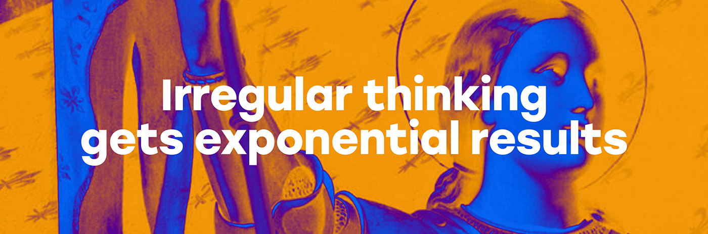
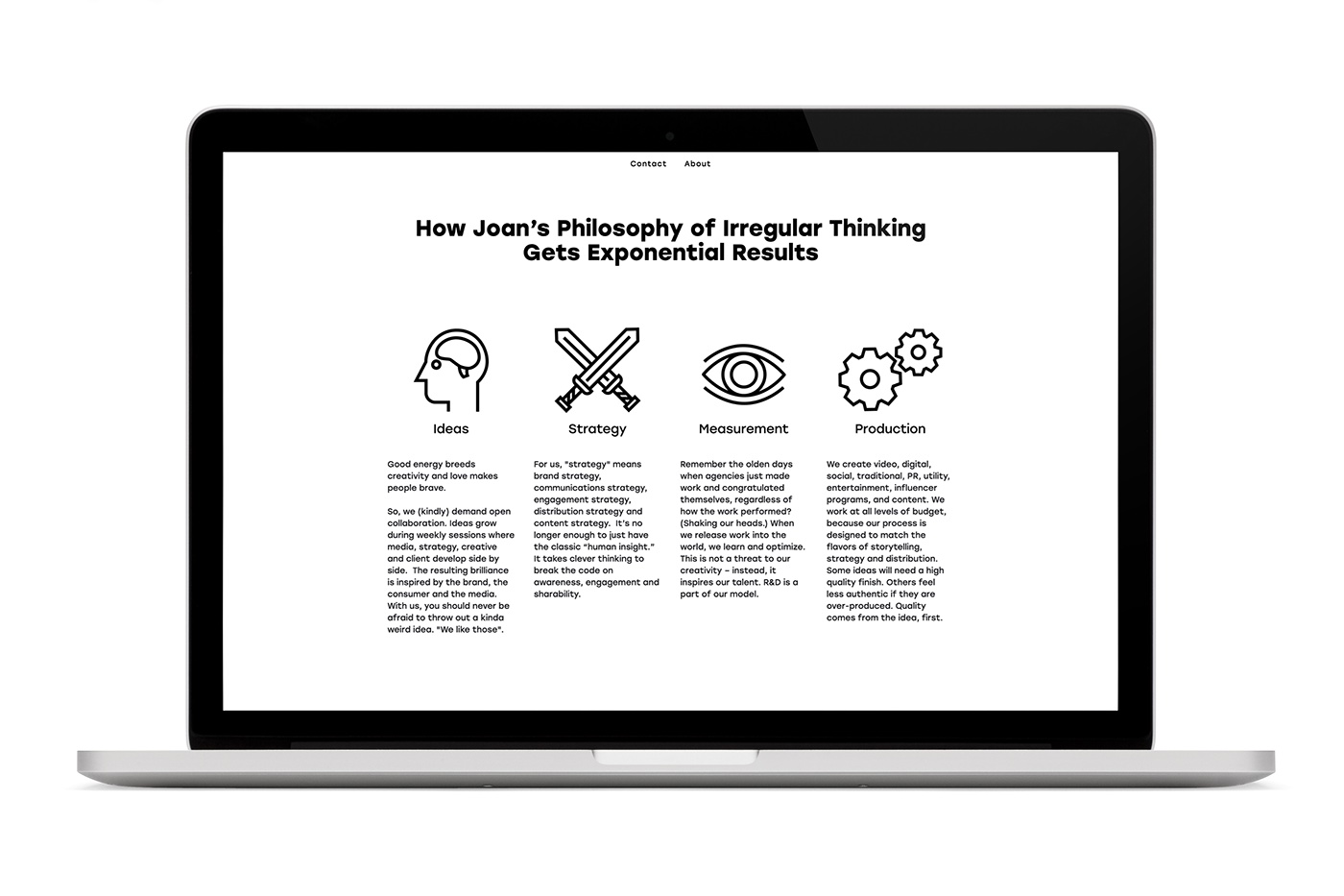
The logo is dynamic and characterize what Joan stands for: Irregular Thinking. The logo is an animation and compilation of selected Joan's. The typography used is historically correct to the time they lived or thrived.
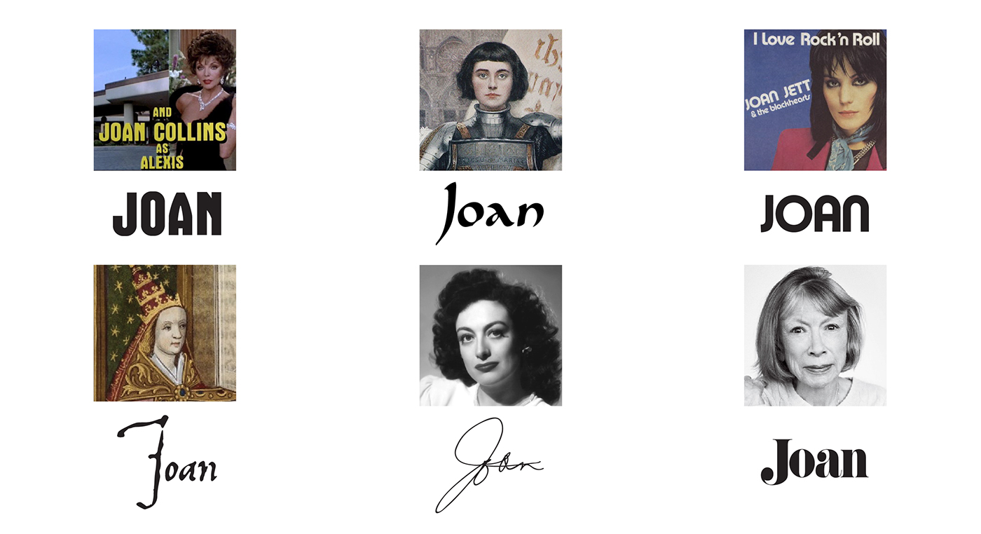
The company is named Joan because throughout history, various Joans have shown up on the scene and completely changed the landscape -- from rock and roll, to comedy, to helping put a new face on the protest movement of the 60s, and of course, to Joan who triumphed on the French battlefields. These Joans knew that the combination of talent, ambition, curiosity, imagination, an eternal work ethic and a completely irregular perspective from the norm would allow them to question, challenge and change.

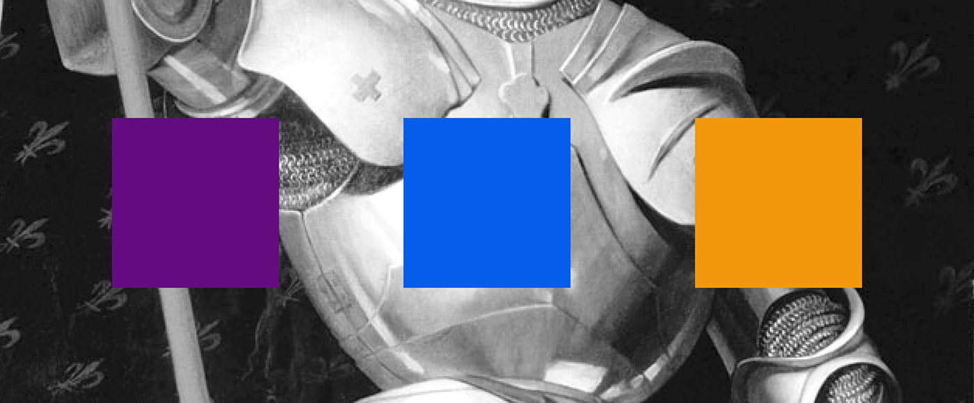
Joan Creative also needs stand on its own without the company of the great women who inspired the name, so we created a wordmark that could represent the creative women and men that do an awesome job every day. The identity colors represent both sexes, the mystical as well as warmth – but combined in a acid like way to create that little irregularity that Joan stands for.


Client: Joan via. Jamie Anderson and Lisa Clunie
Duration: April – May 2016
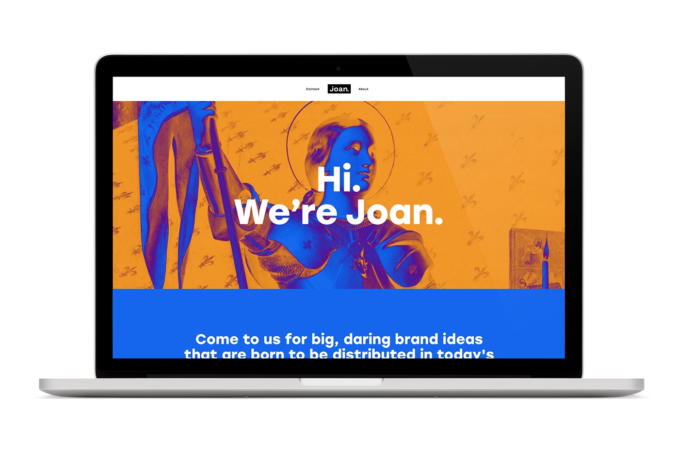
Website: Joan Creative
Duration: April – May 2016
Website: Joan Creative


