


Background
Since 1990, Colombia has endured a silent but deadly problem: landmines. By the end of 2016, the country had over 11,460 confirmed victims and almost 52 million square meters of its territory where mined, making Colombia the second most affected country in the world by landmines, just behind Afghanistan. Although this problem has been around for almost 20 years, it has remained almost invisible to the media, the government and the public’s eyes, as other more appealing news took the headlines. Our objective was to create an idea so powerful, that it could showcase Semana Magazine’s power to create actual changes within society through their content. Since Semana is the most read magazine in Colombia, the challenge we faced was to use the publication itself as the medium to communicate our message and reach everyone who read it in the country. Budget: 25.000 USD.
Idea
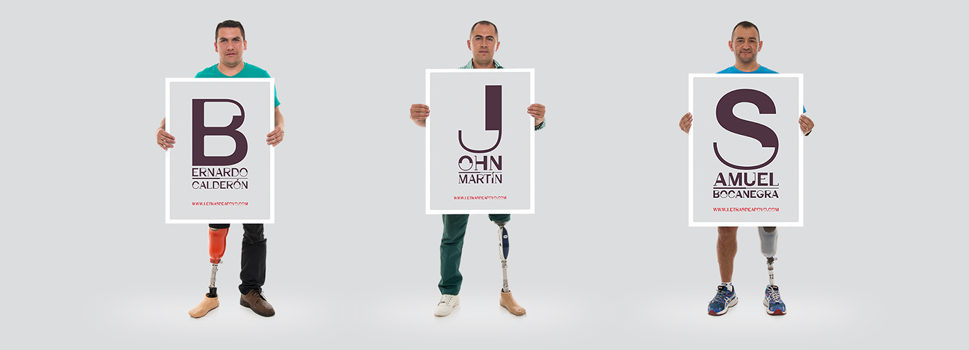
We knew the only way to make the landmine problem visible was to put it on the headlines and front covers, that’s why we created THE HELP FONT, a typeface that no matter the words we write with it, their meaning will always be the same: No more landmines. To design the typography, we “mutilated” letters and gave them back their functionality by using parts of others to represent prosthetic limbs. The outcome was a beautiful new typeface, which became a symbol of all landmine victims in Colombia. Then we launched the font in a special issue with landmines-related content (victim’s stories, maps, statistics…) in which all headlines and even the magazine’s logo was written with Help Font.
Strategy
For years, Semana Magazine has been using the power of words to shape its readers’ opinion. This time we decided to use the power of letters to turn the landmine problem into news and those news, into a campaign. Our idea comes from a basic thought: “if we learned to read, we can also teach to help”. So, we decided to use the power of letters to demonstrate our magazine influence and power to inspire changes beyond quality of information. Changing the logo of our magazine and rewriting it with the Help Font, was part of the strategy to captivate other media’s attention.
Execution
We launched the entire typeface in a special issue which featured victims’ stories, maps of mined areas, statistics and a broad editorial content regarding landmines. Article’s headlines and even our magazine’s logo was written in Help Font, taking the landmine problem for the first time ever, to the cover headlines of Colombia’s most read magazine. After the launch of that special issue, our typography was on the cover of several other magazines and websites. Caracol, the biggest TV broadcaster in Colombia, joined our campaign and show their support by donating commercial slots in which we aired a beautifully written typographic TV spot that depicted, in alphabetical order, a victim’s true story while presenting all Help Font letters. Caracol also created special content that featured some victim’s stories in its most important investigative show: Los Informantes. Radio stations, celebrities and competitors also highlighted the Help Font campaign.
Results
We achieved our main objective: For the first time, landmines and our typography were on the headlines of all news magazines. T.V channels, websites and radio stations joined our campaign, even some used the font, earning more than 2 million USD in free press. The typography itself became a symbol to remember the tragedy of landmines in Colombia. Colombian government approved a 500 million USD budget to create a ground force that will clear all Colombian territory over the next three years, making 2016 as the year with the most progress made in the fight against landmines. So, our magazine’s influence and power to inspire changes was completely demonstrated. Finally, Semana Magazine received the biggest journalists award (CPB), thanks to its landmine special report, highlighting the quality of information as well.


TV Spot
Sístole
Agency
Horacio Maggi, Freddy Méndez
General Creative Director
Freddy Méndez, Nicolás Cortés, Ana M Bernal
Copywriter
Iván Sierra, Andrés Azuero, Alexánder Argüello
Art Director
Nicolás Silva
Typeface Designer
José Mendoza, Sandra Echeverry
Account Director
RECOGNITION
Top 10 P&M / Uso Creativo de Medios 2018 / Letras de Apoyo
Bronce / Media / El Dorado 2017 / Letras de Apoyo
Bronce / Press / El Dorado 2017 / Letras de Apoyo
Designboom / 2017 / https://www.designboom.com/design/semana-magazine-help-font-colombia-04-29-2017/
Bronce / Film / El Dorado 2016 / Letras de Apoyo


