


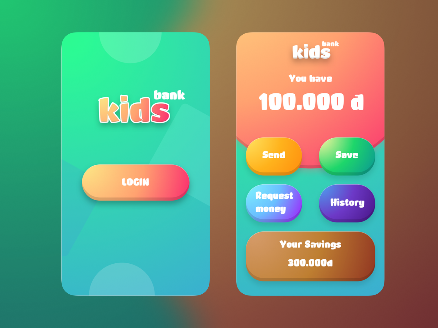
I try to make something interesting with kids. Ans here is the result.
The complete presentation will be uploaded soon. :D
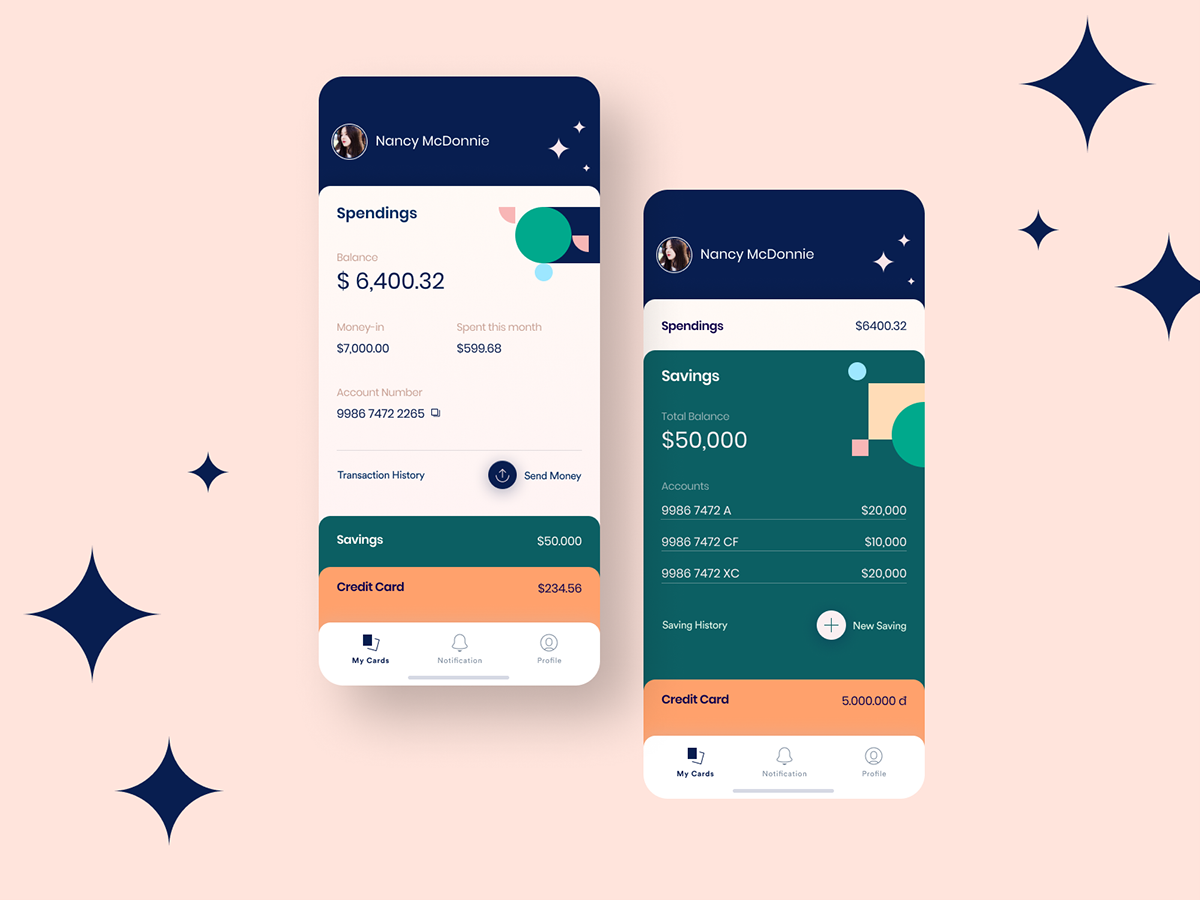
I just found the Maison Neue font and I want to tell you that I'm totally in love with this font. So I picked up an old design and re-designed it with the Maison Neue. And, here is the result.

Nothing super special today, just a bit play with full frame header design featuring popular writing on medium.
See my dribbble post: https://dribbble.com/shots/4368754-Medium-Homepage-explore
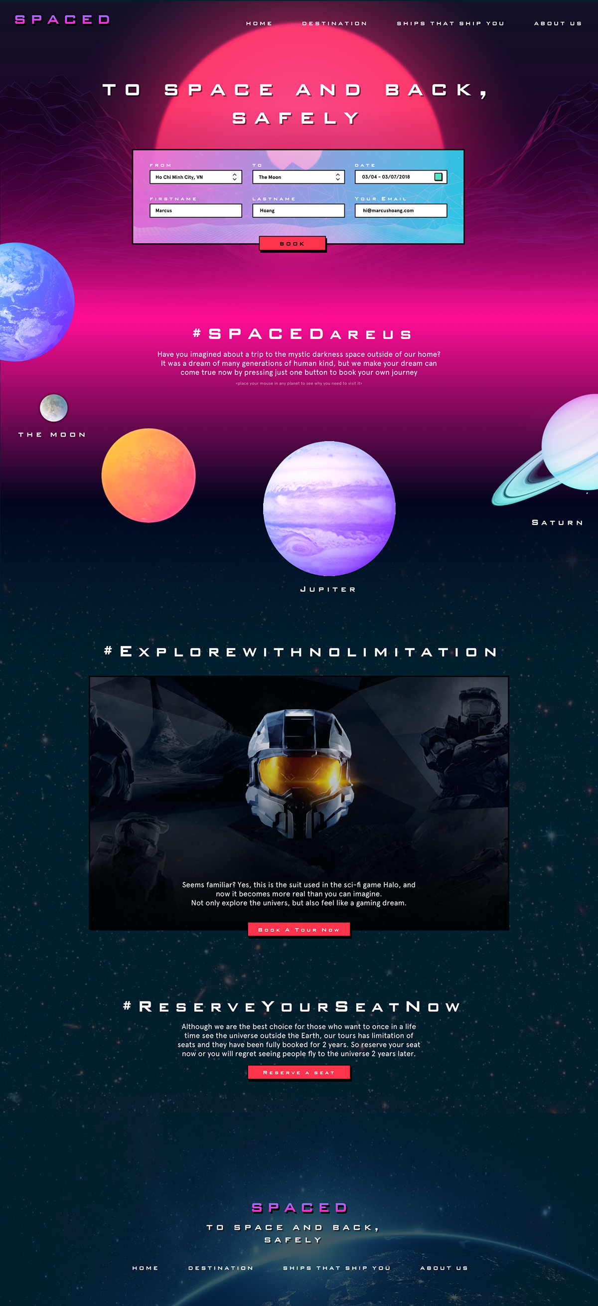
Home page I made to join in the #SPACEDChallenge hosted by @DannPretty on twitter. It featuring a bit of vaporwave style mixing with some modern UI elements, making the page a brilliant yet funny look while still give user an easy way to access their action to book a tour to the Moon.

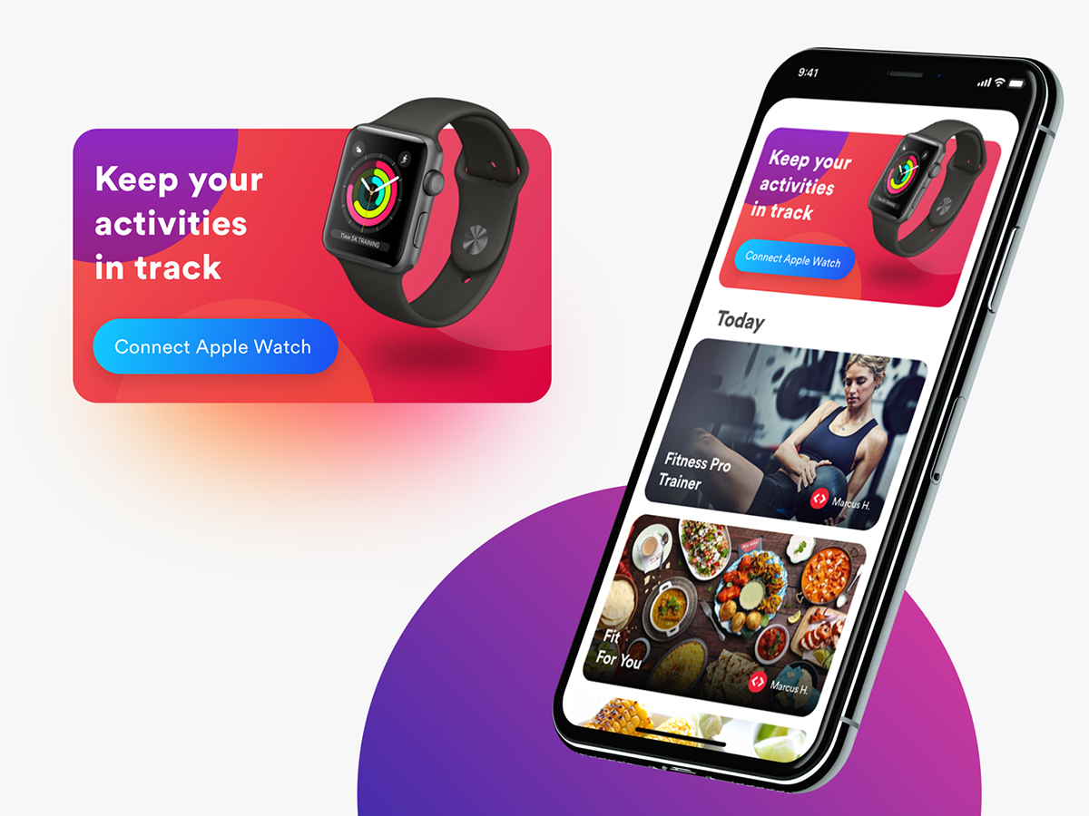
Menutri - Onboarding steps
One of my experiment on making a good onboarding process that not only tell user about what the app can do, but also featuring a good visual feeling that will impress users.
I try to keep the text minimal and super easy to understand as user rarely read long texts when they are eager to experience the app and will skip all the steps if they are showing a wall of text or having nothing special.

Microsite.
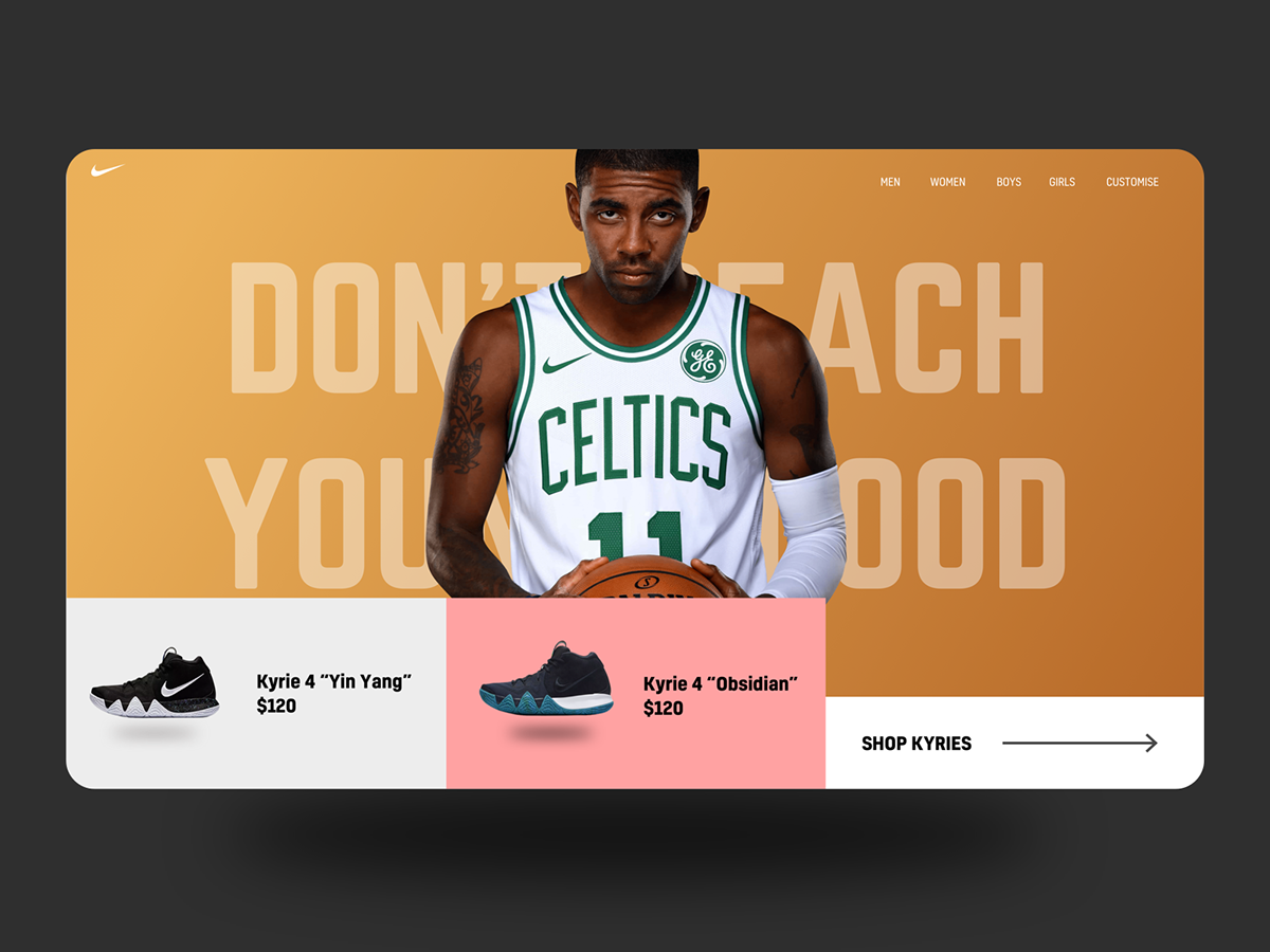
I made a microsite which is a part of Nike website featuring Kyrie Irving's signature shoes line. Kyrie Irving's shoes, the Kyrie 4s are one of the best selling shoes line of Nike.
In this design, I focus to the appearance of Kyrie Irving in the Boston Celtics' jersey. The picture feature one of the most iconic skill of Kyrie, the killer-crossover, which made Kyrie Kyire.
The bottom of the page is showing the newest Kyries for people to quickly check the specs. If they want to see more, they can click "Shop Kyries"
Microsite.
I made a microsite which is a part of Nike website featuring Kyrie Irving's signature shoes line. Kyrie Irving's shoes, the Kyrie 4s are one of the best selling shoes line of Nike.
The bottom of the page is showing the newest Kyries for people to quickly check the specs. If they want to see more, they can click "Shop Kyries"

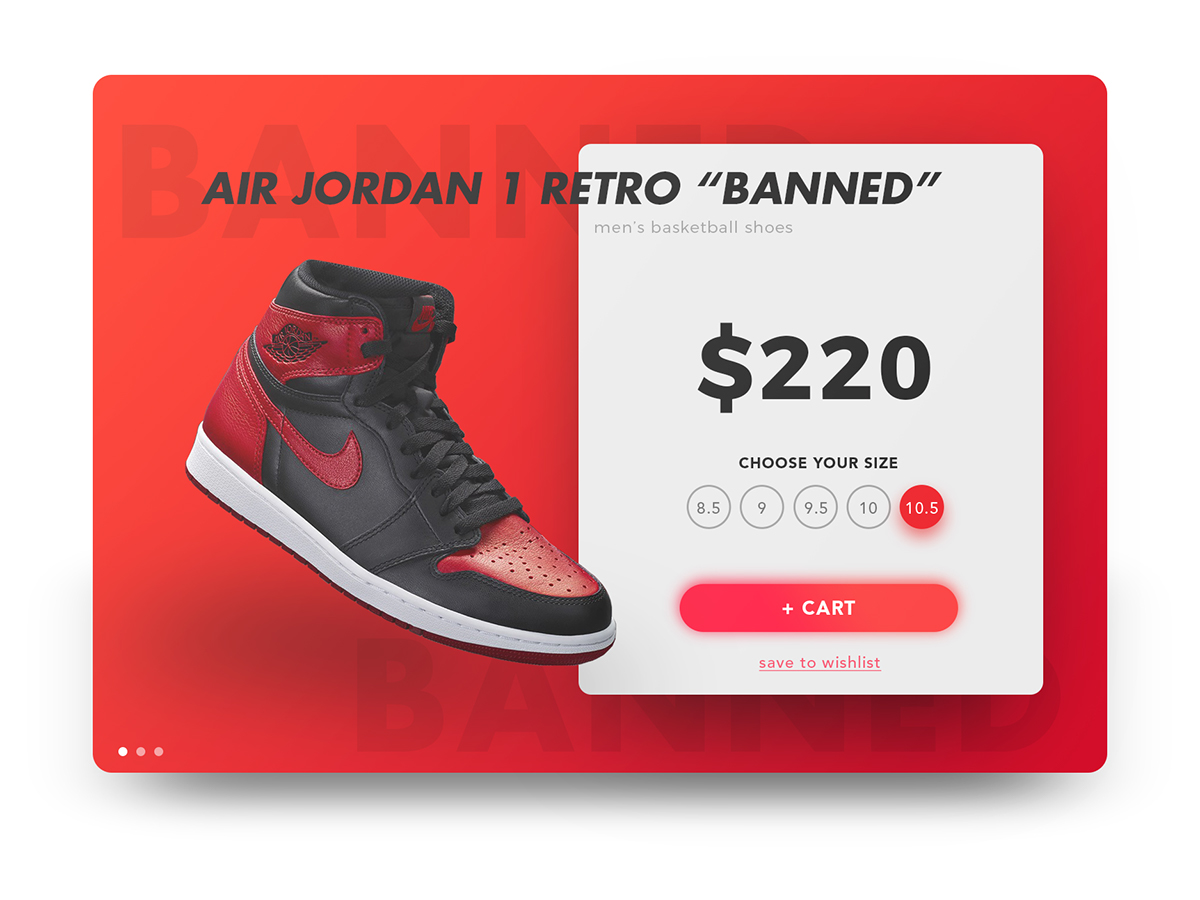
A banner to practice my illustration and color skill


Sound-mate app: Listening to music and find your best mate


Right-menu concept

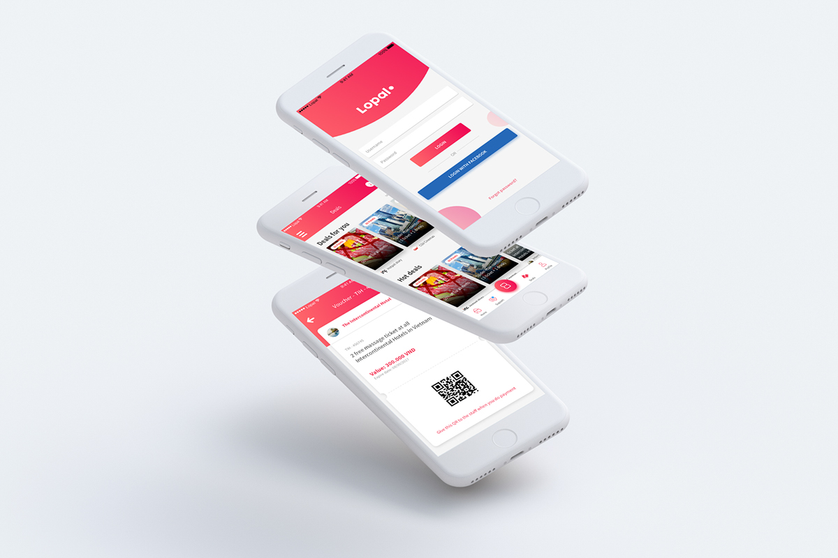
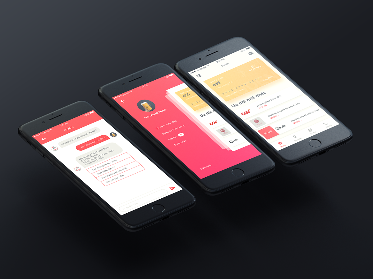
Lopal App - Customer care application
See the whole Lopal app presentation here:
Week 7.4: App menu
Week 7.3: Customer care app

Week 7: What a flying Macbook
Week 6.2: Go shopping now :)

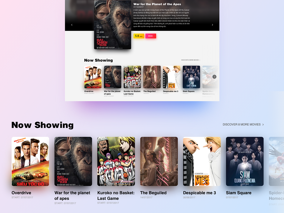
Week 6: Curnon watch Landing page
Making a landing page expermiment which show a big picture of their best selling item

Week 5: Soundcloud redesign with fluent design language
My visual experiment, apply fluent design system to the famous music service - Sound cloud.
My visual experiment, apply fluent design system to the famous music service - Sound cloud.
All of the functions remain the same, but in a new visual way.
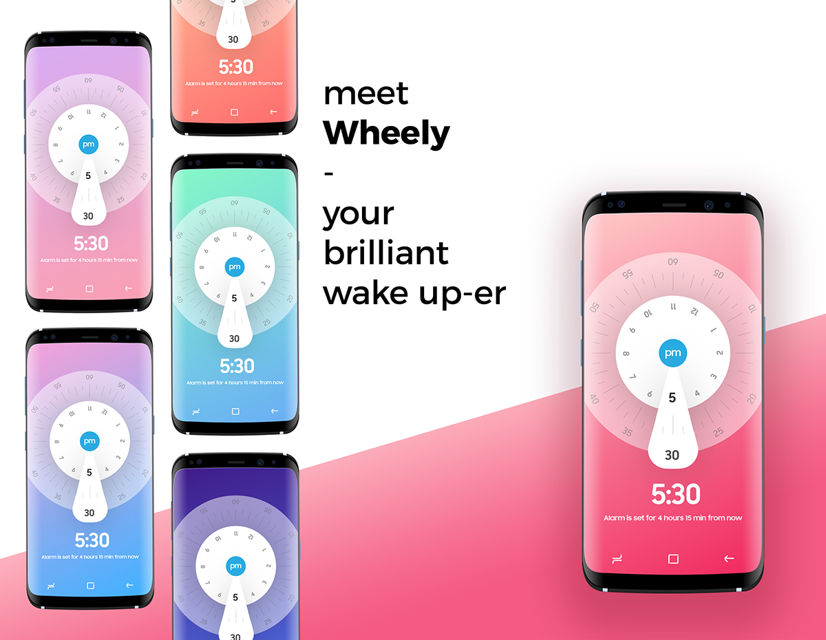
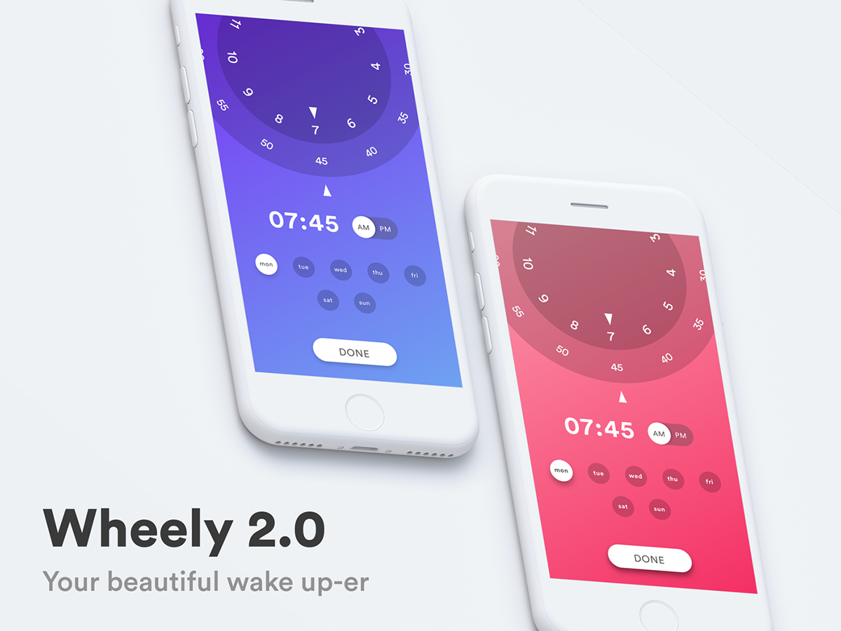
Week 4: Wheely - the joyful alarm application
Trying to reinvent the way people interact with the boring alarm application, I use colors that match the real sky color of the time period people choose (Like: dark blue for late night, or hot red for the noon). Every time user scroll the wheel, they see the color change, and it's will be a really fun experience that people will try to use it more and more.

Week 3: Login Screen
Just some play to practice the pattern of login UI in my own way :)

Week 2: Evaluation Popup for travel location
Some visual treatment used to improve the old version [ Here ].
My original thinking of the old version is: it's good, but it do not give user a joyful feeling when using as they are people who loves traveling. I think they need a more beautiful version which give them the willing to give more and more assessments.
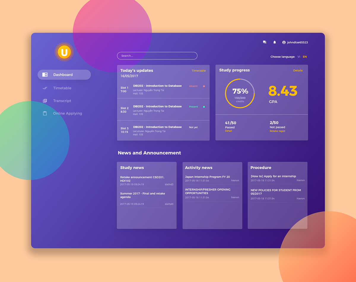
Week 1: Dashboard design
I tried to improve my school E-learning system with a dashboard layout, which present better information hierarchy for user to get what they need quickly and easily. The real version of my school E-learning do not have a good UI (it just raw HTML) and really difficult for student to get the information. So I think my new hierarchy will definitely solve the problem.
The reason I choose the purple color for this design is just for eye-catching. One version is done with white background and orange accent color. For usability reason, I think the White version will work better.


