Passoverdance
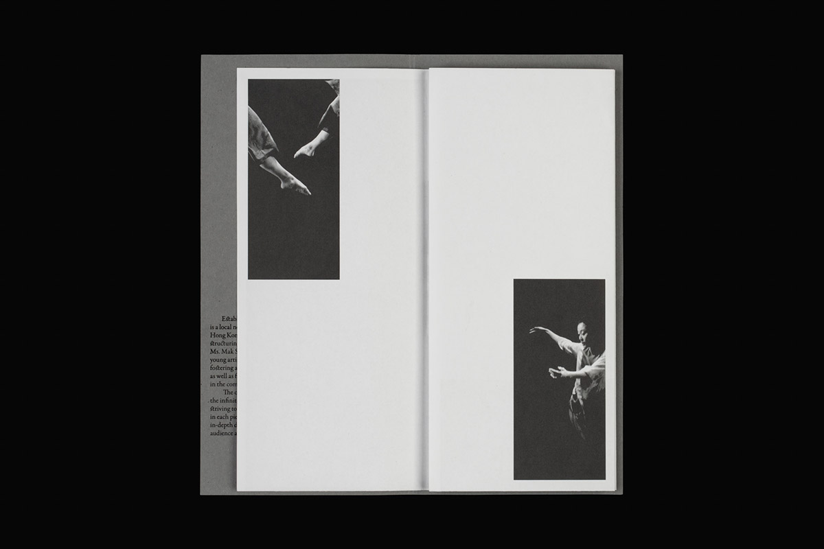
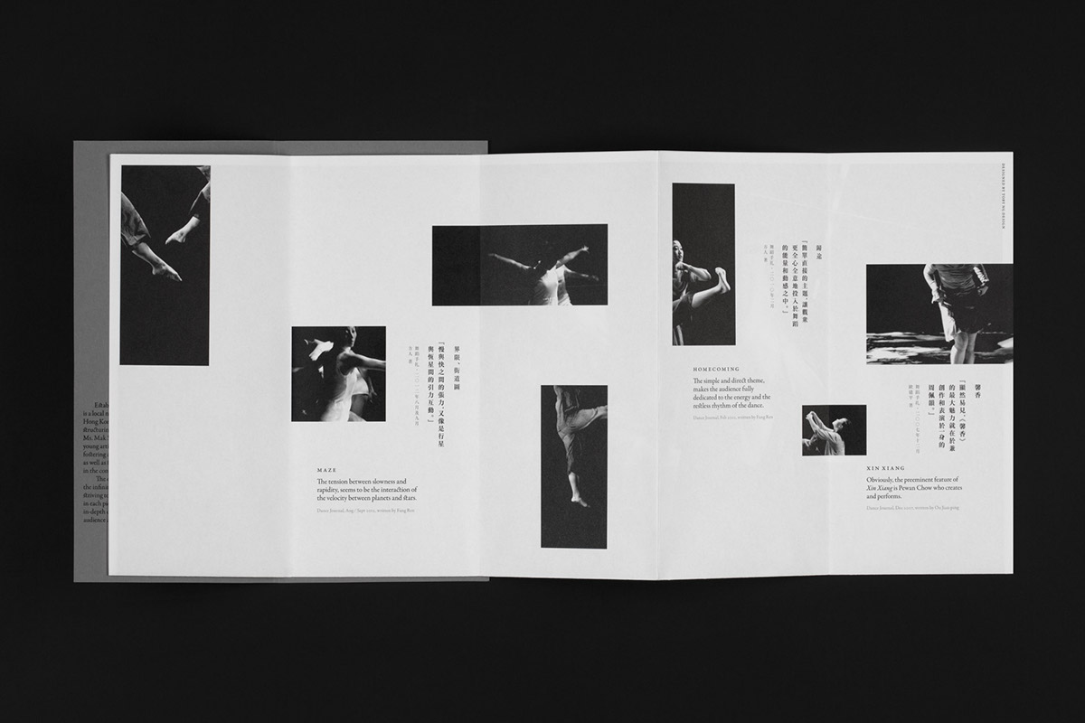
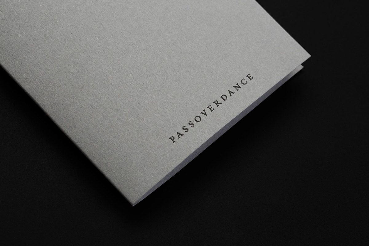
We were appointed to revise the brand identity and develop a printed brochure to redefine the brand position of the Hong Kong non-profit dance organization, Passoverdance. The company is dedicated to fostering and developing local dance. As the previous visual identity’s ‘calligraphy’ logotype was illegible due to its small size, a calligrapher rewrote the logotype and increased its proportions. Concurrently, we chose a monochromatic design direction with a premium finish for their printed brochure to highlight and differentiate the client from its competitors.