
PROJECT NAME:
OLEŚNICA CITY—REBRANDING OF VISUAL IDENTITY
OLEŚNICA CITY—REBRANDING OF VISUAL IDENTITY
BACKGROUND
—
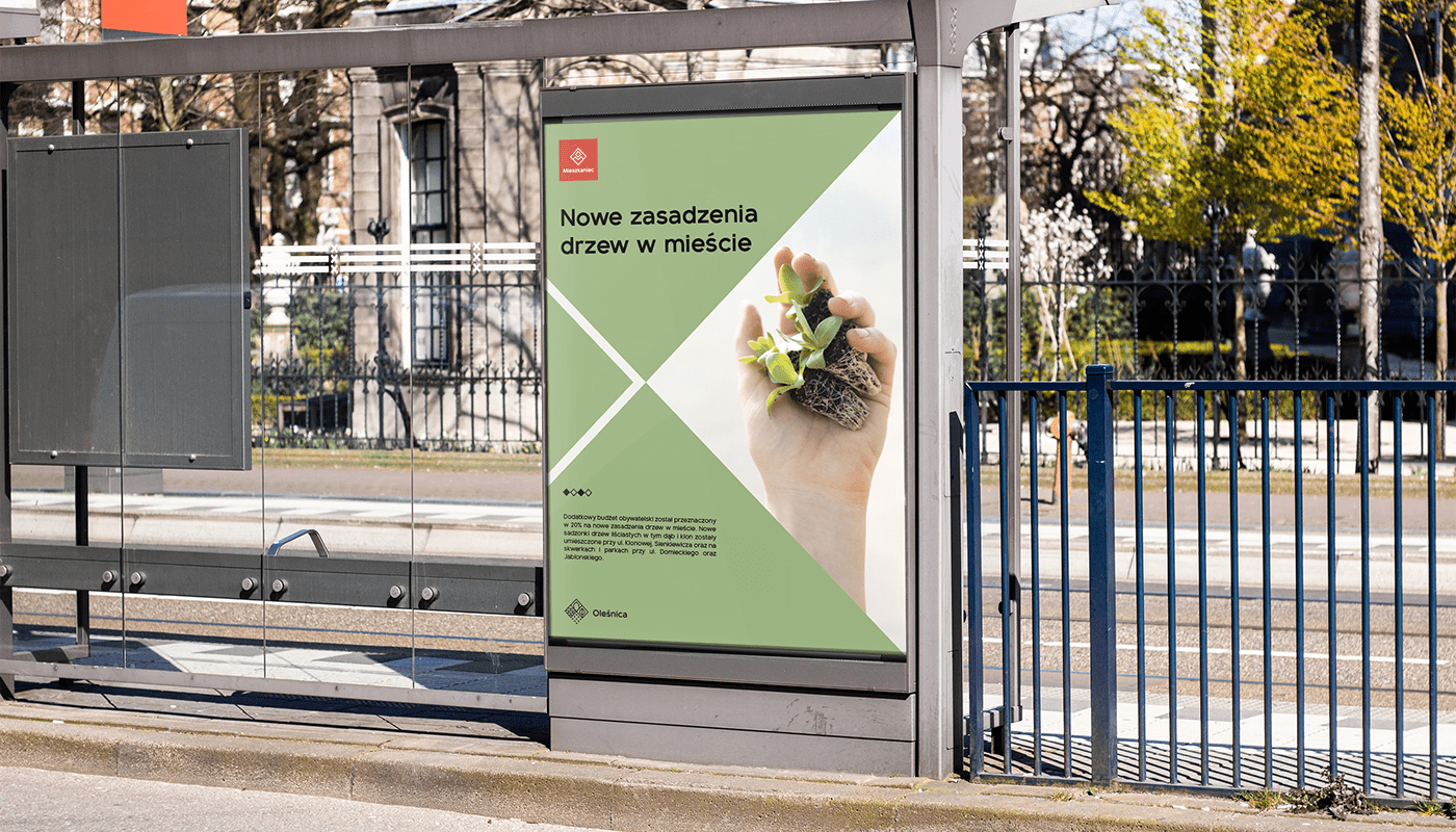
Rebranding of city visual identity with design of official new logo for internal and external promotion and communication.
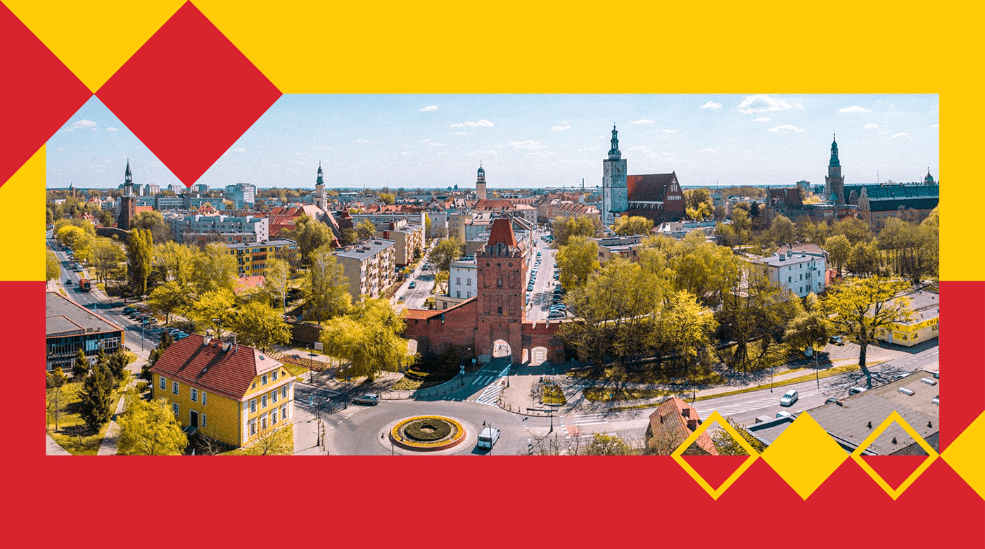
Oleśnica is one of the biggest and oldest city in Lower Silesia in south-western Poland. Located about 30 kilometers northeast of the Silesian capital Wrocław. It has been a stop on an important trade route to the Greater Poland region. Oleśnica is also an important place of economic, social, cultural and administrative life in Lower Silesia. The total population in Oleśnica was estimated at about 40.000 people.
PROBLEM
—
A long-standing problem with the creation of a functional and consistent system of visual identification and a graphic sign that would become the official symbol of the city. One of the main problems is the use of the coat of arms, which through numerous and detailed patterns created problems with readability and transparency on various levels.

SOLUTION
—
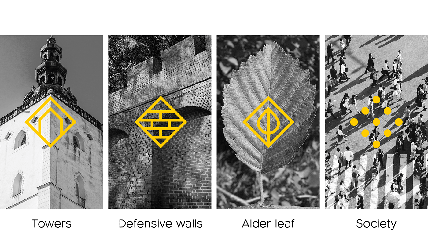
Creating a main sign that will be a symbol for promoting and depicting the city’s identity. Presenting the most important things that the city has. History, tradition, architecture, legend, society – these are the main elements that influence the existence and definitions of the city. An additional goal was to keep the corporate identity system simple, neat and universally replicable and expandable.
We have applied a division between the use of the coat of arms for official matters and the logo for promotional and communication purposes.

COLOURS
—
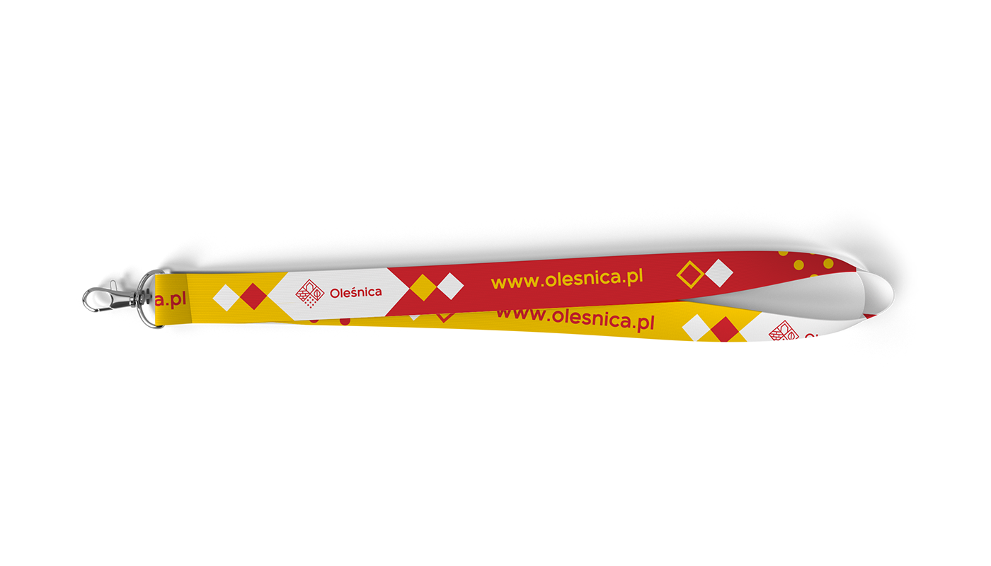
A color division was created to dedicated content for promotional materials with the city’s original colors – yellow, red and white. Monochromatic colors are associated with neutral and fixed graphic materials such as logos, basic documents.


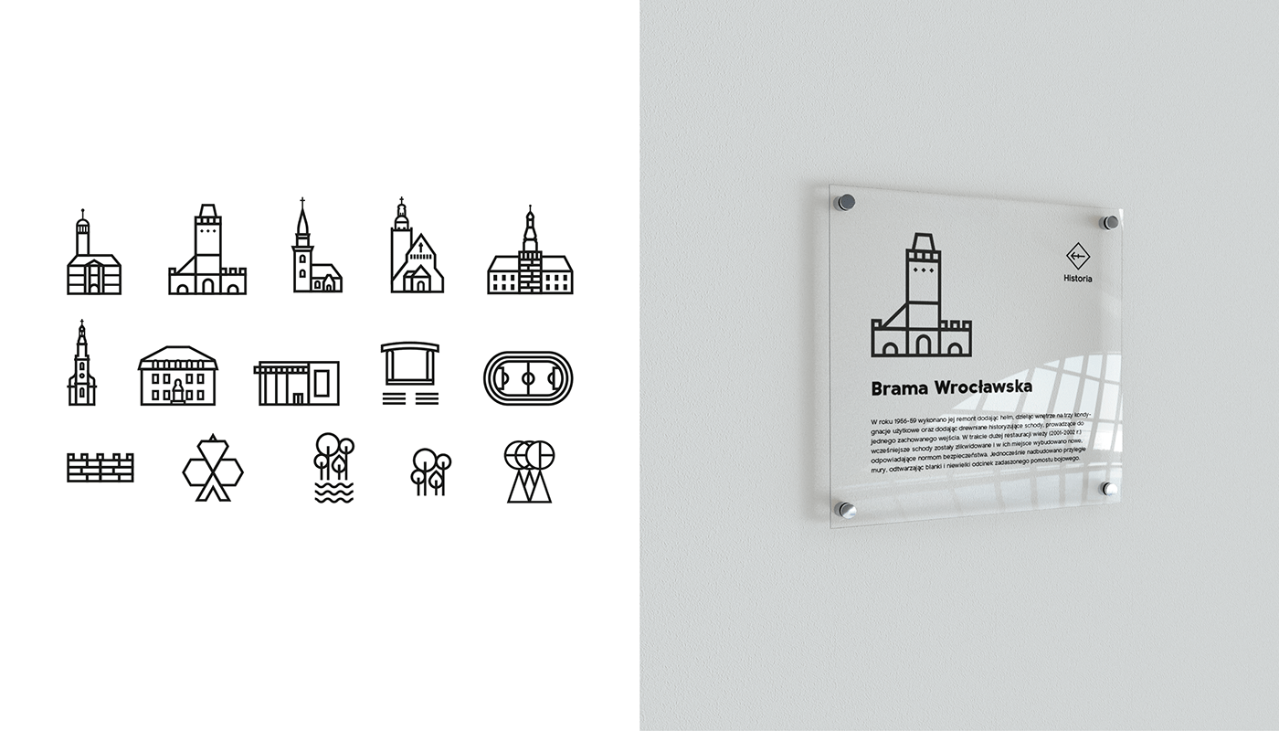
PICTOGRAMS SYSTEM
—
For the purpose of separation of zones and communication, pictograms have been designed to indicate which area an event or message belongs to. The pictograms are based on the shape and elements of the main Olesnica sign, so they relate to the visual identification system.

OCCASIONAL SIGNS
—
Depending on the needs, the lower open form of the pictogram can indicate the openness of the citizens of Olesnica. For example, for the Days of Europe there will be stars instead of dots, and for the celebration of the Great Orchestra of Christmas Charity – a heart.


CREDITS
—
Client: Municipal Office of the Oleśnica city
Year: 2018
Art Directions: Michal Ruchel
Designs: Michal Ruchel
Video: Cooperation with Nomono
Soundtrack: Notopop
Archival video scenes: Contrast Studio
Year: 2018
Art Directions: Michal Ruchel
Designs: Michal Ruchel
Video: Cooperation with Nomono
Soundtrack: Notopop
Archival video scenes: Contrast Studio


