
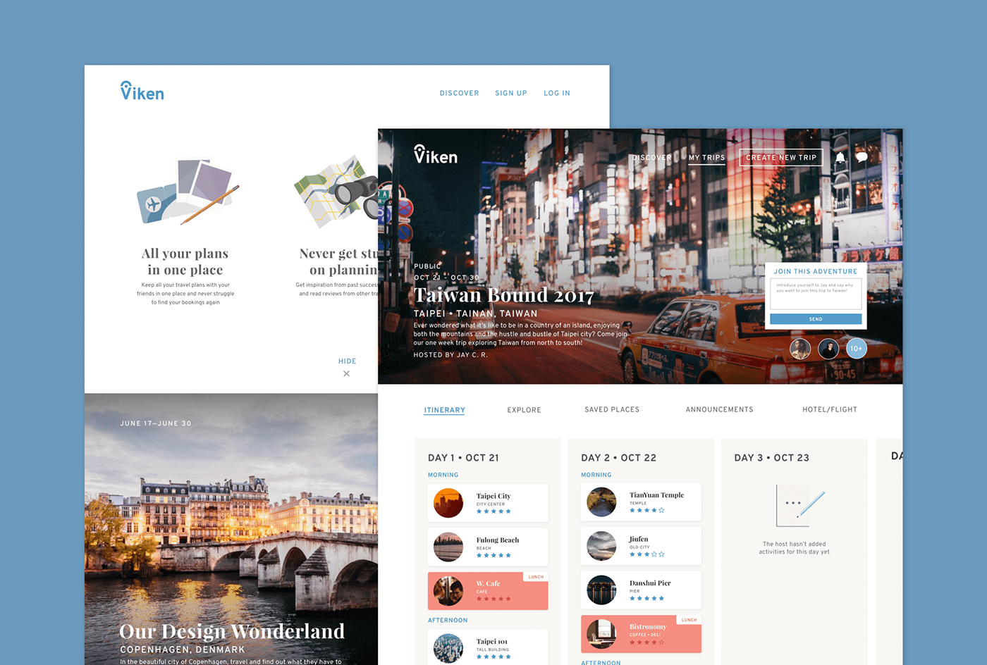
Viken is a simple and easy collaborative trip planner that allows you to keep all your trip details and bookings in one place. Not only can everyone on the trip see the newest update for the trip itinerary, they could also sync their flight and hotel details onto the page. To get inspired, users can save popular attractions to then organize into specific days in their itinerary. If they’re stuck on creating a whole new trip, explore itineraries of other’s successful trips, easily copy them and edit them to your liking with a simple click. Also meet new people with Viken, by requesting to join fun public trips that are happening soon.
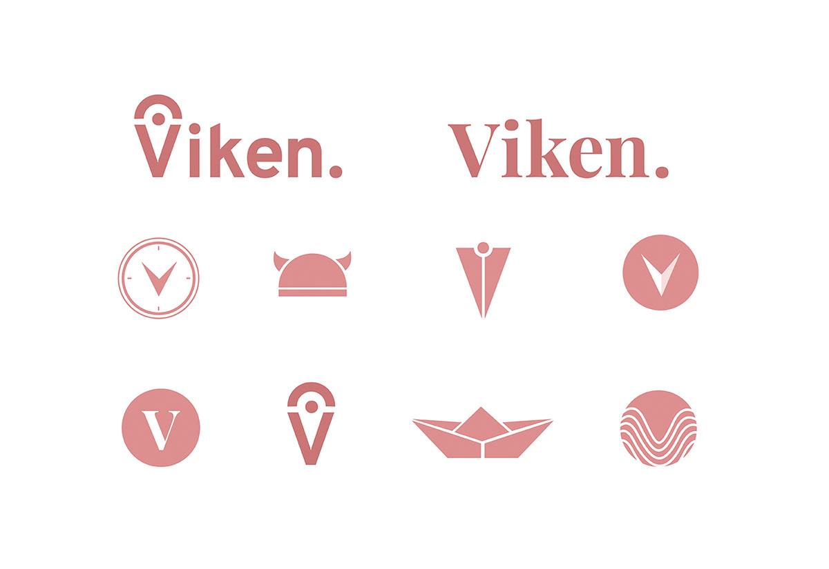
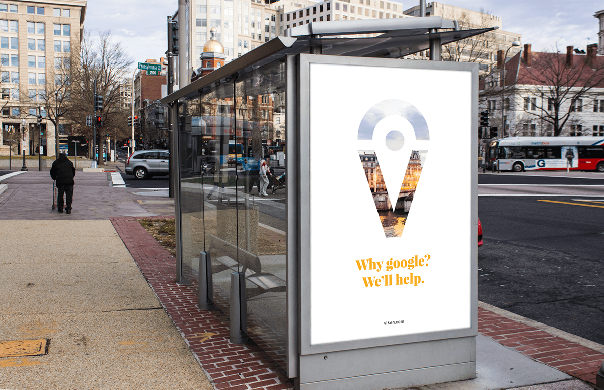
Viken was the origin for the name, Viking, and naturally, since they traveled and explored a lot, we named our app ‘Viken’. We experimented with different ideas for the logo, narrowing them down to the compass, the pin, and other various related icons such as the wave (or topography), the boat and the more obvious Viking helmet. In the end, the pin integrated with the V is chosen due to it’s simplicity and our focus on the destinations.
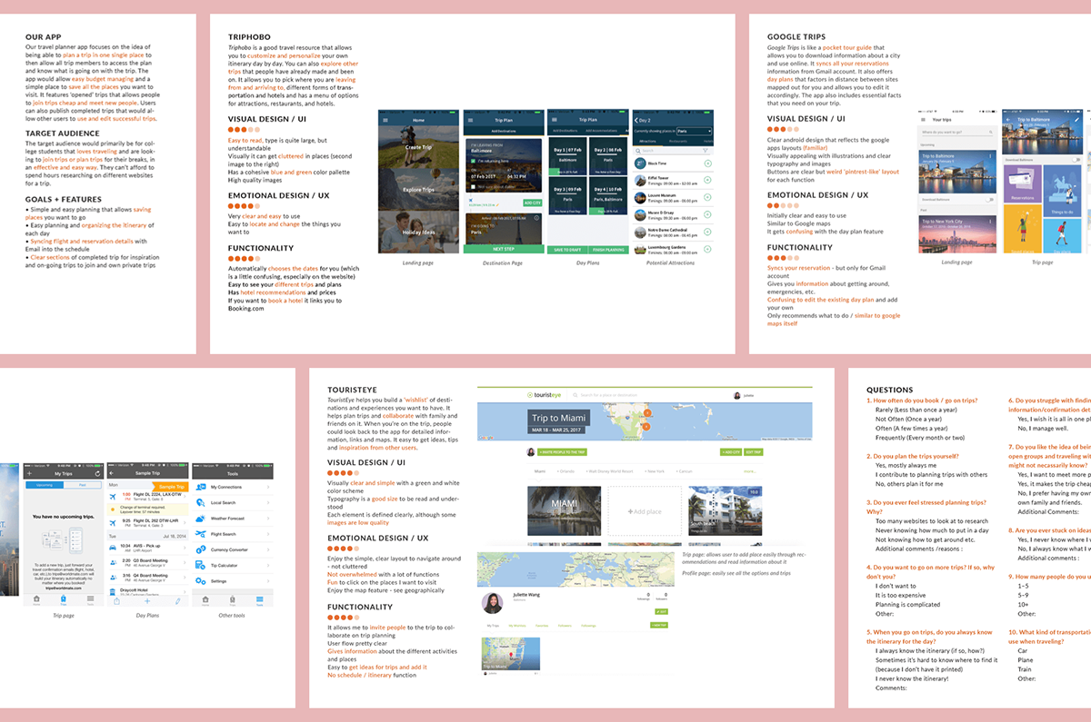
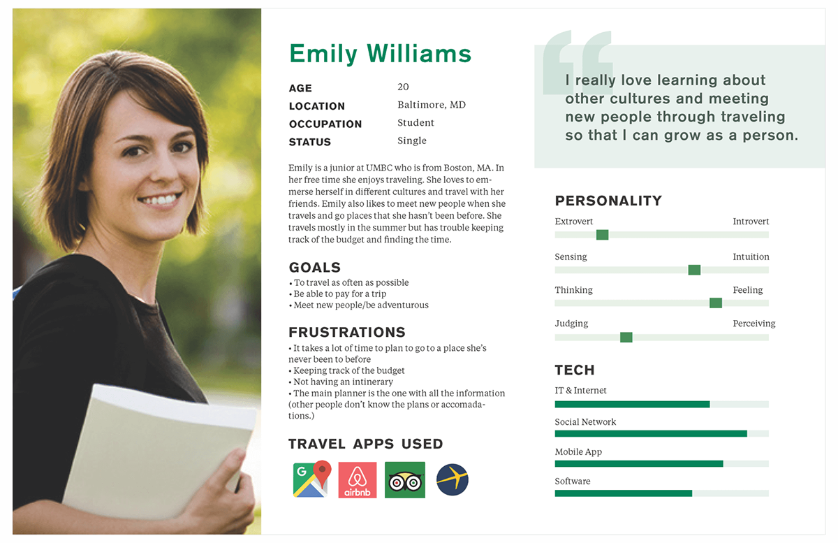
We started defining what function we want for our app, differentiating with existing competitors. After analyzing individual functions and aspects of other apps, it helped us understand what we want to improve and set for our app. We created an user persona to help us target our app to a more specific user, allowing us to focus on her goals and frustrations.

After weeks of researching, analyzing competitors and existing apps, developing personas and moodboards, we started looking at Use Cases. We explored how users would interact and go through to use the app and with that, we sketched out different ideas and came up with the initial wire frames. We carried on developing them, refining them and adding details through the next weeks.
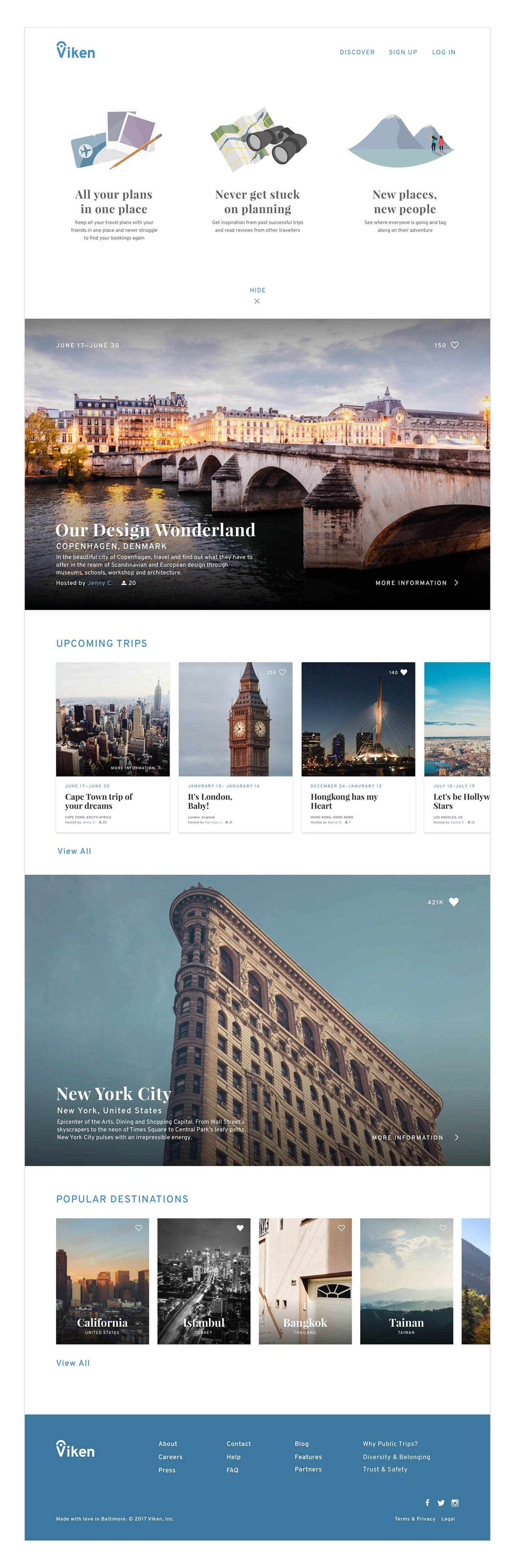
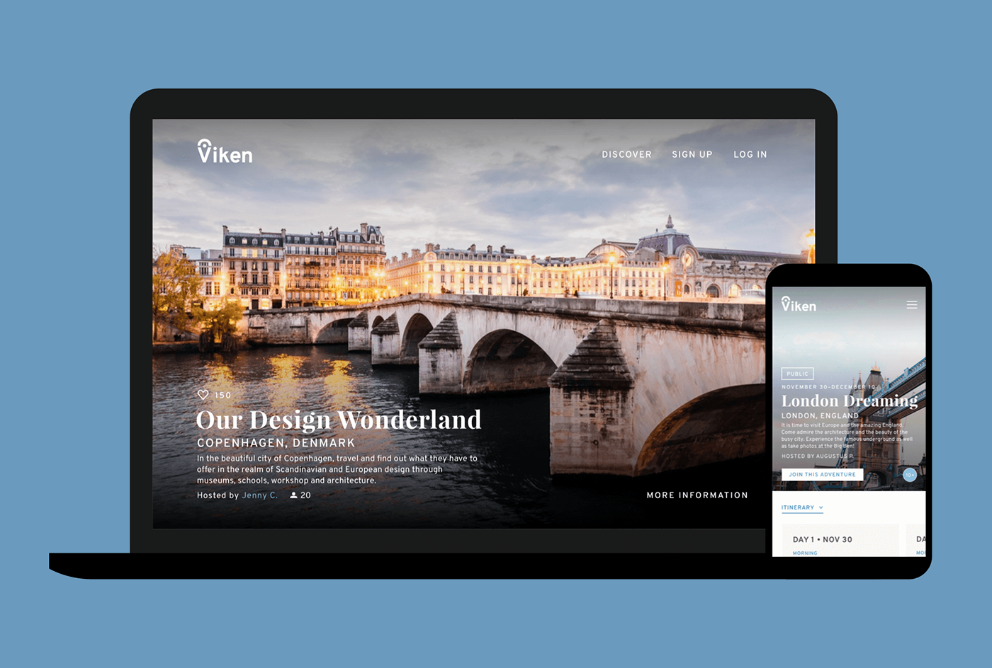
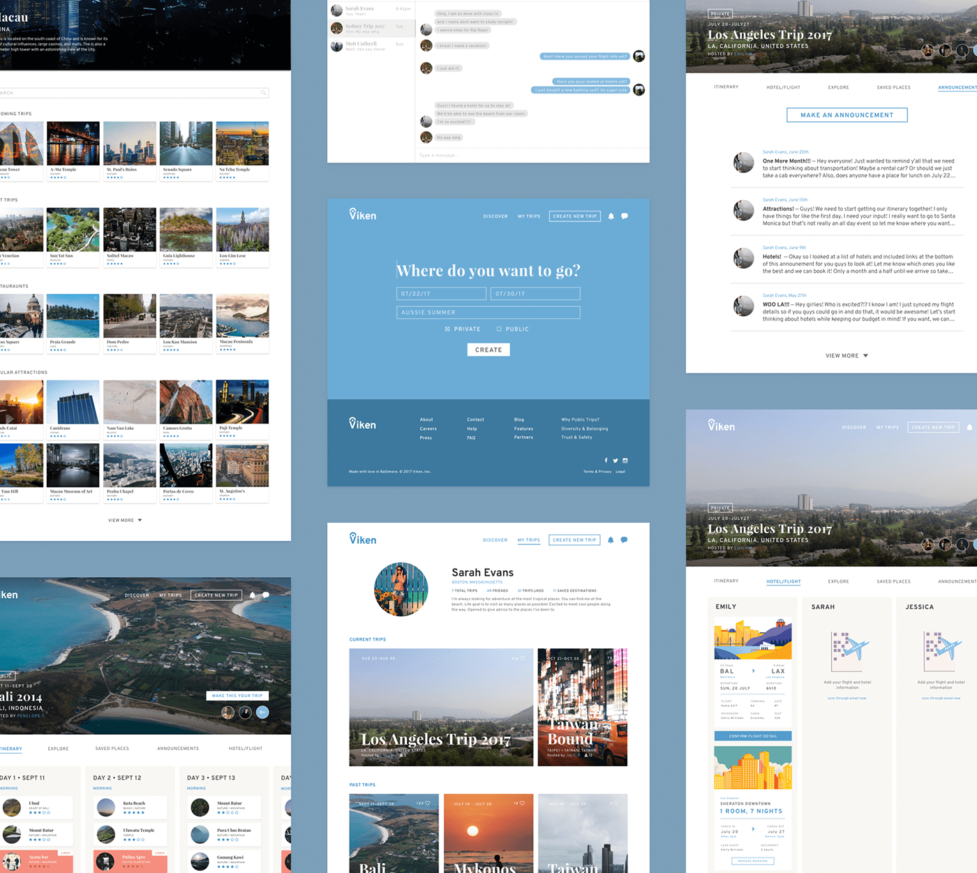
The purpose of the landing page introduces first time users to Viken, with a simple on-boarding of what the app is and how they could use the app. We have a hide option to close out the introduction for returning users and we didn’t want it to log cookies to not show it for returning users. The rest of the page provides the user a sense of what the app does and allows you to browse through various destinations in huge highlighted panels as well as cards of upcoming trips the user could go on.
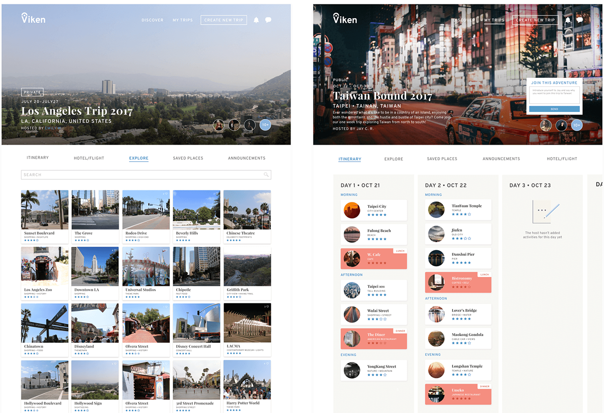
The Itinerary is the page the user would spend the most time on because it consists of the daily schedules for the trip, which are presented in cards of the individual days. This is organized into morning, afternoon, and evening activities; this helps avoid conforming to a tight schedule. Breakfast, lunch and dinner activities are highlighted to easily differentiate between food activities and other excursions. The message screen is also featured on the left which allows trips participants to easily discuss the trip whilst simultaneously looking at the trip plan.
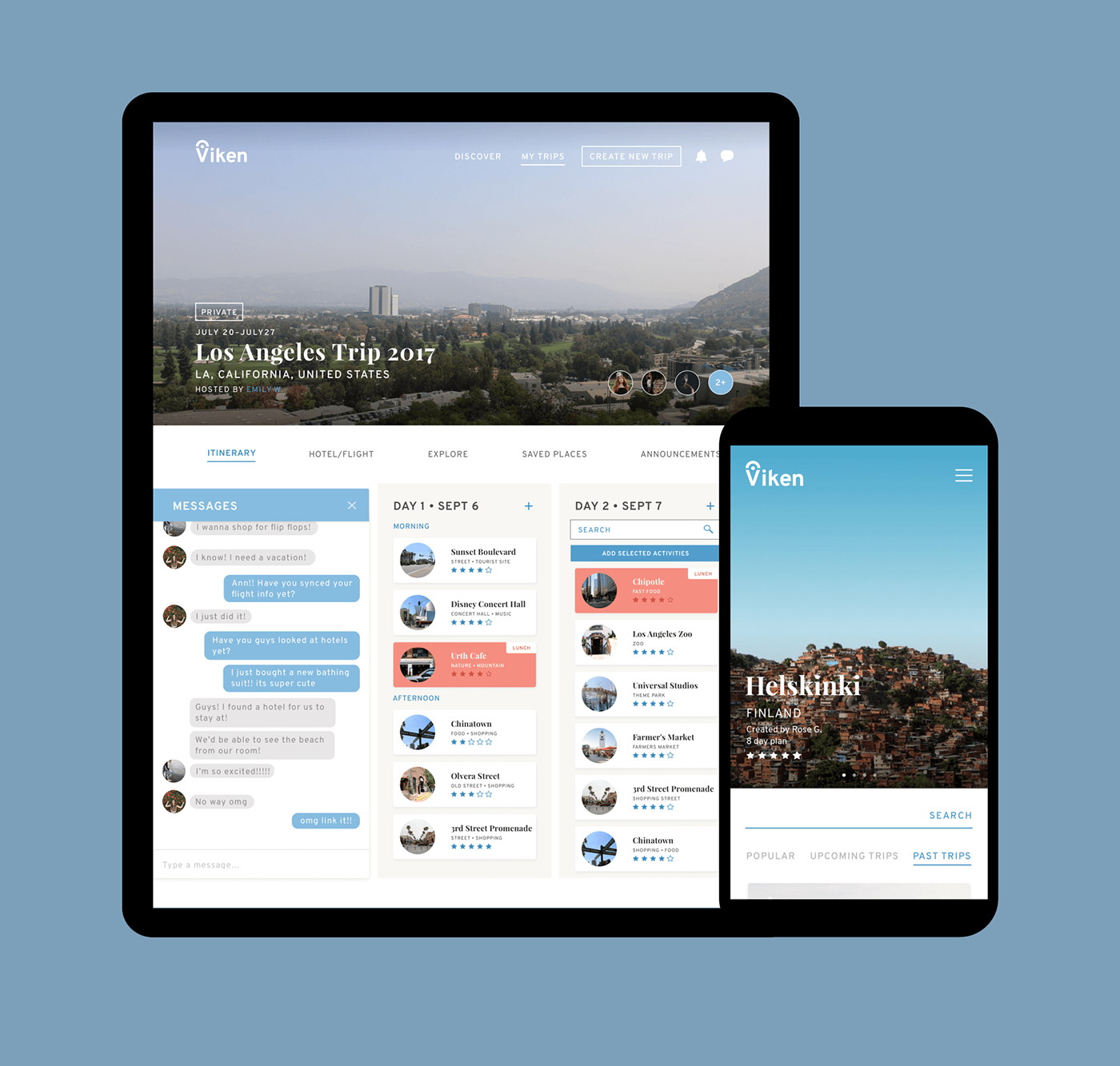
The other pages includes the explore pages, messages, create trip, announcements, flights/hotels, and profile page. They all follow similar patterns and serve their individual functions. The profile archives all the trips the signed in user has been to allow easy reference as well as going back to see their trip memories. We wanted messages to be a function in Viken to allow the conversation about the trips to be seperate from private conversations. The Announcement page allows admins to post important notices that may get lost within messages.
Additional Credits Rachel Dunn — Partner
Thank You!


