


Task
Develop an identity style, a series of brand carriers and a platform for further scaling the makeup brand of an artist Ekaterina Novinskaya.
About the project
Ekaterina Novinskaya works in London and cooperates with major world brands: Asos, Milusha London, Natsuko Tanaka, Avon. Her works are published by well-known and famous magazines: Interview, Boulevard, ETAGE, SNC, Teeth, ELLE, KING KONG and Vogue.
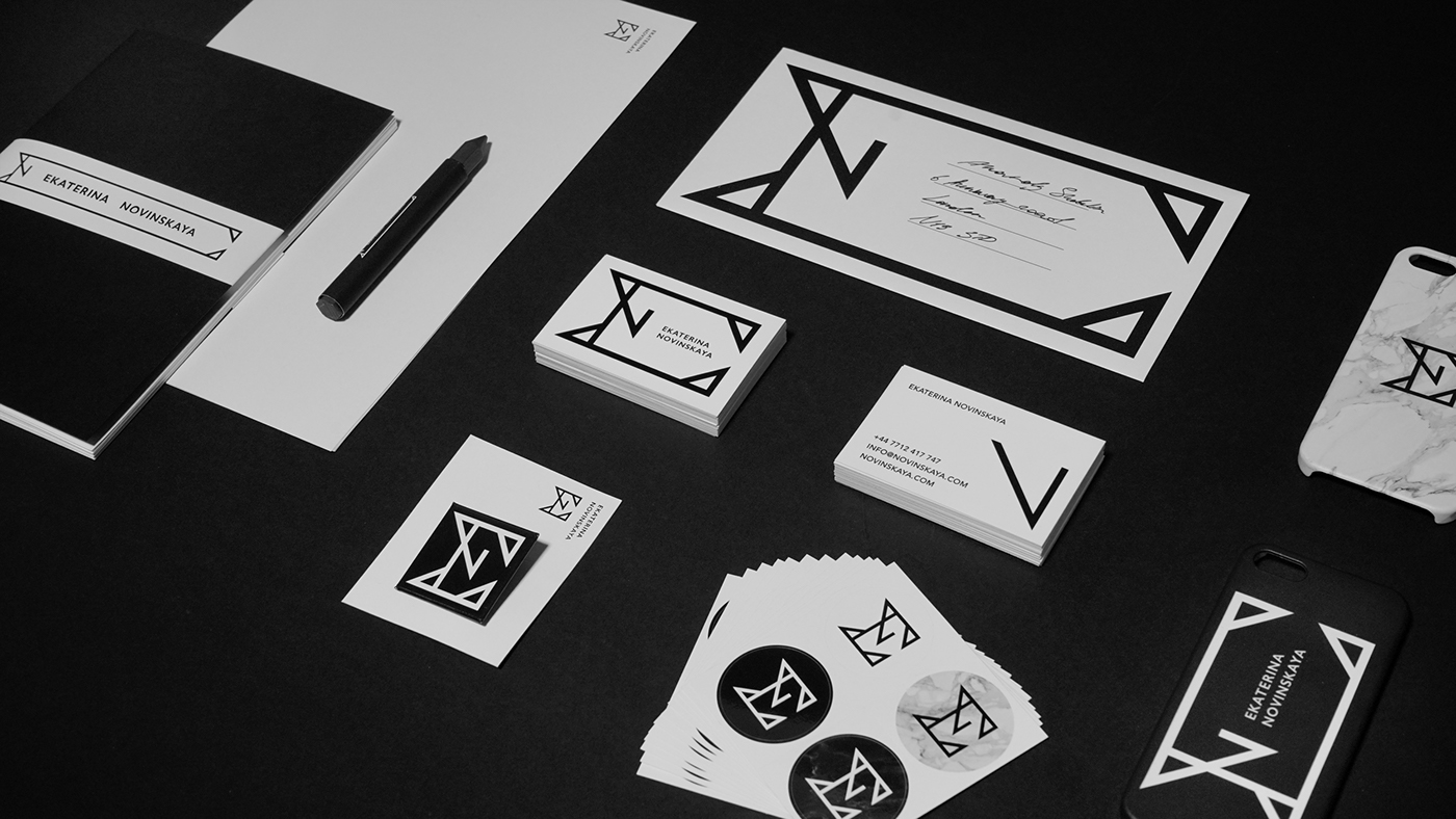
The construction of the sign is a ligature of the first two letters of the name and the surname «E» and «N». The sign has sharp angles and looks aggressive and sexy. The main font is «Gill Sans» - an iconic font developed by British designer Eric Gill in 1926. The font has good readability, both in small type sizes and in bigger ones. It is the classics of English design. In the original version, the sign is square, but it can easily be stretched horizontally, filling any complex format.


Creative-director: Pavel Simonov / Senior-designer: Anatoly Shabalin / Copywriter: Sofia Chukavina / Photographer: Veronika Romanova
Special thanks to Eugene Shishkin to introducing me to Ekaterina Novinskaya.
And thank you Audris Kezi for being a cool guy.
Made in Indyworks, 2016


