


Brief Summary
Semblant Sound, a startup sound engineer company approached me and asked me to create a brand identity that would help them gain more business and stand out amongst their competitors. They wanted a logo, business cards, invoice and order form and a email footer.


Brief Outcome
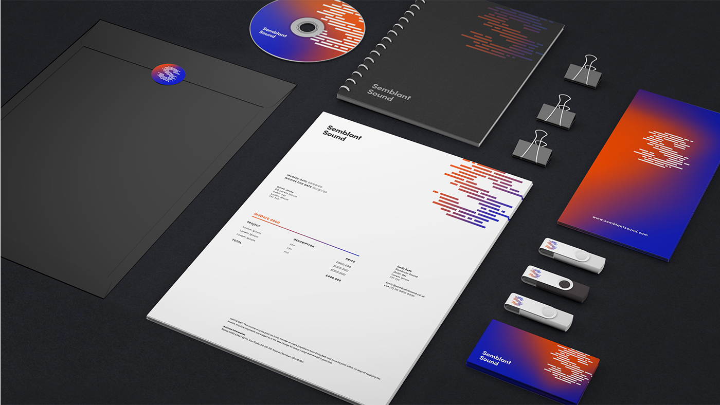
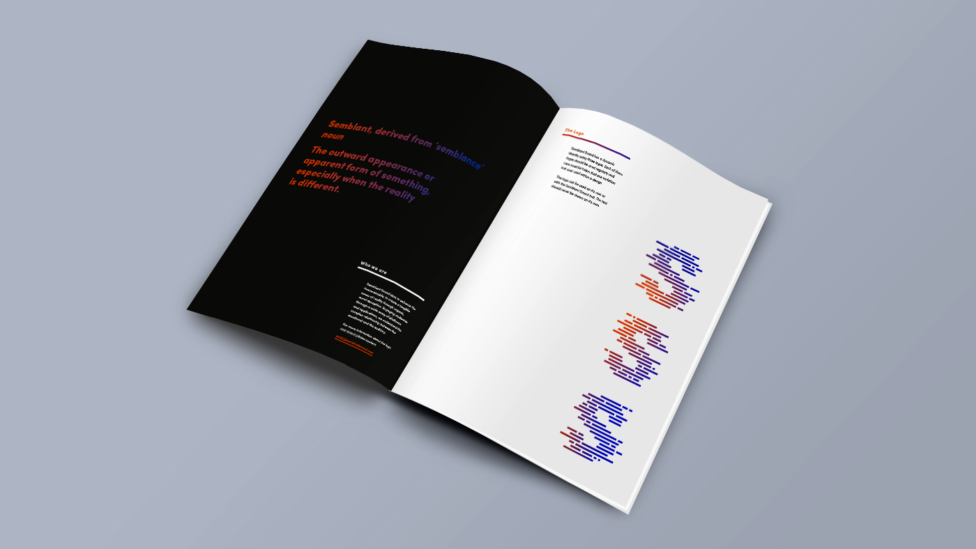
After speaking to the owner of the company I felt that the company needed a dynamic brand identity. I created a S logo based on a waveform, the strongest visual representation of sound. I created three separate logos that would slightly change as like sound the logo is constantly changing.
The colours are based on colour theory, I wanted the colours to be strong and vibrant not only to stand out but to show that even though the company is small it can work just as well as some of it's bigger competitors. The blue and orange are striking together but connotes determination, creativity, knowledge and integrity which summed up the business well. I chose to use these colours together in a moving gradient as the business is constantly changing due to the technological advancements within it's industry.
I then closely worked with a videographer to transform my logos into an animation in which the logo would move like a waveform. I then set up a website where the user controls the logo by moving their mouse on the screen. LINK HERE.
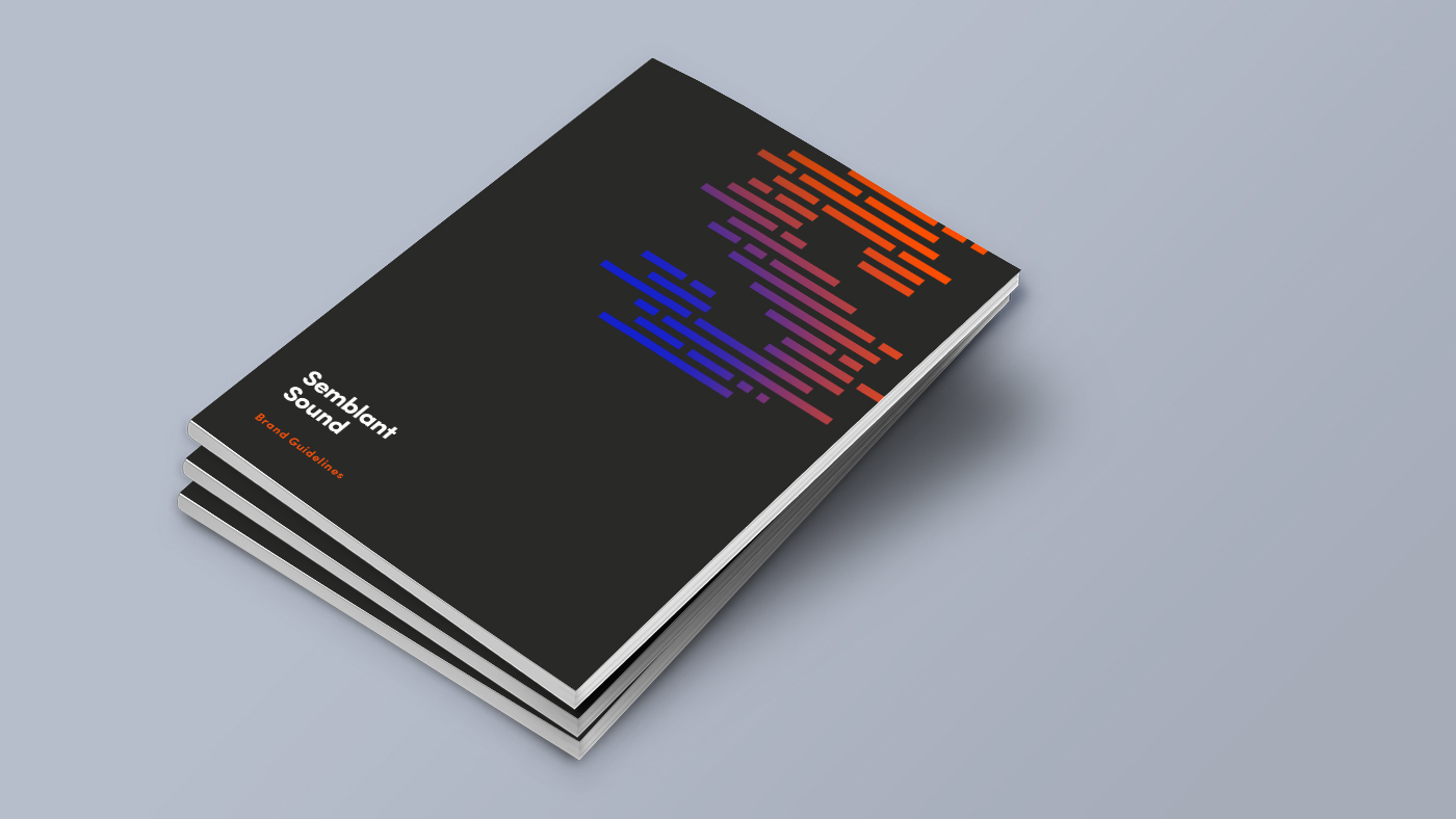
Semblant Sound was very happy with the logo, I also designed the stationary items that they asked for, a brand guidelines book to show them how to use there brand in the future and a few mockups showing how the identity can be used in the real world.


