


SEEDCORP | HO
SEEDCORP | HO began with the merge of SeedCorp and HO. Created in 2013 with the strategy of being an integrated platform for access to the agricultural market, which would bring the most appropriate options to the needs of farmers, SeedCorp began with the production and commercialization of seeds, market development and logistics, with the construction of warehouses in Mato Grosso and, then, offering seeds when farmers needed to plant.
HO, which began in Argentina in 2011 and established in Brazil in 2013, is active in the development of soybean germplasm in the country. The union of the two companies makes SEEDCORP | HO a complete service company, with a presence in all stages of the chain, offering the best options to producers all over South America.
A SEEDCORP | HO nasceu da fusão da SeedCorp e HO. Criada em 2013 com a estratégia de ser uma plataforma integrada de acesso ao mercado agrícola, que trouxesse as opções mais adequadas às necessidades do agricultor, a SeedCorp teve início com a produção e comercialização de sementes, no desenvolvimento de mercado e, então, em logística, com a construção de armazéns no Mato Grosso e, assim, ofertando sementes na hora que o agricultor precisa plantar.
A HO, que nasceu na Argentina em 2011 e se estabeleceu no Brasil em 2013, tem atuação no desenvolvimento de germoplasma de soja no País. A união das duas empresas torna a SEEDCORP | HO uma empresa completa, presente em todas as etapas da cadeia, oferecendo as melhores opções ao produtor em toda a América do Sul.

The main objective of this project is to unite the two companies to generate a new brand without harm the identity and history of each one.
To come to a solution without generating strangeness, we have adopted a conciliatory name to explain the strength of these brands. The strategy of blending names to create a new one maintains loyalty to their origins.
From there, the way was open to take advantage of the qualities acquired by the brands and to correct some problems so that we can present a modern brand and represents all the characteristics of the business.
O objetivo principal desse projeto é unir as duas empresas para gerar uma nova marca sem por em risco a identidade e a história de cada uma.
Para chegar a uma solução bem aceita sem gerar estranheza, adotamos um nome conciliador para dar conta da fortaleza dessas marcas. A estratégia de misturar os nomes para criar um novo mantém a fidelidade às origens.
A partir daí, abriu-se o caminho para aproveitar todas as qualidades adquiridas pelas marcas e corrigindo alguns problemas para que pudéssemos apresentar uma marca moderna e que representasse todas as características do negócio.

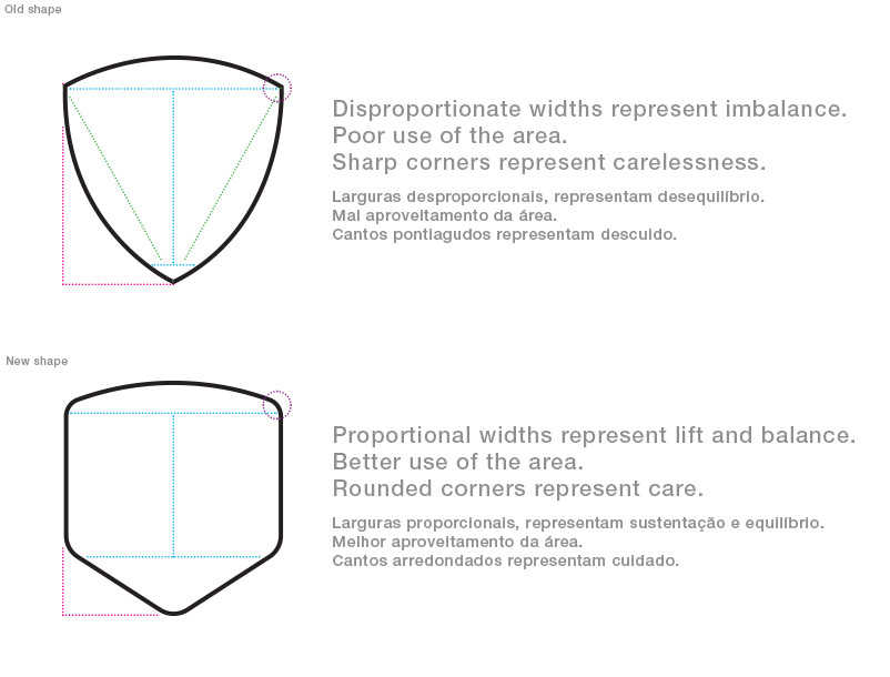
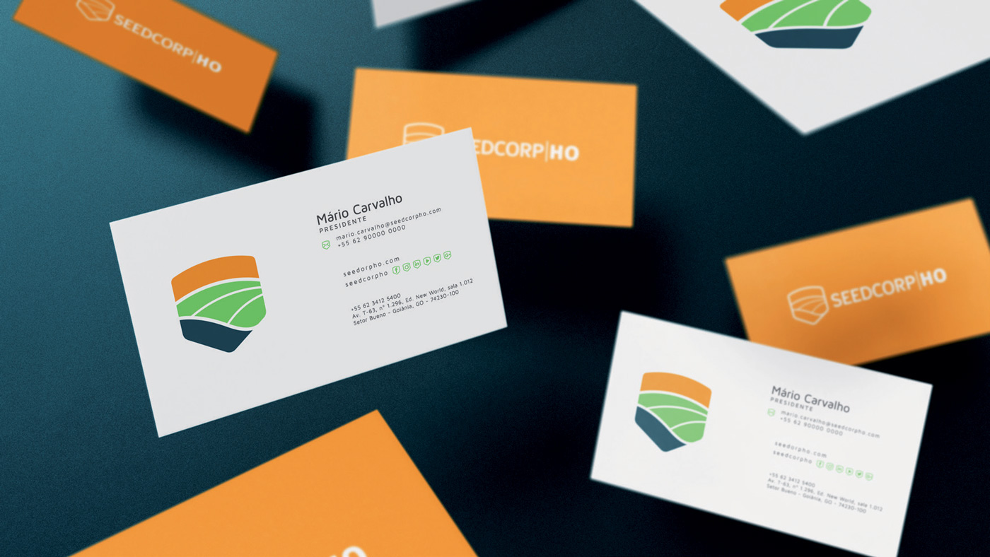
The maintenance of the shield is necessary because the symbol is already known. However we suggest a modernization to correct some formatting flaws, too much information and the difficult to apply and read in reduced sizes. The modernization of the brand is the opportunity to communicate an identity of its own, with new values, meanings and connections. Therefore, the new symbol becomes something larger, with a more uniform basis to support the entire strength of the company with more balance than the previous brand.
A manutenção do escudo é necessária pois o símbolo já é conhecido no meio. Porém sugerimos uma modernização para corrigir algumas falhas no formato, excesso de informação e dificuldade de aplicação e de leitura em tamanhos reduzidos. A modernização da marca é a oportunidade de comunicar uma identidade própria, com novos valores, significados e conexões. Por isso, o novo símbolo se torna algo maior, com uma base mais uniforme para sustentar toda a força da empresa com mais equilíbrio que a marca anterior.


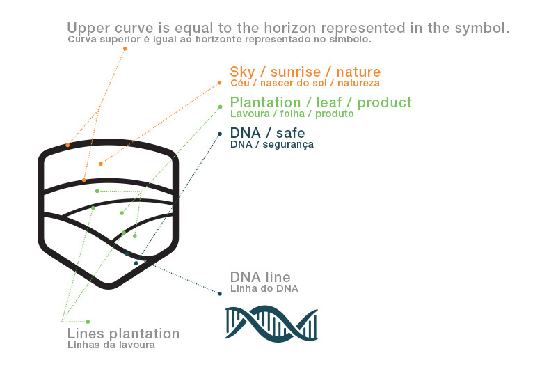
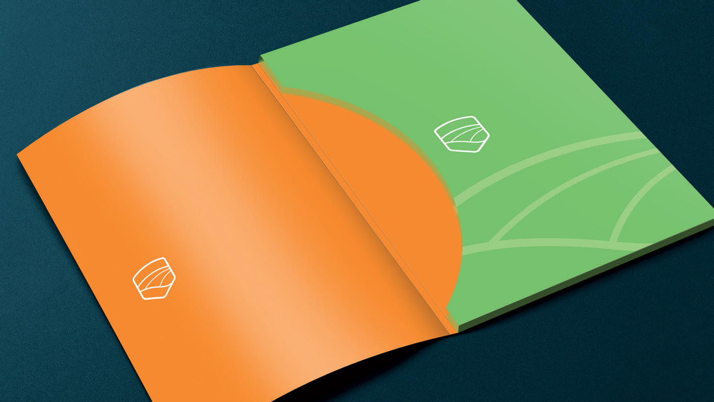
Each visual information has a specific reason. Keeping some characteristics, but with more visibility, we have the upper part (orange) representing the sky, the crop is represented by the middle part (green), and the brand DNA is in the base of support (blue) to highlight values and all which both companies carry as a tradition. In this way, in addition to highlighting what matters most, the shield gains greater applicability and facilitates application in specific materials.
Cada informação visual tem um motivo específico. Mantendo algumas características, porém com mais visibilidade, temos a parte superior (laranja) representando o céu, a lavoura fica representada pela parte intermediária (verde), e o DNA da marca fica na base de sustentação (azul) para destacar valores e tudo aquilo que as duas empresas carregam como tradição. Dessa maneira, além de evidenciar aquilo que mais importa, o escudo ganha maior aplicabilidade e facilita a aplicação em materiais específicos.


It is extremely important that we represent the new identity whenever it is necessary to pass on information related to the new brand. For external materials such as social networking and location, for example, we will always use the new shield to existing symbols (facebook, instagram, ...). For internal communication, we will use symbols also involved within the new shield, but guarded with the new DNA.
É de extrema importância que representemos a nova identidade sempre que for preciso passar alguma informação relacionada à nova marca. Para materiais externos, como redes sociais e localização, por exemplo, iremos utilizar sempre o novo escudo para envolver os símbolos já existentes (facebook, instagram, etc). Para a comunicação interna, utilizaremos símbolos também envolvidos dentro do novo escudo, porém guardados com o novo DNA da marca.


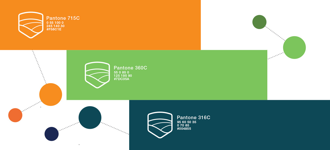
The institutional colors were maintained, however in new tonalities, with changes for better application and harmony between them. At tonalities of the new palette to be adopted will be better explored and will demonstrate greater synergy, allowing the application in any type of media, printed or digital.
As cores institucionais foram mantidas, porém em novas tonalidades, com mudanças para melhor aplicação e harmonia entre elas. As tonalidades da nova paleta a ser adotada serão melhor exploradas e demonstrarão maior sinergia, permitindo a aplicação em qualquer tipo de mídia, impressa ou digital.


.............................................................................................................................
CREDITS
AGENCY
Inédita Comunicação Integrada - www.ineditacomunicacao.com
MY JOB
Creative Direction / Brand Design
Thanks! ;)


