In January Interbrand Milan rebranded Juventus football club. I, among many others, felt it was wrong for the club and football as a whole.
Italy’s oldest and most successful football team. They completely changed the overall brand. The new visual identity, titled Black and White and More, is intended to help the brand grow in presence as the club explores new business initiatives less directly related to football. However, club fans were quick to disparage the rebrand on social media. Some complained the new logo is too anonymous and corporate.
“The new logo tells me this is the Juventus brand and we are customers, not fans.” Wrote user @JuventusCrazy
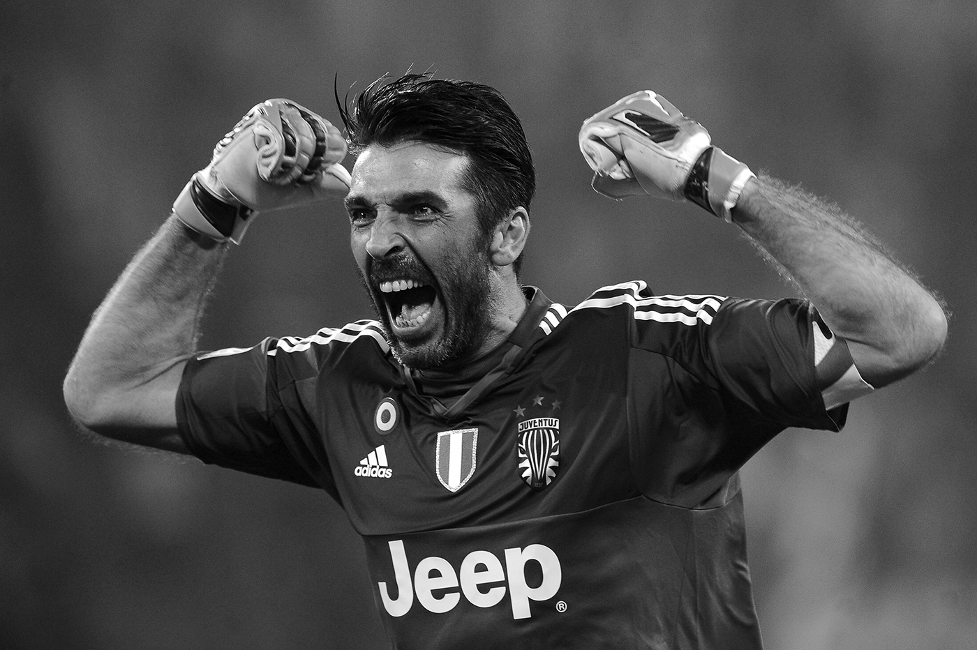
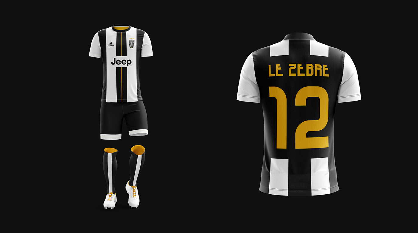
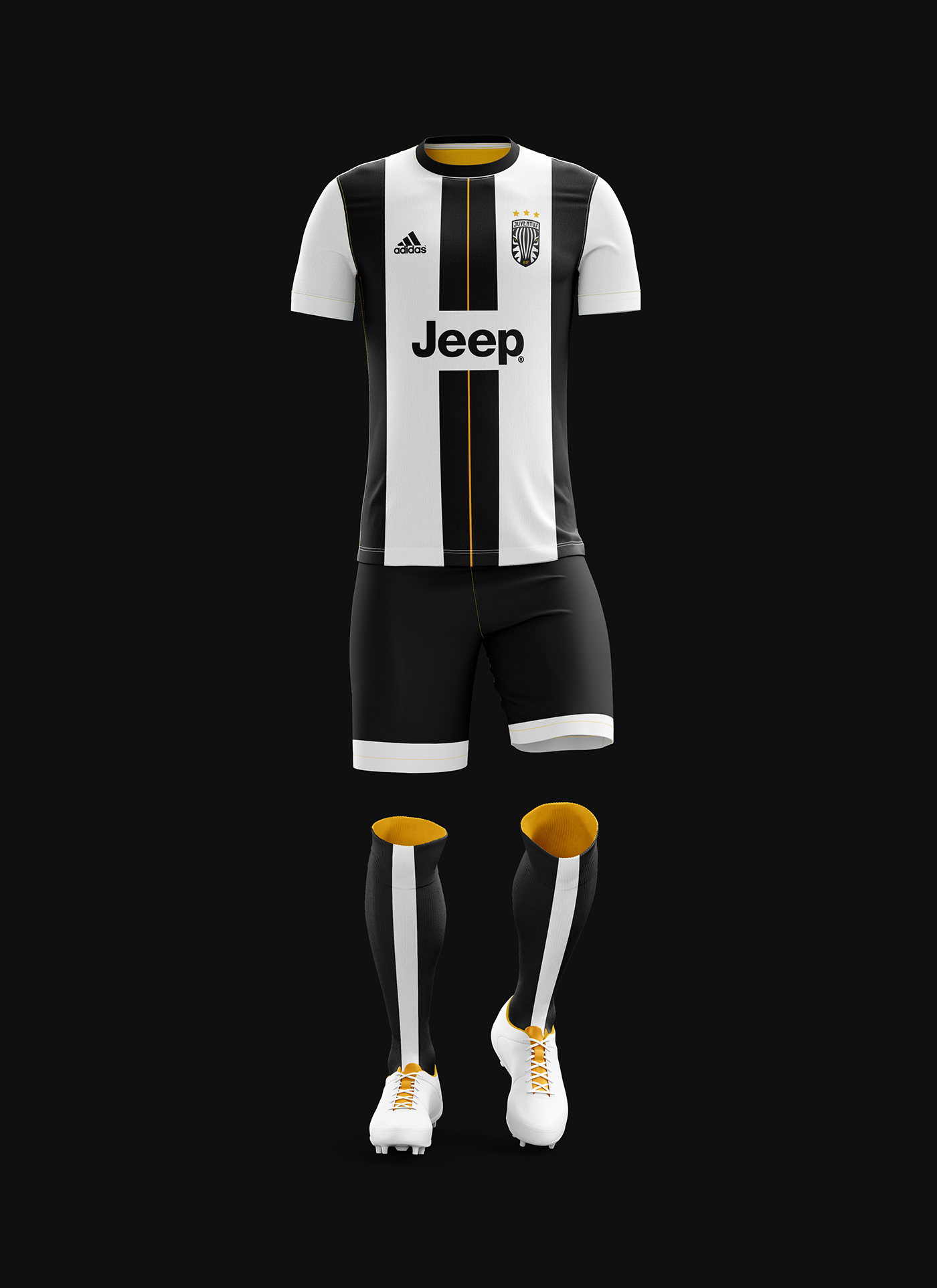
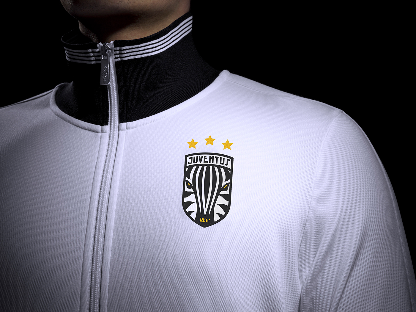
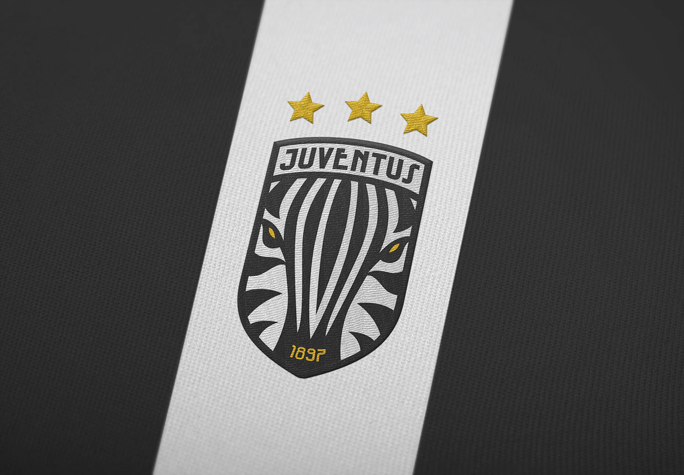
I wanted to centre the brand around the fans and bring the club to focus on what's important to them. Using the nickname for the fans ‘Le Zebra (The Zebras)’ which is because of the kit and how they look when all together in the stands. Using the imagery of zebra’s in the logo mark and branding.
The campaign is built on the concept of ‘12 vs 11’. In football, the fans are often referred to as the “12th man”. There has been a great deal of public debate surrounding ticket prices, money, and profit within football, with a number of people pointing out that “We’re fans, not customers.”
“12 vs 11” is showing the brilliance, passion, and strength that the Juventus fanbase (Le Zebre) have. By rebranding the logo as a zebra, it goes back to the heritage when a Zebra was a mainstay in the logo. It also represents the fans and puts them over the heart of each player. The campaign shows how much a part of the team the fans are, and how they are the difference makers, the spark that makes Juventus the most successful club in Italy.