


Prêt à Lire, is an editorial company that focuses on fashion. The name comes from well known frase used in the fashion industry during the 50’s “Prêt à Porter” (ready to wear). From this frase the word “Porter” was replaced with “Lire” (read) which leaves us with the name Prêt à Lire.
The creation of the logo was inspired by patterns used to create clothing. Three different patterns were chosen in order to give the logo a harmonious look and divid it into 3 parts. Each word in the name is applied inside its own pattern using the typeface Univers, a typeface created in the 50’s.
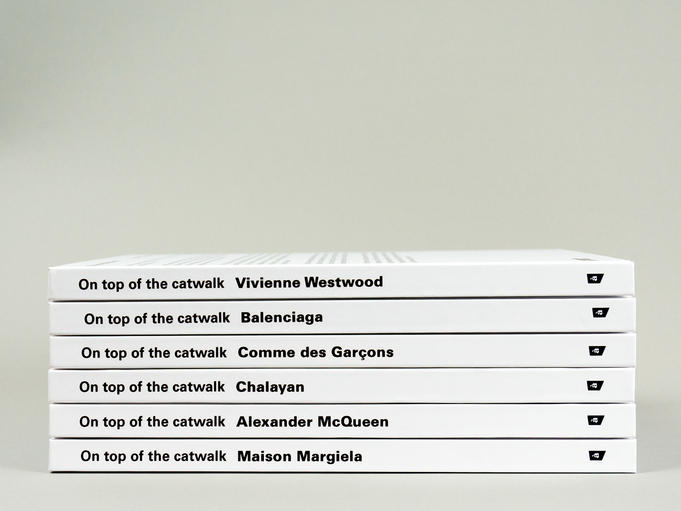
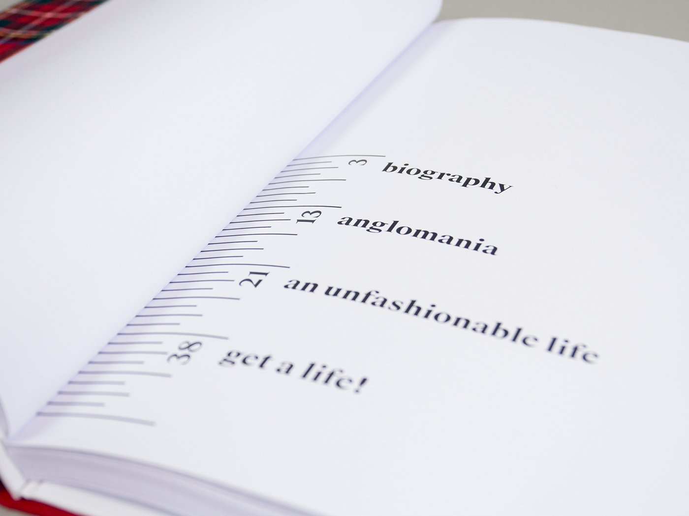
A collection of 6 books has been created that show exactly what the publisher is about.
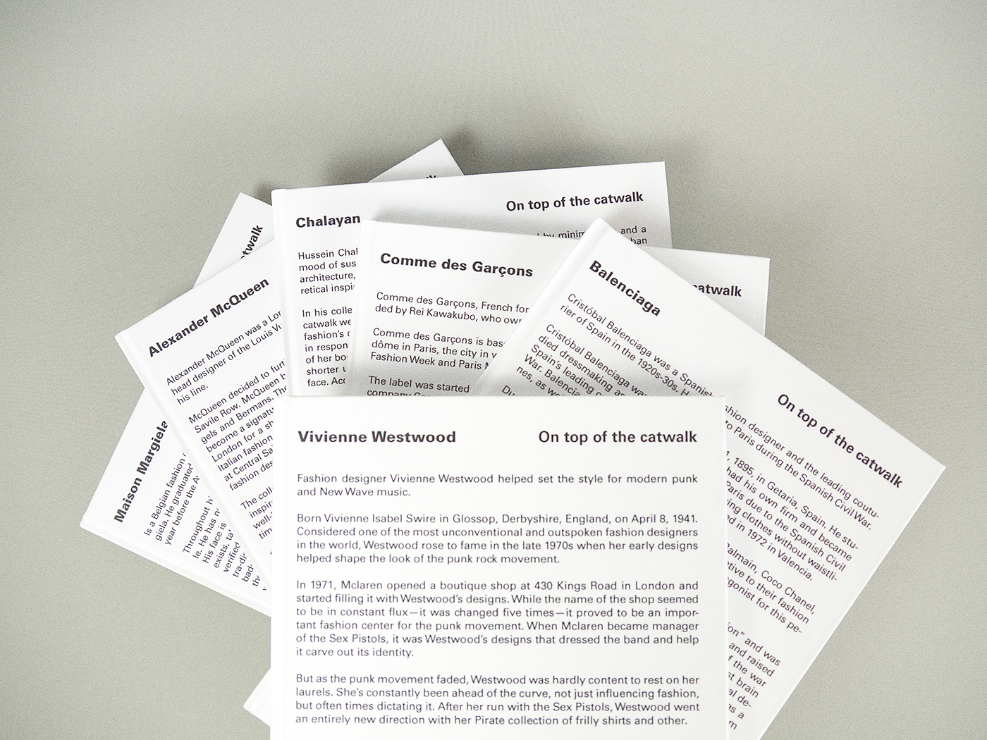
These books are biographies on 6 different designers that take their designs to a different level: Vivienne Westword, Balenciaga, Comme des Garçons, Maison Margiela, Alexander McQueen and Chalayan. The name of the collection is On Top of the Catwalk, this name was selected due to the subjects being on a different level compared to other fashion designers.
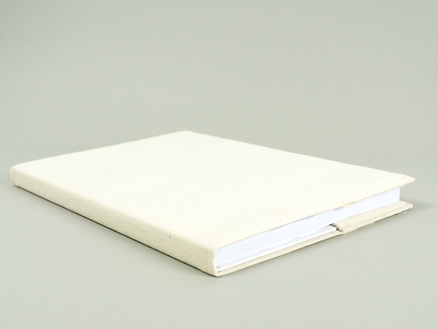
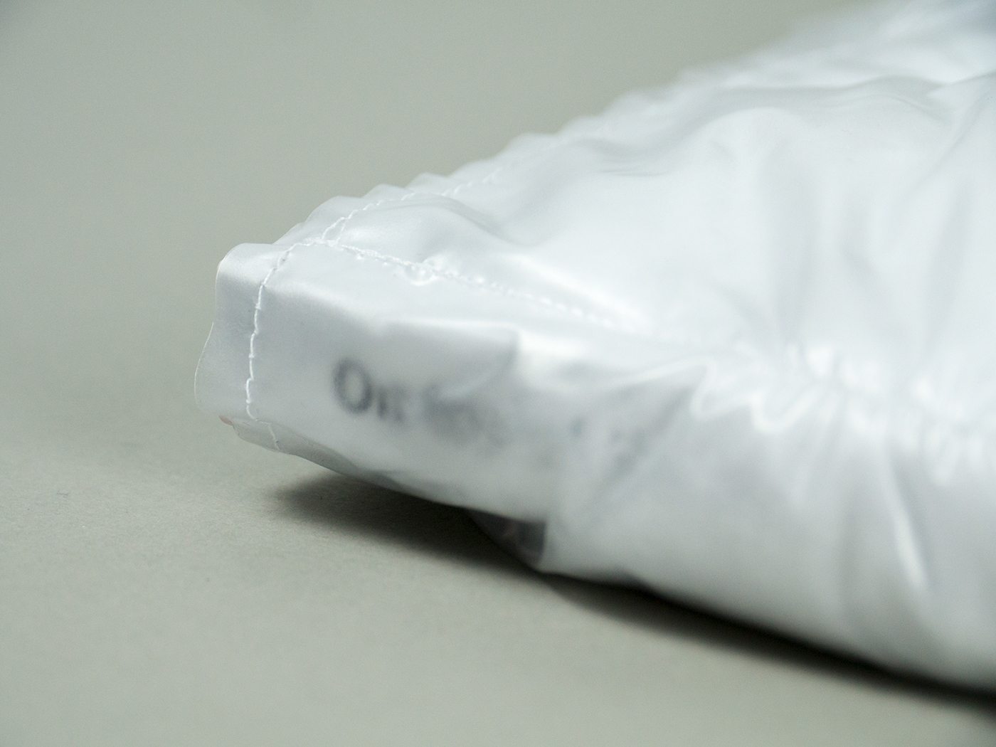
For the covers a different approach has been taken. Instead of applying an image of the designer, an introductory text has been used, Prêt à Lire. Then each book has its own sleeve made from a specific material used frequently by the designers.
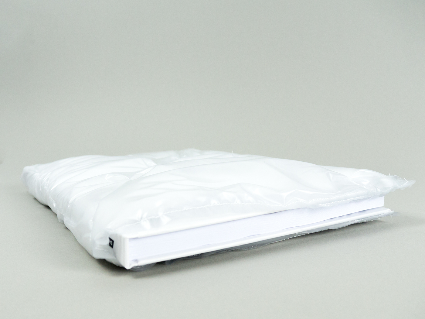
Finally each book comes wrapped up inside its own box, just like when one purchases a luxurious garment. These books are luxurious pieces of timeless fashion.
Moltes gràcies – Muchas gracias – Thank you


