Akayama focused itself as a wood home decor company that mainly provides wood frame products to its audience. Derived from “Aktualisasi Karya Bersama”, the brand aims to highlight the exercise of cohesion to manifests the presumed outcome.Akayama is also a subsidiary company of PT Daisen Wood Frame, that has been exporting and importing goods to Japan for more than 20 years.
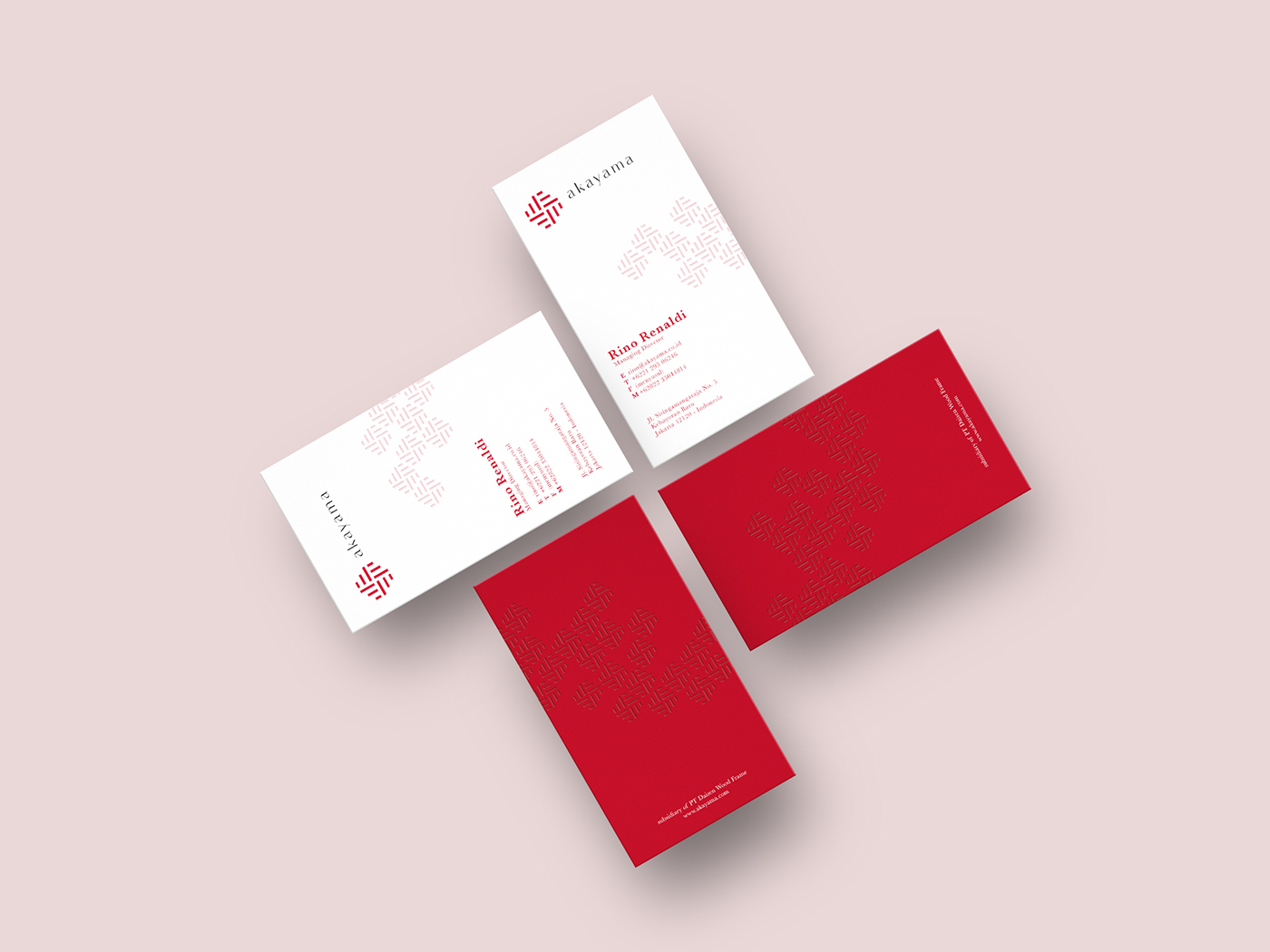
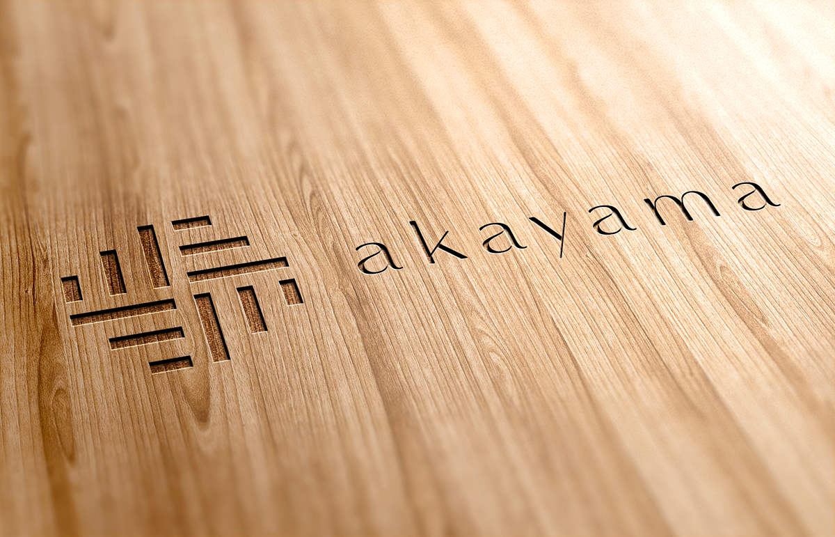
Inspired by the narrative, we fabricate a webbing impression on the logogram that is harnessed mainly in the application.The strong, closely woven method is oftentimes utilized on Japanese and Indonesian customary craftwork, such as on the making of tatami and traditional mat (tikar).The red color comes from the word “Aka” which means red in Japanese. Psychologically, it also symbolizes passion, which is inline with Akayama’s fundamental ethos: the creation of cohesiveness.

Letterhead.

Business cards.

Brochure.

Brochure.

Screensaver.

Embossed on wood.


