


RYNKEBY JUICE RE-DESIGN
I was given the task to re-design the on-the-go products from Rynkeby
which included 250ml and 500ml juice cartons and 500ml PET bottles.
The product range included orange, apple and multi juice (pineapple, orange and apple).
You can see the apple and orange variants of the old design in the top image.
The client wanted a design that stood out in the cooler
and challenged the standard – and sometimes a bit conservative – design on juice products.
I did two different takes on the design; a clean modern look and a Rynkeby retro look.


For the clean modern look I did my own fruit prints to challenge the photo based standards of juice box design
CLEAN MODERN
I wanted a clean and crisp look with a different and fun way of showing the variant.
The fruit prints give the design a playful character that fits the product – while the consistant use of colour gives it a modern touch.
The variants are easily decoded with the bright colours that match the flavour.
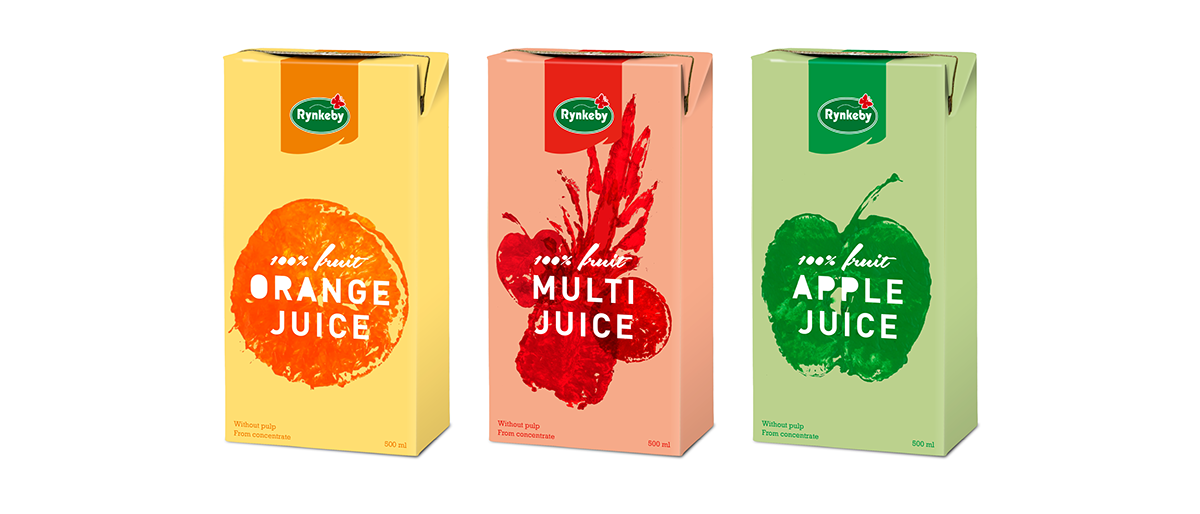

First image – the 500ml carton of each variant
Second image – all the sizes of each variant lined up together


I took inspiration in the company's great and loving history of juice making in Denmark
RYNKEBY RETRO
Rynkeby is a household name in Denmark and was established in the small town of Rynkeby
in 1934 by Inger Rasmussen a housewife who took a one-day course in juice manufacturing.
Most people recognize the old design on their juices – which is still used on their "æblemost" bottle today – and the slanted sash logo.
So with inspiration in this old design I created a modern version for the on-to


First image – the 500ml carton of each variant
Second image – all the sizes of each variant lined up together

THANK YOU


