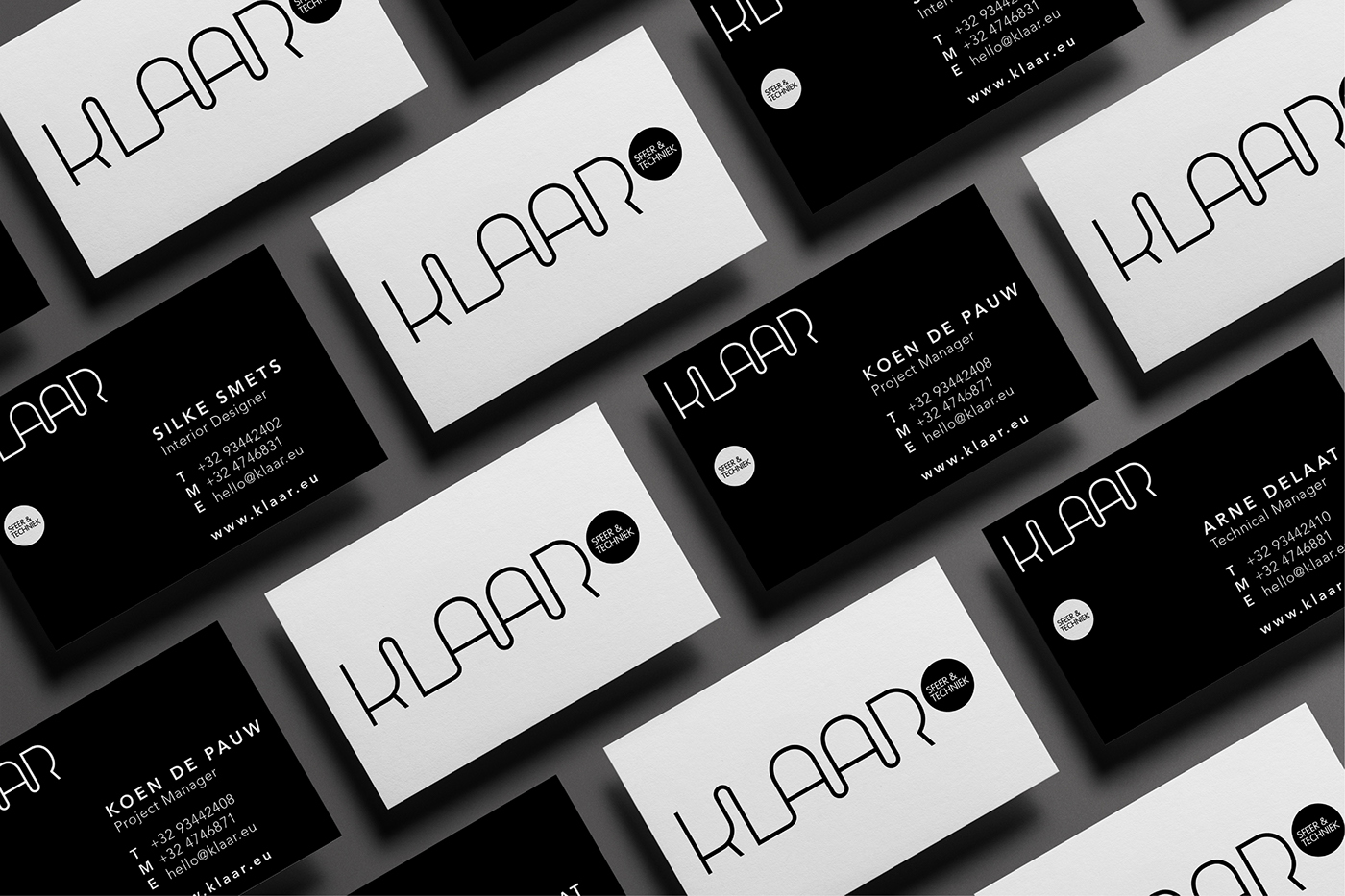
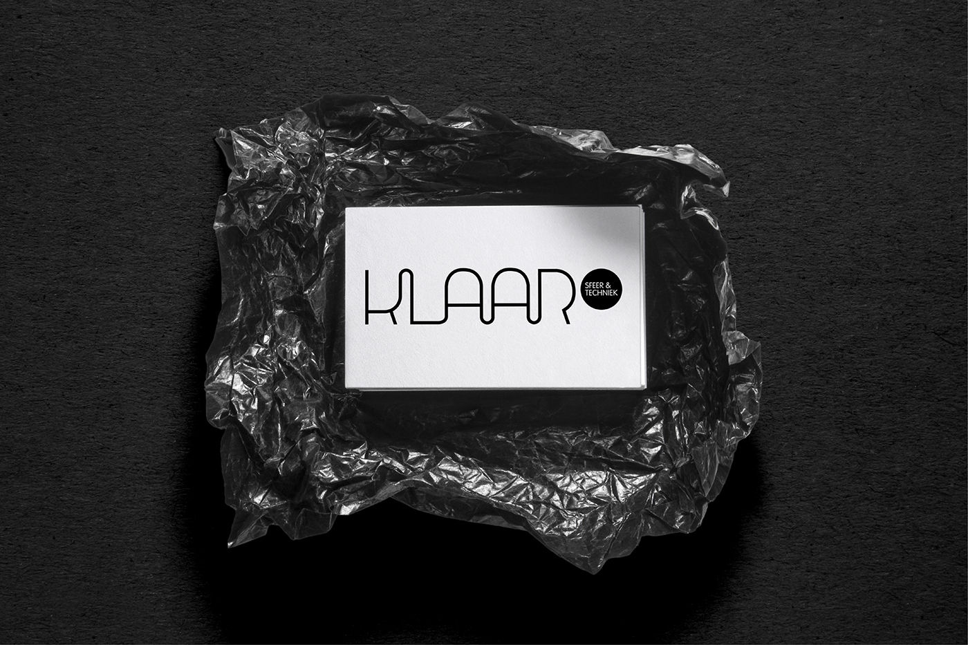
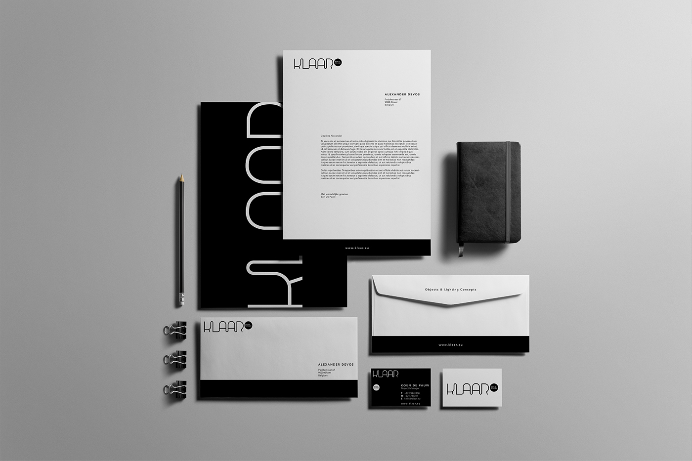
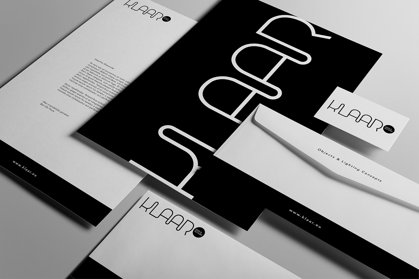
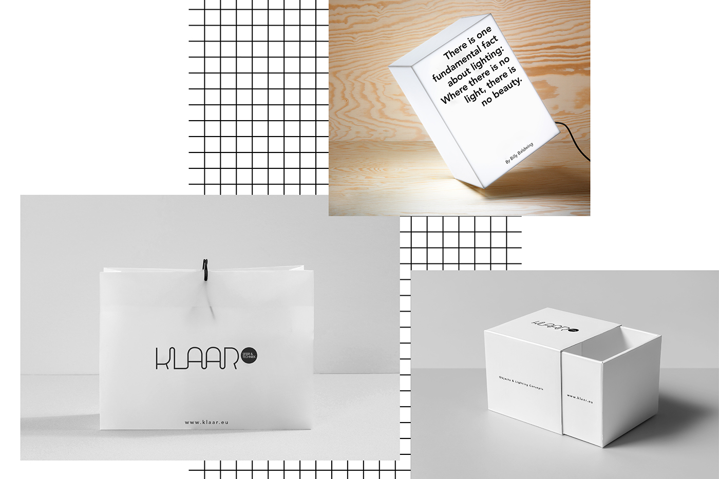
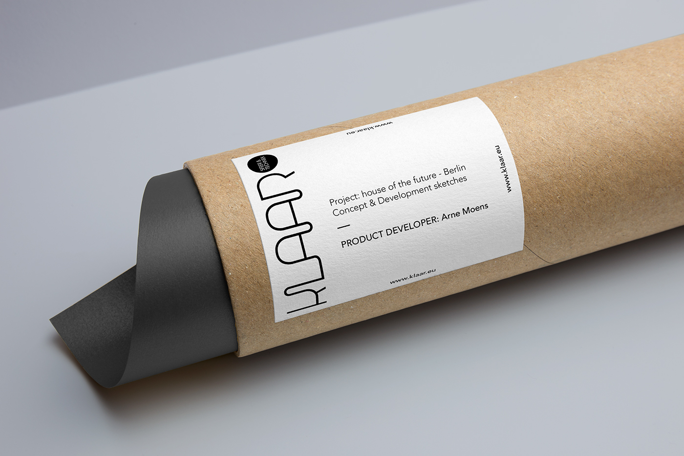
KLAAR - objects & lighting
A complete rebranding for De Pauw, a light and interior design shop based in Ghent. "KLAAR" is the dutch word for light / bright. It was decided to develop a modern and minimalistic identity, so the brand would suit the different lightning styles being offered. The rebranding used black and white, referring to darkness and light. Furthermore, a wide range of cardboard packaging and store bags have been developed.
The logo design
The logo is designed in a custommade font. I used the cables of the lightning as an inspiration. This is subtly incorporated into the logo so it is still a readable and aesthetical logo.
Enjoy & thank you for watching!