

Google Fonts is an interactive directory of free hosted application programming interfaces for web fonts started by Google. Google Fonts was launched in 2010 and revamped in 2011 by Google to provide an Open font foundry. Many of the fonts are released under the SIL Open Font License 1.1, while some are released under the Apache License, both are free software licenses .
In this project i have tried to achieve different types of typography design styles using google fonts which are based on different principles of design. I also have provided detailed font formatting for each style and how it can be achieved .
In this project i have tried to achieve different types of typography design styles using google fonts which are based on different principles of design. I also have provided detailed font formatting for each style and how it can be achieved .
Principles of Design.
"Design principles are the fundamental ideas and elements that can be applied to achieve successful design."
"Design principles are the fundamental ideas and elements that can be applied to achieve successful design."
01
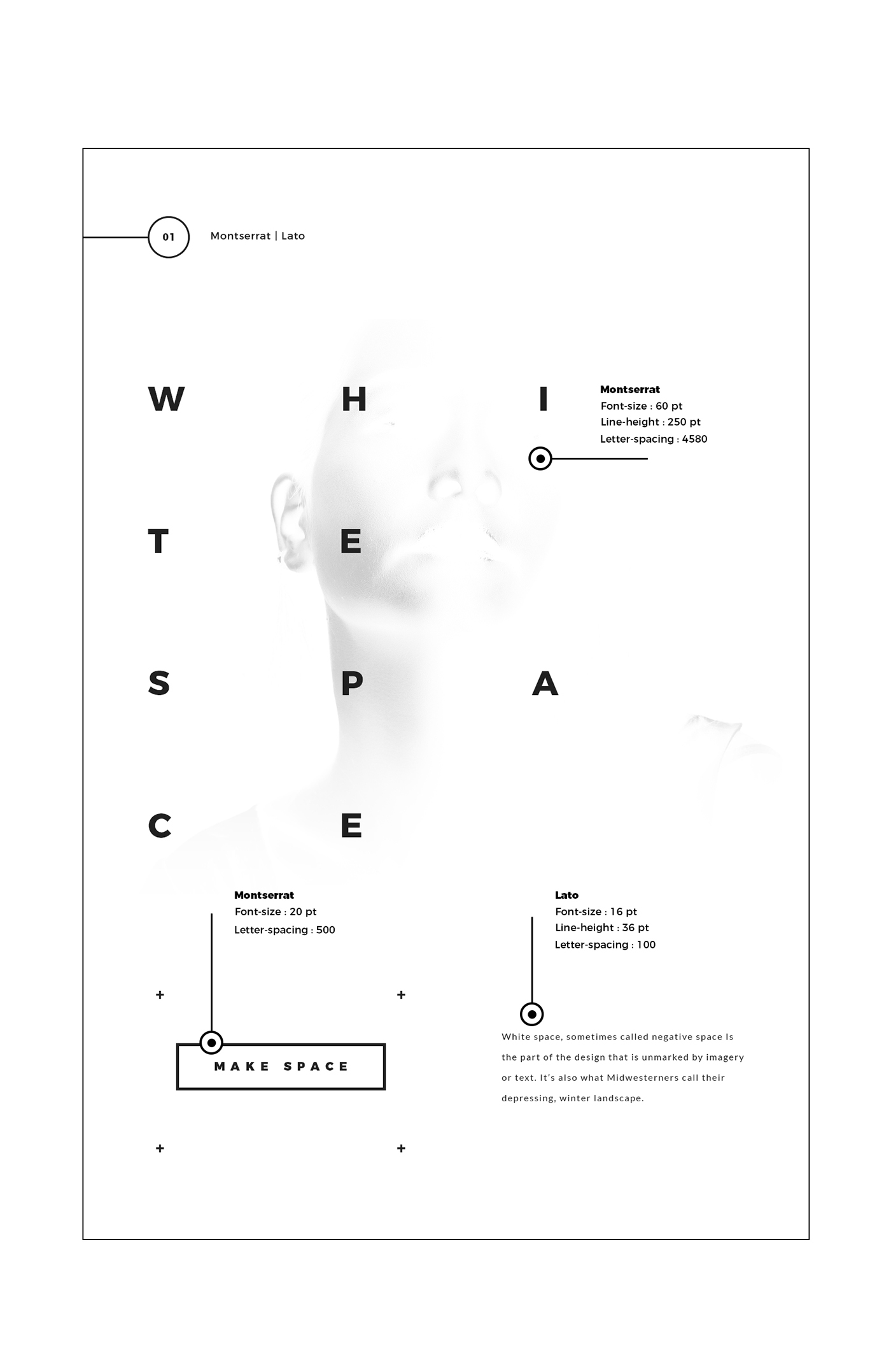
Principle - White Space
In page layout, illustration and sculpture, white space is often referred to as negative space. It is the portion of a page left unmarked: margins, gutters, and space between columns, lines of type, graphics, figures, or objects drawn or depicted. The term arises from graphic design practice, where printing processes generally use white paper. White space should not be considered merely "blank" space — it is an important element of design which enables the objects in it to exist at all; the balance between positive (or non-white) and the use of negative spaces is key to aesthetic composition. Inexpert use of white space, however, can make a page appear incomplete.

02
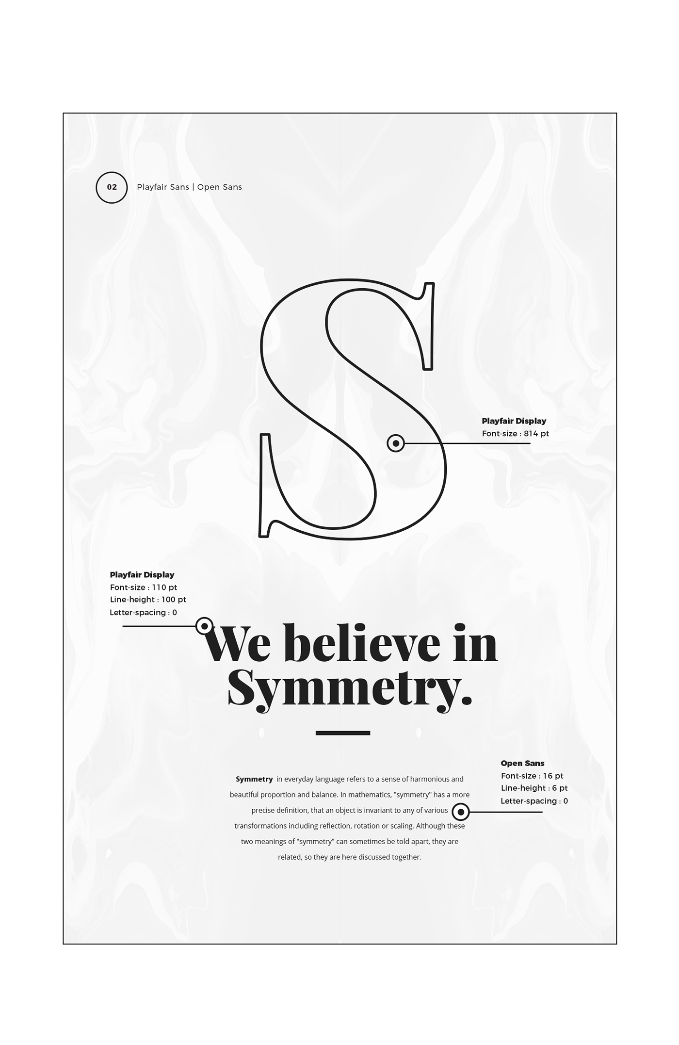
Principle - Symmetry.
Symmetry in everyday language refers to a sense of harmonious and beautiful proportion and balance. In mathematics, "symmetry" has a more precise definition, that an object is invariant to any of various transformations; including reflection, rotation or scaling. Although these two meanings of "symmetry" can sometimes be told apart, they are related, so they are here discussed together.
03
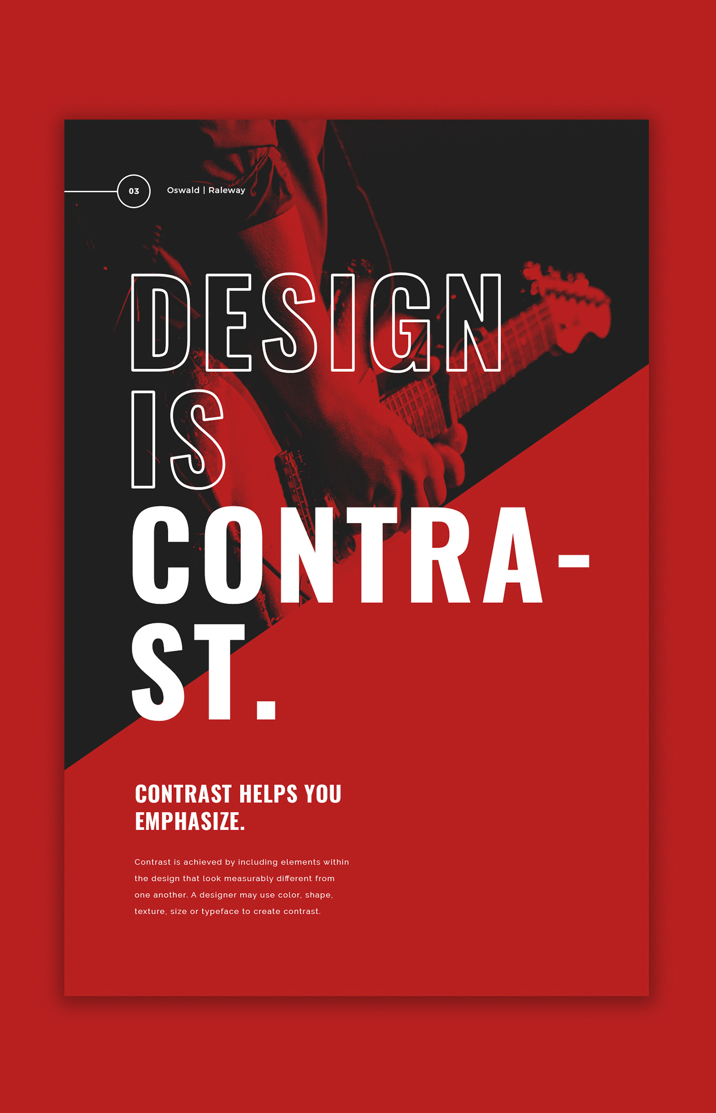
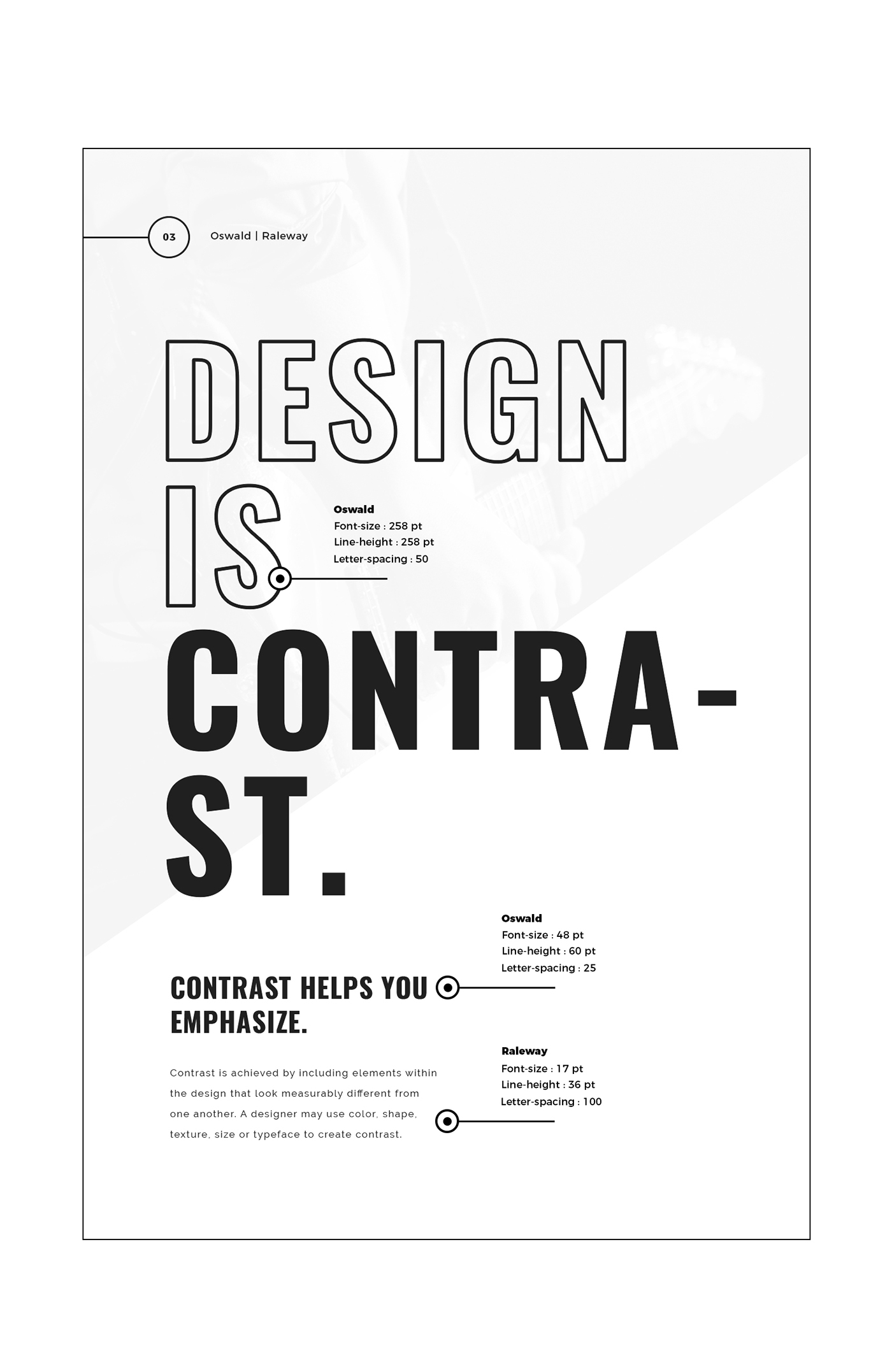
Principle - Contrast
Planning a consistent and similar design is an important aspect of a designer's work to make their focal point visible. Too much similarity is boring but without similarity important elements will not exist and an image without contrast is uneventful so the key is to find the balance between similarity and contrast .
04
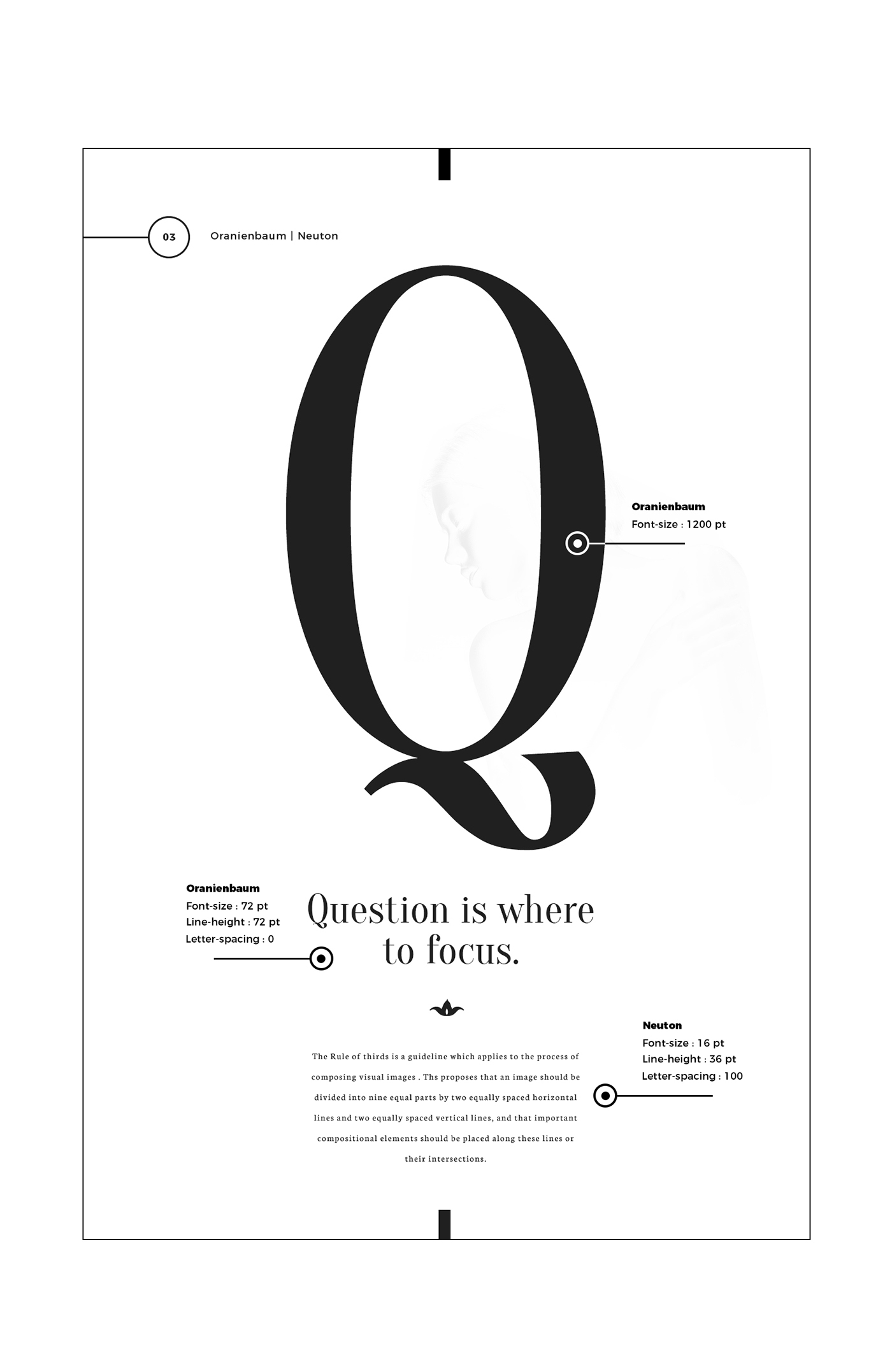
Principle - The Rule of Thirds
The rule of thirds is a "rule of thumb" or guideline which applies to the process of composing visual images such as designs, films, paintings, and photographs. The guideline proposes that an image should be imagined as divided into nine equal parts by two equally spaced horizontal lines and two equally spaced vertical lines, and that important com-positional elements should be placed along these lines or their intersections. Proponents of the technique claim that aligning a subject with these points creates more tension, energy and interest in the composition than simply centering the subject.

05
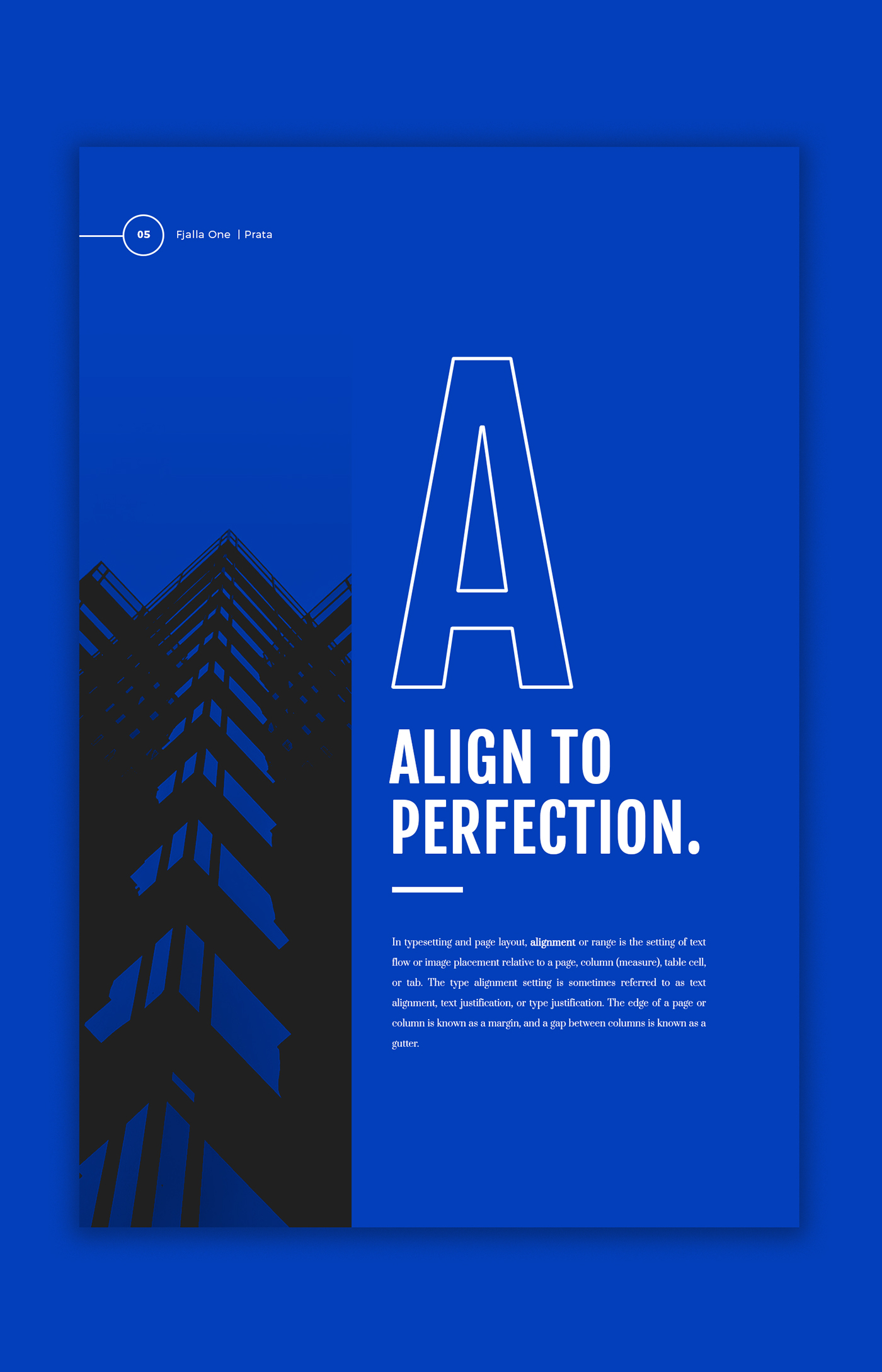
Principle - Alignment
Alignment is the act of keeping design objects in line, not only vertically or horizontally but across any linear plane. Alignment also be done respectively, i.e one design element is positioned with respect a another element within same frame.

If you like the work , Please Appreciate and share
Thank you


