


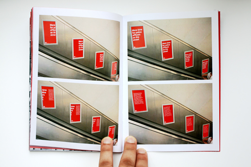

CATEGORYBrandingCLIENTRavensbourne College of DesignABOUT***THIS IS A FICTICIOUS BRIEF***This project was started before the election and was completed in time for the British General Election on May 6th 2010. What was clear this time around was that people were fed up with politics and had lost trust in the honesty of British politicians.With that in mind I set out to see if graphic design could play a role in rectifying this and to see exactly what it would take to get Gordon Brown re-elected. To make this project even more challenging, I took lessons from the Obama campaign and decided to brand a candidate rather than a party. And so this project was a case of branding Gordon Brown himself, rather than Labour.Through my research I found that people wanted and needed a candidate who was open, honest, trustworthy and simple and therefore this formed the ethos of my campaign. Unlike Obama, Gordon Brown is completely non-photogenic, and was as much a loathed figure as Obama was a symbol of hope. My brand uses typography to communicate with the audience in a direct and honest manner, whilst also removing the need to use imagery of Gordon Brown. However this isn't necessarily a hinderence, as his greatest strength is that he can be considered an elder statesmen who has a vast experience in politics, unlike Obama who was seen as a symbol of change and hope.The campaign is split into two sections: stage 1 focuses on an apology from Gordon Brown and thus the visual language is comprised of 1 colour and 1 typeface. The current Labour brand is a mess of conflicting colours and typefaces and so I felt it was necessary to go back to basics in order to give a sense of honesty and trust. The second stage is focused on simplifying the policies to one core sentence and driving people to the website to learn more about it. The typography for the stage is made to feel more dynamic and more like speech through the use of red blocks and is therefore the main element. Because of this it seemed fitting that the logo should be a logotype.The photographic style for the brand is black and white as it conforms to the ethos of being honest because there's no colour to distort your view. Moreover the photography is based on real life situations that don't focus on just the good things in Britain. These are treated in untouched and unmanipulated manner, which further enhances the ethos of honesty.The black and white nature of the photography contrasts extremely well with the red, which was derived from the Labour party. The use of colour in this project is very simple and honest and indeed where possible only 1 colour is used.The target audience for the campaign is first-time voters and therefore it only seemed appropriate that web and mobile technologies played such a pivotal role in the campaign. A mobile app meant that live news could be pushed to supporters and they could received a simple and honest breakdown (even if negative about the candidate) of what was happening. This work was continued on the website which was stripped bare of uneccessary pages �" coming down from the hundreds labour currently has to just a dozen. Moreover the way the architecture of information was made much simpler, not only in terms of the menu, but also in the articles by placing text above images. This gives more prominence and importance to the text and what is being said, with the language following the new ethos of openness and honesty.The website also acted as a hub for 'Your Labour' which was a series of applications that gave control of the campaign to the public, for example with 'You Voice' they could track who was reading their comments and how it was being passed up the political ladder. Furthermore instead of 'Support Us,' supporters were given the opportunity to organise 'campaigns' (events) in their local areas and in doing so were able to download custom generated flyers, web banners, picket signs and material to publish on social media sites. This kind of grassroots support was inspired by the Obama campaign, however as it was Gordon Brown is couldn't be as open due to the likelihood of him being subjected to ridicule and hate comments.Overall, this project uses typography to communicate with the public in an honest and direct manner. It also focuses on first-time voters who do not carry political allegiances yet and therefore took the campaign to every facet of their lives �" such as mobile, social and web technologies. In doing so it creates a sense of openness and connectivity without ever feeling patronising.


