


Mobilete Creative Studio
Branding Process
When working in this branding we took in consideration the following characteristics which define very well the studio attributes and way of work.
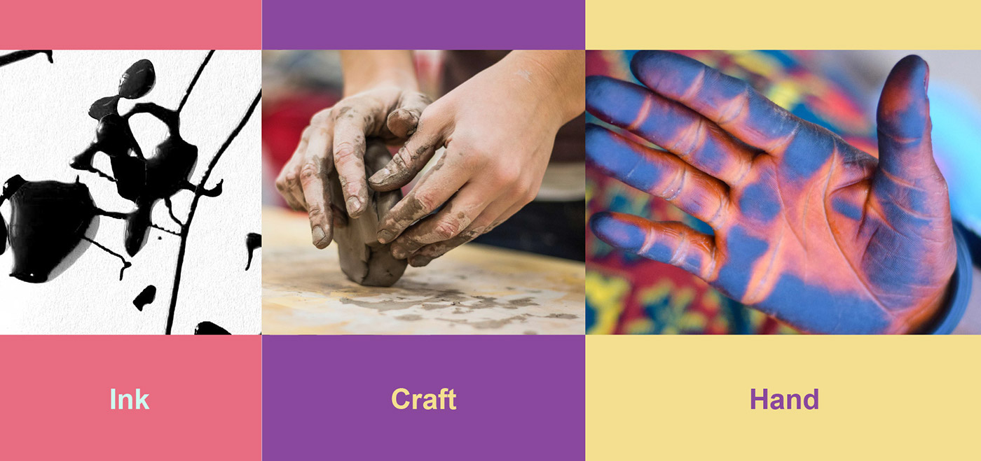
Words Association

Wordmark
The wordmark is the main piece of the branding and it must reflect those attributes above somehow. Combined together with another elements, the wordmark and the logo/symbol must build a strong brand identity. Considering the words association, the best option was to try some custom lettering. There was a lot of exploration before finding a cool shape and flow.

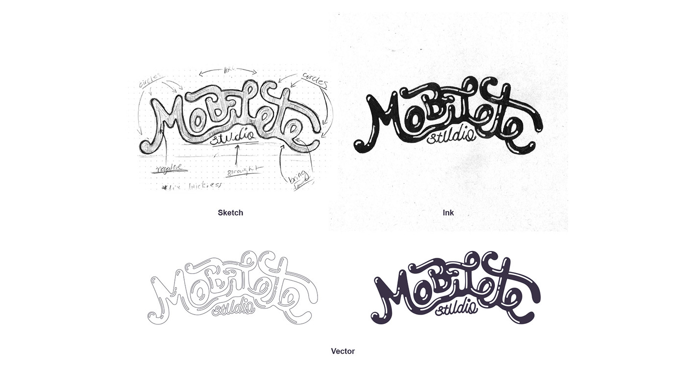
Evolving the Chosen Wordmark
After spending lots of ink, we found potential in this one.
Logo/Symbol
We felt the necessity to have a logo/symbol along with the wordmark. So, considering the attributes mentioned above we started sketching.


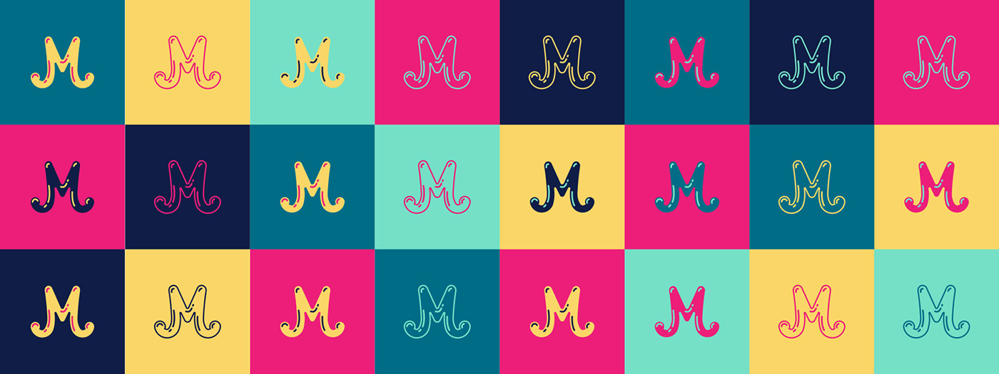
Lettermark
The wordmark with the letter “M” seemed to be totally fitable as the “M” represents what is in the palm of our hand, which is the power to create anything. Besides we literally have an “M” marked in the palm of our hand, have you noticed?

Color Explorations
At the first take on defining the color schemed we tried to use and combine vibrant colors. But after using it for a while, it seemed a little bit too much.
The Chosen Color Palette
After some attempts we decided to go with a more sober palette scheme, although still a bit audacious.

Colors

Subtones

Color Transitions

Typeface
The typeface should be modern and straightforward. We also thought that a type combination would work fine.


Brand Guidelines


Branding Patterns and Illustration


Website and Examples of
Branding Usage


