/ identity / packaging
Olio Sagra
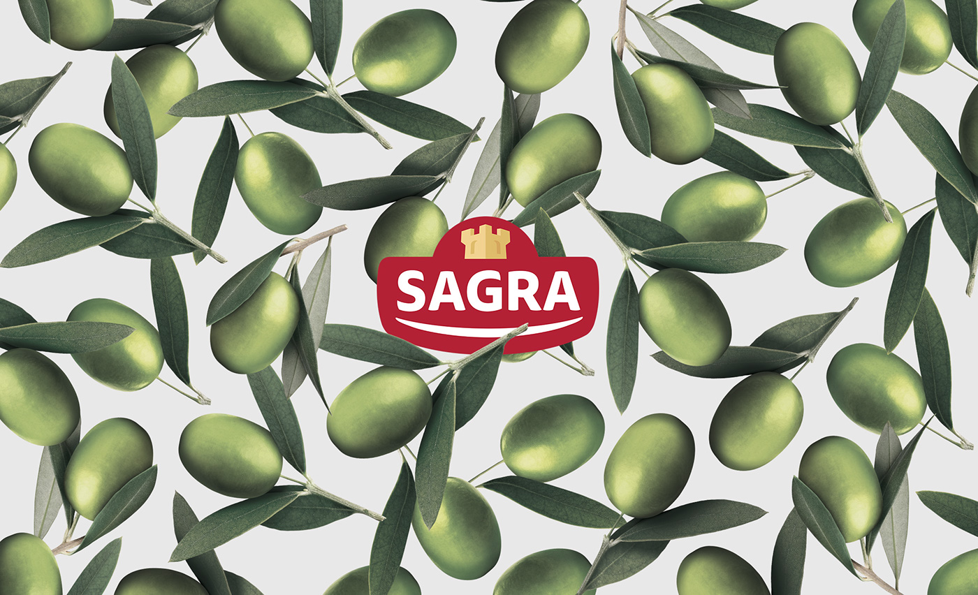
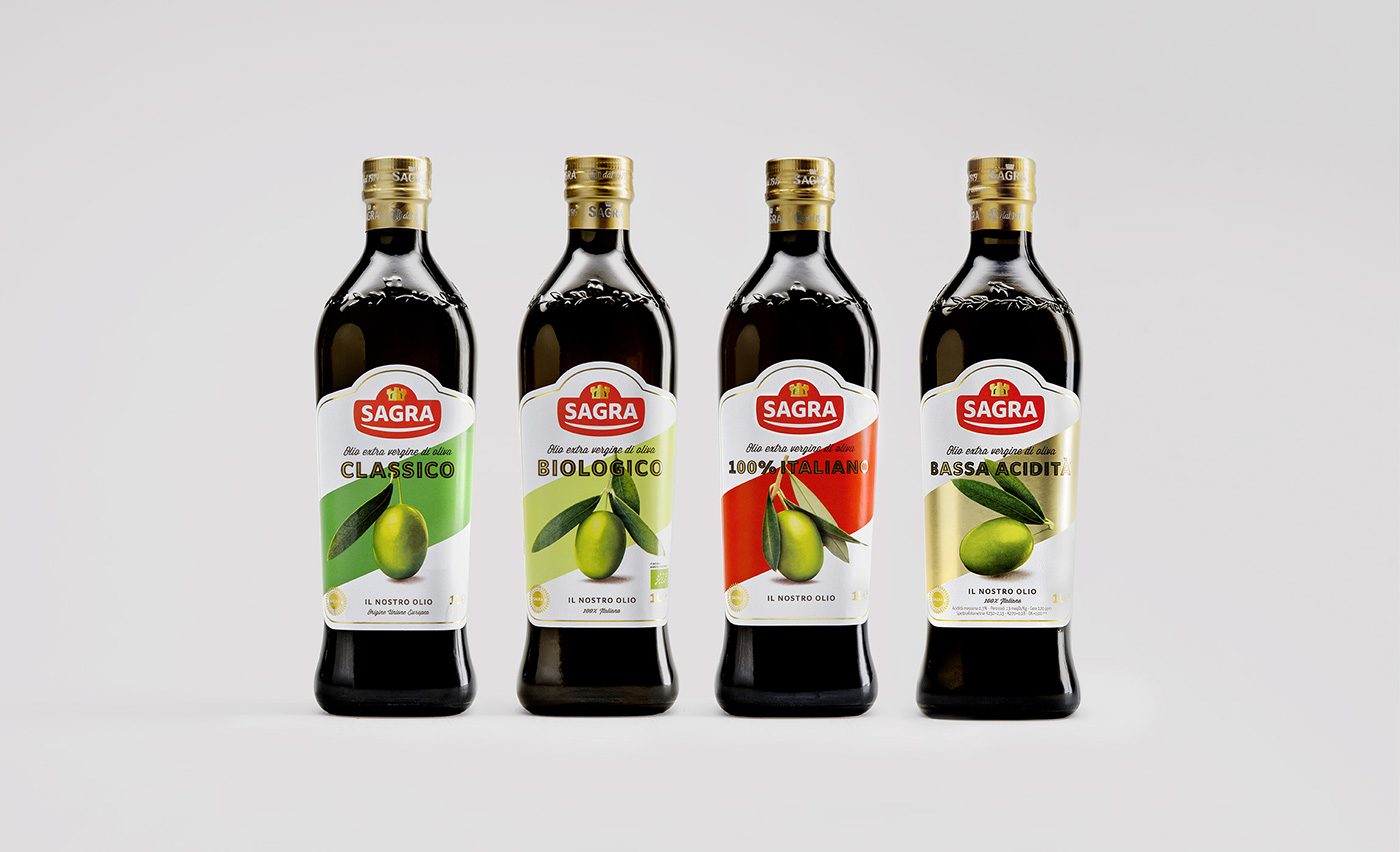
Assignment: rejuvenate the brand image of the historical italian oil brand. From logo to labels, we made a trip through italian good taste. We built a family feeling extremely powerful on shelves.
CLIENT
Sagra. Historical brand in the olive oil production, amongst the most important italian brands.
ASSIGNMENT
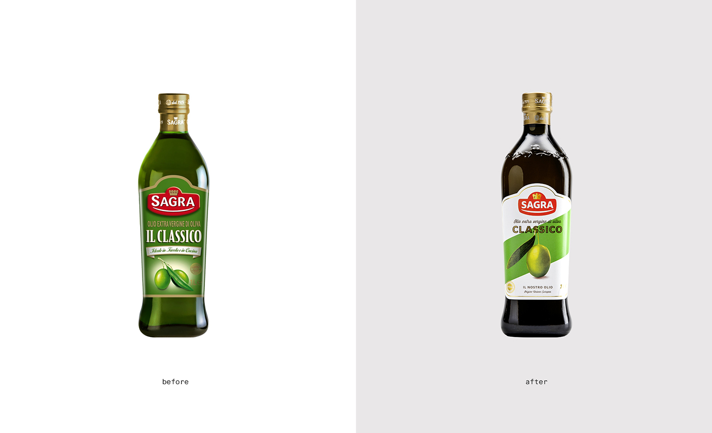
Rejuvenate the brand image, create a stronger visual impact and unify the different products to be recognized as part of the same family.
SOLUTION
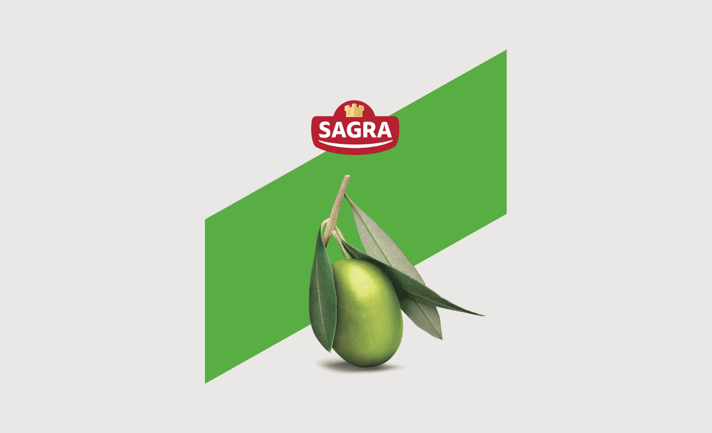
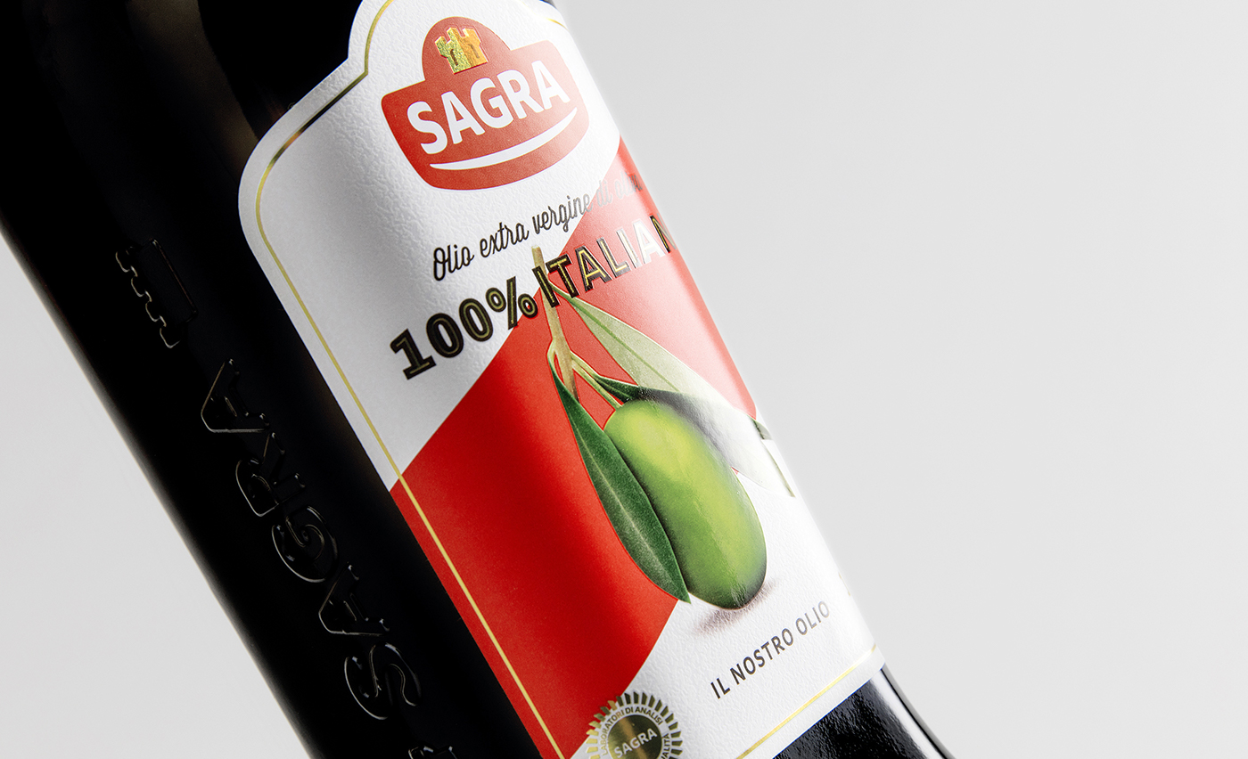
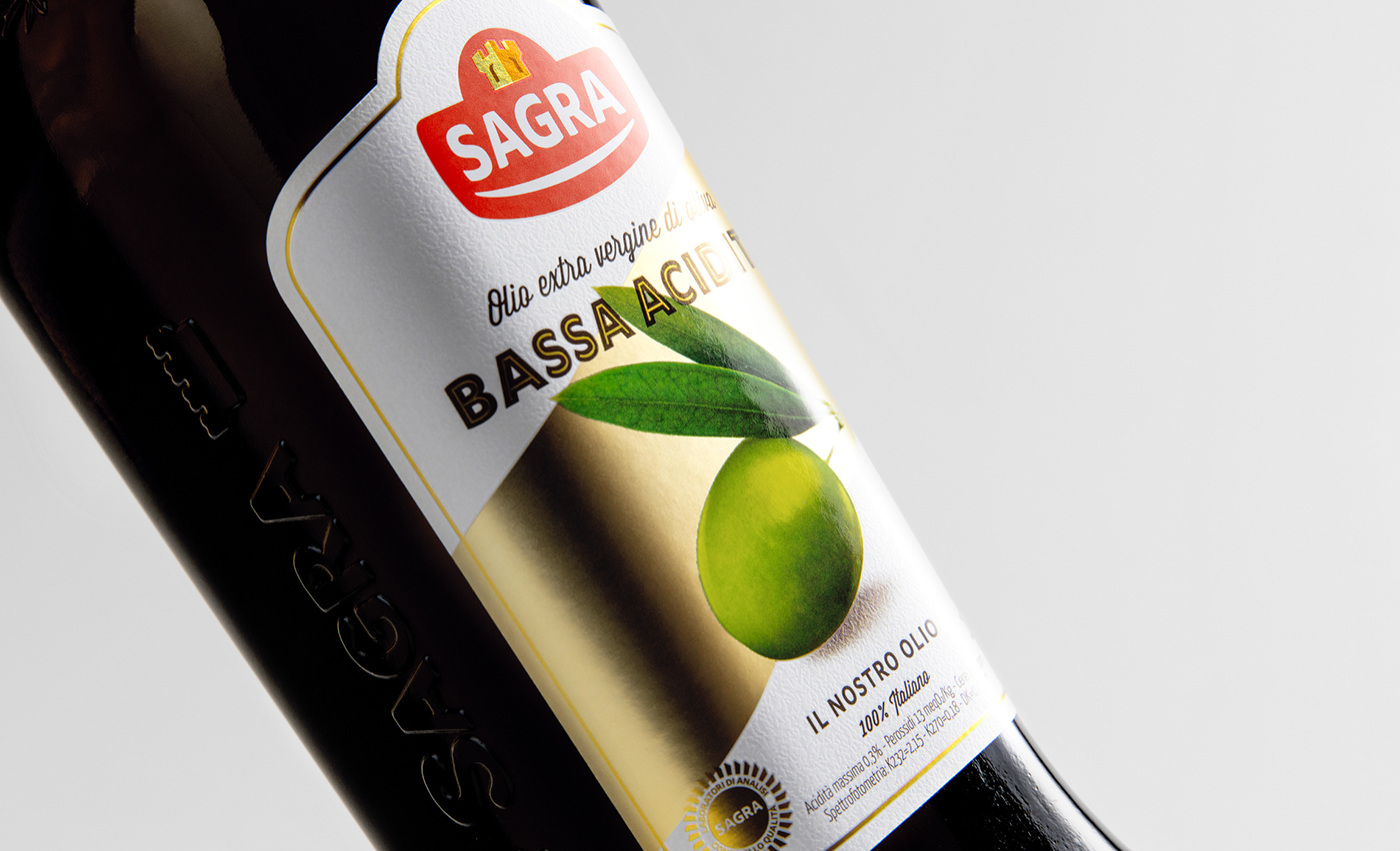
Creation of a new graphic label system, characterized by a diagonal band, recalling the appearance of an heraldic coat of arms, like the castle that is present in the logo. The band also changes color in relation with each product.
PROCESS
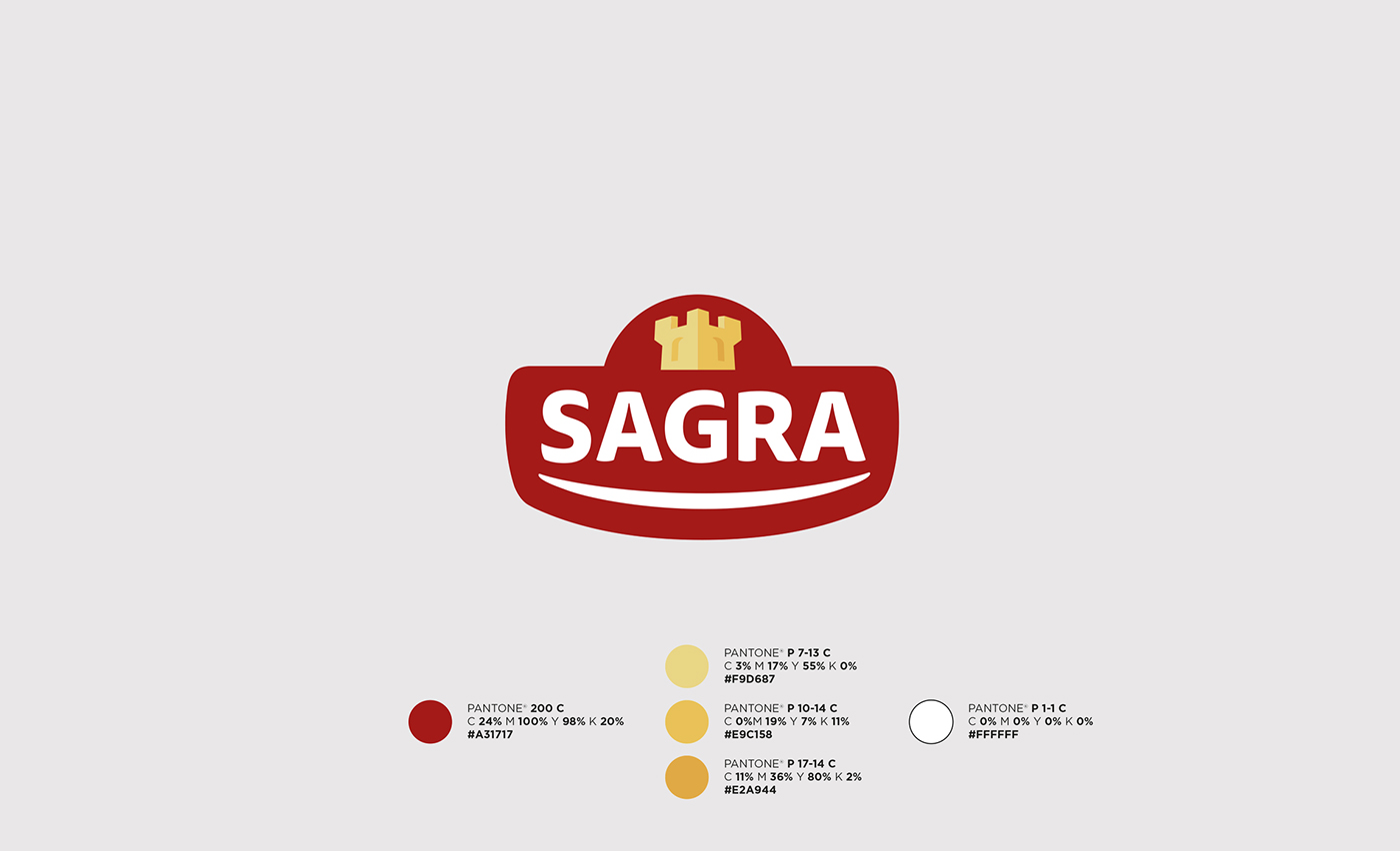
Restyling of the logo and creation of the new label system.
---
YEAR / 2016