
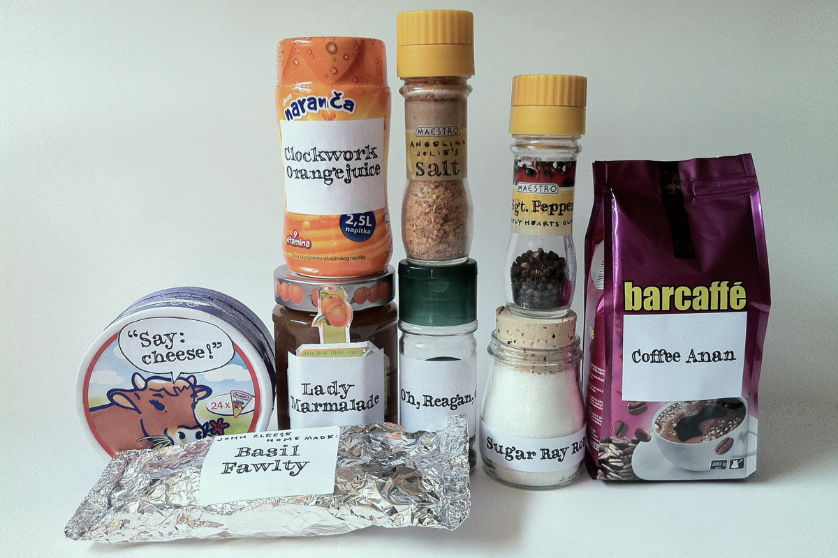
Process:
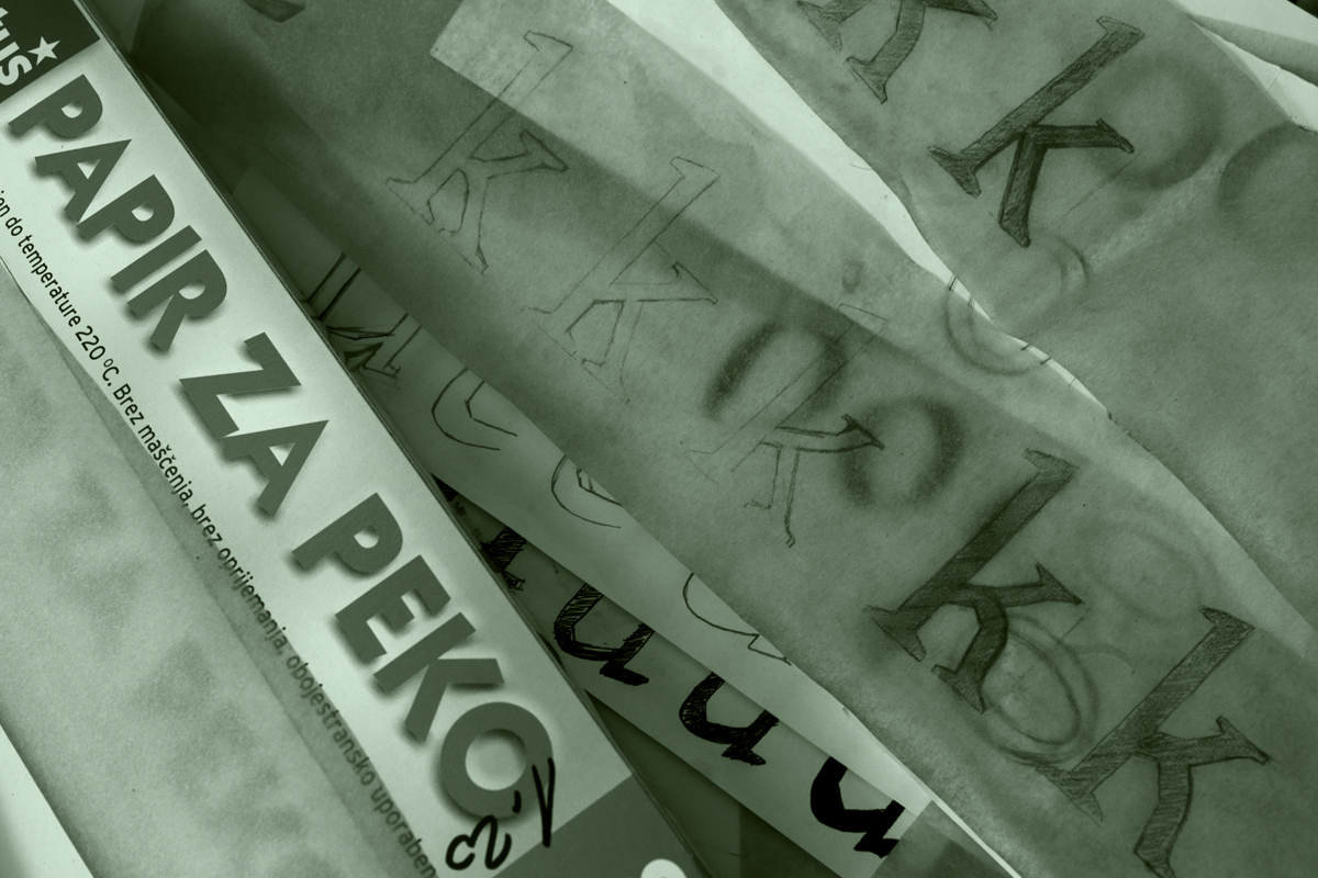


Our typicall process, with a little help of baking paper and a domesticated llama.
Works:

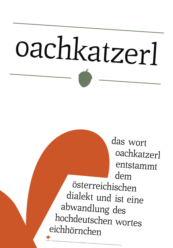
Anja Schwendenwein, Oachakatzerl
A serif typeface inspired by linguistic contrasts - the sharpness and softness of German language spoken in Austria.
A serif typeface inspired by linguistic contrasts - the sharpness and softness of German language spoken in Austria.
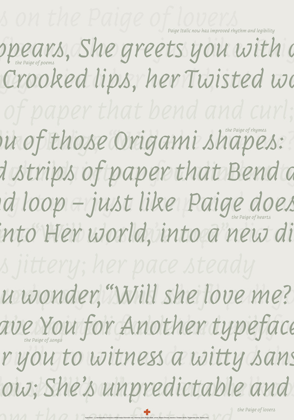
Paige Italic
A bodytext oriented continuation of a previously display typeface. But the principal idea remained the same. Every character still pedantically maintain the look of folded strips of paper.
A bodytext oriented continuation of a previously display typeface. But the principal idea remained the same. Every character still pedantically maintain the look of folded strips of paper.
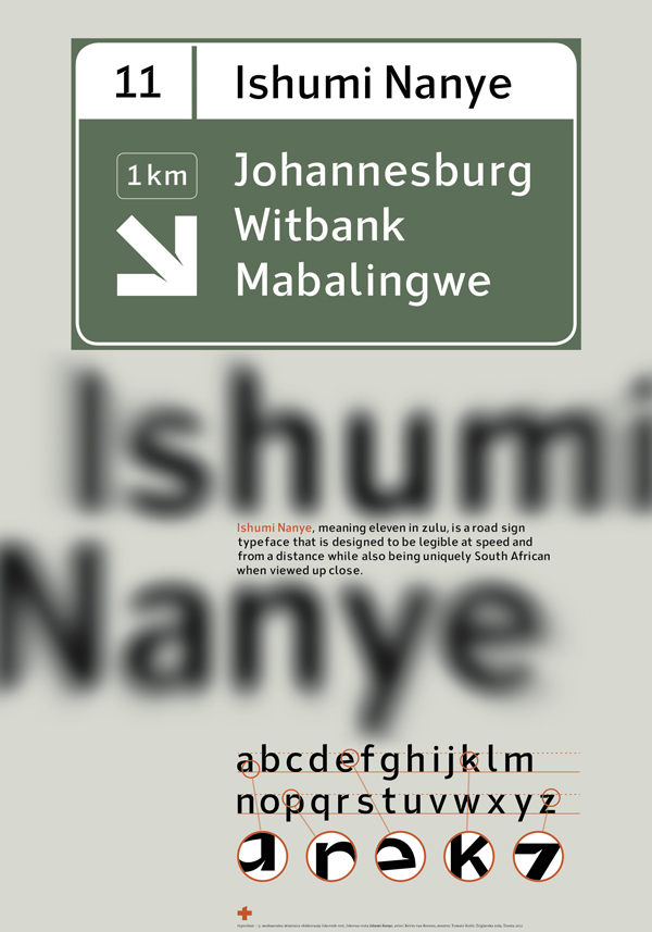
Kevin van Reenen, Ishumi Nanye
A sans serif typeface created for the road sign system of South Africa. It uses the recognisable triangular shape from South-African flag for huge ink-traps, much needed for the best possible readibility from a distance.
A sans serif typeface created for the road sign system of South Africa. It uses the recognisable triangular shape from South-African flag for huge ink-traps, much needed for the best possible readibility from a distance.

Marianne Riegelnegg, Janis Book
Expansion of a book type family Janis, that got fresh small caps in Regular and Bold.
Expansion of a book type family Janis, that got fresh small caps in Regular and Bold.

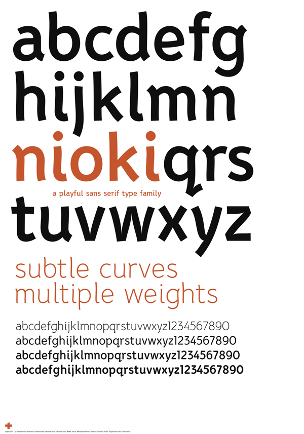
Marijana Oršolić, Nioki
A humanised sans serif family offering multiple weights.
A humanised sans serif family offering multiple weights.

Marija Rnjak, Prouge
A soft didone that is best for titling, but can be successfully used also in smaller sizes down to 12 pt.
A soft didone that is best for titling, but can be successfully used also in smaller sizes down to 12 pt.
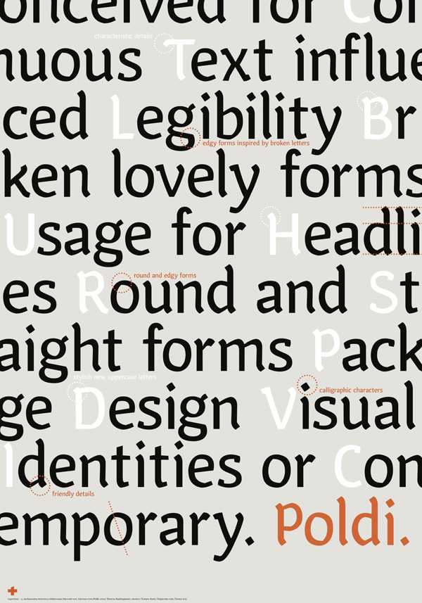
Theresa Radlingmaier, Poldi
Poldi is a modern typeface with a calligraphic character.
Poldi is a modern typeface with a calligraphic character.

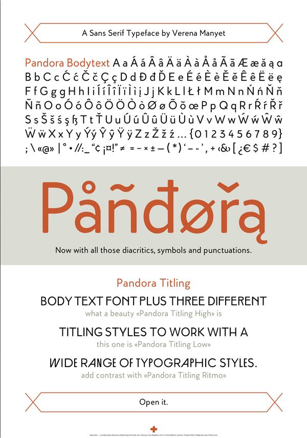
Verena Manyet, Pandora
A continuation of a slightly rounded sans serif typeface, with three different style variations for titling. It offers a art nouveau, bauhaus and avantgarde styled capital letters.
A continuation of a slightly rounded sans serif typeface, with three different style variations for titling. It offers a art nouveau, bauhaus and avantgarde styled capital letters.
Deletes scenes:
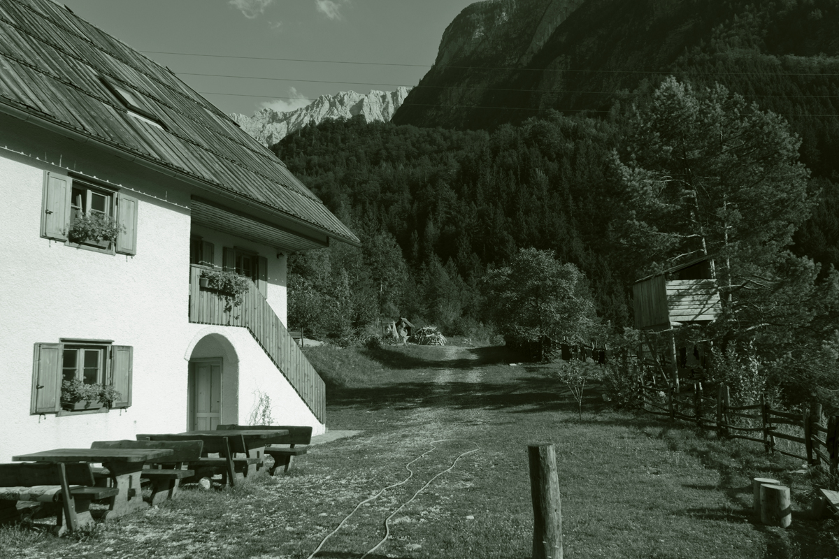
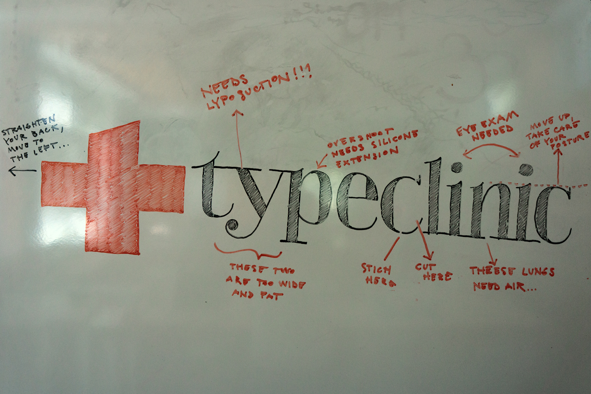
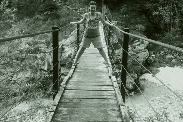
Our clinic with a nutricion headquarters, operating room and recovery facilities upstairs.
TypeClinic's
international type design workshop
every winter and summer
in Trenta, Slovenia
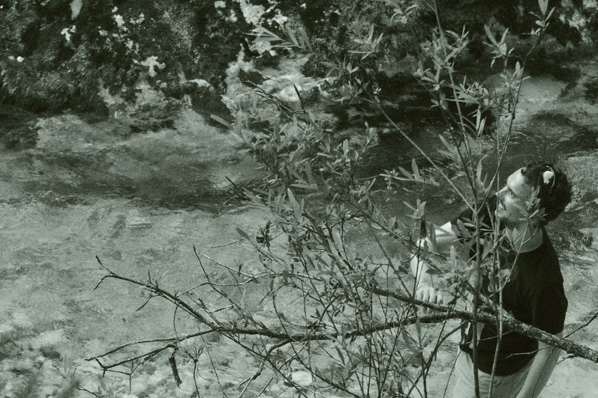
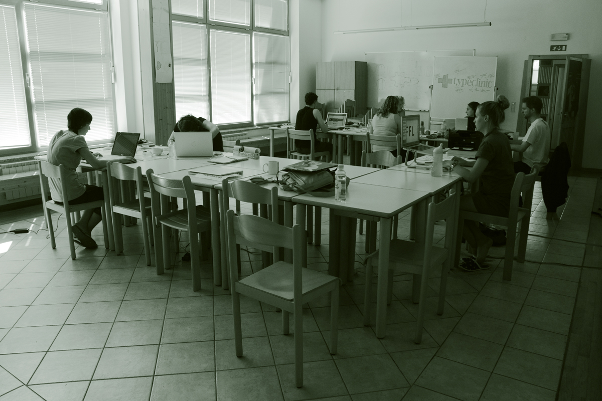
Our workshops (previously named tipoRenesansa) deal with bodytext and display typefaces for print and digital usage. Participants of all levels of expertease come from all over the world: Austria, Australia, Croatia, Czech Republic, Germany, Great Britain, Finland, Italy, Serbia, South Africa, Romania, Slovenia ... ... to work for a week in Trenta Valley, Slovenia. The final products includes typefaces with 40 characters minimum.
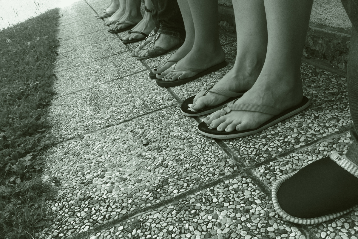
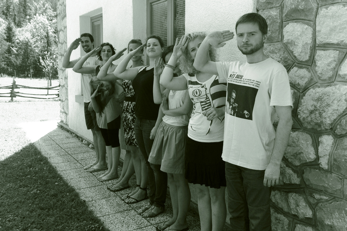
Final saluting, with our feet curvature in sufficient “overshoot”.
