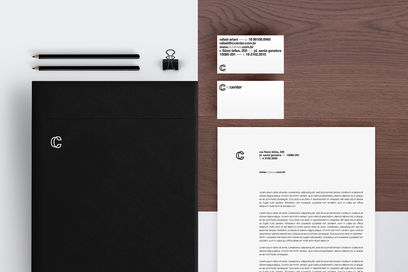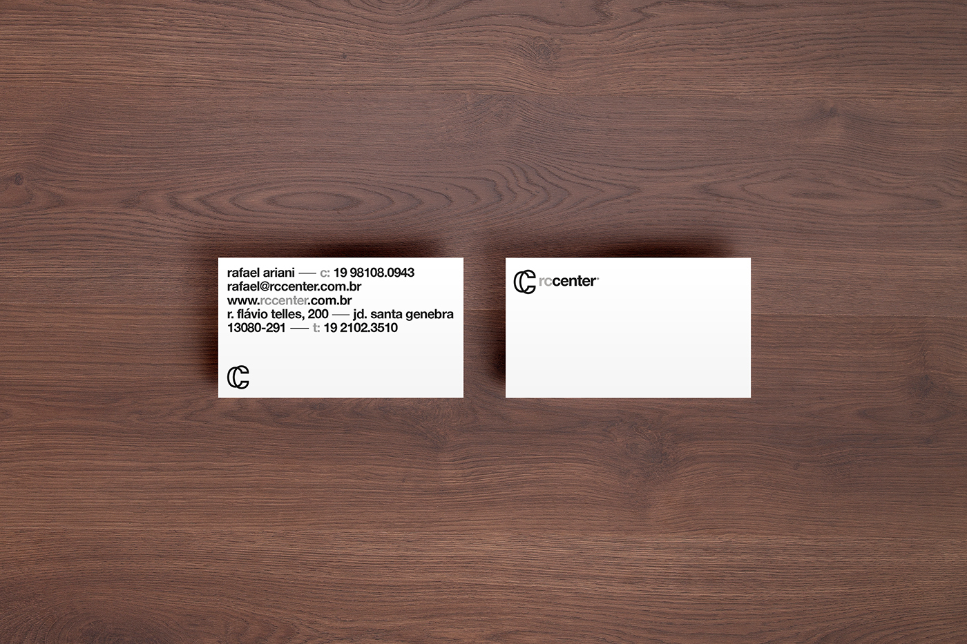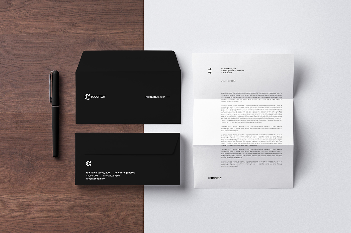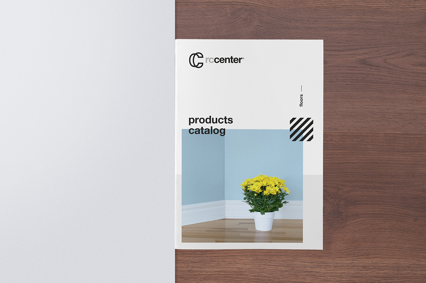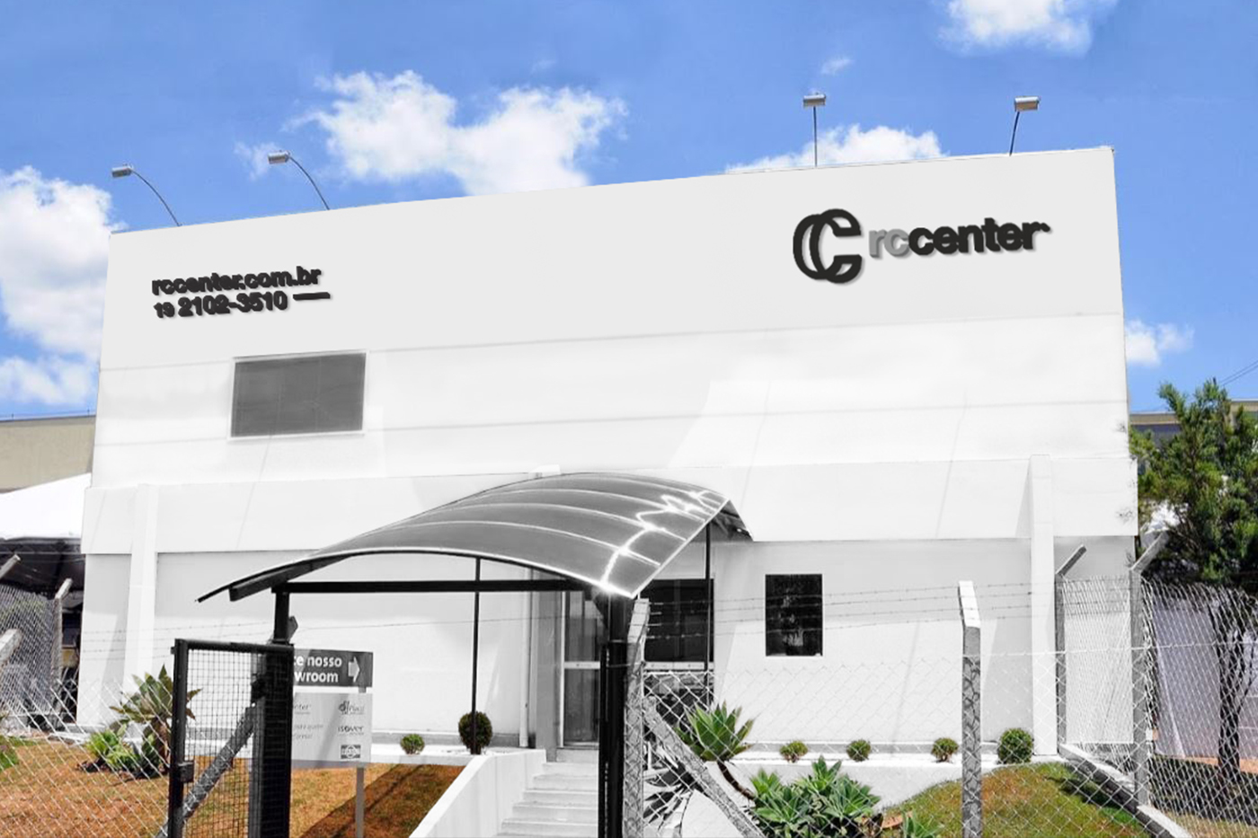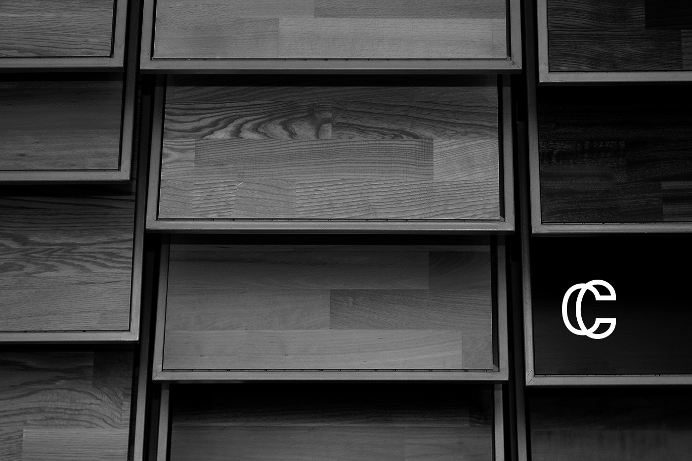
For the creation of the logo and visual identity of RC CENTER, we have established the relationship between brand spelling and the market in which it operates. By analyzing the RC CENTER we can see the two letters "C" together, duplicated, repeated.
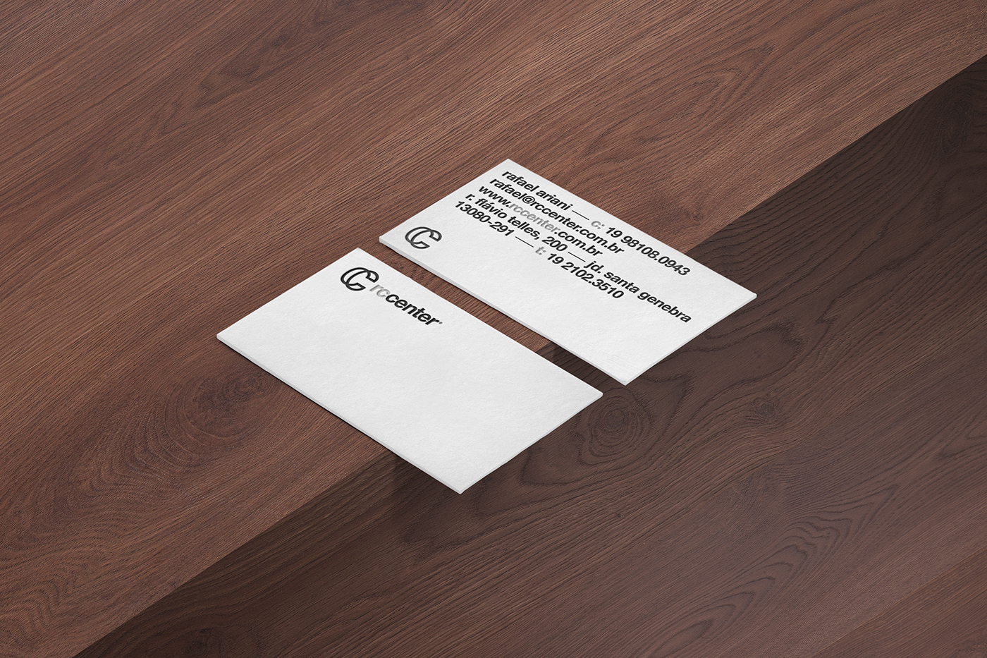
When we analyze the way in which floors and coatings are installed, we can observe a pattern, a repetition, just as the letter "C" is repeated in the spelling of the mark. Following this concept, we constructed a symbol where we have two letters "C", referring to RC CENTER, forming a symbol, a letter "C" three-dimensional, which refers to something tactile, something we can feel and touch, as well as The products offered by brand.