


The studio's only request was to use the mandala as its symbol. We went to the basics of the mandalas— the repetition, rotation and symmetry — and applied it to the new icon, a reduced version of the wordmark.

The icon.
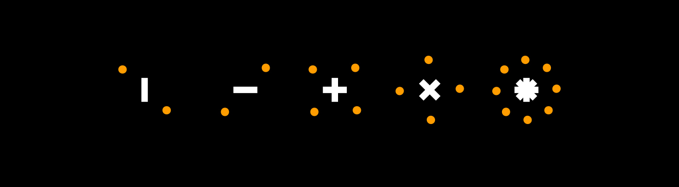
idit's i is the mandala, capable of reshaping itself and ultimately becoming the basis for the entire iconography and communication.

From there, we could develop all the iconography we needed. Like the bow and arrow, which was another element the studio was keen on having in its communication.

Icons for directions and navigation.
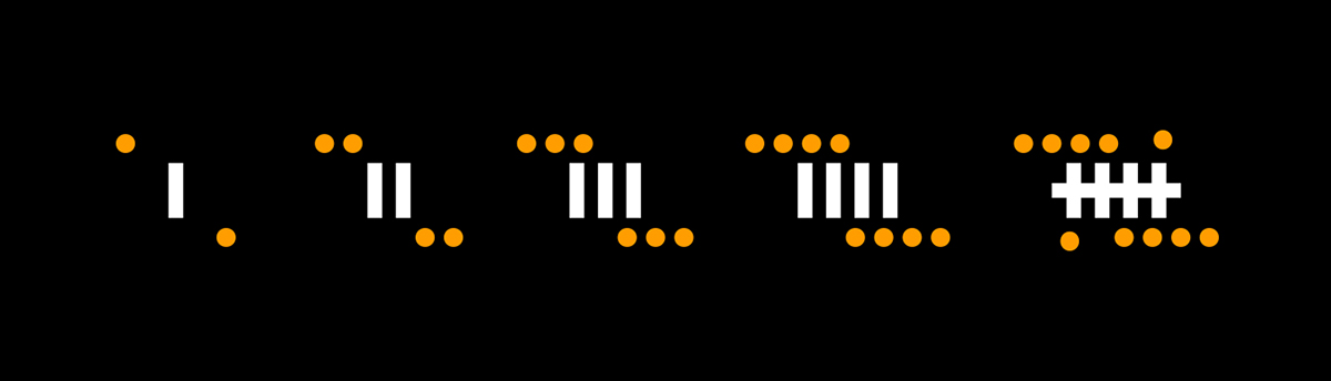
Numerals.


