

Projections 2016
Graphic Design Conference
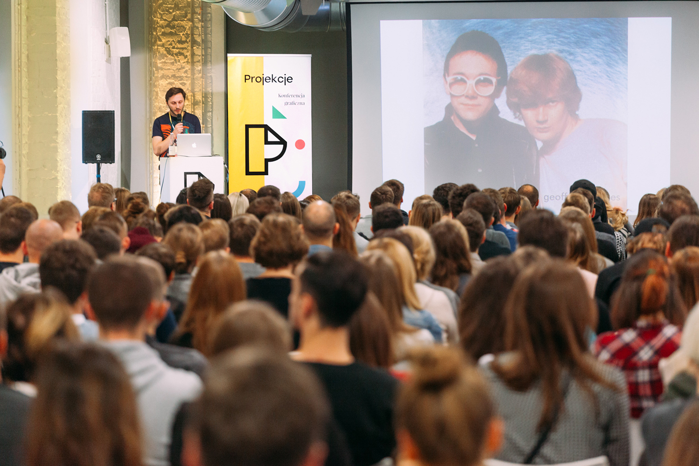
Projections is an event organised by graphic designers for graphic designers. It's main goal is to integrate the community, but most of all to be an inspiration for further creative work. We wish to allow new solutions to be produced and developed, to generate new ideas and encourage designers to search for new forms of expression. We wish to focus on passion of being creative, to nurture and develop it. Projections is an idea which came directly from graphic designers who took on the challenge of organizing as well as designing the event.
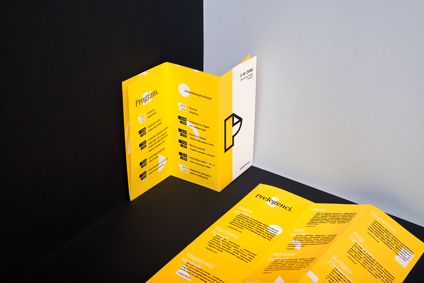
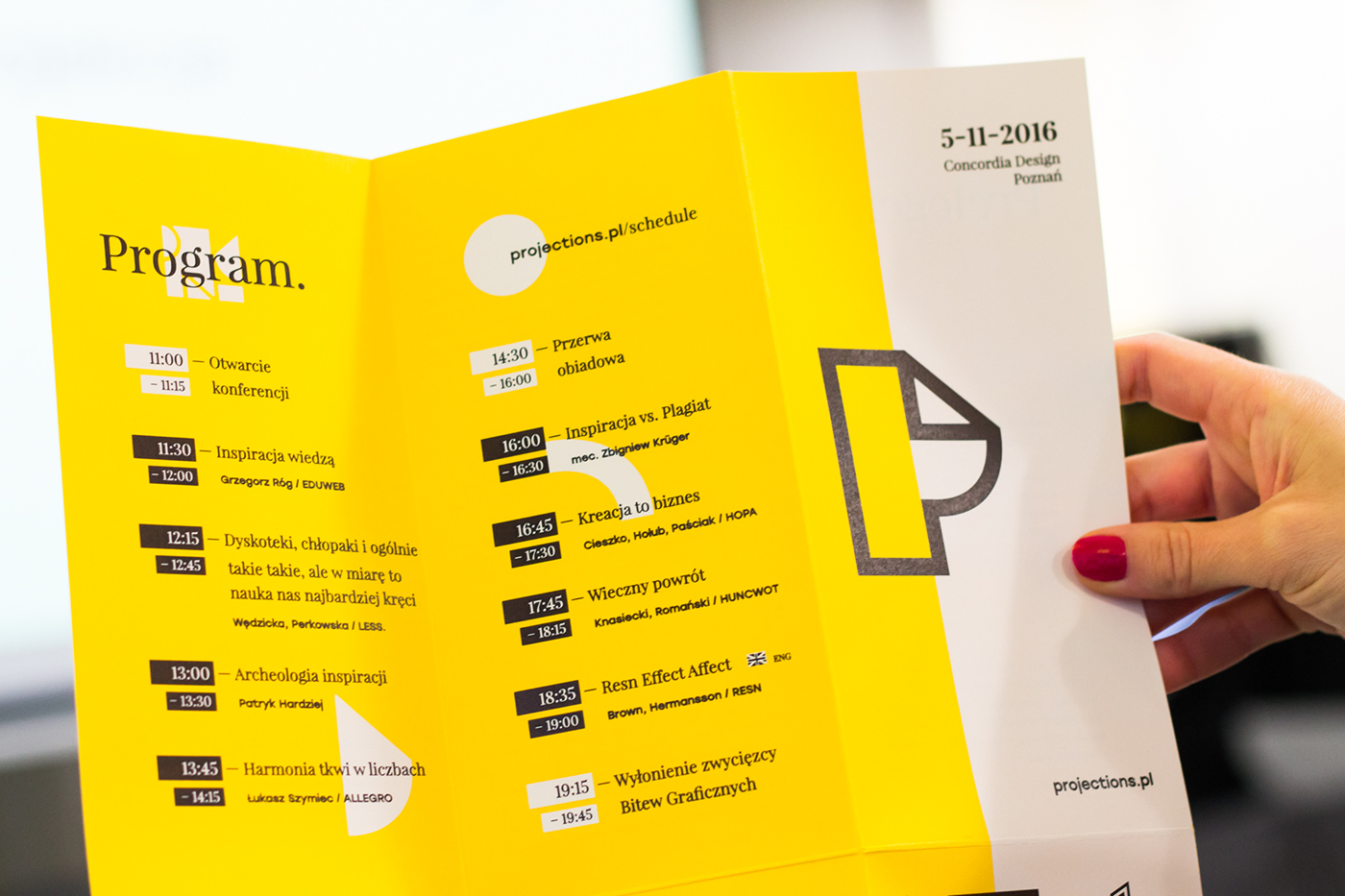
The visual identity of this kind of an event requires a balance between coherent brand design and diversity of the graphic design language to keep the content attractive.
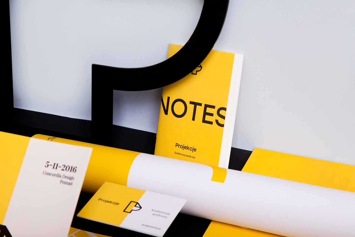
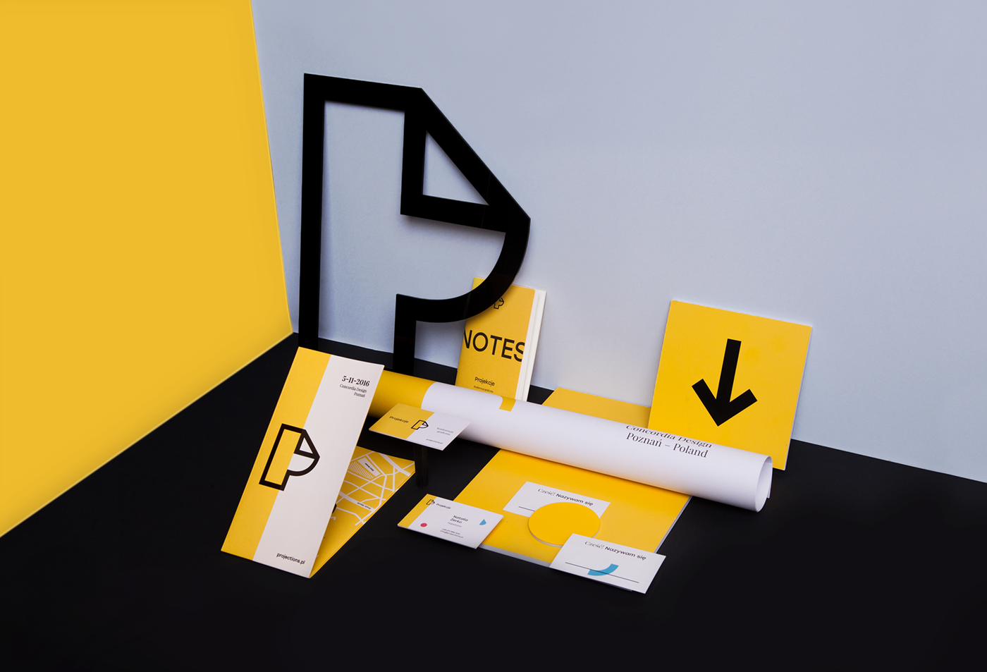
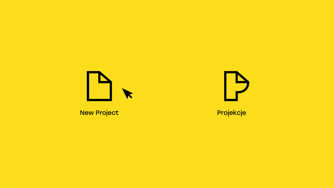
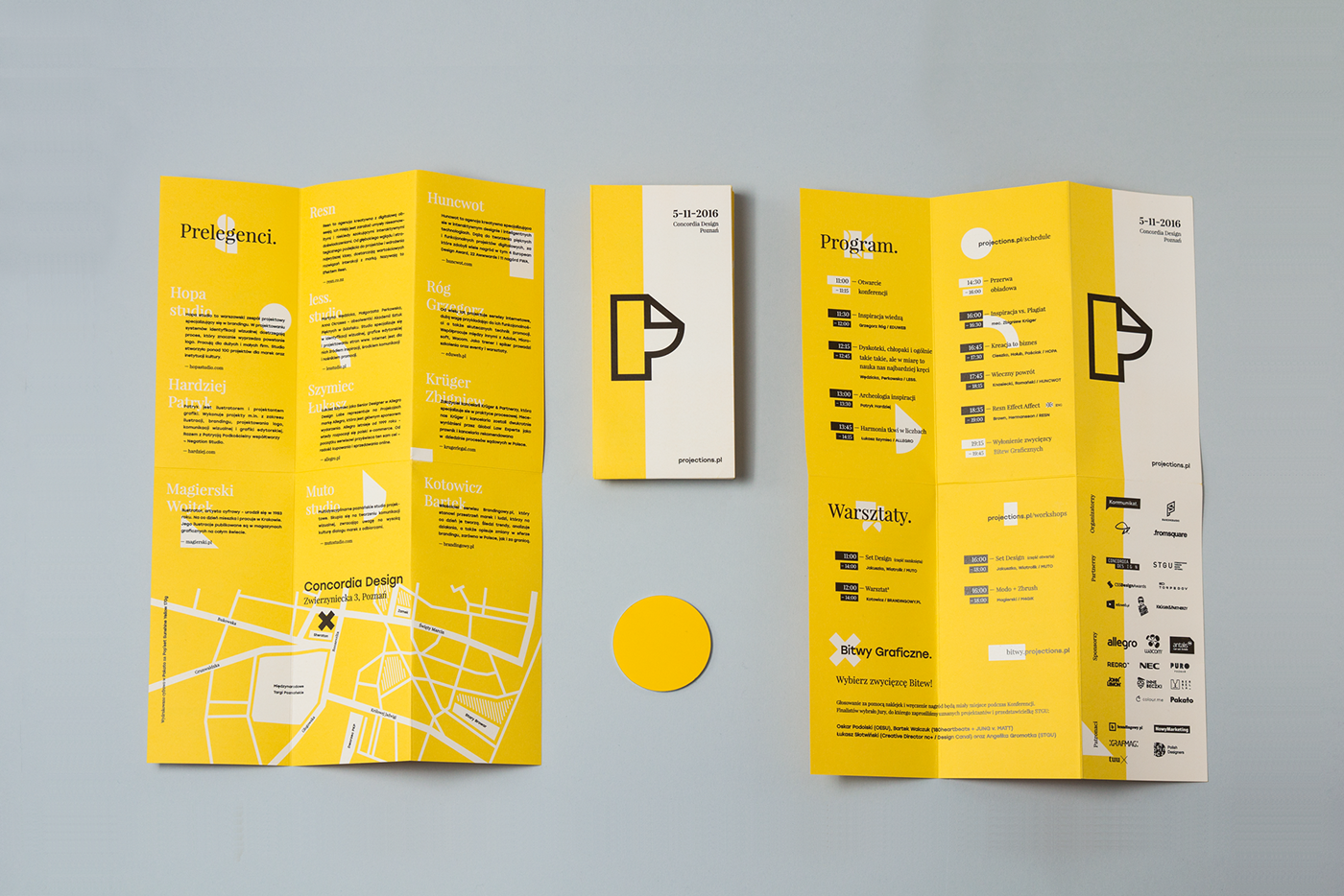
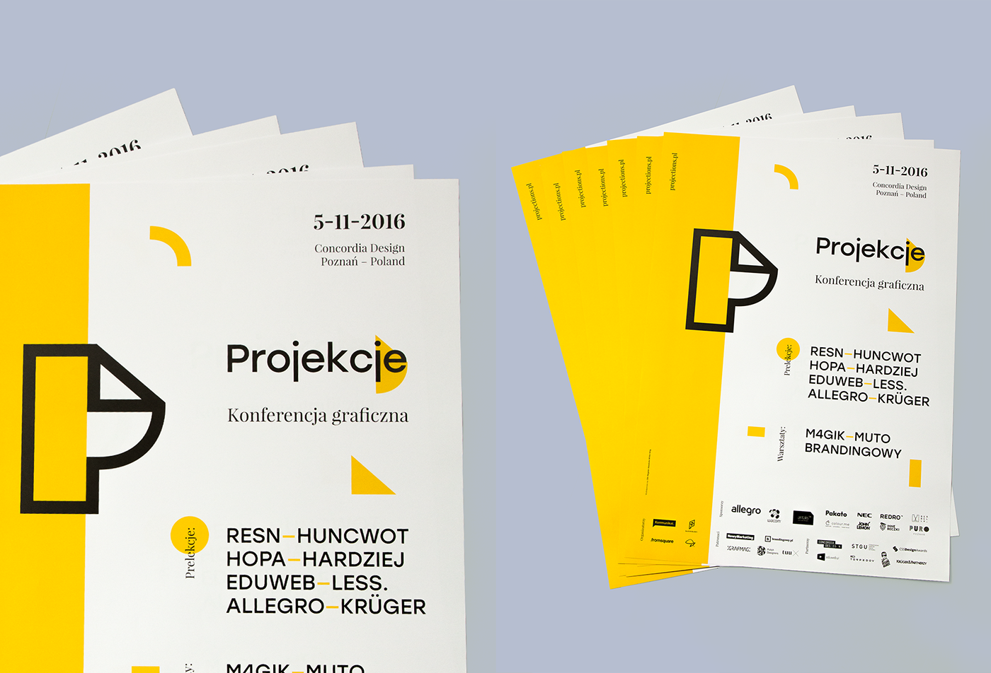
The key to an effective visual identity directed towards designers was basing on imagination and creativity. The theme of the first edition of the Conference was Inspiration. We decided to get inspired by the Projection's logo to create the elements of the event's identity. Sticking to the basics was the core - we cut the symbol in simple geometric shapes, which enabled us to build the next elements e.g. icons. We designed a consistency by 'recycling' the shapes so that the ID works on different levels (web design, animation and print).
We decided to use two main elements in the visual language of the brand: specific 'cut' in the layout using main yellow color (coherent design) and set of colorful shapes wandering within the layouts (diversity).
We chose yellow as the main color, as it gave a good contrast between black and white. Additionally we felt that the high contrast of yellow and black will be most visually engaging. We used this contrast as a base for more lively colors, to add more energy to the overall design.
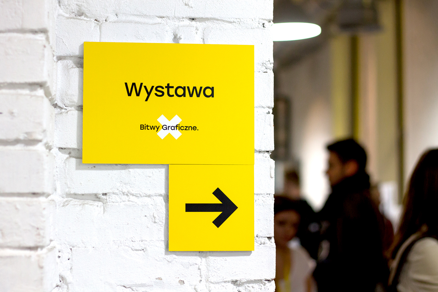
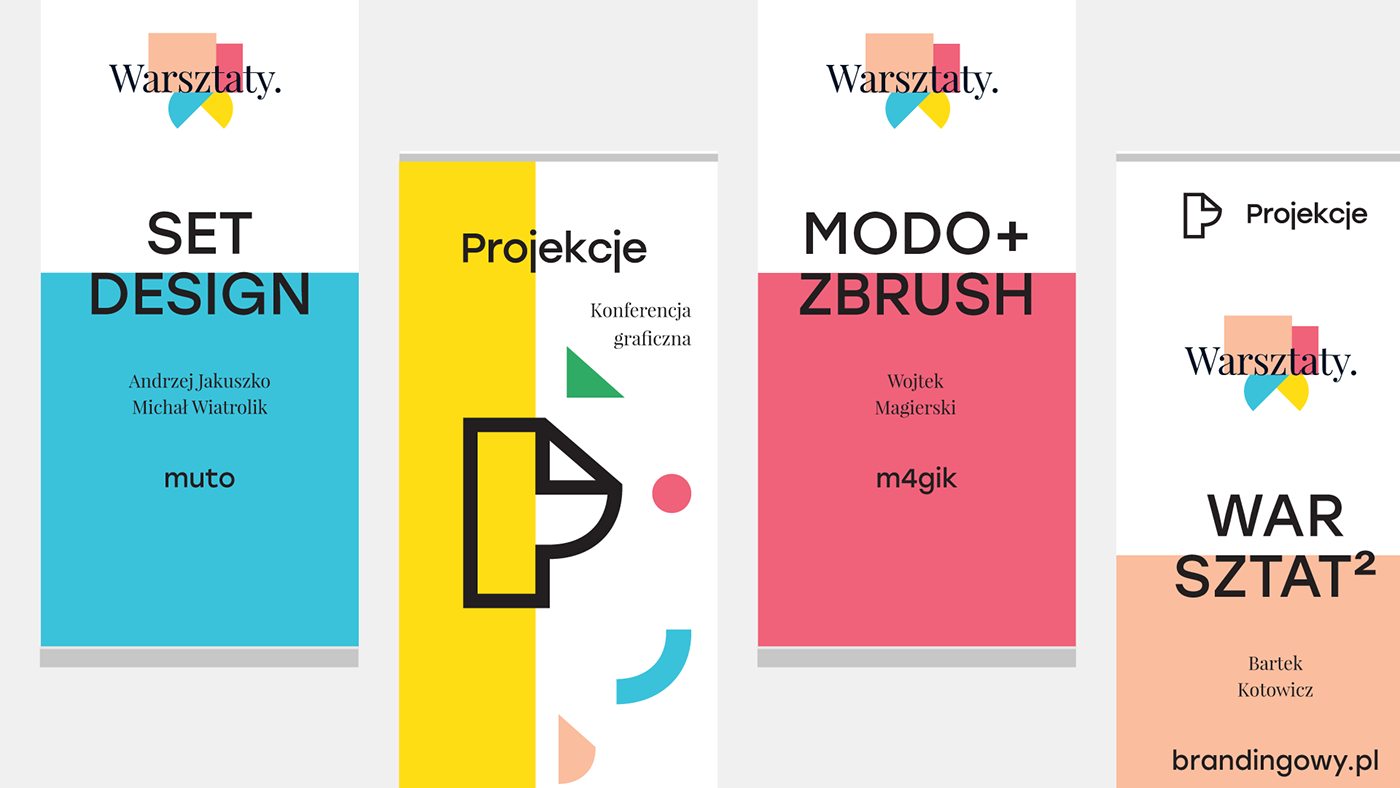
Typography was selected with the same things in mind, that's why we decided to use two typefaces. Thanks to these tools we had freedom to create diverse content staying within the visual frame of the brand identity. Starting with icons and animation, up to minimal way-finding system.
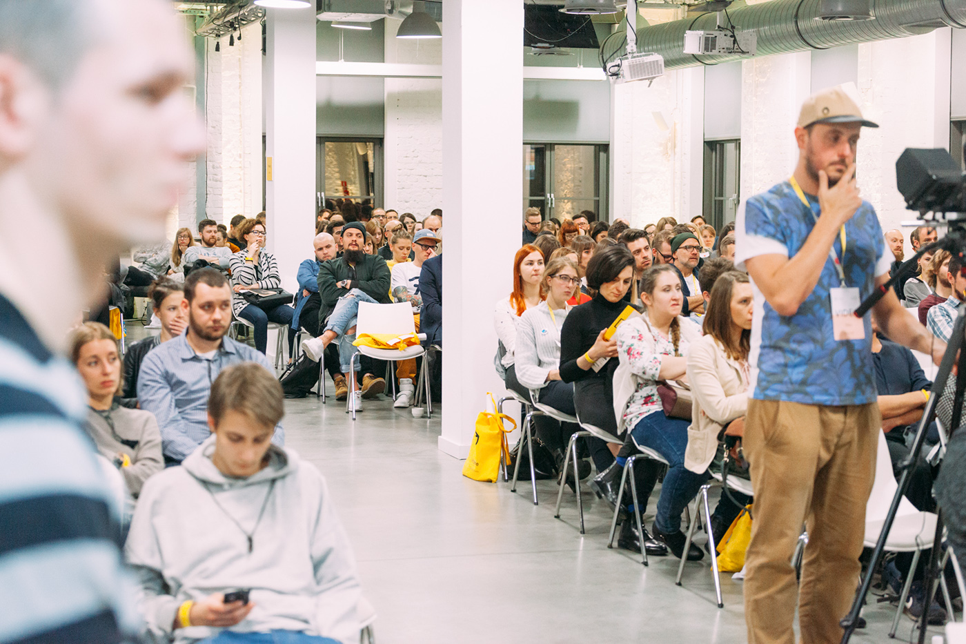
Design Battles were a big part of Projections. They were a competition which engaged designers from different fields, but also gave the young designers a chance to compete against more experienced colleagues. The main goal here was to remind us all that design should mix work and fun - the brief and the execution.
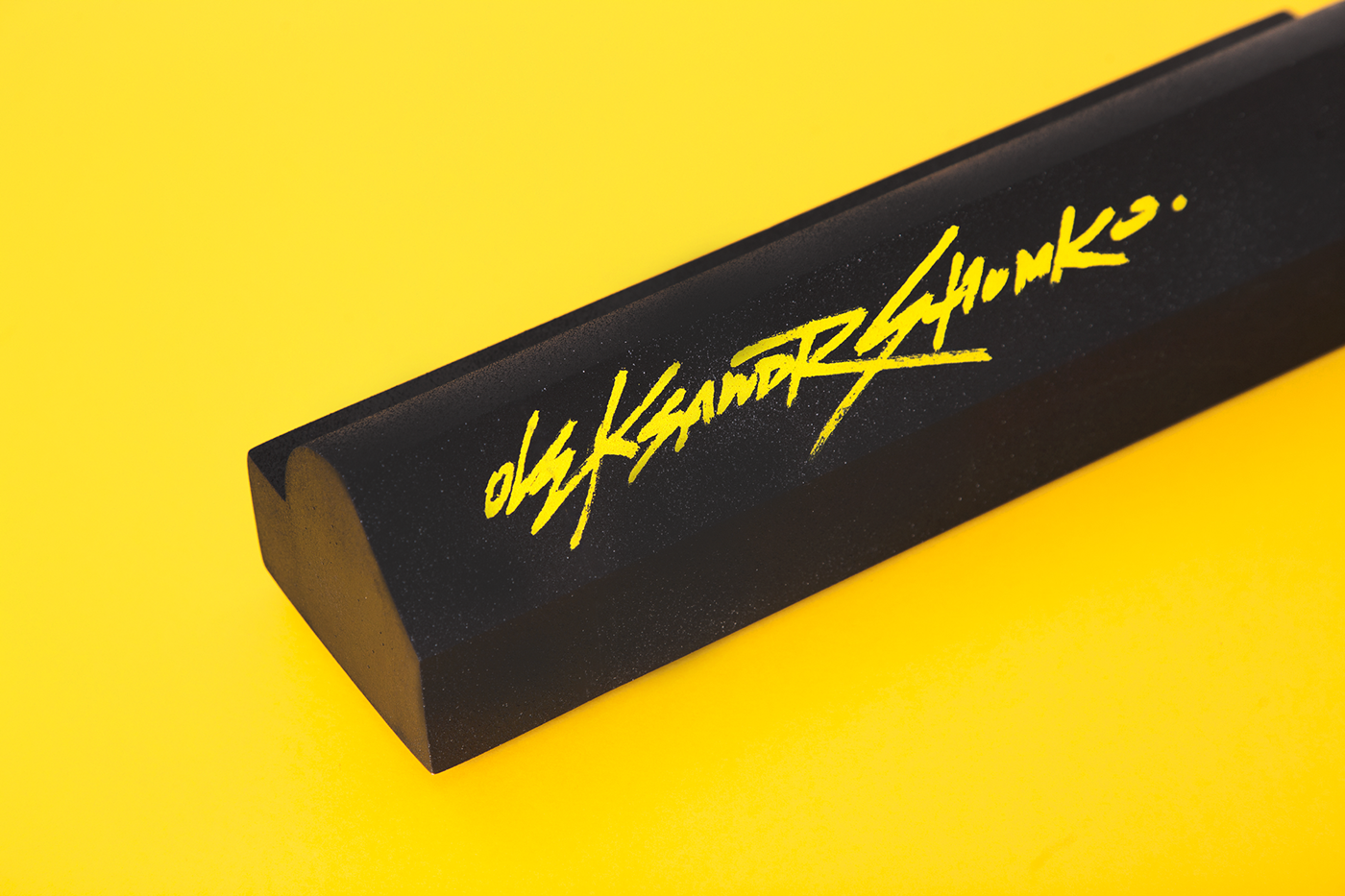
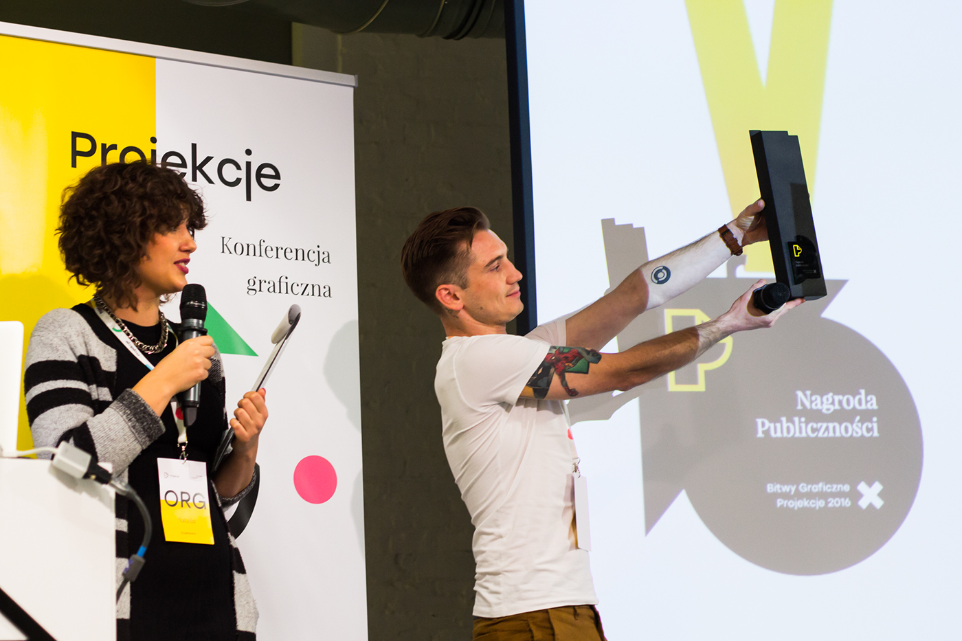
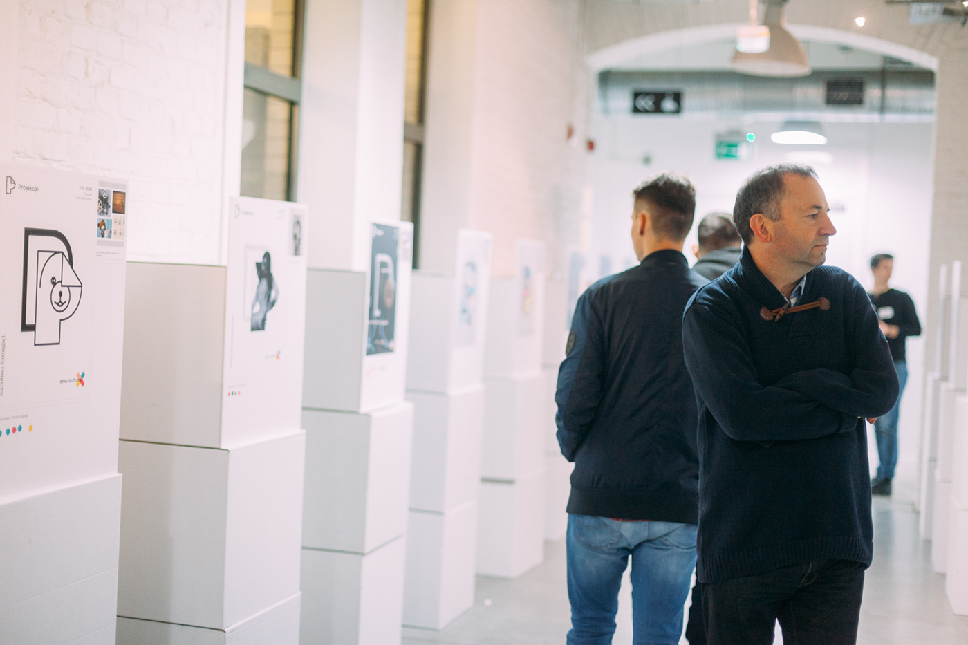
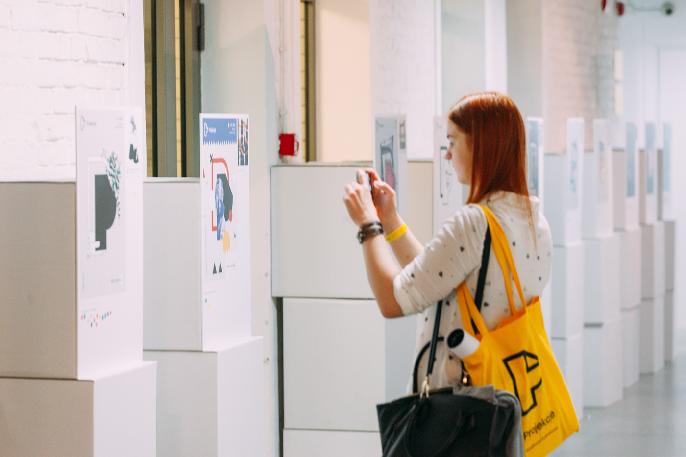
The assignment was to create a poster based on the provided template and inspiration selected by the contestant. The jury chose 20 best posters (of almost 60 received) which were shown during an exhibition. The audience had a chance to chose their favorite by voting with color dots. There were three main awards: Jury Award, Audience Award and Organizers' Award. We designed custom made medals for all three categories. The Audience Award was a statue designed by Wojciech 'M4gik' Magierski & signed with the winner's name by Oskar Podolski.


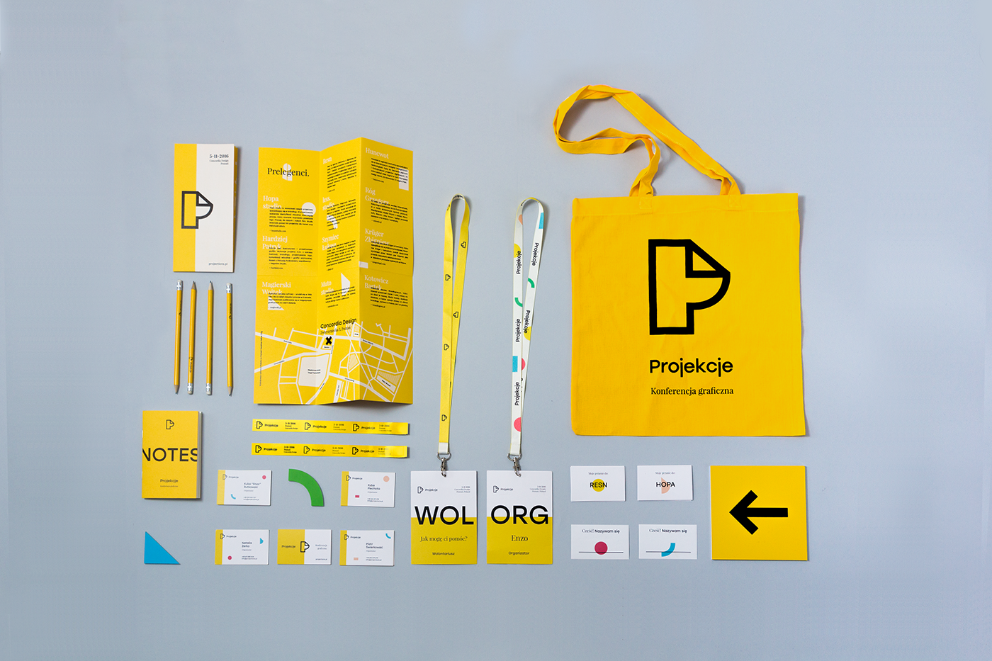
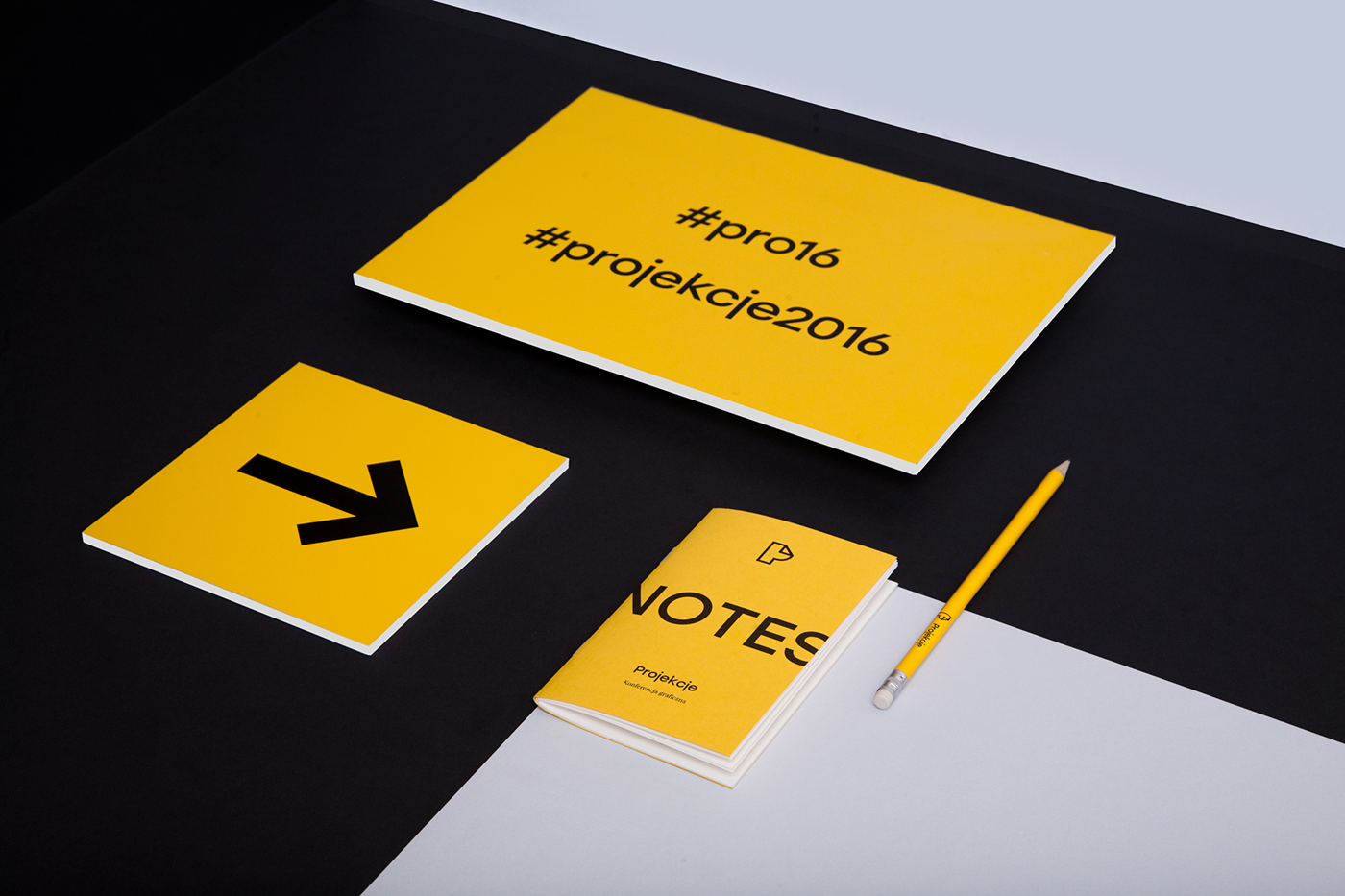
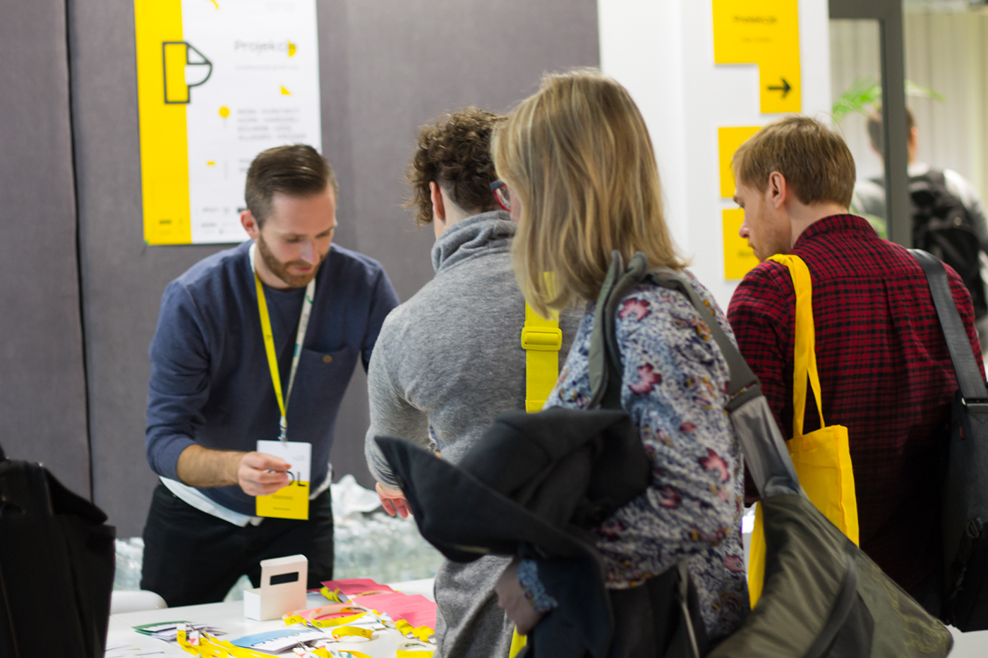
All branding materials needed to correspond with the main graphic theme of the whole event. Not only printed materials and gifts for the attendees and speakers, but also the website and social media content.
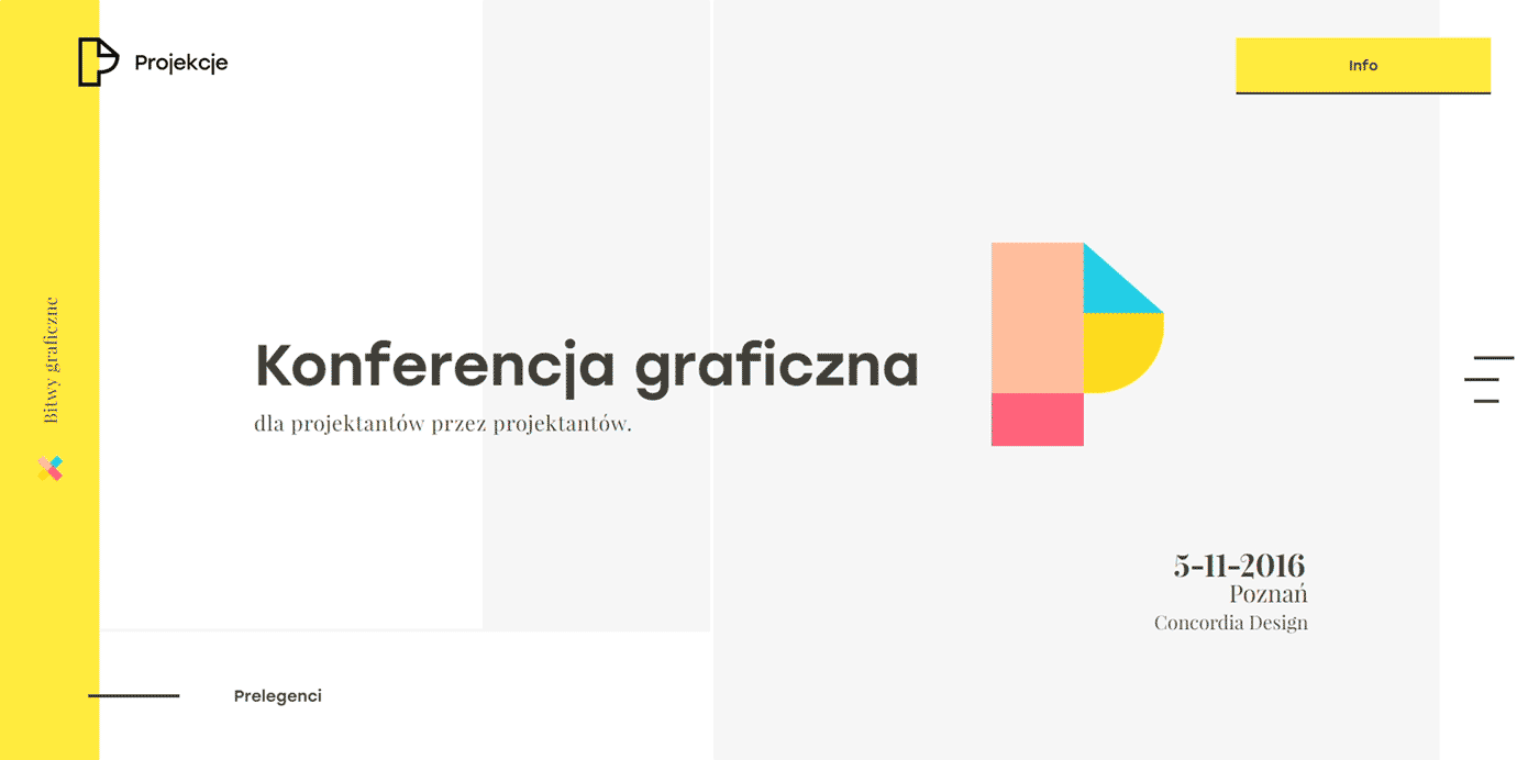
The website for the event was a big part of the on-line presence. Great design and implementation showed what the Projections 2016 ID is all about. The site was honored on well known webdesign-related sites such as Awwwards and CSS Awards. You can check it out at projections.pl
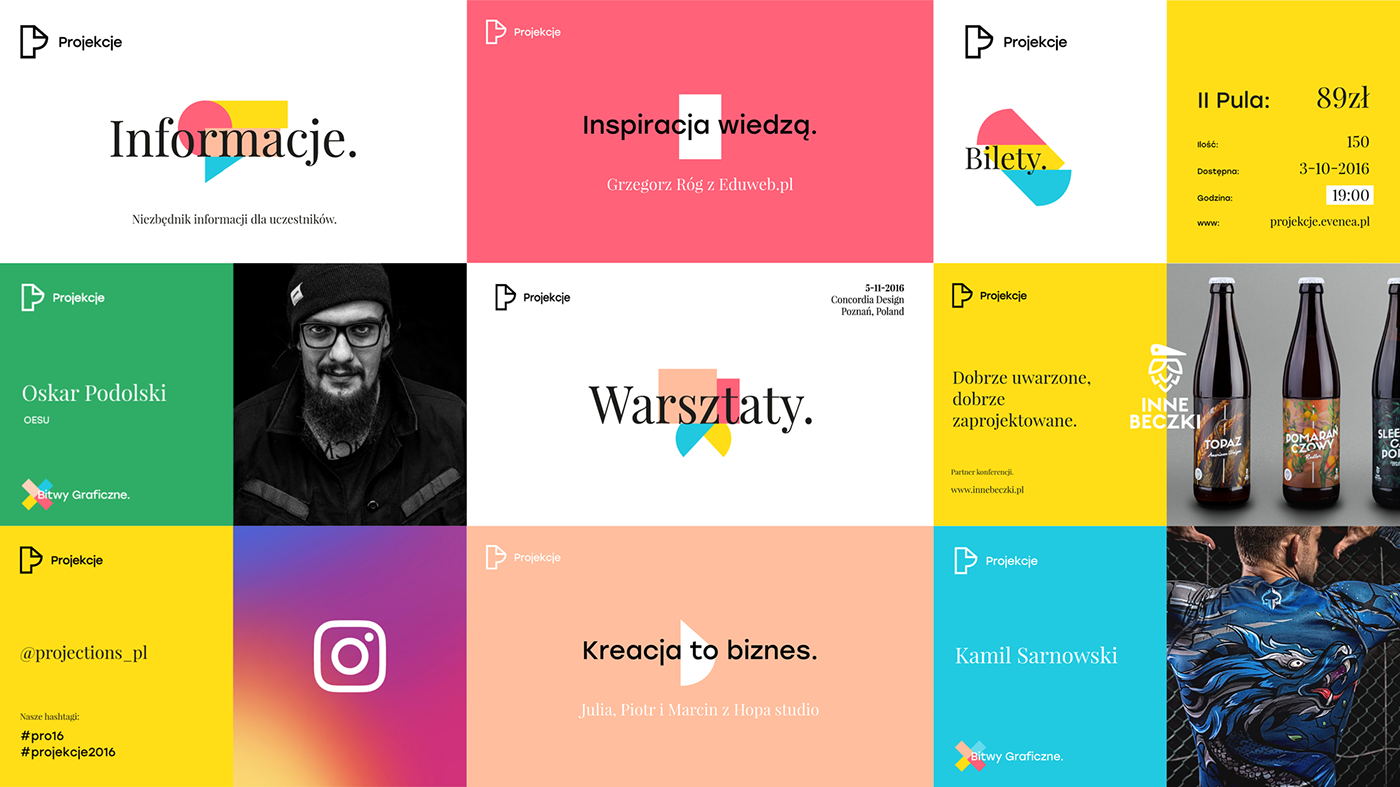
Social media posts were also an important part of keeping the visual identity coherent. We created well recognizable post templates using the colors, shapes and fonts. We designed different types of Facebook posts for different types of information, e.g. Workshops & Lectures, Design Battles, general information - all had slightly different layouts. Some of them were animated and used also during the main event for continuity.

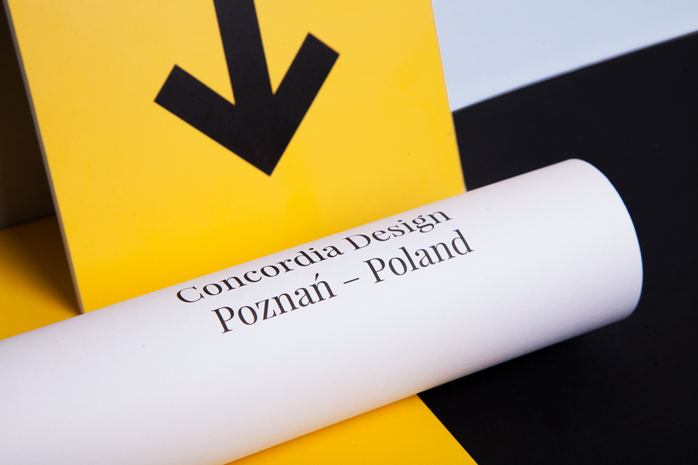
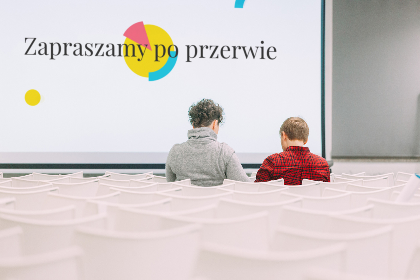
Projections were all about design. A graphic design conference for designers organized by designers, held at a place with a great history (an old printing house, now known as Concordia Design) and with carefully designed brand identity.
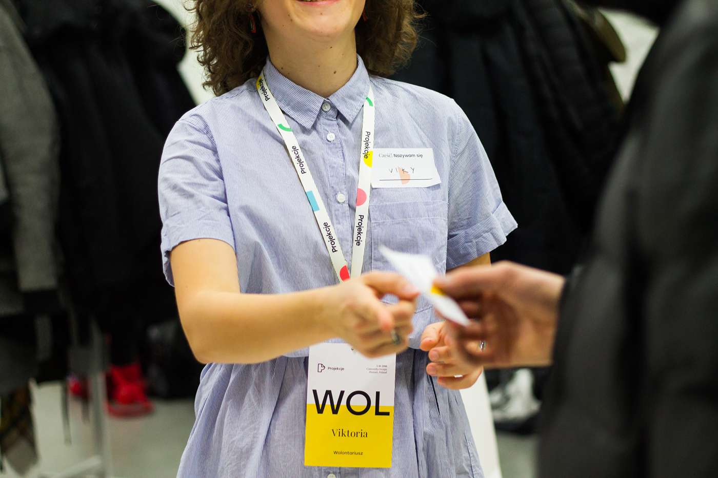
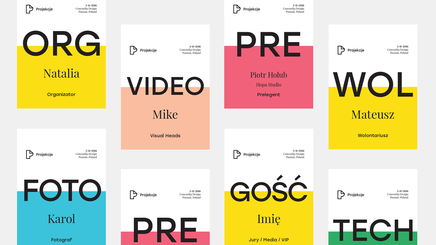
The team of organizers covered all necessary fields of expertise: branding, animation and graphic design. This gave us an opportunity to show the brand identity and good design on gift bags, ID tags, roll-ups, but also in webdesign and animation. The outcome was a well crafted design conference.


Projections 2016
Video short of the 1st edition held in Concordia Design / Poznań, PL
Credits:
Brand Design: Kuba 'Enzo' Rutkowski / Natalia Żerko
Web Design / UI: Piotr Swierkowski
Frontend: Torpedov
Animation: .fromsquare studio
Video production: Visual Heads
Camera operators: Visual Heads, Adam Rotnicki / Oktagon
Brand identity photos: Andrzej Jakuszko / Muto
Event photos: Karol Wysmyk, Ola Gościniak, Stefan Lorentz, Rafał Dryżałowski, Ewelina Dymek


