A helical pile is an extendable deep foundation system with helical bearing plates welded to a central steel shaft.
Helica. is the first brand in Portugal providing this construction foundation system.
Challenge:
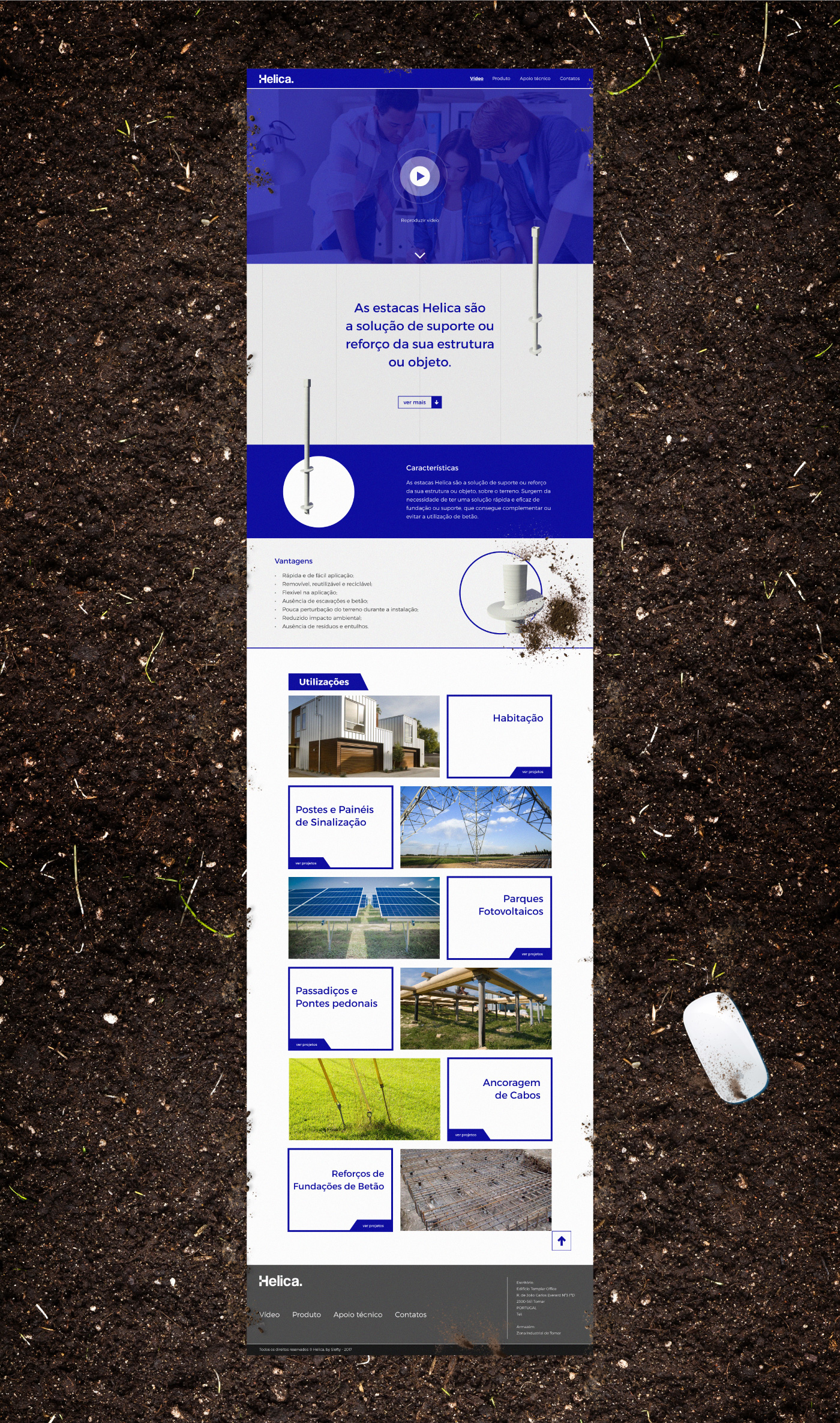
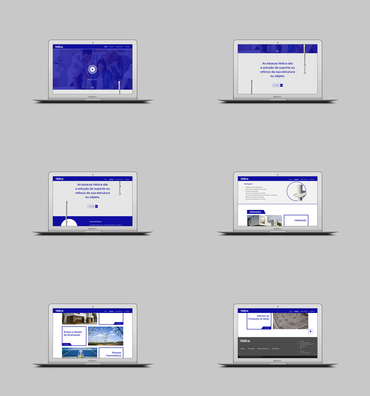
Communicate the products functionality and operational areas through an easy, understandable and appealing visual language system.
Communicate the products functionality and operational areas through an easy, understandable and appealing visual language system.
References:
(Images/photos below are only used for demonstration purpose and belong to their owners.)
(Images/photos below are only used for demonstration purpose and belong to their owners.)

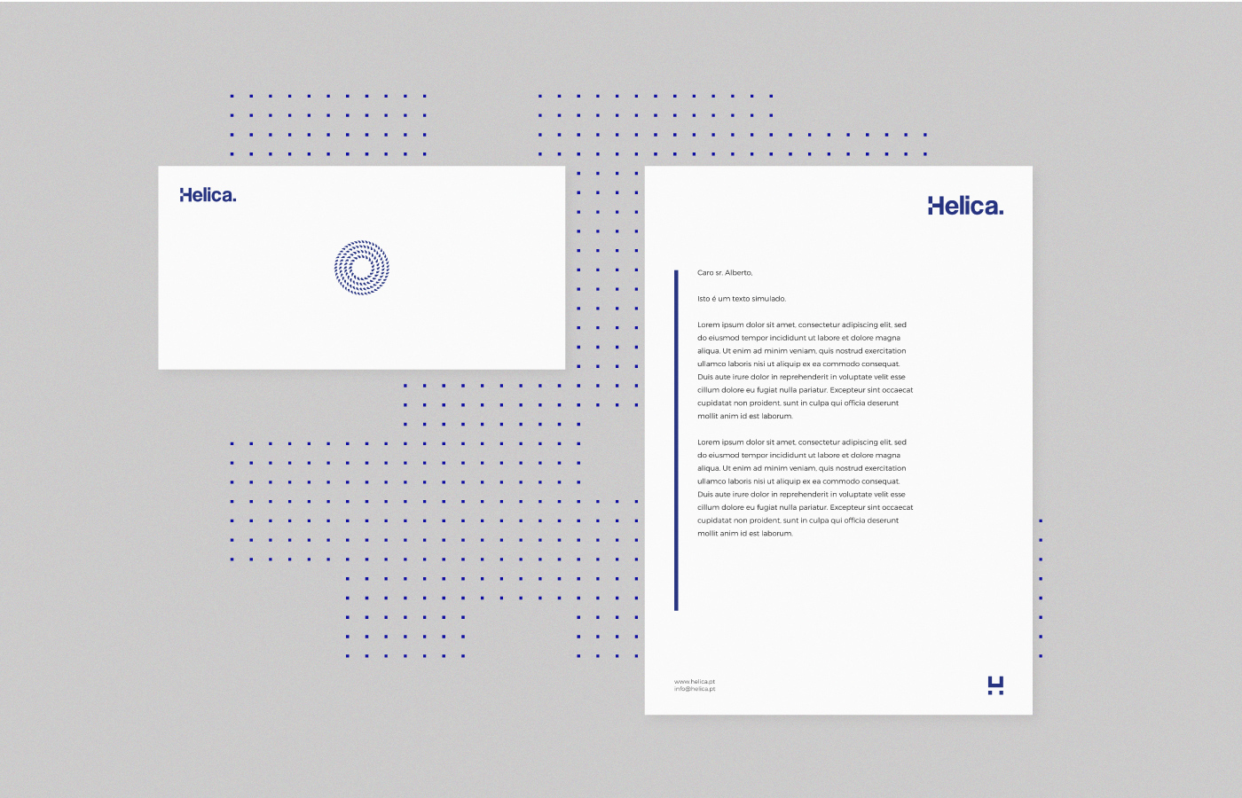
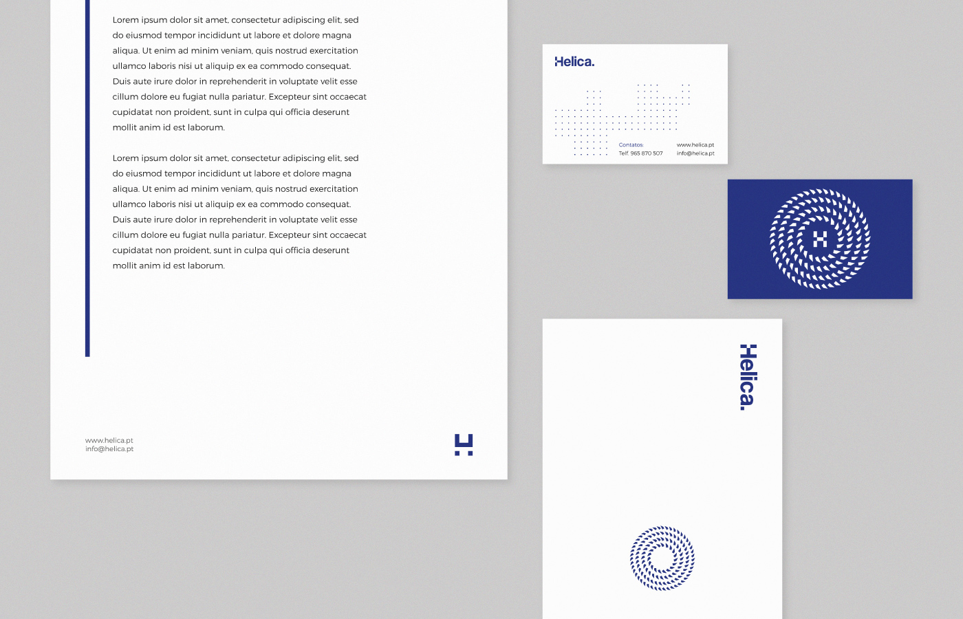
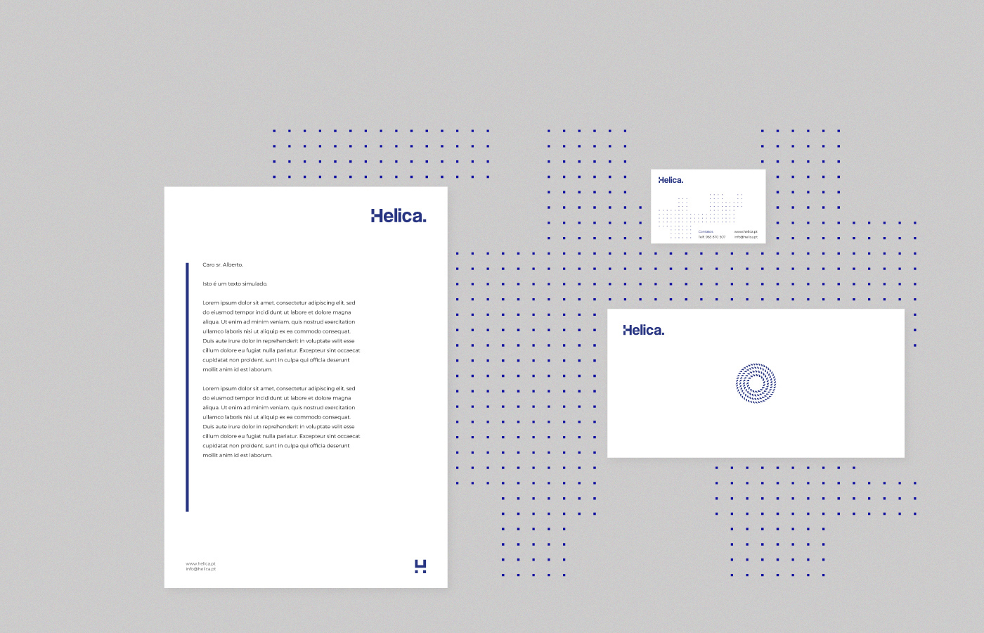
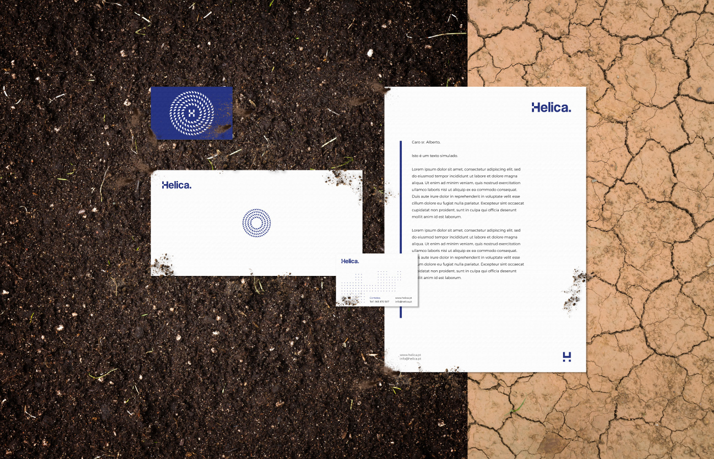
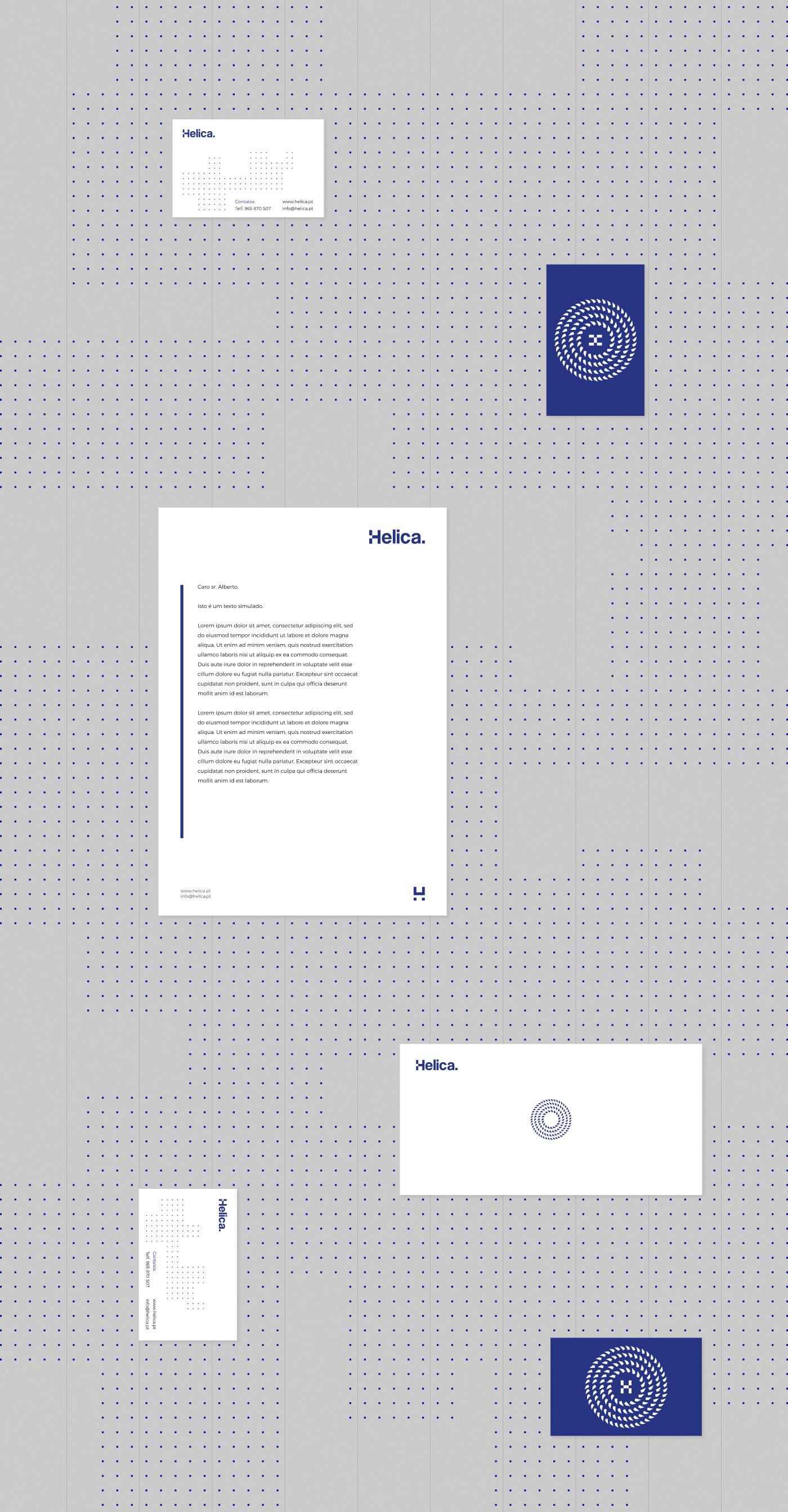
The graphical representation of the helical pile/pipe suggests rotational movement, high-tech and engineering.

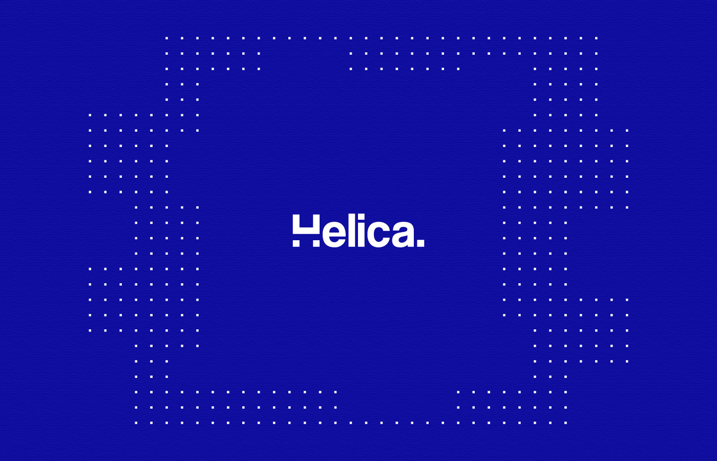
The modern and simple wordmark communicates commitment, balance and confidence.

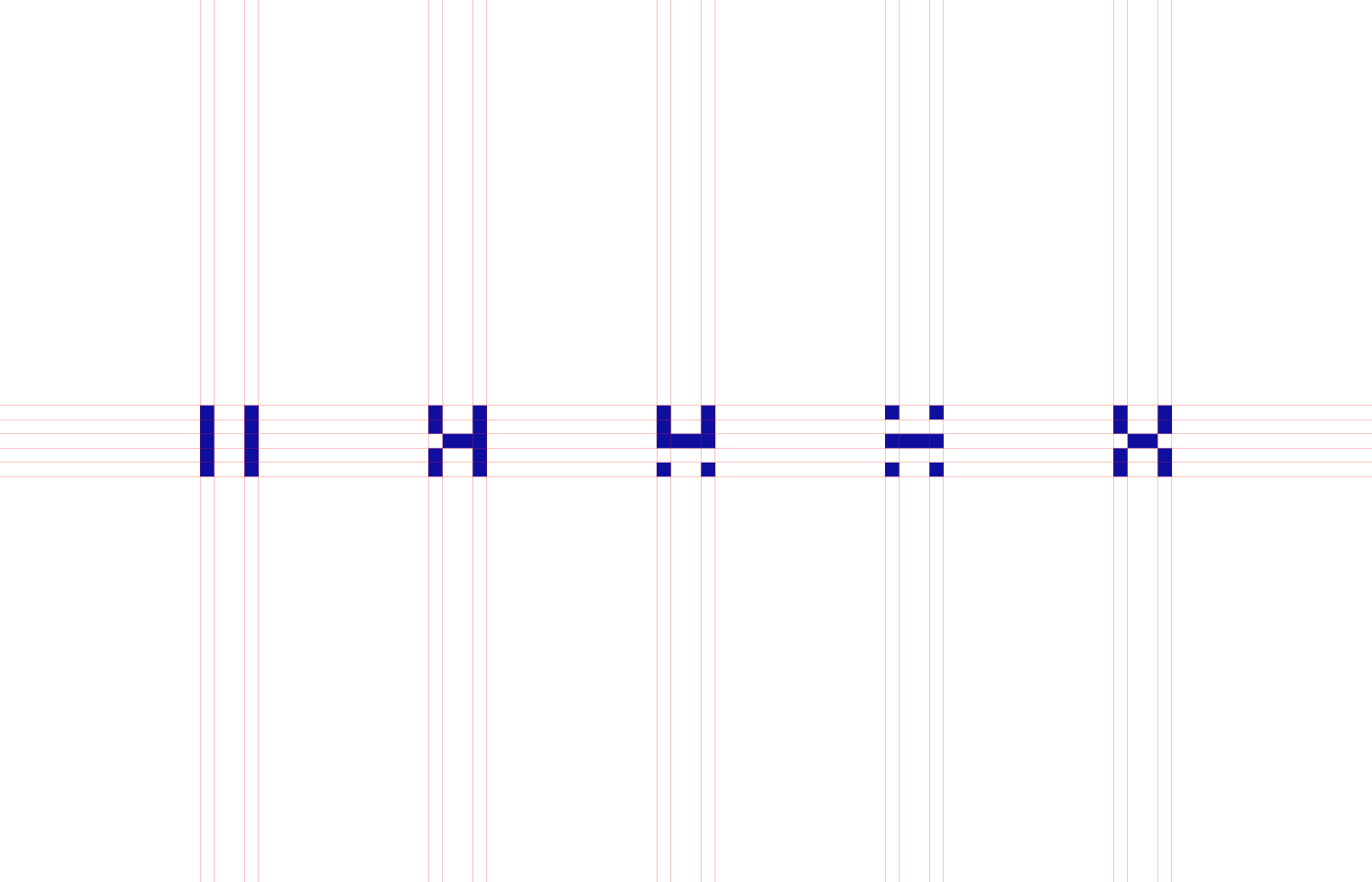
Various symbols were developed from the silent letter "H", as a way to communicate operational areas/places, always keeping the resemblace of the letter "H".
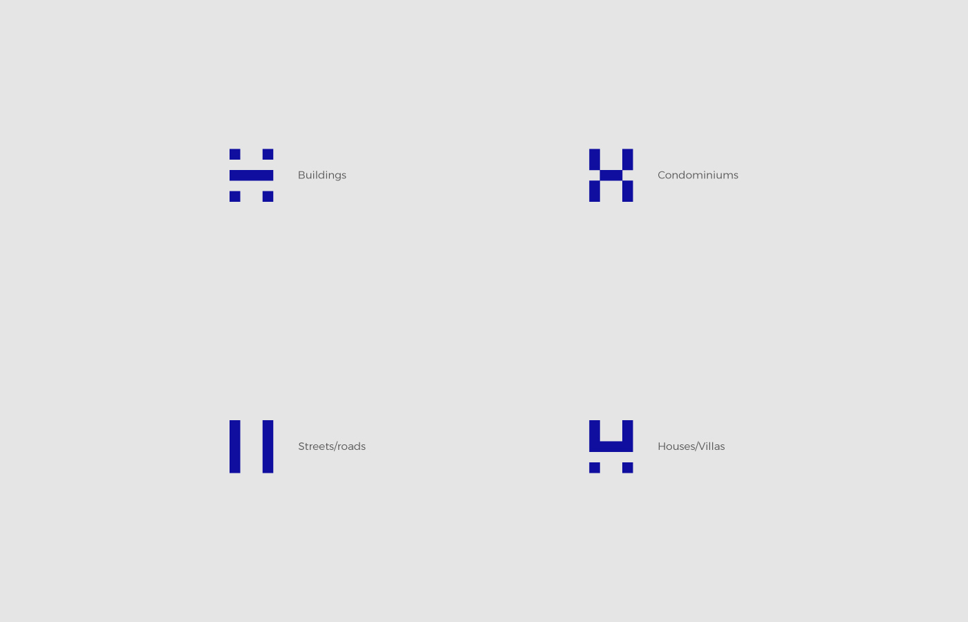
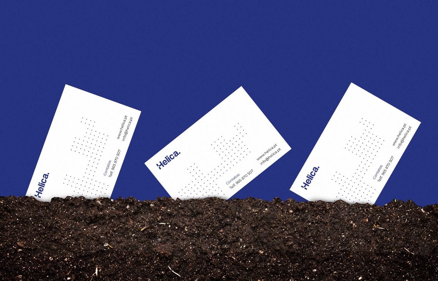
The little dots/squares refers to the top view of a plant/area where Helica can operate.
No matter how large the area is, Helica has the solution.
No matter how large the area is, Helica has the solution.

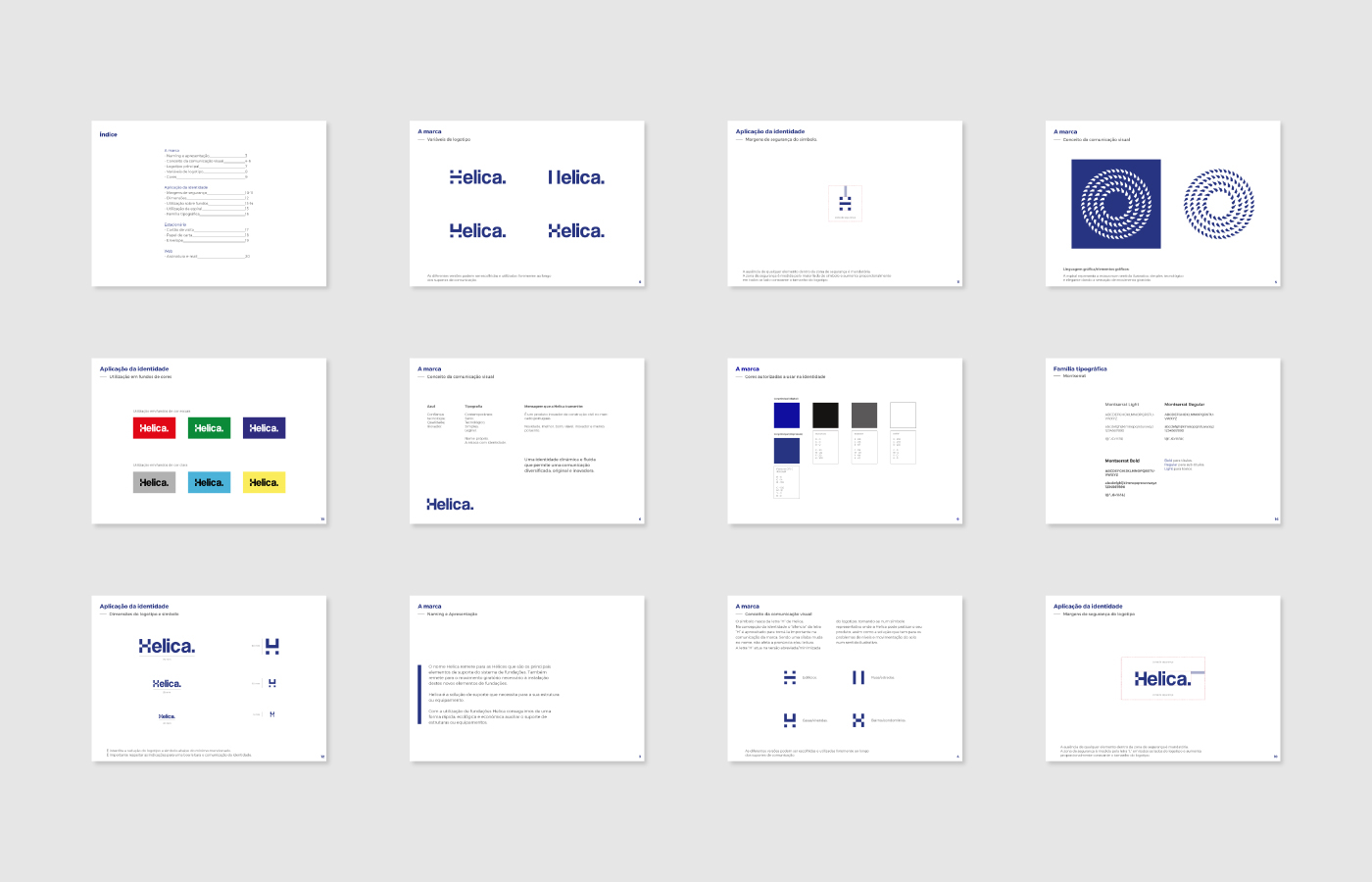
Brandbook guidelines





E-mail signature
www.helica.pt
Brand design and UI/UX by Pedro Almeida / pedrobrands.com
Web Development by Cristiano Almeida / csalmeida.com


