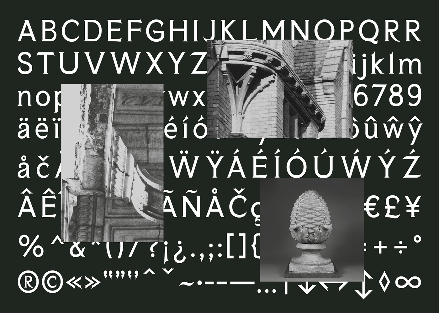
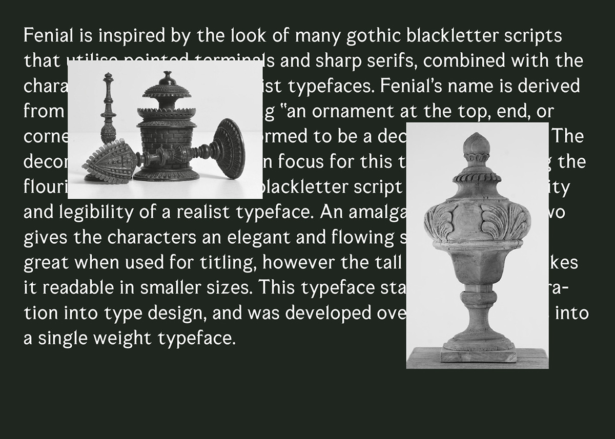
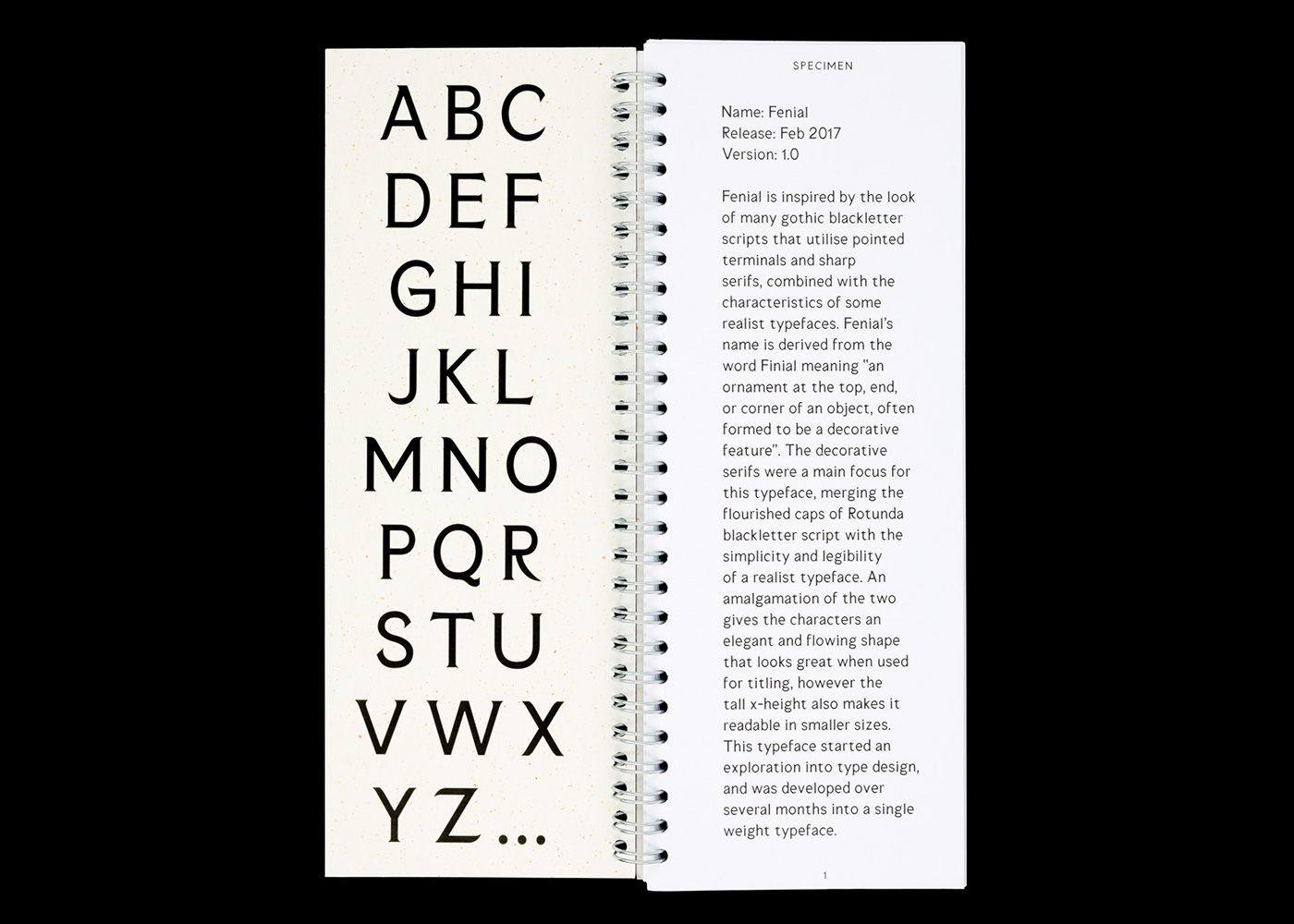
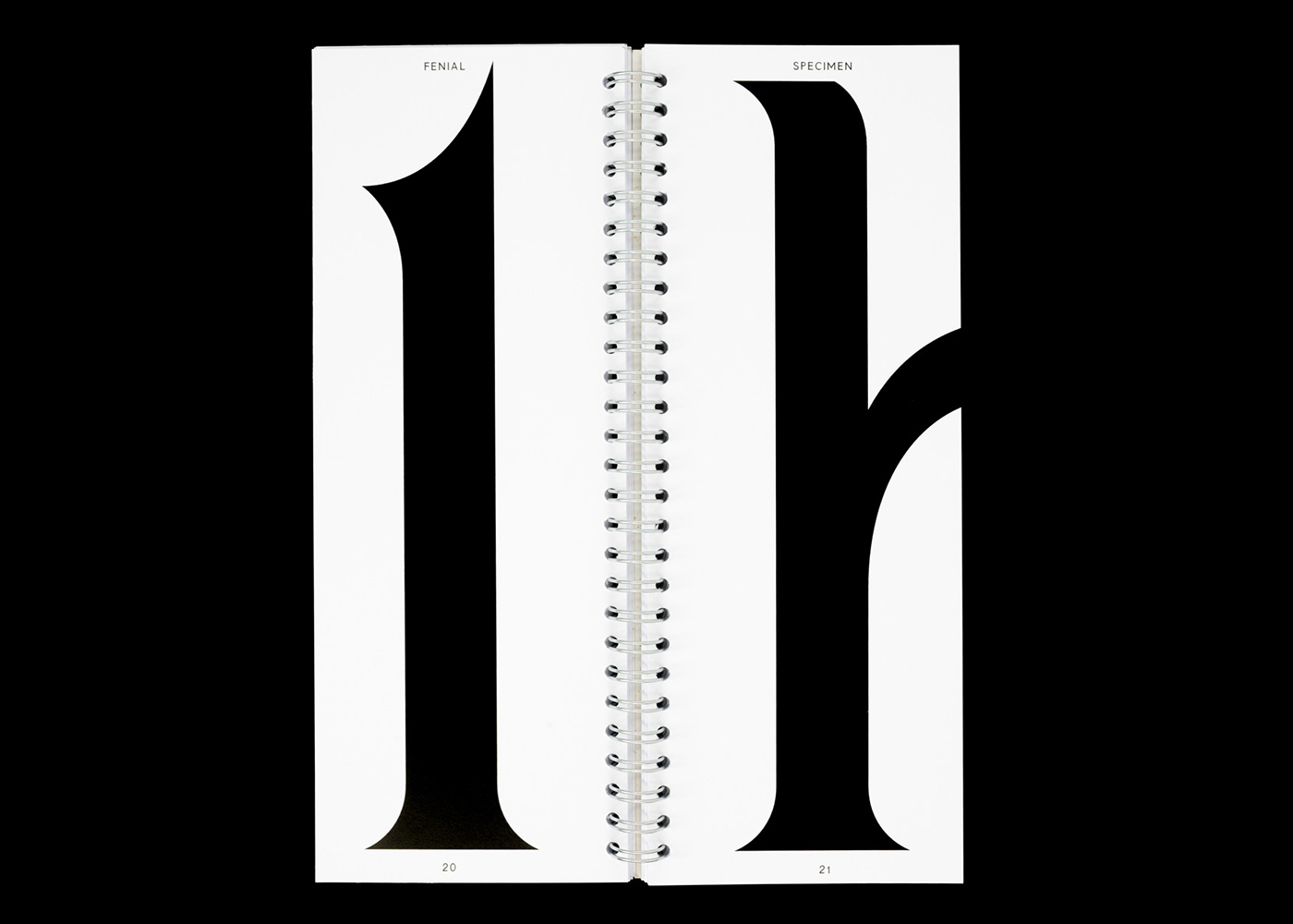
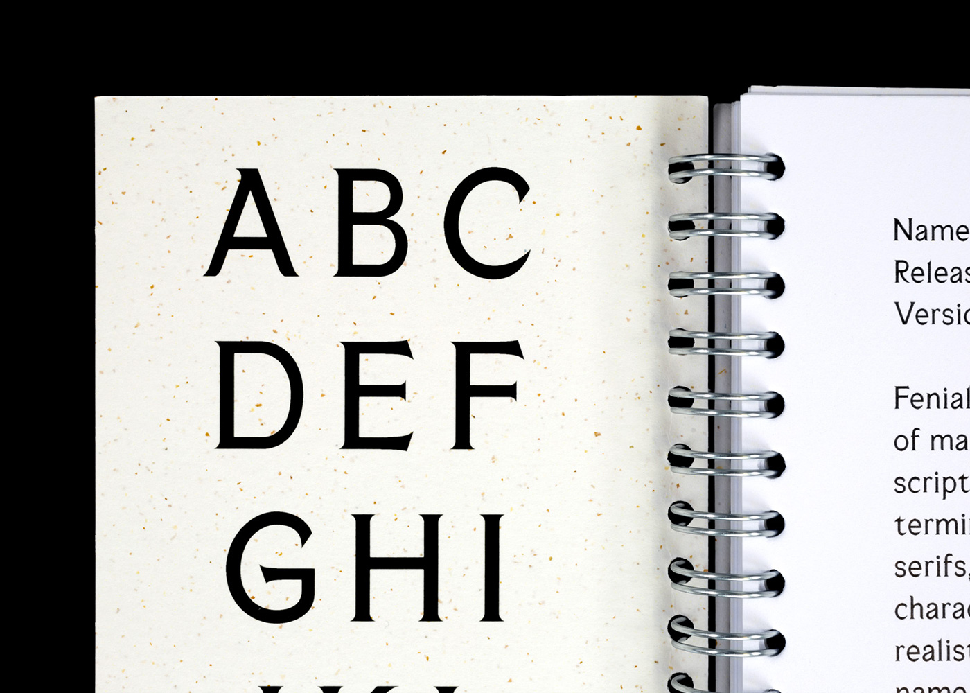
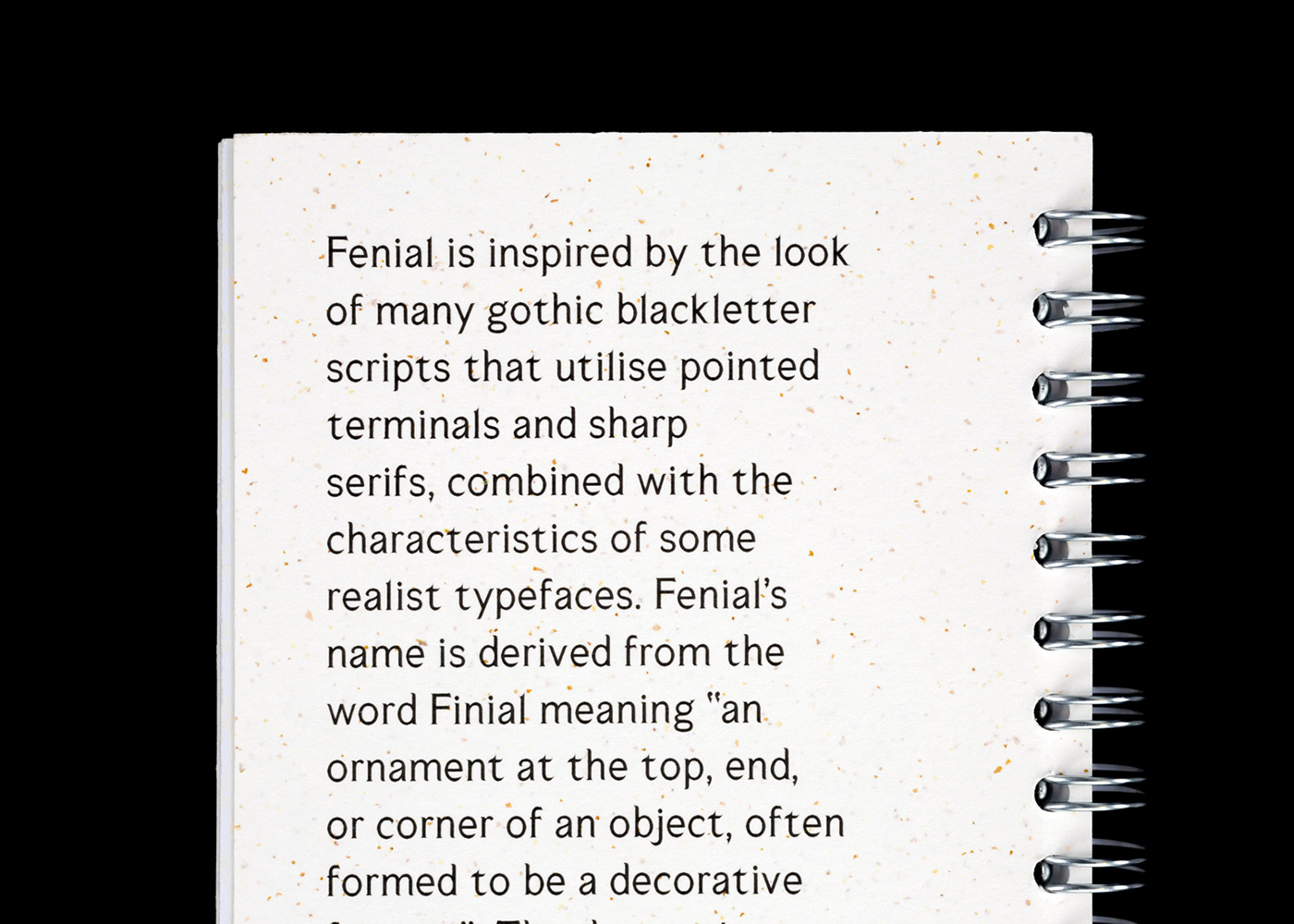
Fenial is inspired by the look of many gothic blackletter scripts that utilise pointed terminals and sharp serifs, combined with the characteristics of some realist typefaces. Fenial’s name is derived from the word Finial meaning “an ornament at the top, end, or corner of an object, often formed to be a decorative feature”. The decorative serifs were a main focus for this typeface, merging the flourished caps of Rotunda blackletter script with the simplicity and legibility of a realist typeface. An amalgamation of the two gives the characters an elegant and flowing shape that looks great when used for titling, however the tall x-height also makes it readable in smaller sizes. This typeface started an an exploration into type design, and was developed over several months into a single weight typeface.


Thanks for viewing!

