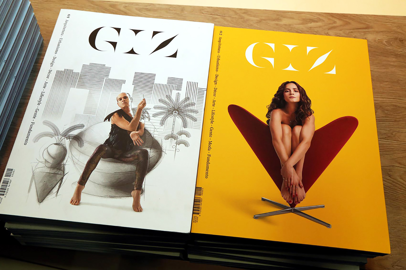
GIZ Brasil is an innovative architecture and design publication that mixes a print magazine in almost coffee table book format with 400+ pages with a website dedicated to all things design/decoration/fashion/architecture. The challenge in designing the magazines logo was to translate their keen Brazilian sensitivity into three unassuming letters: GIZ. We drew inspiration from Cobogó, a modular building block used to great effect in Brazilian modernist architecture. Architecture and typography are both positive negative space in pure play. This chiaroscuro relationship lends the word mark a balance and rhythm through the basic shapes mixed with forms that break the staccato monotony of a purely modular construction.
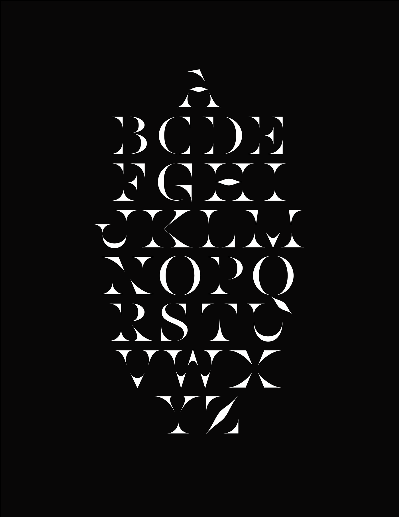
In order to allow more freedom and possibilities, we completed an alphabet in the same vein as the logo, to be used sparingly and in monumental sizes inside the magazine.
Art Direction
Mariana Ochs
Design
Rodrigo Saiani, Lucas Campoi, Flora de Carvalho