In this article I am keen to take you trough my process of building the new custom logotype for Marvel, from sketch to final product.
I post work in progress on Dribbble and tweet about it on Twitter and using Instagram at the same time.
Introduction
Marvel is a design, prototyping an collaboration application based in London, UK.
Marvel's co-founder Murat Mutlu reached out to me for a logotype refresh. I quite liked the old logo actually. Next to being awesome, Murat was pretty clear in his intend for style direction and after a quick call I was excited to get started. The goal was pretty clear, the new type needed to resemble a friendly, fun yet professional character with lots of personality and energy. The Marvel type also needed a stand-alone "M" character for smaller display usage.
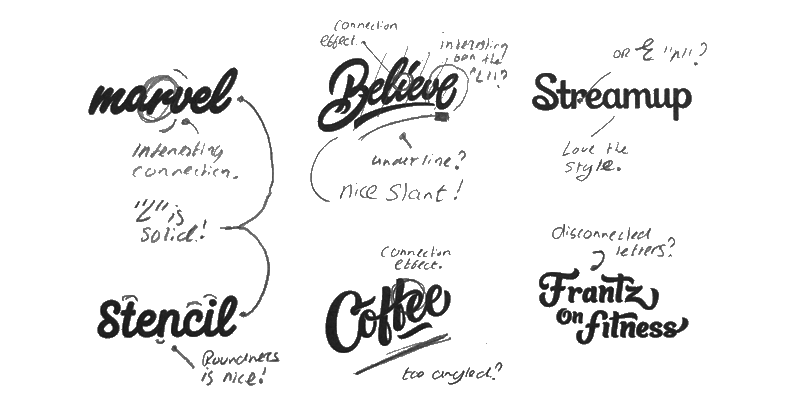
As mentioned above the goal was pretty clear which made the hunt for inspiration much easier. I had a clear view in my mind on how the first sketches should look, image below was used as a reminder while sketching. Work included from Nick Slater, Sergey Shapiro, Mark Caneso, Leo Gomez and myself.
Exploration
Sketching
Actually took a lot of inspiration from the previous Marvel type, especially the "r-v" and "v-e" connection were interesting to explore further.
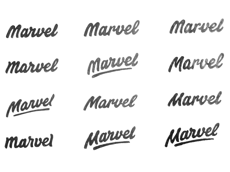

Murat was a big fan of the angled versions as it resembled an energetic character. In the following image it was time to reflect on the type and see what needed improvement. The top left "M" was favourite over the bottom left "M", used Photoshop to combine the two together.
Final Sketch
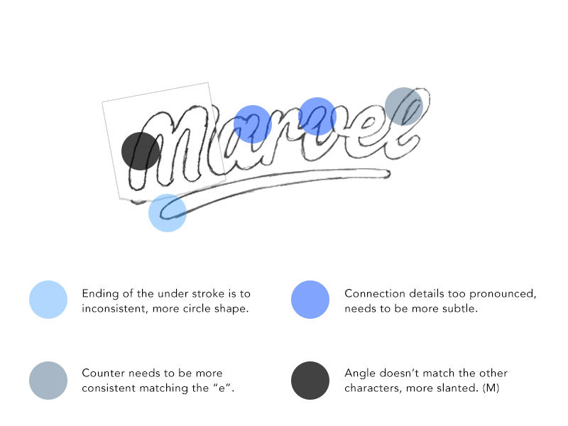
At this point it was time to improve the reflections of the sketch above and build the final sketch. With the above sketch underneath I used tracing paper to model the final sketch.
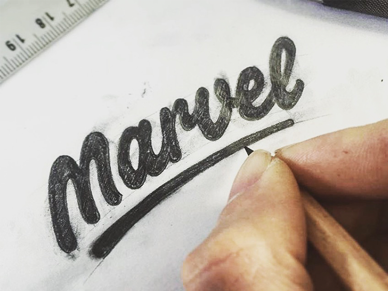
The counters of the "e" and "l" turned out a bit too small but left it at that and decided to go digital from here and refine it in Illustrator later.
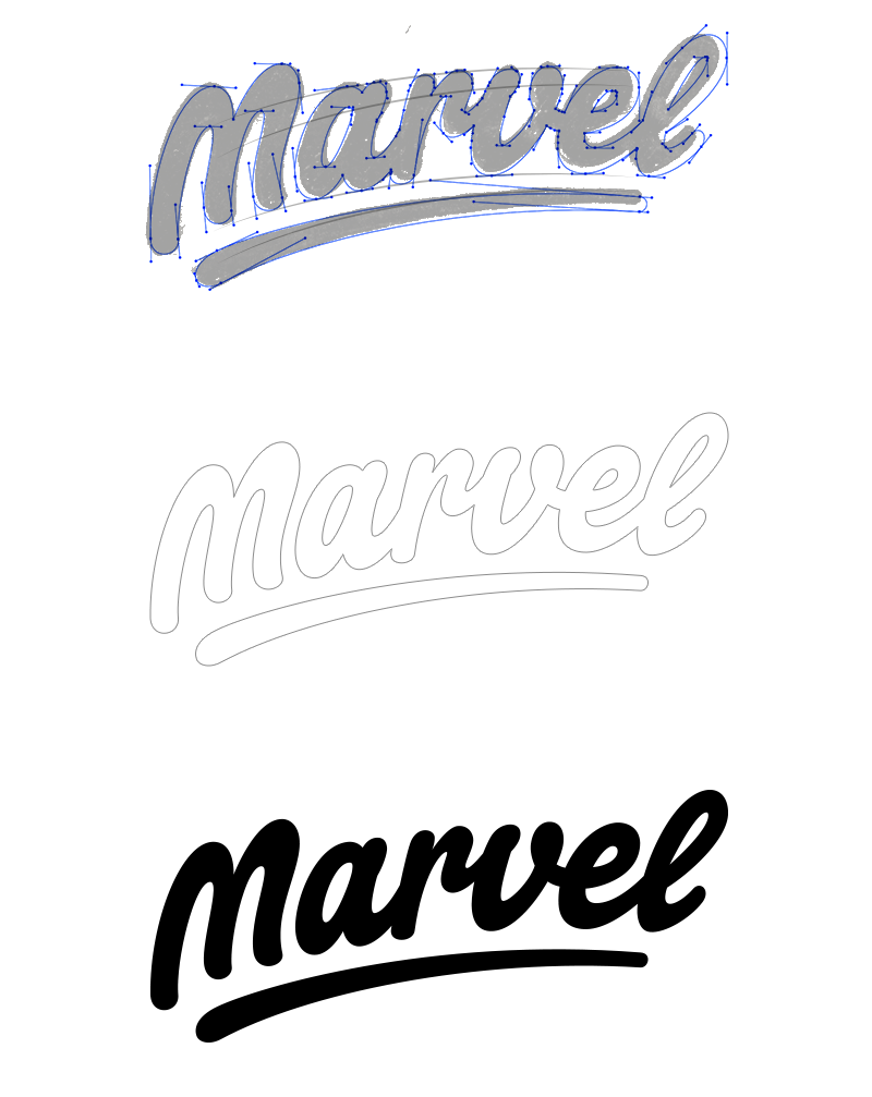
Digital Version
Below is a screenshot of the final sketch with the vectoring lettering on top. To position the characters correctly along the curved underline I started the tracing with the underline and used the underline as grid. The finished trace has a slightly less slanted curve angle, coming closer to an arch. Other aspects like kerning, stroke width and corners were also digitally refined.
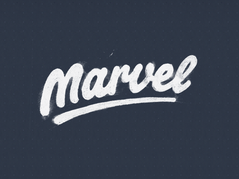
Alternate Version
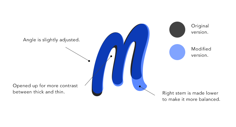
With the full logotype done we still needed a stand-alone "M", this particular one was tricky to use because it was so slanted and angled. This caused us exploring back and forth between different "M's" but after all we maintained the original "M".
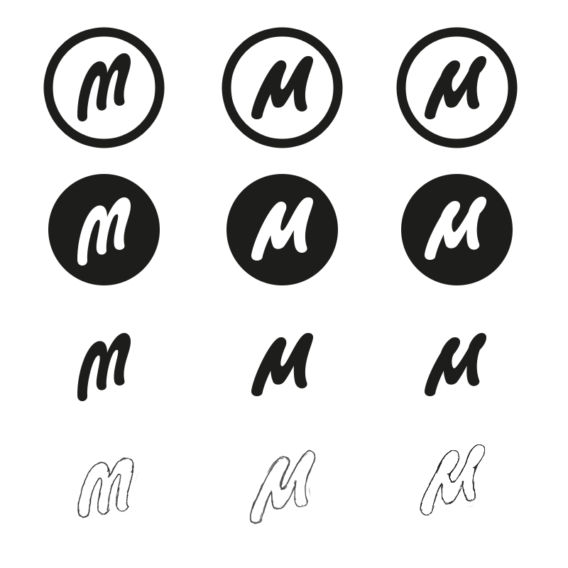
The stand-alone "M" will only be used at the smallest display's, on small to medium and above sizes the full Marvel type will be used most. We modified the original "M" from the word-mark to make it fit better within smaller sizes and make it look more extinct.
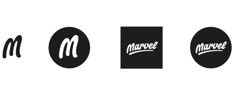
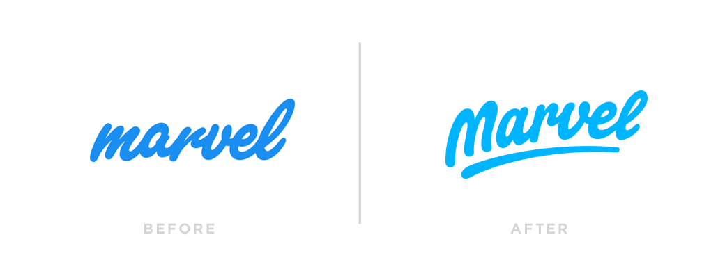
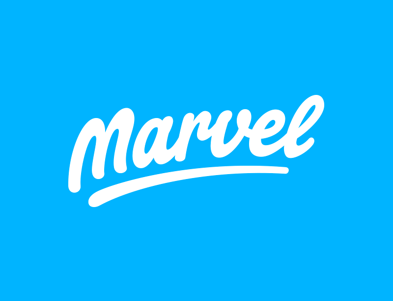
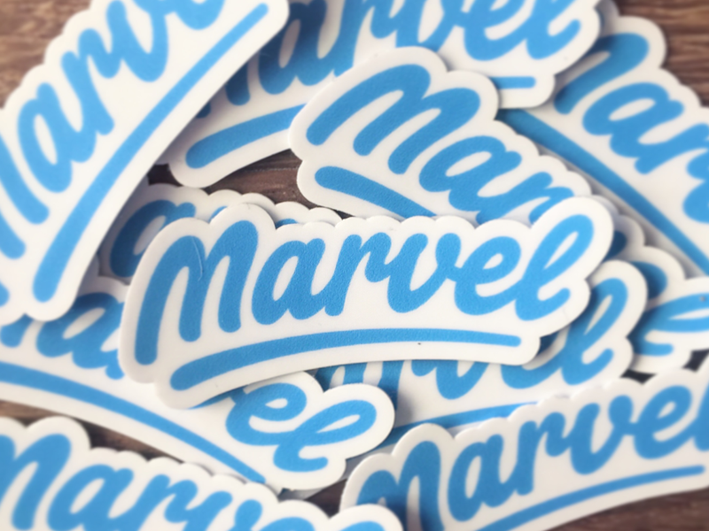
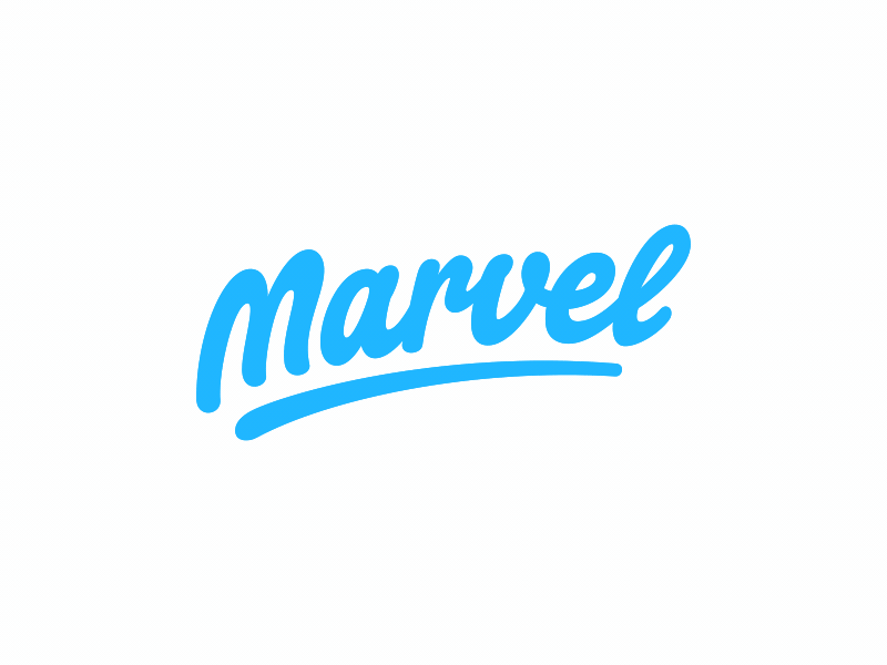
The Final Result
Had an awesome time working together with Murat on the new Marvel logotype and really satisfied how the final result came out. Hope you like me doing this kind of articles more often, I would like to do this on a more regular basis and happy to hear your feedback for improvements!
Client: Murat Mutlu (Co-Founder Marvel)
Art Direction: Murat Mutlu