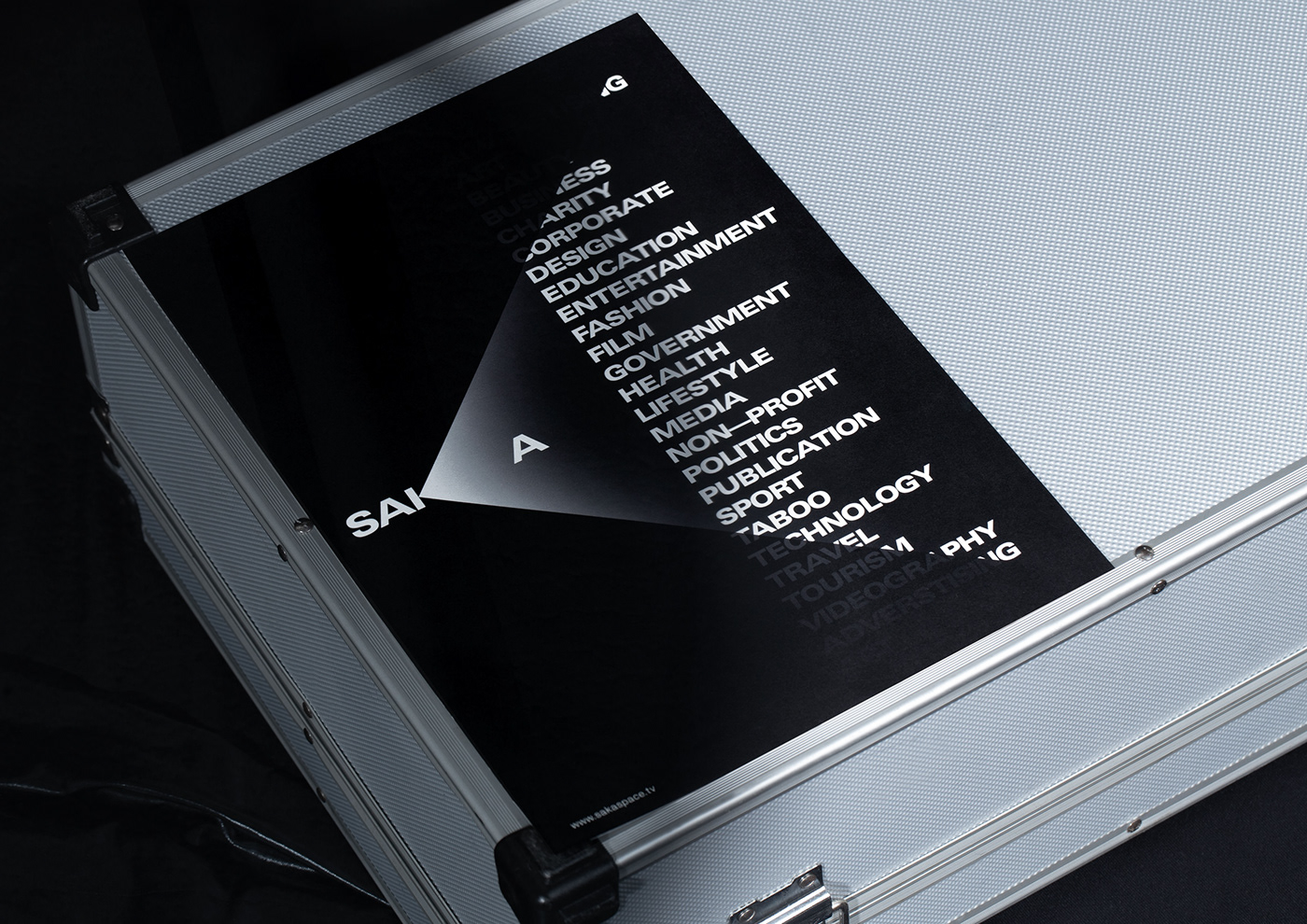
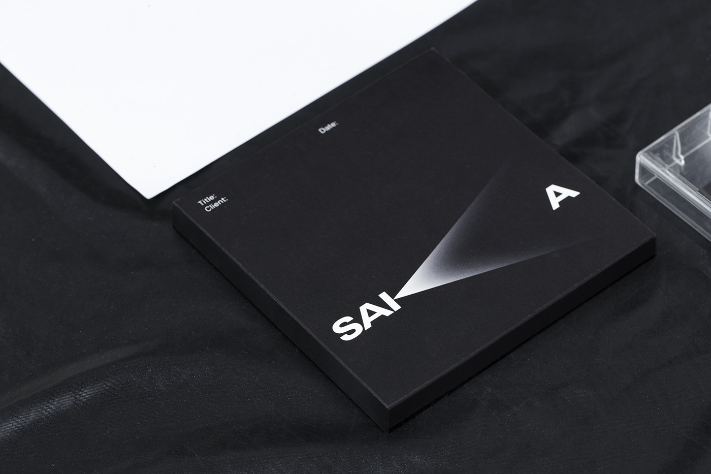
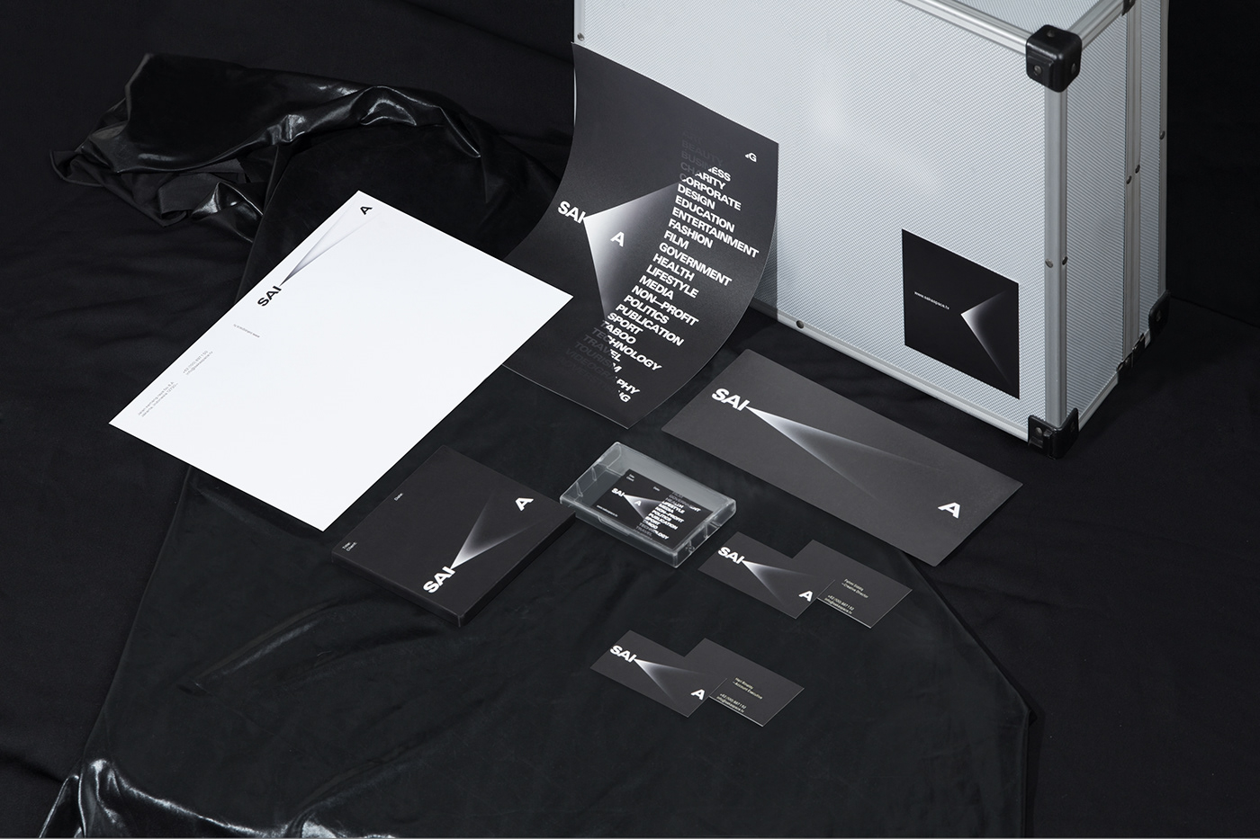
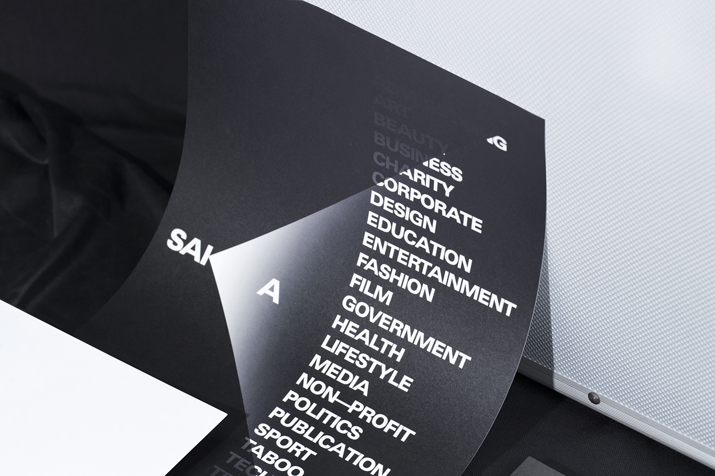
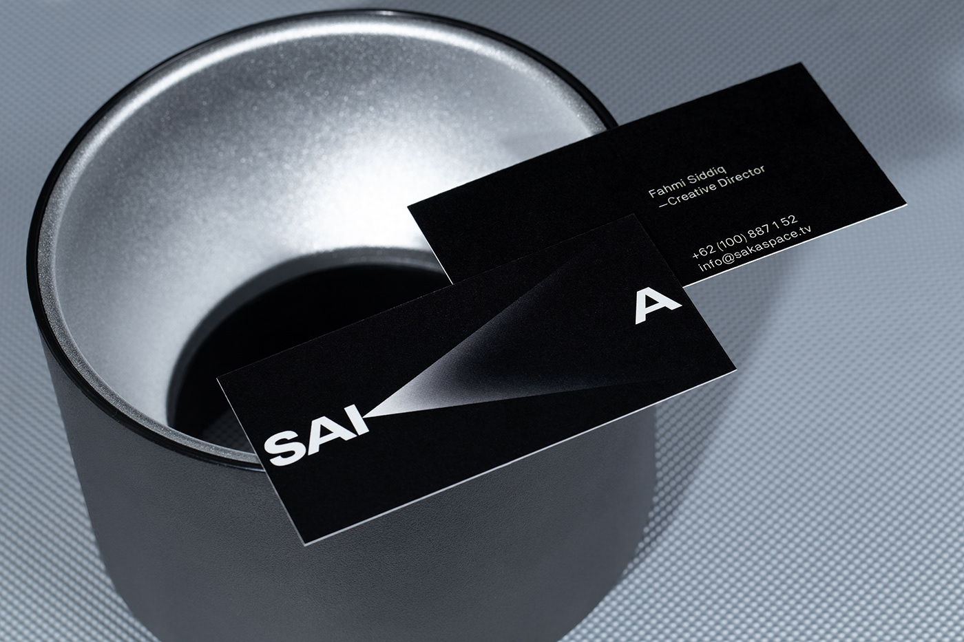
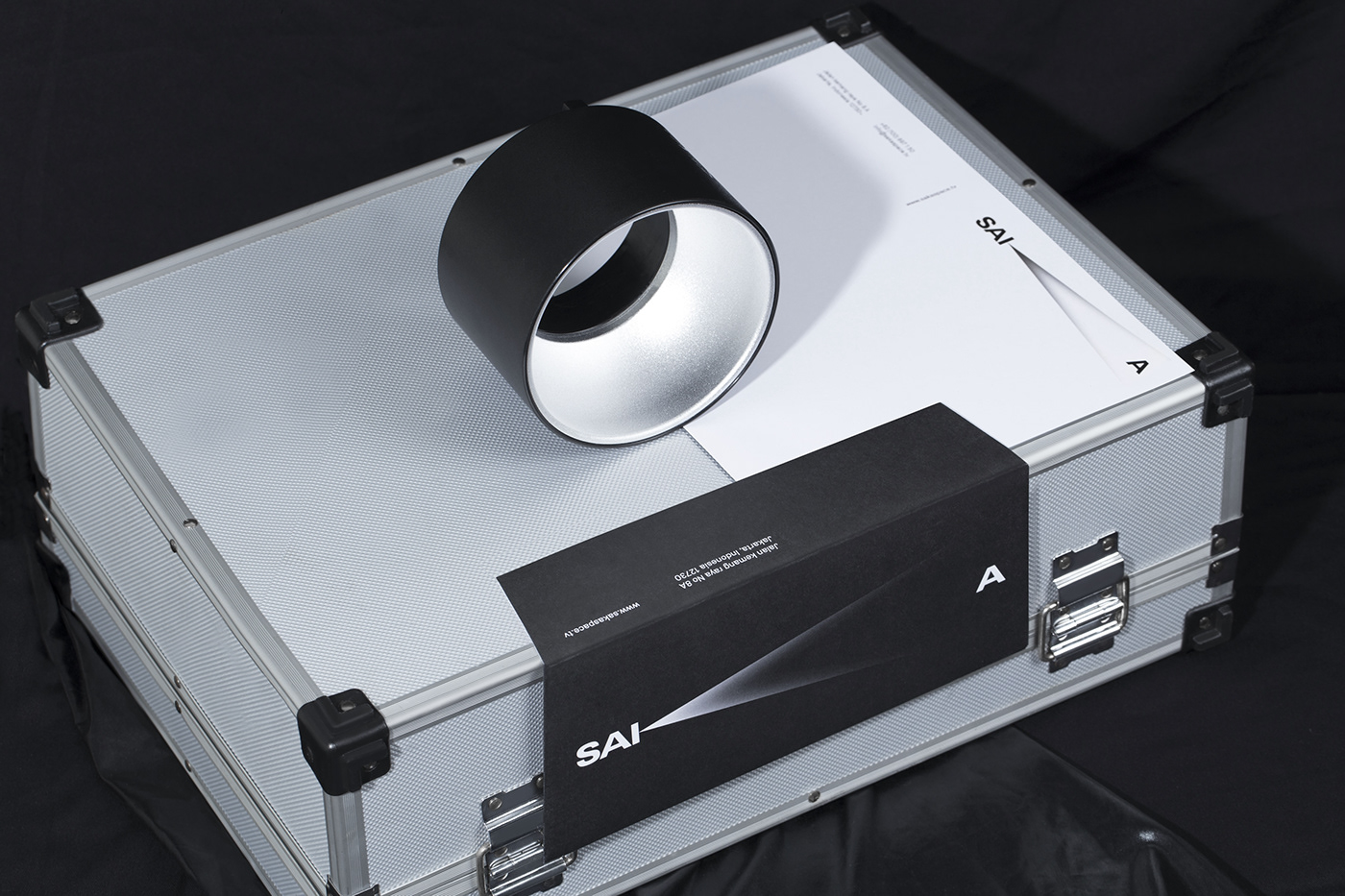
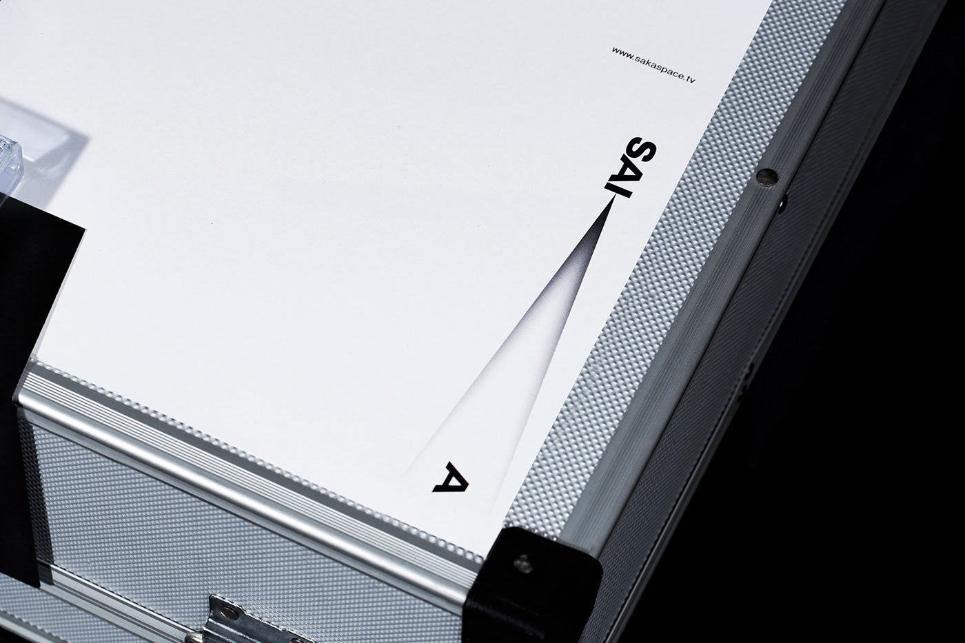
SAKASpace aims to have a brand identity fully representative of its DNA as well as collaborative nature in the audio-visual field. Inspired by the movie projection device, we shape the SAKA characters to be seen as a reliable platform to project A-Quality audio-visuals. Utilizing the typography of its name, SAKA, we create a dynamic logotype through its extended light from the ‘K’. This visual system aims to support their ever-changing needs and opportunities in the future.
We see SAKA’s character as a destination for brands in need of low-risk, reliable hands to solve their audio-visual project. We use Extended Sans Serif to maintain its minimalist, modern, and solid character with a spark of edginess. The projection purveys dynamic sense and can be extended to showcase its services.
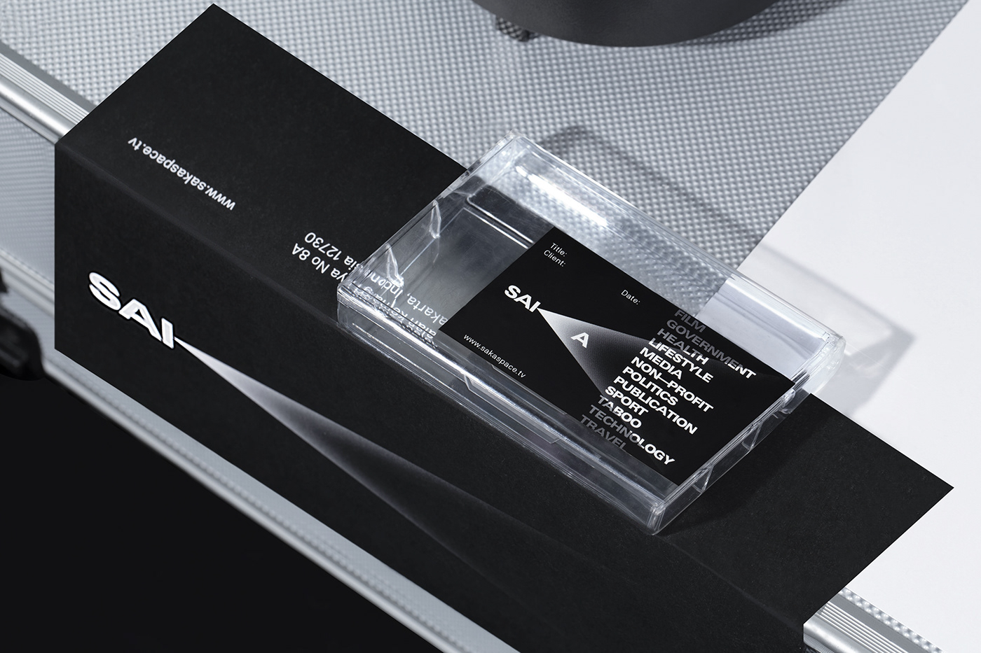
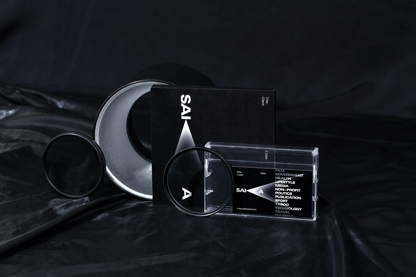
We came up with an idea of showcasing their range of industry, seen through accented spotlights. To raise awareness of SAKA’s services, this showcase combines a sense of confidence and dynamic functionality into one aesthetic visual.


