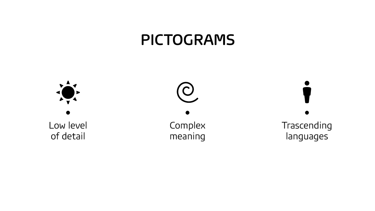
The following was part of a proposal for GfK to improve brand consistency and image throught their brand icons, better defined as pictograms, thanks to a new grid and guidelines to even style, look and feel.
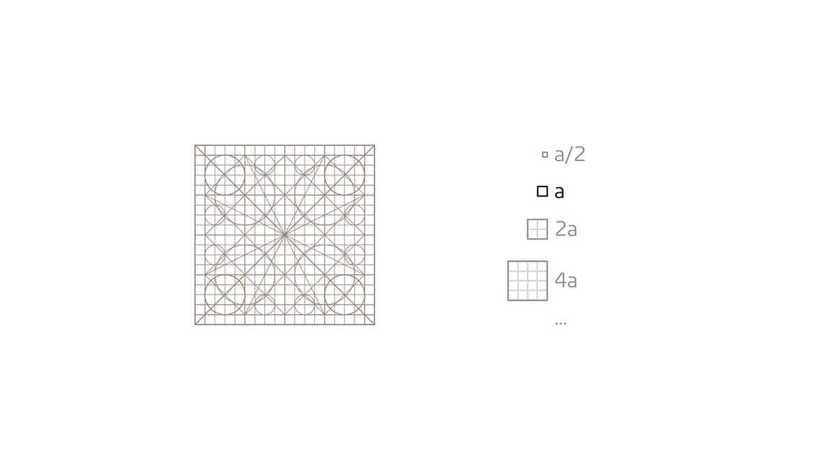
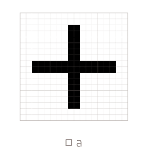
To keep consistent with GfK's strong identity, the grid design was based on their square logo.
Considering the need of icons bounded in a square, I left a margin on each side, diviging then the remaining space in modules and submudels, always in multiples of 4, to strengthen the feeling of solidity given by the square logo.
This include a main square module, a square submodule, a main diagonal module of 45°, a secondary diagonal module following the grid and not as bisector of the main one and three suggestions of rounded modules. These last ones were used as basic module for the rounded corners of the pictograms.

by ensuring that the series would look consistent.
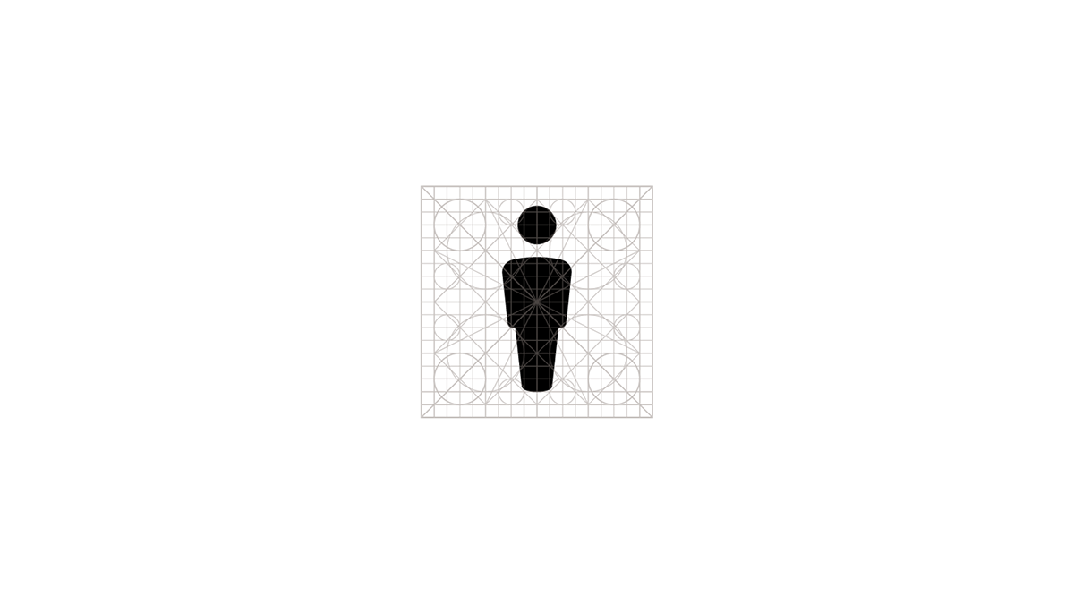
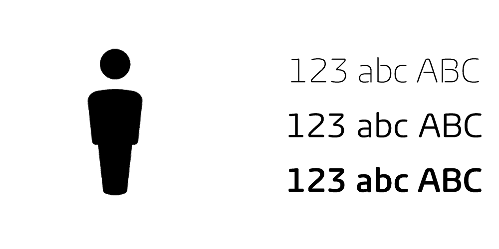
A really important detail to give more personality to the new set of pictograms is the consistency in the rounded corners, which reminds of the rounded corners of the brand font letters, resulting in a stronger brand identity.
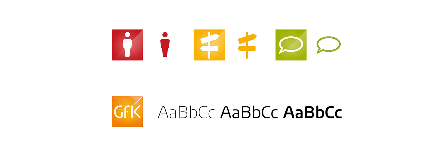
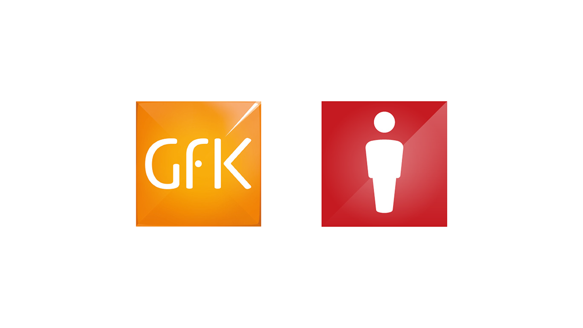
I suggested to abandon the use of the metallic, hard-light-like reflect, often abused especially on the simple icons, since this was not consistent with the light used on the rest of the brand graphics and could possibly lead to misunderstanding ("no man" or "the 50% of men" in the example below).

Instead I proposed to use a very simple soft light, plastic reflection, when needed, in orded to be more consistent with the rest of the brand identity.
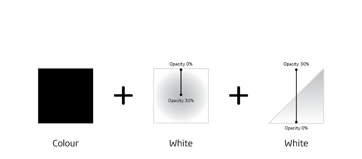

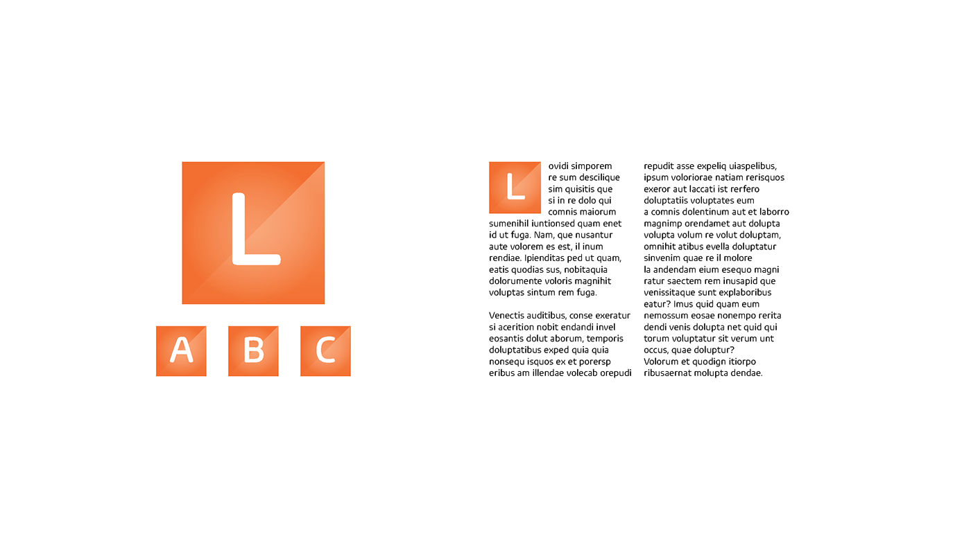
This effect could also be applied to different cases, such as drop caps in fine printed publications and annual reports.