


Learning Typeface Design
Anderson
The brief was to depict diversity through a typeface. Diversity could mean any kind of diversity and not just cultural.
Every famous director has his own way of making films, his own way of visually framing every scene. The idea behind choosing this topic was to depict diversity through the uniqueness of the visual style of a director – To celebrate an individual director’s distinct filmmaking style and then coming up with a typeface as a tribute. After initial research, I decided to work on Wes Anderson, a director with idiosyncratic style— marked by eccentric, colorful compositions and a fastidious attention to detail. His films are known for their distinctive visual and narrative style.Anderson has chosen to direct mostly fast-paced comedies marked by more serious or melancholic elements, with themes often centered on grief, loss of innocence, parental abandonment, adultery, sibling rivalry and unlikely friendships.
Initial explorations include making the letterforms look like a work of art, by making them really beautiful. As the explorations went on, it was felt that the letterforms did not give an Anderson feel. So ditching the idea of making it look pretty, I decided to completely focus on symmetry instead. And to give that dysfunctional touch of the characters involved in Anderson’s movies, further explorations were made to break that symmetry. The final output is a typeface that is entirely symmetrical which could be used for body text and a dysfunctional yet symmetric typeface that can be used for display.
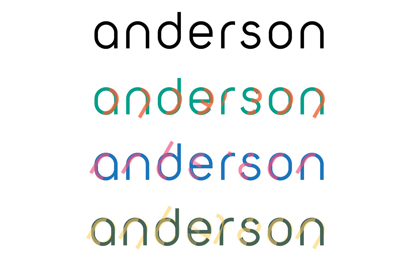
Anderson is a family of typefaces created as a tribute to the famous film director, Wes Anderson. It consists of two typefaces, one for body text and the other for display. The highly symmetric body text is inspired from the ubiquitous visual symmetry in Wes Anderson’s movies. Each letterform has been constructed using strict application of the capsular shape, thus resulting in similarity across all the alphabets.
The display text is inspired from the dysfunctional aspects of the characters in Wes Anderson’s movies. Therefore, the display text is made up of two parts, the body text base, and its mirror image. The two parts are juxtaposed in a manner which shows a conflict between them. Since it is made up of two parts, it cannot be used in a single color. The user also has the choice of selecting between four variations.
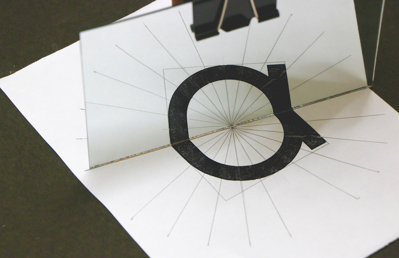
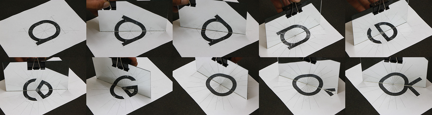
Initial attempts were made to create an entirely symmetrical typeface and then distort the symmetry to showcase the dysfunctional aspects of an Anderson film. The first attempt resulted in using the circle as the base for the letterforms and then diagonally cutting the letterform into two parts and shifting the parts by a small margin. However, the typeface created ended up being very similar to an already existing typeface.
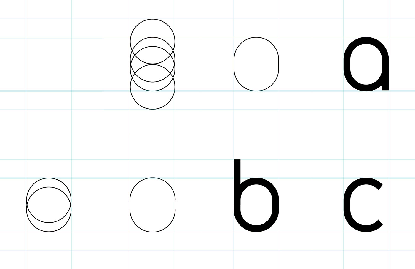
The circular base was replaced by a capsular shape which looked like an elongated circle. This acted as the base for the final letterform construction. Once the basic layout was decided, certain letterforms had variations in the way of construction. Working on all the variations that worked, specimen examples were created to see how the letterforms reacted with each other in each case. Then, one of the specimens was selected as the final typeface. Further attention was paid to the notches of the letterforms.

Final Typeface

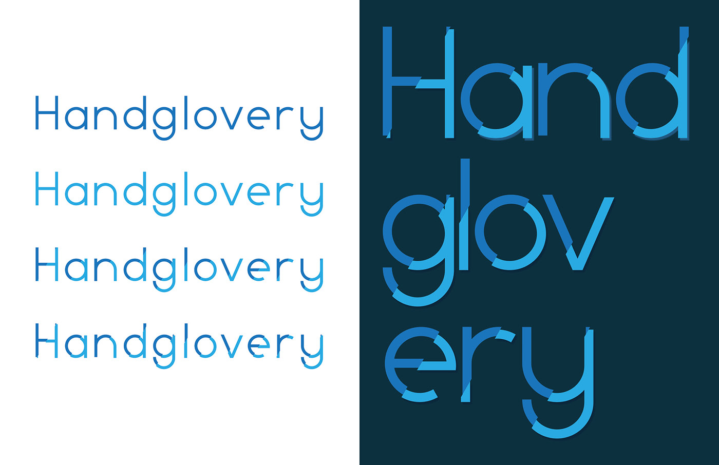
For the display text, the final body text typeface was cut and mirrored at different angles.
The display text would allow the users to set different colors for the base of the letterform and the mirror image.
The display text would allow the users to set different colors for the base of the letterform and the mirror image.
Final Display Typeface

FIN
...


