Barcelona Metro App Design
OBJECTIVE
Apply printed diagrammatic maps to a handheld device, such as a cell phone or tablet
Create a functional application that satisfies the basic needs of the user of massive transportation systems, such as trains, subways, and buses
Create diagrammatic visual material for smartphones that considers the needs of this medium, such as contrast, colors, and typography.
User experience and user interface important to the success of the design
AUDIENCE
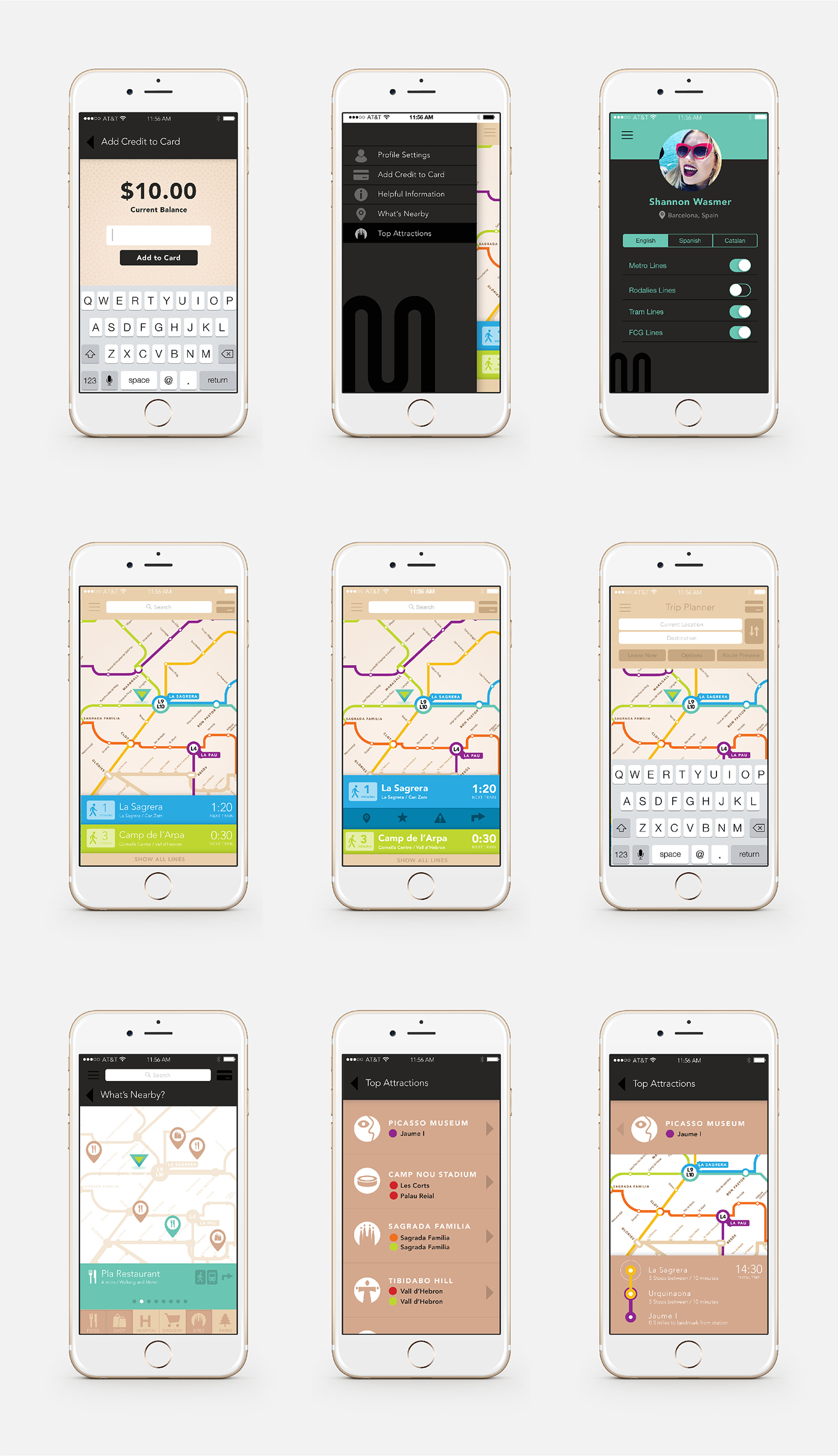
Tourists and newcomers are typically the highest users of maps in cities. Because of this, top attractions in Barcelona are included, with easy directions to each, that reflect the printed map design.
PROCESS
To test the needs for this application, I used various wayfinding apps for public transportation and noted what was helpful and what could be improved upon based on ease of use and functionality. Since I have traveled to Barcelona before, I thought about what would have been helpful when I was there, such as walking directions from stops to sites, pop-ups of what site is nearby, and information you may not know as a tourist such as the Ramblas is a full street and not one specific site.
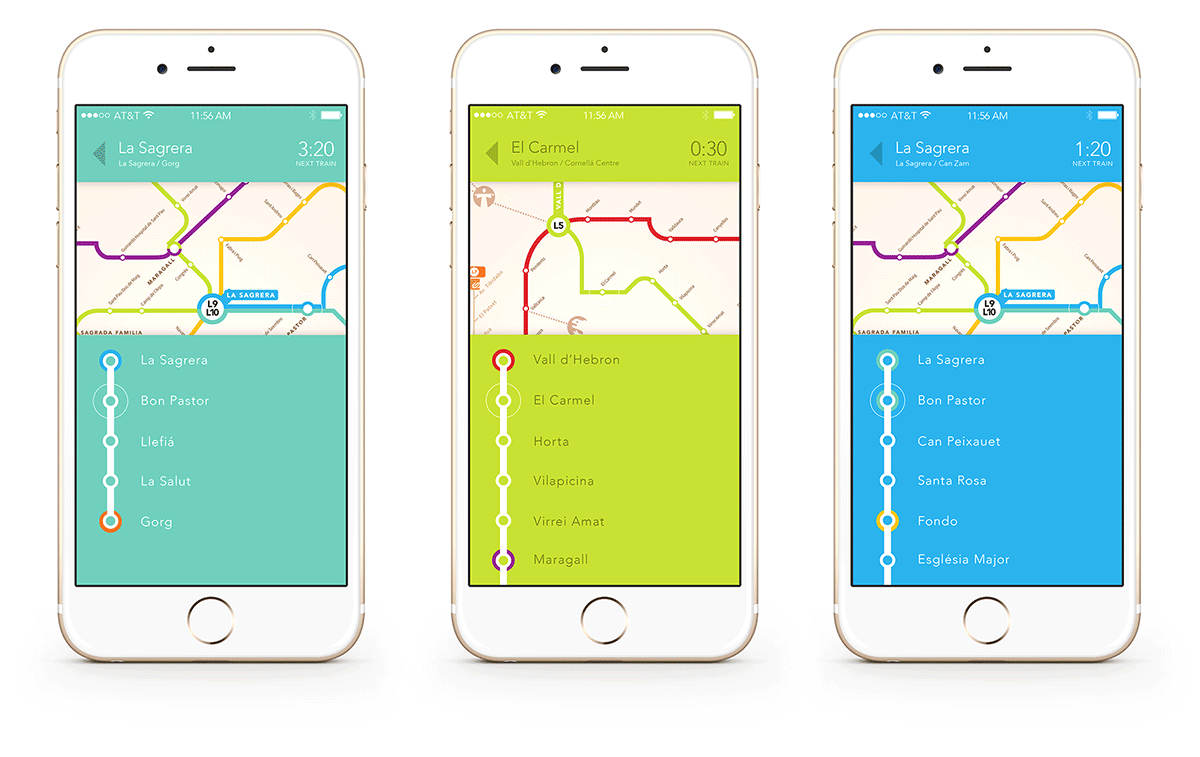
The prototype includes functions such as directions, saving favorite places, loading, reloading and using your metro card through the app, time until next train arrives, time to next stop and final stop, current location, nearby attractions, a list of and directions to top sites, a profile to create a social aspect, an overview of all lines, trip planner, and much more. Everything was planned to make the traveling experience for both locals and tourists as easy and informative as possible.
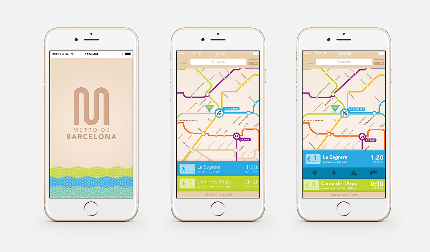
The user experience starts with an arrow directing where you are now and the closest lines to you at the bottom. Each line coordinates with the printed metro map for ease of use. Upon opening the app, the user automatically has reference to search, add money to their credits that can be used on the phone, directions, adding the stop as a favorite location, inserting an end destination for directions, and seeing all the lines at once.
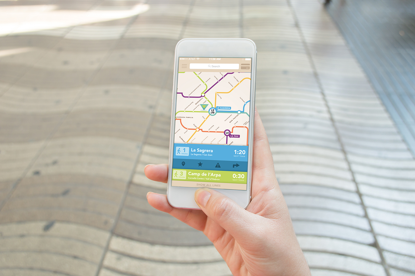
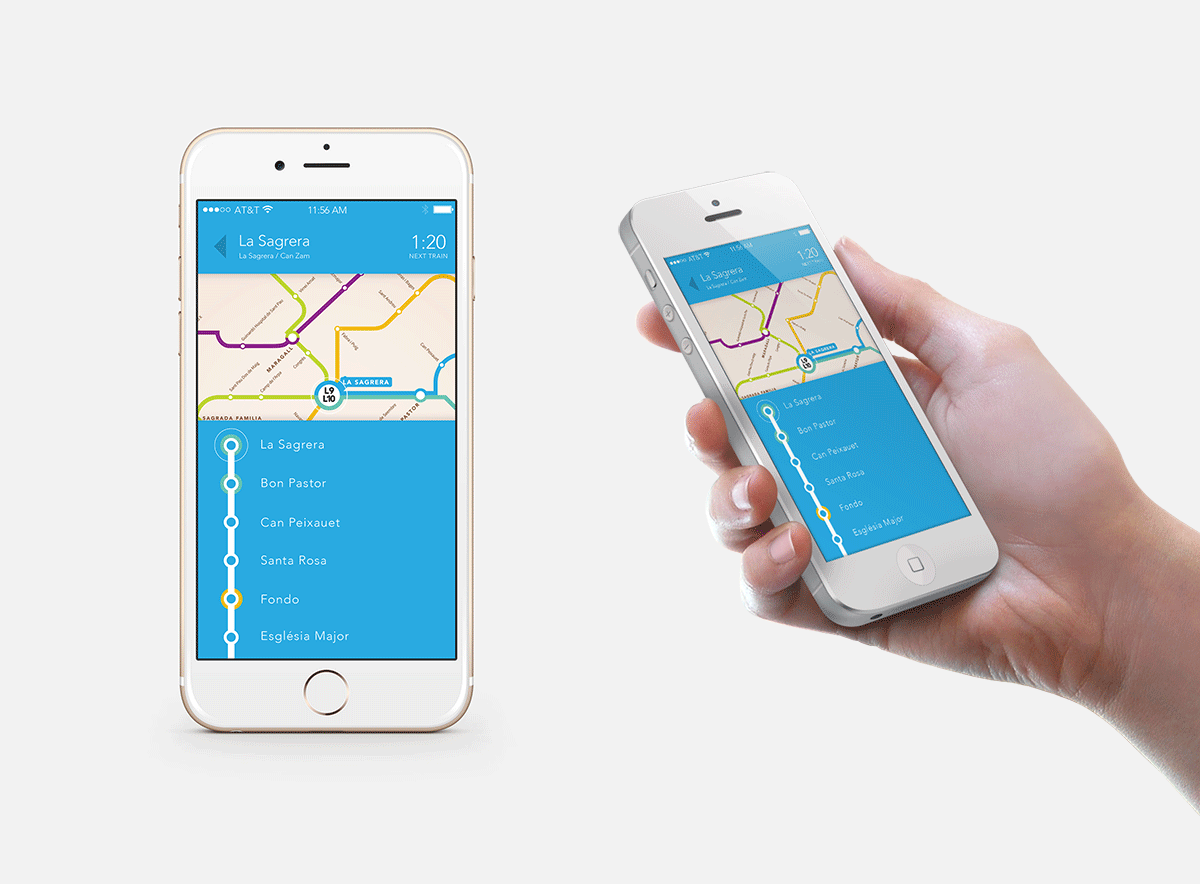
Once directions are selected, the user knows at which stop they are located at all times by a blinking circle around the dot representing where they are currently. The line color is reflected as a primary color of the page to make the user experience as easy as possible to know which line they are on at all times.
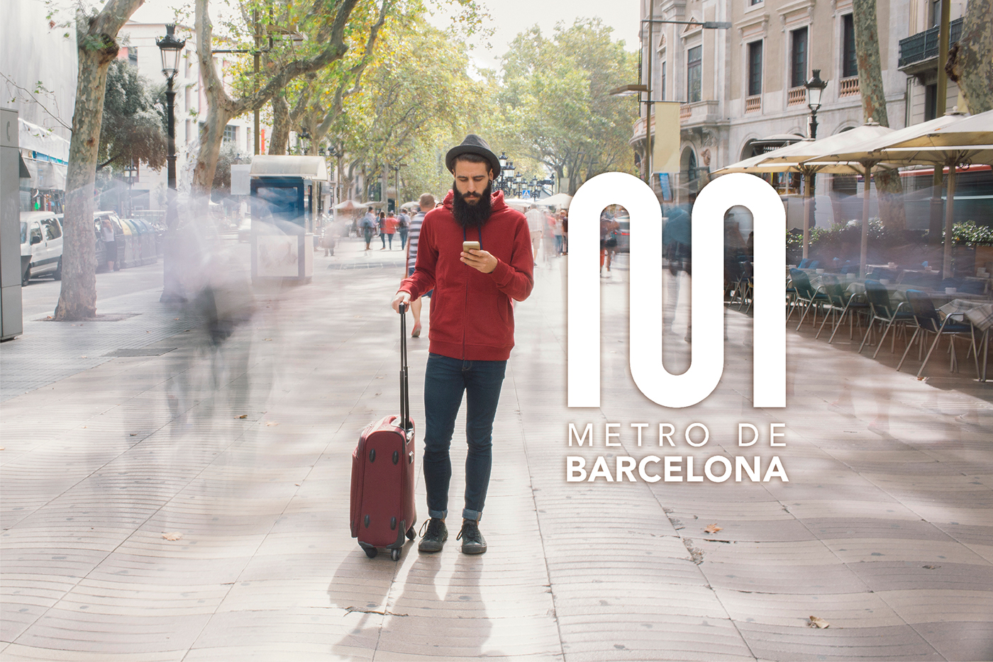
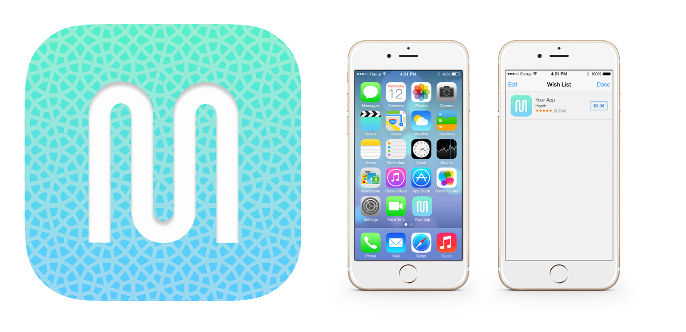
The logo and icon for the Barcelona Metro App design represents the line in a subway system as well as the curves of the Ramblas, a famous street in Barcelona. The pattern in the background of the app icon reflect the texture La Sagrada Família, and the colors are inspired by the architectural and mosaic artwork that floods the vibrant, Mediterranean water city.
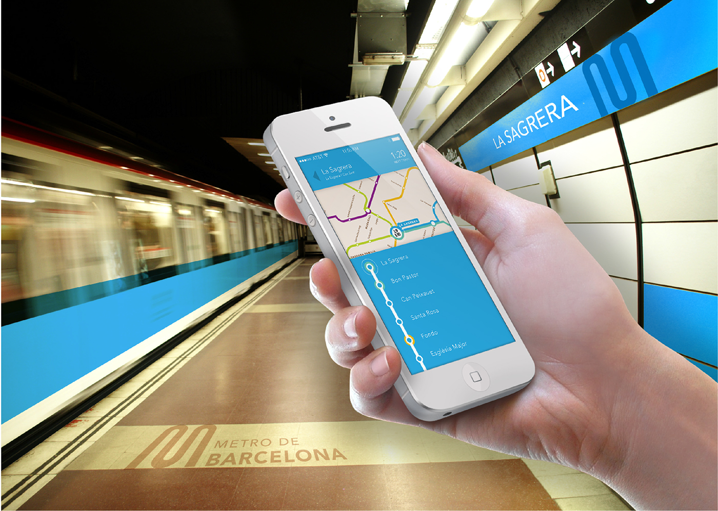
While traveling the subway, users can easily identify that they are on the right line by matching the line color on the app to the train and way-finding signage of the subway.